Guides
Every section we cover, with the explainers that go with it.
Accessibility
Guide
-
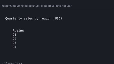 Accessible data tables
How to build data tables that are semantically correct for screen readers and visually usable on narrow viewports, with complete CSS and HTML samples.
Accessible data tables
How to build data tables that are semantically correct for screen readers and visually usable on narrow viewports, with complete CSS and HTML samples.
-
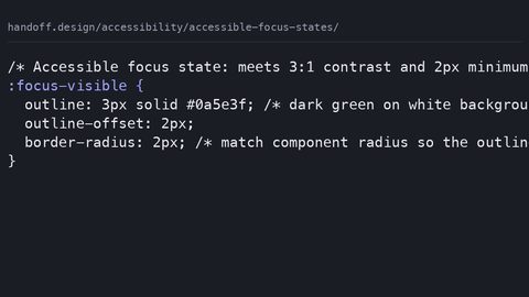 Accessible focus states
How to design focus states that meet WCAG 2.4.7, with complete CSS samples showing :focus-visible, contrast requirements, and the outline: none anti-pattern.
Accessible focus states
How to design focus states that meet WCAG 2.4.7, with complete CSS samples showing :focus-visible, contrast requirements, and the outline: none anti-pattern.
-
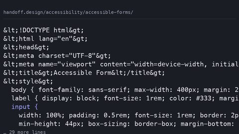 Accessible forms
How to style forms with visible labels, accessible error recovery, and focus indicators that meet WCAG 2.2, with complete code samples.
Accessible forms
How to style forms with visible labels, accessible error recovery, and focus indicators that meet WCAG 2.2, with complete code samples.
-
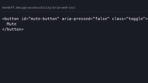 ARIA and CSS
How to use CSS attribute selectors to style component states based on ARIA attributes like aria-expanded and aria-current, with complete code samples.
ARIA and CSS
How to use CSS attribute selectors to style component states based on ARIA attributes like aria-expanded and aria-current, with complete code samples.
-
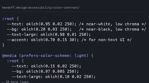 Color contrast
How to meet WCAG 2.2 color contrast requirements with modern CSS, using oklch(), prefers-color-scheme, and color-mix() to maintain AA and AAA ratios.
Color contrast
How to meet WCAG 2.2 color contrast requirements with modern CSS, using oklch(), prefers-color-scheme, and color-mix() to maintain AA and AAA ratios.
-
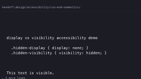 CSS and semantics
How CSS properties like display, visibility, content, and order affect the accessibility tree and what assistive technology exposes to users.
CSS and semantics
How CSS properties like display, visibility, content, and order affect the accessibility tree and what assistive technology exposes to users.
-
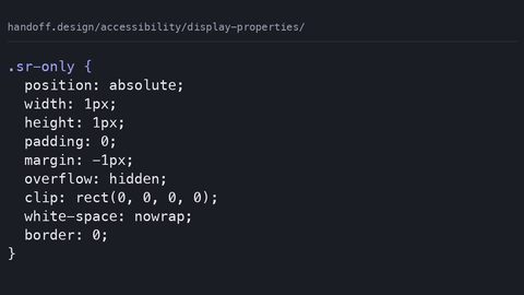 Display properties
How display: none, visibility: hidden, and CSS-generated content each affect the accessibility tree, with the WCAG success criteria that govern them.
Display properties
How display: none, visibility: hidden, and CSS-generated content each affect the accessibility tree, with the WCAG success criteria that govern them.
-
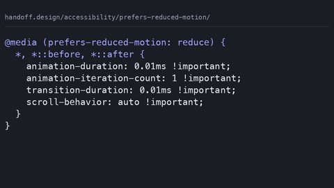 Prefers reduced motion
Write CSS that respects the prefers-reduced-motion media query, with WCAG 2.3.3 guidance on essential versus non-essential animation.
Prefers reduced motion
Write CSS that respects the prefers-reduced-motion media query, with WCAG 2.3.3 guidance on essential versus non-essential animation.
-
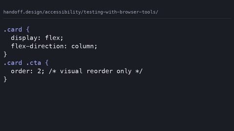 Testing with browser tools
Use Chrome DevTools and Firefox Accessibility Inspector to test how CSS affects the accessibility tree, contrast, and focus order.
Testing with browser tools
Use Chrome DevTools and Firefox Accessibility Inspector to test how CSS affects the accessibility tree, contrast, and focus order.
-
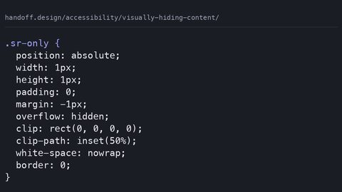 Visually hiding content
The CSS clip-rect pattern for hiding content visually while keeping it in the accessibility tree, and why display: none is the wrong tool.
Visually hiding content
The CSS clip-rect pattern for hiding content visually while keeping it in the accessibility tree, and why display: none is the wrong tool.
Animation
Guide
-
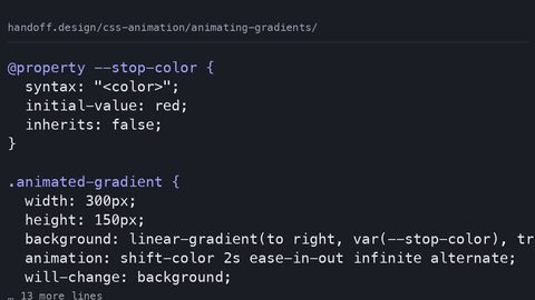 Animating gradients
CSS gradients cannot be transitioned directly—the browser snaps between values. Learn how @property enables smooth gradient animation by typing custom properties for interpolation.
Animating gradients
CSS gradients cannot be transitioned directly—the browser snaps between values. Learn how @property enables smooth gradient animation by typing custom properties for interpolation.
-
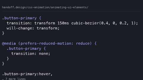 Animating UI elements
Animate UI elements at 60fps by restricting motion to transform and opacity. Learn compositor-safe techniques for buttons, toggles and form controls with reduced-motion fallbacks.
Animating UI elements
Animate UI elements at 60fps by restricting motion to transform and opacity. Learn compositor-safe techniques for buttons, toggles and form controls with reduced-motion fallbacks.
-
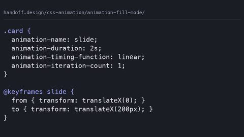 Animation fill mode
animation-fill-mode controls whether an element retains styles from the keyframes before the animation starts and after it ends. Learn forwards, backwards and both with runnable samples.
Animation fill mode
animation-fill-mode controls whether an element retains styles from the keyframes before the animation starts and after it ends. Learn forwards, backwards and both with runnable samples.
-
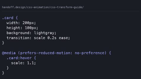 CSS transform guide
CSS transform functions scale, rotate and skew animate on the compositor thread without triggering layout or paint. Learn each function with complete, runnable code samples.
CSS transform guide
CSS transform functions scale, rotate and skew animate on the compositor thread without triggering layout or paint. Learn each function with complete, runnable code samples.
-
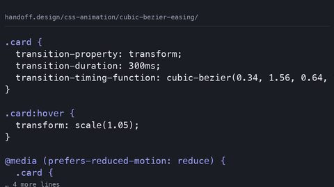 Cubic bezier easing
cubic-bezier defines custom easing curves with four control points for CSS transitions and animations. Learn to design curves that feel natural using complete code samples.
Cubic bezier easing
cubic-bezier defines custom easing curves with four control points for CSS transitions and animations. Learn to design curves that feel natural using complete code samples.
-
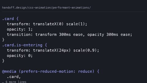 Performant animations
Only transform and opacity animate on the compositor thread. Learn which CSS properties trigger layout or paint, how to measure the cost, and how to write animations that stay at 60fps.
Performant animations
Only transform and opacity animate on the compositor thread. Learn which CSS properties trigger layout or paint, how to measure the cost, and how to write animations that stay at 60fps.
-
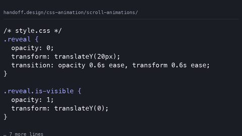 Scroll animations
Build on-scroll animations with IntersectionObserver or the declarative scroll() and view() timeline functions. Learn which approach runs off the main thread with runnable samples.
Scroll animations
Build on-scroll animations with IntersectionObserver or the declarative scroll() and view() timeline functions. Learn which approach runs off the main thread with runnable samples.
-
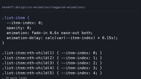 Staggered animations
CSS has no stagger() function. Create staggered animations with animation-delay, custom properties and nth-child to cascade start times across a list of elements.
Staggered animations
CSS has no stagger() function. Create staggered animations with animation-delay, custom properties and nth-child to cascade start times across a list of elements.
-
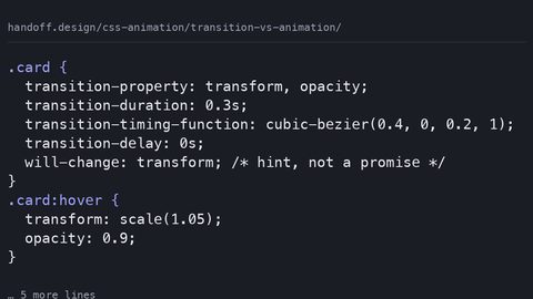 Transition vs animation
CSS transitions respond to property state changes; CSS animations run independently. Learn the performance cost of each and when to choose one over the other.
Transition vs animation
CSS transitions respond to property state changes; CSS animations run independently. Learn the performance cost of each and when to choose one over the other.
-
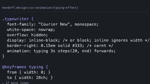 Typing effect
Build a CSS-only typewriter effect with animation-timing-function: steps(). Understand the layout cost, the monospace requirement, and the reduced-motion fallback.
Typing effect
Build a CSS-only typewriter effect with animation-timing-function: steps(). Understand the layout cost, the monospace requirement, and the reduced-motion fallback.
Architecture
Guide
-
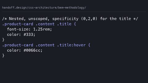 BEM methodology
BEM uses block, element, and modifier naming to keep CSS specificity flat and predictable. See it compared to unscoped nesting, and learn what @scope replaces.
BEM methodology
BEM uses block, element, and modifier naming to keep CSS specificity flat and predictable. See it compared to unscoped nesting, and learn what @scope replaces.
-
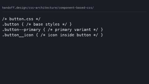 Component based CSS
Organise CSS by component using @scope, CSS Modules, or BEM. See the same button styled three ways and learn what each approach protects against.
Component based CSS
Organise CSS by component using @scope, CSS Modules, or BEM. See the same button styled three ways and learn what each approach protects against.
-
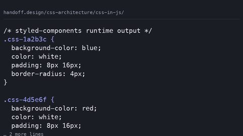 CSS in JavaScript
CSS-in-JS libraries inject styles at runtime or extract them at build time. See the actual CSS each approach emits and understand the performance cost.
CSS in JavaScript
CSS-in-JS libraries inject styles at runtime or extract them at build time. See the actual CSS each approach emits and understand the performance cost.
-
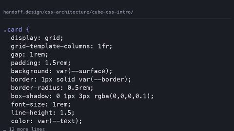 CUBE CSS intro
CUBE CSS separates layout composition from visual treatment so the cascade helps rather than hinders. See a component written both ways and understand the trade-off.
CUBE CSS intro
CUBE CSS separates layout composition from visual treatment so the cascade helps rather than hinders. See a component written both ways and understand the trade-off.
-
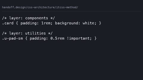 ITCSS method
ITCSS layers stylesheets from generic to specific so specificity is predictable. See a conflict resolved by layering versus selector hacks, and how @layer maps on.
ITCSS method
ITCSS layers stylesheets from generic to specific so specificity is predictable. See a conflict resolved by layering versus selector hacks, and how @layer maps on.
-
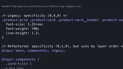 Refactoring legacy CSS
Refactor legacy CSS incrementally on a live site using cascade layers, coverage audits, and component-scoped custom properties without a full rewrite.
Refactoring legacy CSS
Refactor legacy CSS incrementally on a live site using cascade layers, coverage audits, and component-scoped custom properties without a full rewrite.
-
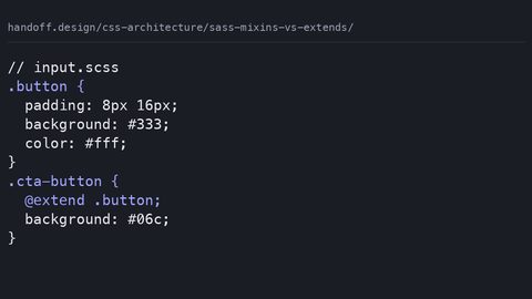 Sass mixins vs extends
Compare Sass mixins and extends by examining the actual compiled CSS output, source order risks, and why gzip makes code duplication less of a concern.
Sass mixins vs extends
Compare Sass mixins and extends by examining the actual compiled CSS output, source order risks, and why gzip makes code duplication less of a concern.
-
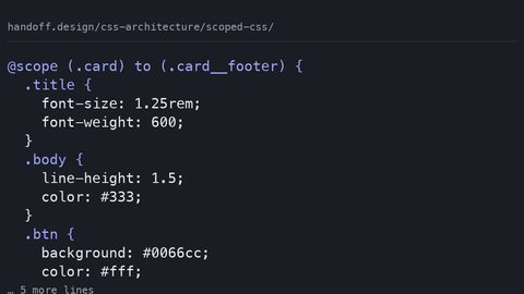 Scoped CSS
Compare @scope, CSS Modules, and Shadow DOM for scoping component styles, with complete code samples showing what each method protects against and costs.
Scoped CSS
Compare @scope, CSS Modules, and Shadow DOM for scoping component styles, with complete code samples showing what each method protects against and costs.
-
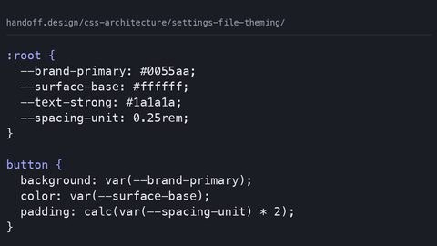 Settings file theming
Build a runtime theme system with CSS custom properties instead of Sass variables, with complete samples showing why build-time values freeze and cascade tokens don't.
Settings file theming
Build a runtime theme system with CSS custom properties instead of Sass variables, with complete samples showing why build-time values freeze and cascade tokens don't.
-
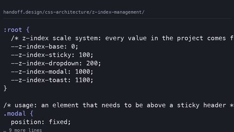 Z index management
Organise z-index values in large projects with a custom property scale system and explicit stacking context isolation to prevent the 9999 arms race.
Z index management
Organise z-index values in large projects with a custom property scale system and explicit stacking context isolation to prevent the 9999 arms race.
Color
Guide
-
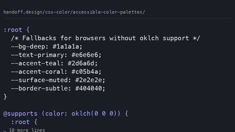 Accessible color palettes
Build WCAG-compliant color palettes in oklch with real contrast ratios for every swatch, hsl fallbacks for older browsers, and light-dark mode parity.
Accessible color palettes
Build WCAG-compliant color palettes in oklch with real contrast ratios for every swatch, hsl fallbacks for older browsers, and light-dark mode parity.
-
 Color management tools
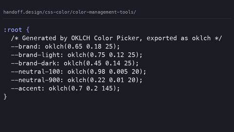
Evaluate color management tools by whether they output modern CSS like oklch and color-mix, with complete palette samples and real contrast ratios.
Color management tools
Evaluate color management tools by whether they output modern CSS like oklch and color-mix, with complete palette samples and real contrast ratios.
-
 Color mix function
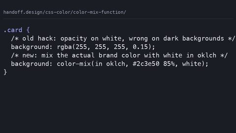
Use CSS color-mix() to blend colors dynamically in any color space, with a complete fallback pattern for browsers that do not support the function.
Color mix function
Use CSS color-mix() to blend colors dynamically in any color space, with a complete fallback pattern for browsers that do not support the function.
-
 Color scheme property
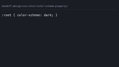
The CSS color-scheme property tells the browser to render its own chrome, form controls, and scrollbars in light or dark mode, separate from your authored styles.
Color scheme property
The CSS color-scheme property tells the browser to render its own chrome, form controls, and scrollbars in light or dark mode, separate from your authored styles.
-
 Contrast ratios
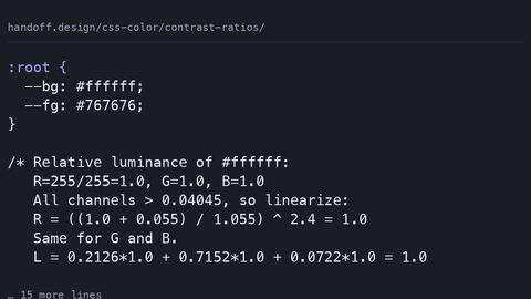
Calculate WCAG 2.2 contrast ratios from CSS colour values using the relative luminance formula, with exact AA and AAA thresholds for text and non-text content.
Contrast ratios
Calculate WCAG 2.2 contrast ratios from CSS colour values using the relative luminance formula, with exact AA and AAA thresholds for text and non-text content.
-
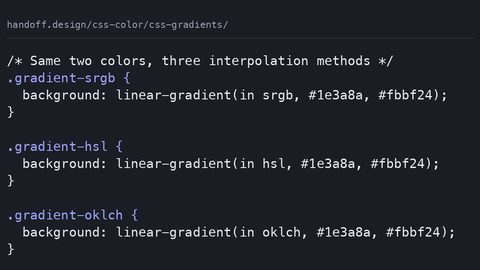 CSS gradients
 now support color interpolation in oklch, hsl, and sRGB, producing visibly different results from the same color stops with a medium paint cost.
CSS gradients
CSS gradients now support color interpolation in oklch, hsl, and sRGB, producing visibly different results from the same color stops with a medium paint cost.
-
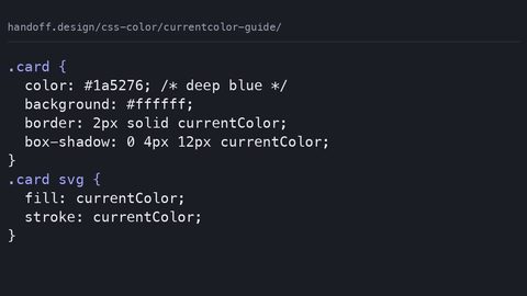 Currentcolor guide
The CSS currentColor keyword inherits the computed color value and applies it to borders, shadows, and SVG fills without declaring custom properties.
Currentcolor guide
The CSS currentColor keyword inherits the computed color value and applies it to borders, shadows, and SVG fills without declaring custom properties.
-
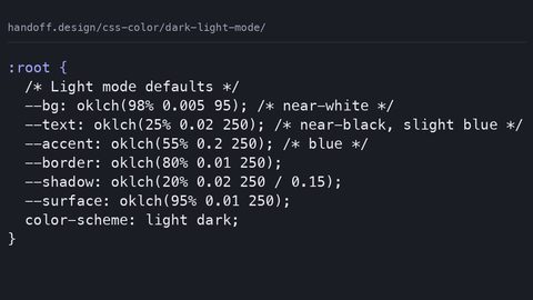 Dark light mode
Build a dark and light mode theme with CSS custom properties, the light-dark() function, and the color-scheme meta tag to prevent a flash of the wrong theme.
Dark light mode
Build a dark and light mode theme with CSS custom properties, the light-dark() function, and the color-scheme meta tag to prevent a flash of the wrong theme.
-
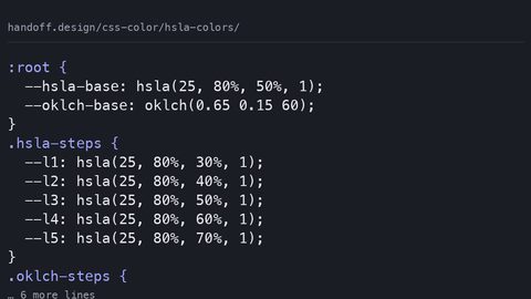 Hsla colors
HSLA colors are perceptually uneven because they map to sRGB; OKLCH provides uniform lightness and wider gamut with a simple two-value fallback pattern.
Hsla colors
HSLA colors are perceptually uneven because they map to sRGB; OKLCH provides uniform lightness and wider gamut with a simple two-value fallback pattern.
-
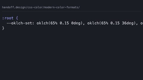 Modern color formats
OKLCH is a perceptually uniform CSS color space where equal numerical steps look equal to the eye, with gamut mapping that LCH does not guarantee.
Modern color formats
OKLCH is a perceptually uniform CSS color space where equal numerical steps look equal to the eye, with gamut mapping that LCH does not guarantee.
Design tools
Guide
-
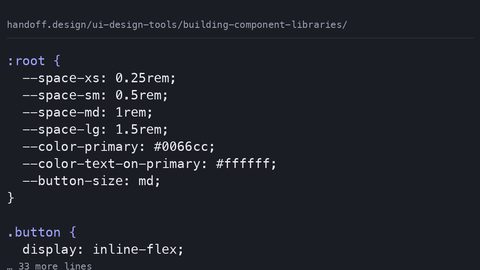 Building component libraries
Structure design tool component libraries so variants map to CSS states and design tokens export as custom properties, not absolute-positioned frames.
Building component libraries
Structure design tool component libraries so variants map to CSS states and design tokens export as custom properties, not absolute-positioned frames.
-
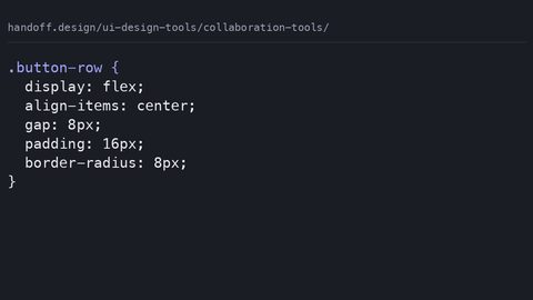 Collaboration tools
Evaluate design collaboration tools by what they export for developers: usable CSS snippets, design tokens, and component state documentation.
Collaboration tools
Evaluate design collaboration tools by what they export for developers: usable CSS snippets, design tokens, and component state documentation.
-
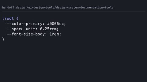 Design system documentation tools
Compare design system documentation tools by what they actually export: CSS custom properties, JSON tokens, and code snippets a developer can use without manual translation.
Design system documentation tools
Compare design system documentation tools by what they actually export: CSS custom properties, JSON tokens, and code snippets a developer can use without manual translation.
-
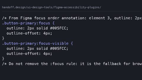 Figma accessibility plugins
Evaluate Figma accessibility plugins by what they catch before code exists: contrast violations, missing focus orders, and heading structure errors that CSS alone cannot fix.
Figma accessibility plugins
Evaluate Figma accessibility plugins by what they catch before code exists: contrast violations, missing focus orders, and heading structure errors that CSS alone cannot fix.
-
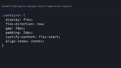 Figma auto layout
Audit the CSS that Figma auto layout actually generates: where it produces clean flexbox, where it falls back to absolute positioning, and what a developer must rewrite.
Figma auto layout
Audit the CSS that Figma auto layout actually generates: where it produces clean flexbox, where it falls back to absolute positioning, and what a developer must rewrite.
-
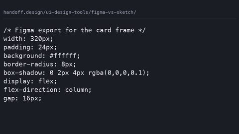 Figma vs sketch
Compare Figma and Sketch solely on developer handoff output: which tool's CSS snippets, design tokens, and asset exports require fewer manual corrections.
Figma vs sketch
Compare Figma and Sketch solely on developer handoff output: which tool's CSS snippets, design tokens, and asset exports require fewer manual corrections.
-
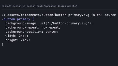 Managing design assets
Establish the asset handoff contract: naming conventions, export formats, and folder structures that let developers drop design files directly into a CSS codebase.
Managing design assets
Establish the asset handoff contract: naming conventions, export formats, and folder structures that let developers drop design files directly into a CSS codebase.
-
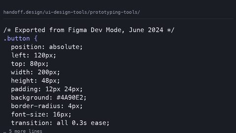 Prototyping tools
Evaluate prototyping tools by the CSS they export: which tools produce animation and interaction code that survives the transition to production without a rewrite.
Prototyping tools
Evaluate prototyping tools by the CSS they export: which tools produce animation and interaction code that survives the transition to production without a rewrite.
-
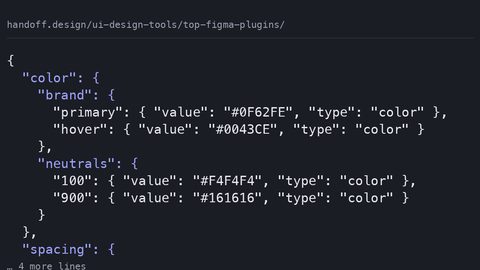 Top figma plugins
Rank Figma plugins by developer handoff output quality: which produce CSS snippets, design tokens, and assets that require no manual cleanup before production.
Top figma plugins
Rank Figma plugins by developer handoff output quality: which produce CSS snippets, design tokens, and assets that require no manual cleanup before production.
-
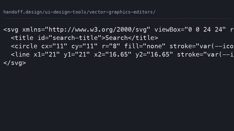 Vector graphics editors
Compare vector graphics editors by the SVG they emit: which produce clean markup with correct viewBox attributes that CSS can style without manual cleanup.
Vector graphics editors
Compare vector graphics editors by the SVG they emit: which produce clean markup with correct viewBox attributes that CSS can style without manual cleanup.
Frameworks
Guide
-
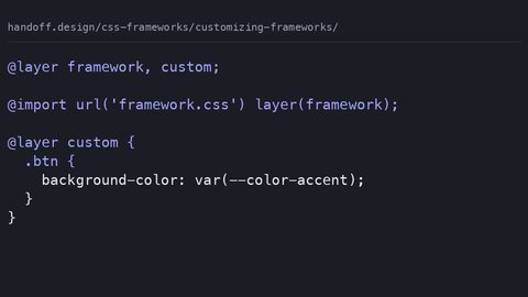 Customizing frameworks
How to customise CSS frameworks at the correct override point: design tokens, cascade layers, and the specificity traps that break when the framework updates.
Customizing frameworks
How to customise CSS frameworks at the correct override point: design tokens, cascade layers, and the specificity traps that break when the framework updates.
-
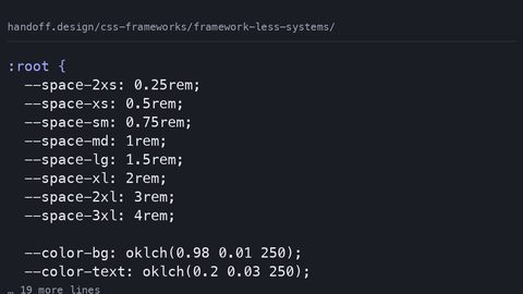 Framework less systems
How modern CSS features—custom properties, @scope, @layer, Container Queries, and CSS Nesting—replace the utilities developers reach for frameworks to provide.
Framework less systems
How modern CSS features—custom properties, @scope, @layer, Container Queries, and CSS Nesting—replace the utilities developers reach for frameworks to provide.
-
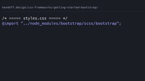 Getting started bootstrap
What Bootstrap 5 ships in bytes after compression, the build step it requires, and which customisation paths its architecture closes off.
Getting started bootstrap
What Bootstrap 5 ships in bytes after compression, the build step it requires, and which customisation paths its architecture closes off.
-
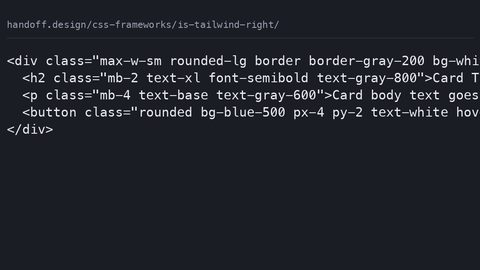 Is tailwind right
What Tailwind CSS costs in shipped bytes after purging, the design problems it makes harder, and who should not use it.
Is tailwind right
What Tailwind CSS costs in shipped bytes after purging, the design problems it makes harder, and who should not use it.
-
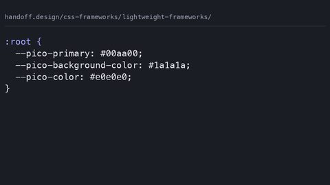 Lightweight frameworks
A comparison of lightweight CSS frameworks by shipped bytes, missing features, and when the omission is the point.
Lightweight frameworks
A comparison of lightweight CSS frameworks by shipped bytes, missing features, and when the omission is the point.
-
 Migrating away
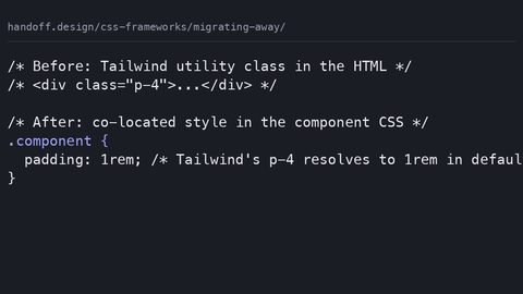
A step-by-step strategy for migrating away from a CSS framework: audit dead code, extract to native declarations, and use @layer to replace without a rewrite.
Migrating away
A step-by-step strategy for migrating away from a CSS framework: audit dead code, extract to native declarations, and use @layer to replace without a rewrite.
-
 Open props intro
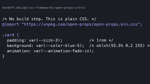
What Open Props ships as design tokens via custom properties, how it differs from utility-class frameworks, and who should skip it.
Open props intro
What Open Props ships as design tokens via custom properties, how it differs from utility-class frameworks, and who should skip it.
-
 Performance impact
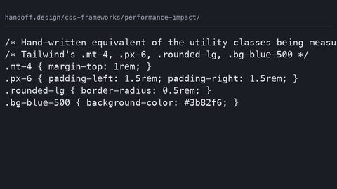
Quantifies what CSS frameworks actually cost in shipped bytes after compression, build-step overhead, and the runtime performance of the selectors they generate.
Performance impact
Quantifies what CSS frameworks actually cost in shipped bytes after compression, build-step overhead, and the runtime performance of the selectors they generate.
-
 Prototyping frameworks
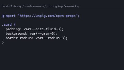
Evaluates CSS frameworks for prototyping by what they emit, what they cost in bytes, and whether the prototype styles can be discarded without a rewrite.
Prototyping frameworks
Evaluates CSS frameworks for prototyping by what they emit, what they cost in bytes, and whether the prototype styles can be discarded without a rewrite.
-
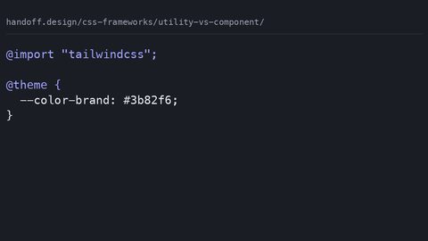 Utility vs component
Compares utility-first and component-based CSS frameworks by their actual shipped output after compression, specificity overhead, and the cost of overriding them.
Utility vs component
Compares utility-first and component-based CSS frameworks by their actual shipped output after compression, specificity overhead, and the cost of overriding them.
JavaScript for CSS
Guide
-
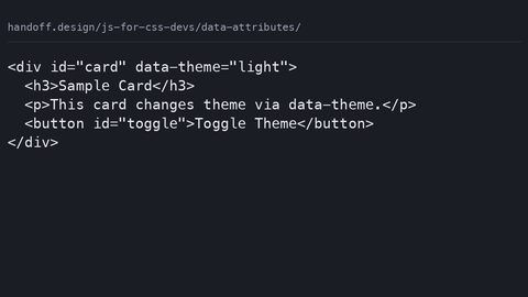 Data attributes
Use HTML data-* attributes as the single source of truth for component state, styled with CSS attribute selectors and read by JavaScript via dataset, replacing class-toggling patterns.
Data attributes
Use HTML data-* attributes as the single source of truth for component state, styled with CSS attribute selectors and read by JavaScript via dataset, replacing class-toggling patterns.
-
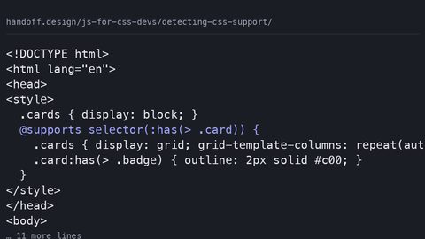 Detecting CSS support
Use @supports in CSS as the primary feature-detection mechanism, with CSS.supports() in JavaScript only for the gaps that the at-rule cannot cover, per the CSS Conditional Rules specification.
Detecting CSS support
Use @supports in CSS as the primary feature-detection mechanism, with CSS.supports() in JavaScript only for the gaps that the at-rule cannot cover, per the CSS Conditional Rules specification.
-
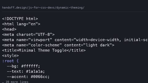 Dynamic theming
Build a theme toggle that reads prefers-color-scheme on first visit, persists user overrides in localStorage, and sets a data-theme attribute before first paint to prevent flicker.
Dynamic theming
Build a theme toggle that reads prefers-color-scheme on first visit, persists user overrides in localStorage, and sets a data-theme attribute before first paint to prevent flicker.
-
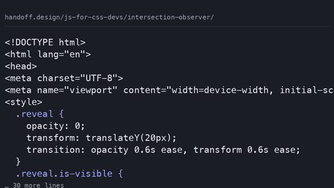 Intersection observer
Use IntersectionObserver to trigger CSS animations and lazy loading when elements enter the viewport, and know when the CSS-only view() timeline replaces the JavaScript approach entirely.
Intersection observer
Use IntersectionObserver to trigger CSS animations and lazy loading when elements enter the viewport, and know when the CSS-only view() timeline replaces the JavaScript approach entirely.
-
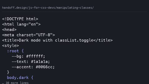 Manipulating classes
Use the classList API to add, remove, toggle, and replace CSS classes, and know when a data-* attribute or custom property is the better choice for component state that JavaScript needs to read.
Manipulating classes
Use the classList API to add, remove, toggle, and replace CSS classes, and know when a data-* attribute or custom property is the better choice for component state that JavaScript needs to read.
-
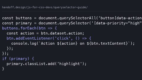 Queryselector guide
Use document.querySelector and querySelectorAll with full CSS selector syntax to find DOM elements, and understand when right-to-left selector matching makes a complex query cost more than a targeted one.
Queryselector guide
Use document.querySelector and querySelectorAll with full CSS selector syntax to find DOM elements, and understand when right-to-left selector matching makes a complex query cost more than a targeted one.
-
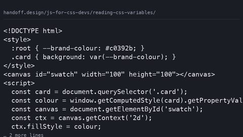 Reading CSS variables
Read CSS custom property computed values with getComputedStyle and getPropertyValue, write them with setProperty, and register types with @property so JavaScript receives parsed values instead of strings.
Reading CSS variables
Read CSS custom property computed values with getComputedStyle and getPropertyValue, write them with setProperty, and register types with @property so JavaScript receives parsed values instead of strings.
-
 Resize observer
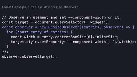
Use ResizeObserver to detect element size changes and drive CSS breakpoints via custom properties, and know when native container queries eliminate the JavaScript dependency and the main-thread cost.
Resize observer
Use ResizeObserver to detect element size changes and drive CSS breakpoints via custom properties, and know when native container queries eliminate the JavaScript dependency and the main-thread cost.
-
 Simple tabs component
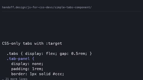
Build a tabs component where JavaScript only toggles data-state attributes and ARIA, leaving the visual logic to CSS cascade, scroll-driven animations, and container queries.
Simple tabs component
Build a tabs component where JavaScript only toggles data-state attributes and ARIA, leaving the visual logic to CSS cascade, scroll-driven animations, and container queries.
-
 Triggering animations
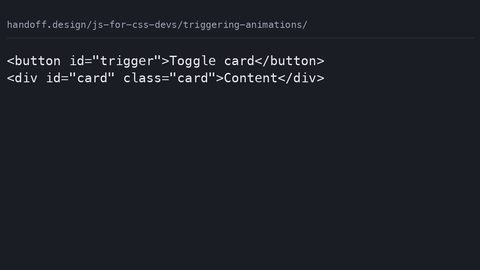
Trigger CSS animations from JavaScript only when CSS cannot detect the state itself: class toggles, scroll-driven timelines, and WAAPI calls that read custom properties.
Triggering animations
Trigger CSS animations from JavaScript only when CSS cannot detect the state itself: class toggles, scroll-driven timelines, and WAAPI calls that read custom properties.
Layout
Guide
-
 Box model refresher
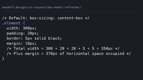
Explains the CSS box model's actual dimension calculation rules, margin collapse, and why box-sizing: border-box replaced the 2014 width-calculation hacks.
Box model refresher
Explains the CSS box model's actual dimension calculation rules, margin collapse, and why box-sizing: border-box replaced the 2014 width-calculation hacks.
-
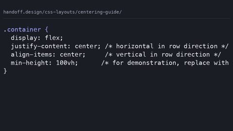 Centering guide
Shows the two-declaration CSS centering techniques that replaced the twelve hacks developers needed in 2014, using flexbox, grid, and place-items.
Centering guide
Shows the two-declaration CSS centering techniques that replaced the twelve hacks developers needed in 2014, using flexbox, grid, and place-items.
-
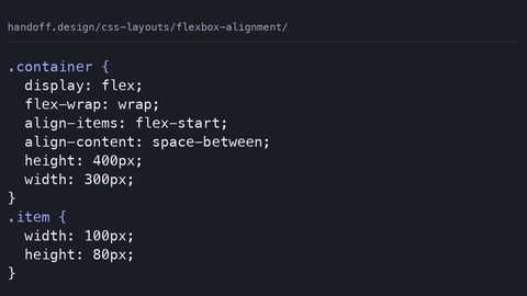 Flexbox alignment
Explains flexbox alignment properties justify-content and align-items with complete code samples, naming the 2014 hacks each value replaces.
Flexbox alignment
Explains flexbox alignment properties justify-content and align-items with complete code samples, naming the 2014 hacks each value replaces.
-
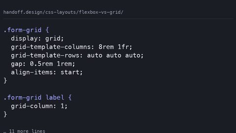 Flexbox vs grid
Replaces the 'grid for page, flexbox for component' rule with the actual decision criterion: one-axis distribution versus two-axis row-and-column alignment.
Flexbox vs grid
Replaces the 'grid for page, flexbox for component' rule with the actual decision criterion: one-axis distribution versus two-axis row-and-column alignment.
-
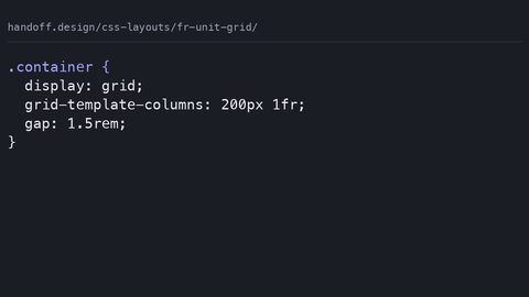 Fr unit grid
The CSS Grid fr unit distributes remaining space after fixed tracks and gaps are accounted for, not a percentage of total width. Learn how available space is calculated and when content minimums override fr sizing.
Fr unit grid
The CSS Grid fr unit distributes remaining space after fixed tracks and gaps are accounted for, not a percentage of total width. Learn how available space is calculated and when content minimums override fr sizing.
-
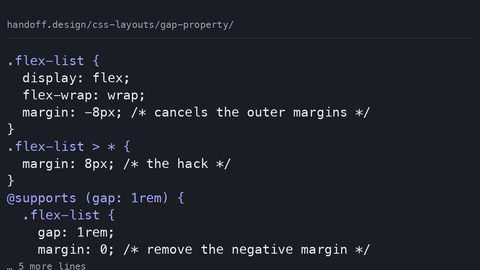 Gap property
The CSS gap property provides spacing between flexbox and grid items without margin hacks or negative container margins. Use it with a fallback for older browsers.
Gap property
The CSS gap property provides spacing between flexbox and grid items without margin hacks or negative container margins. Use it with a fallback for older browsers.
-
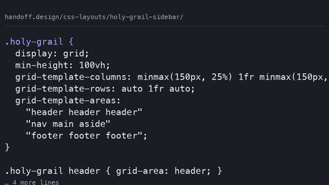 Holy grail sidebar
CSS Grid replaces float-based holy grail layouts with grid-template-areas, automatic equal-height columns, and source-order independence. Build a sidebar layout that works without hacks.
Holy grail sidebar
CSS Grid replaces float-based holy grail layouts with grid-template-areas, automatic equal-height columns, and source-order independence. Build a sidebar layout that works without hacks.
-
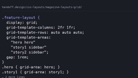 Magazine layouts grid
CSS Grid enables magazine-style editorial layouts with grid-template-areas, spanning items, and dense packing. Visual placement separates from source order without restructuring HTML.
Magazine layouts grid
CSS Grid enables magazine-style editorial layouts with grid-template-areas, spanning items, and dense packing. Visual placement separates from source order without restructuring HTML.
-
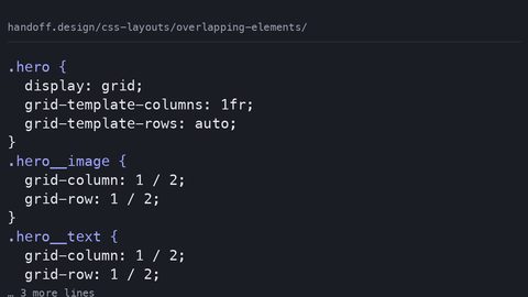 Overlapping elements
CSS Grid places multiple items in the same cell for overlapping layouts without position: absolute. Control stacking with z-index and manage stacking contexts with isolation.
Overlapping elements
CSS Grid places multiple items in the same cell for overlapping layouts without position: absolute. Control stacking with z-index and manage stacking contexts with isolation.
-
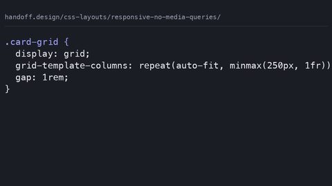 Responsive no media queries
CSS Grid auto-fit with minmax and flexbox wrapping create responsive layouts that adapt to container size without @media queries. Breakpoints follow content, not device widths.
Responsive no media queries
CSS Grid auto-fit with minmax and flexbox wrapping create responsive layouts that adapt to container size without @media queries. Breakpoints follow content, not device widths.
New CSS
Guide
-
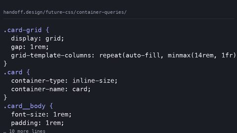 Container queries
-
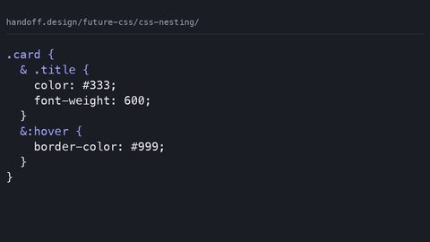 CSS nesting
-
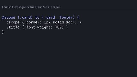 CSS scope
-
 Custom properties deep dive
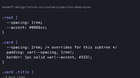
CSS custom properties inherit and cascade at runtime, enabling dynamic theming that preprocessor variables cannot match. Learn how @property adds type constraints and animation.
Custom properties deep dive
CSS custom properties inherit and cascade at runtime, enabling dynamic theming that preprocessor variables cannot match. Learn how @property adds type constraints and animation.
-
 Future responsive
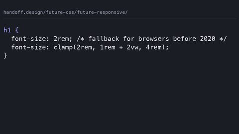
CSS min(), max(), and clamp() let elements define their own size constraints, replacing media query breakpoints with fluid, self-adjusting layouts.
Future responsive
CSS min(), max(), and clamp() let elements define their own size constraints, replacing media query breakpoints with fluid, self-adjusting layouts.
-
 New color spaces
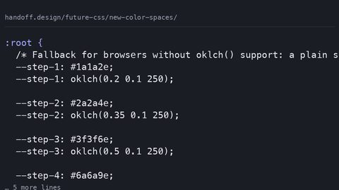
oklch() and oklab() offer perceptually uniform color spaces where equal numeric steps look equal, replacing hsl() for systematic color work with wide gamut support.
New color spaces
oklch() and oklab() offer perceptually uniform color spaces where equal numeric steps look equal, replacing hsl() for systematic color work with wide gamut support.
-
 Style queries
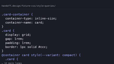
 let a container's custom property value drive component variants, replacing BEM modifier classes with a single source of truth on the container.
Style queries
Style queries let a container's custom property value drive component variants, replacing BEM modifier classes with a single source of truth on the container.
-
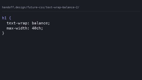 Text wrap balance 2
text-wrap: balance evens out multi-line headlines while text-wrap: pretty prevents widows in body text, replacing JavaScript polyfills with native browser typographic control.
Text wrap balance 2
text-wrap: balance evens out multi-line headlines while text-wrap: pretty prevents widows in body text, replacing JavaScript polyfills with native browser typographic control.
-
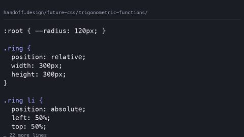 Trigonometric functions
CSS sin(), cos(), and tan() compute angles directly in stylesheets, enabling circular layouts and orbital animations without JavaScript trigonometry.
Trigonometric functions
CSS sin(), cos(), and tan() compute angles directly in stylesheets, enabling circular layouts and orbital animations without JavaScript trigonometry.
-
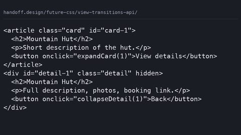 View transitions API
The View Transitions API morphs between DOM states using CSS ::view-transition pseudo-elements, but requires JavaScript to trigger—it is not purely declarative.
View transitions API
The View Transitions API morphs between DOM states using CSS ::view-transition pseudo-elements, but requires JavaScript to trigger—it is not purely declarative.
Performance
Guide
-
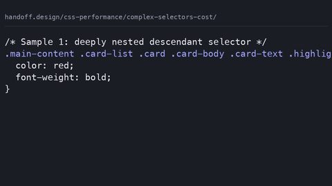 Complex selectors cost
Complex CSS selector matching is rarely the bottleneck in page performance, but specific patterns can increase style recalculation cost. Measure with DevTools, not selector-counting rules.
Complex selectors cost
Complex CSS selector matching is rarely the bottleneck in page performance, but specific patterns can increase style recalculation cost. Measure with DevTools, not selector-counting rules.
-
 Content visibility
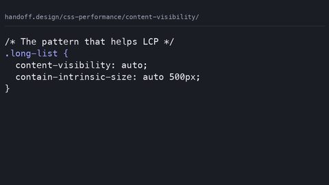
content-visibility defers layout and paint for off-screen content, improving LCP and INP, but requires contain-intrinsic-size to prevent layout shift and breaks find-in-page and accessibility tree exposure.
Content visibility
content-visibility defers layout and paint for off-screen content, improving LCP and INP, but requires contain-intrinsic-size to prevent layout shift and breaks find-in-page and accessibility tree exposure.
-
 Core web vitals
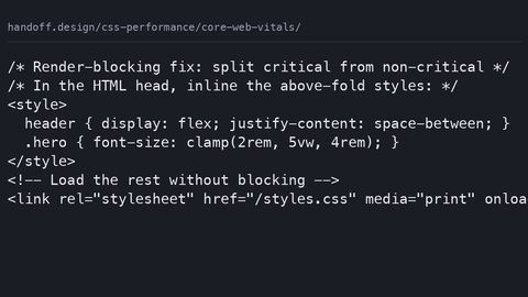
CSS directly affects all three Core Web Vitals: render-blocking stylesheets delay LCP, un-sized content causes CLS, and main-thread animations block INP; each has a measurable fix.
Core web vitals
CSS directly affects all three Core Web Vitals: render-blocking stylesheets delay LCP, un-sized content causes CLS, and main-thread animations block INP; each has a measurable fix.
-
 Critical CSS guide
Critical CSS inlining eliminates render-blocking requests for above-the-fold content, directly reducing LCP; the improvement is measurable with Lighthouse and proportional to the bytes deferred.
Critical CSS guide
Critical CSS inlining eliminates render-blocking requests for above-the-fold content, directly reducing LCP; the improvement is measurable with Lighthouse and proportional to the bytes deferred.
-
 CSS in JavaScript performance
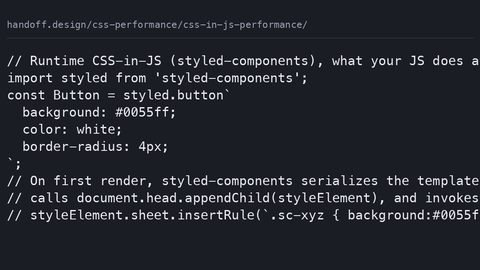
Runtime CSS-in-JS libraries inject styles via JavaScript, adding main-thread bytes and delaying LCP; zero-runtime alternatives extract static CSS at build time, eliminating the JavaScript dependency.
CSS in JavaScript performance
Runtime CSS-in-JS libraries inject styles via JavaScript, adding main-thread bytes and delaying LCP; zero-runtime alternatives extract static CSS at build time, eliminating the JavaScript dependency.
-
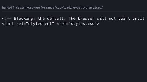 CSS loading best practices
CSS loading strategies range from blocking to fully deferred; the media attribute and preload+onload patterns eliminate render-blocking while preventing FOUC, with LCP improvement measurable in Lighthouse.
CSS loading best practices
CSS loading strategies range from blocking to fully deferred; the media attribute and preload+onload patterns eliminate render-blocking while preventing FOUC, with LCP improvement measurable in Lighthouse.
-
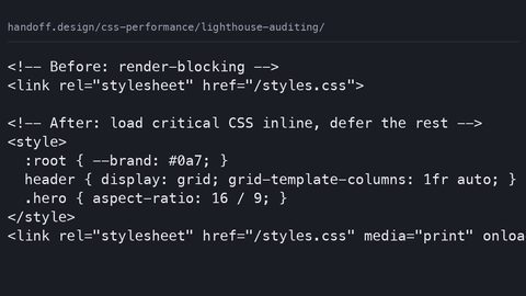 Lighthouse auditing
Lighthouse isolates CSS performance problems through specific audits: render-blocking resources, unused CSS bytes, and layout shifts; each maps to a measurable LCP, CLS, or TBT improvement.
Lighthouse auditing
Lighthouse isolates CSS performance problems through specific audits: render-blocking resources, unused CSS bytes, and layout shifts; each maps to a measurable LCP, CLS, or TBT improvement.
-
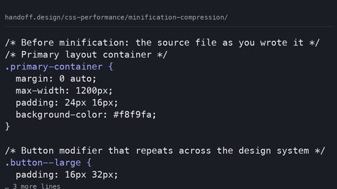 Minification compression
CSS minification removes whitespace and comments from source files; compression with gzip or brotli reduces transfer bytes over the wire; both are measurable in DevTools as reduced download size.
Minification compression
CSS minification removes whitespace and comments from source files; compression with gzip or brotli reduces transfer bytes over the wire; both are measurable in DevTools as reduced download size.
-
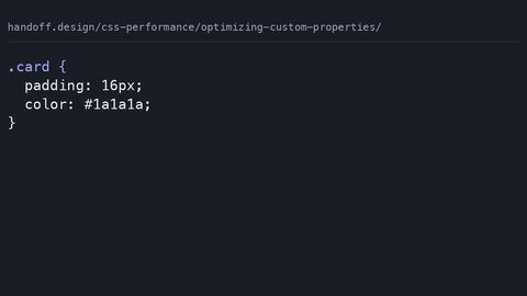 Optimizing custom properties
CSS custom properties enable runtime theming but trigger style recalculation on all descendants when changed; the cost is measurable in DevTools and proportional to the inheritance chain length.
Optimizing custom properties
CSS custom properties enable runtime theming but trigger style recalculation on all descendants when changed; the cost is measurable in DevTools and proportional to the inheritance chain length.
-
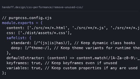 Remove unused CSS
Measure and remove unused CSS with the Coverage panel and PurgeCSS to reduce render-blocking bytes and improve LCP, without breaking conditionally-applied styles.
Remove unused CSS
Measure and remove unused CSS with the Coverage panel and PurgeCSS to reduce render-blocking bytes and improve LCP, without breaking conditionally-applied styles.
Responsive
Guide
-
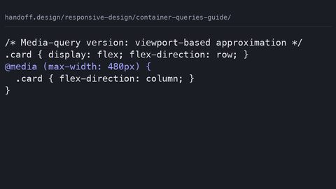 Container queries guide
Use container queries in production with a media-query fallback pattern, side-by-side code showing when each approach is the right call for the component.
Container queries guide
Use container queries in production with a media-query fallback pattern, side-by-side code showing when each approach is the right call for the component.
-
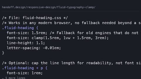 Fluid typography clamp
Implement fluid typography with clamp() that respects WCAG 2.2 zoom requirements by using rem as the preferred value, not viewport units alone.
Fluid typography clamp
Implement fluid typography with clamp() that respects WCAG 2.2 zoom requirements by using rem as the preferred value, not viewport units alone.
-
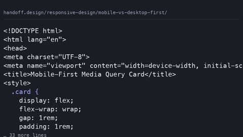 Mobile vs desktop first
Container queries do not eliminate the mobile-first vs desktop-first decision; they relocate it from page-level breakpoints to component-level defaults and overrides.
Mobile vs desktop first
Container queries do not eliminate the mobile-first vs desktop-first decision; they relocate it from page-level breakpoints to component-level defaults and overrides.
-
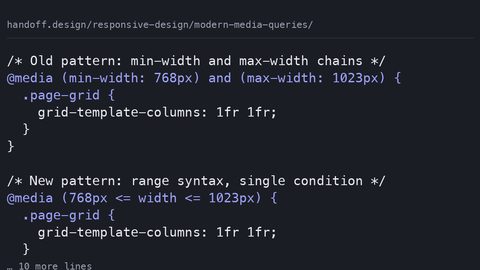 Modern media queries
Media queries now earn their place for user preferences, device characteristics, and page-level layout; container queries own component responsiveness.
Modern media queries
Media queries now earn their place for user preferences, device characteristics, and page-level layout; container queries own component responsiveness.
-
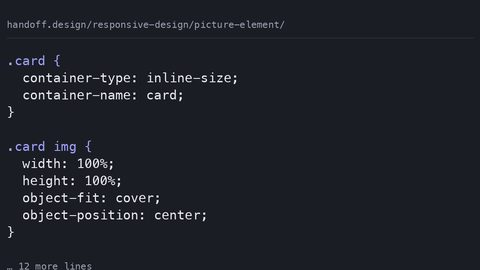 Picture element
Use the picture element when the image itself must change at different sizes; use CSS object-fit and container queries when a single image adapts to its container.
Picture element
Use the picture element when the image itself must change at different sizes; use CSS object-fit and container queries when a single image adapts to its container.
-
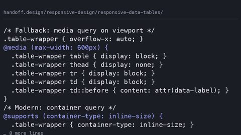 Responsive data tables
Preserve semantic table markup and accessibility while making data tables responsive using container queries and overflow techniques, not div hacks.
Responsive data tables
Preserve semantic table markup and accessibility while making data tables responsive using container queries and overflow techniques, not div hacks.
-
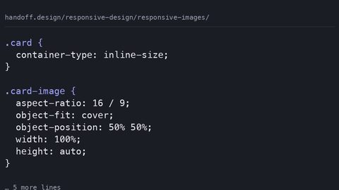 Responsive images
Combine srcset, sizes, object-fit, and aspect-ratio to serve responsive images that prevent cumulative layout shift and support art direction.
Responsive images
Combine srcset, sizes, object-fit, and aspect-ratio to serve responsive images that prevent cumulative layout shift and support art direction.
-
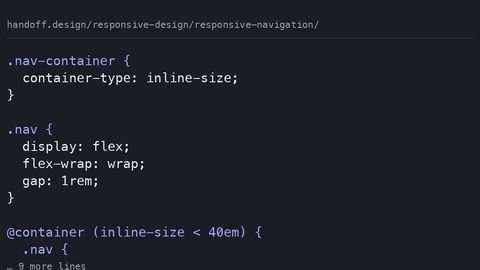 Responsive navigation
Build responsive navigation that collapses based on its own container width using container queries, CSS-only toggle patterns, and accessible state management.
Responsive navigation
Build responsive navigation that collapses based on its own container width using container queries, CSS-only toggle patterns, and accessible state management.
-
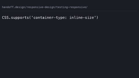 Testing responsive
Test responsive CSS designs that use container queries, viewport units, and user preference queries using browser DevTools and automated checks.
Testing responsive
Test responsive CSS designs that use container queries, viewport units, and user preference queries using browser DevTools and automated checks.
-
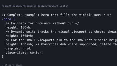 Viewport units
Understand dvh, svh, and lvh viewport units, how they handle mobile browser chrome, and when to use container query units instead.
Viewport units
Understand dvh, svh, and lvh viewport units, how they handle mobile browser chrome, and when to use container query units instead.
Selectors
Guide
-
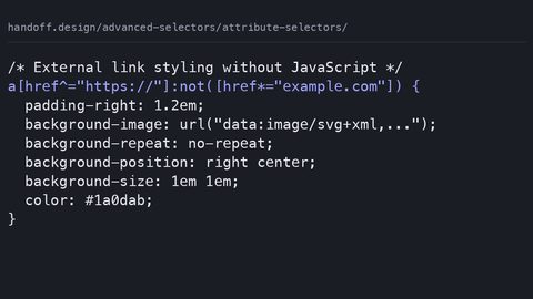 Attribute selectors
Use CSS attribute selectors for substring and value matching, with specificity values and the case-insensitive flag that shipped across engines.
Attribute selectors
Use CSS attribute selectors for substring and value matching, with specificity values and the case-insensitive flag that shipped across engines.
-
 Combinators explained
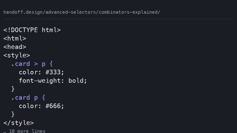
How the child, adjacent sibling, general sibling, and descendant combinators match element relationships, with zero specificity contribution.
Combinators explained
How the child, adjacent sibling, general sibling, and descendant combinators match element relationships, with zero specificity contribution.
-
 Combining selectors
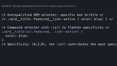
Combine CSS selectors into compound rules with :is(), :has(), and :not() while controlling specificity and avoiding forgiving-list surprises.
Combining selectors
Combine CSS selectors into compound rules with :is(), :has(), and :not() while controlling specificity and avoiding forgiving-list surprises.
-
 Empty selector
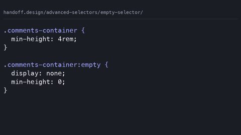
The :empty pseudo-class matches elements with no children, including text nodes, letting you hide or style empty containers without JavaScript.
Empty selector
The :empty pseudo-class matches elements with no children, including text nodes, letting you hide or style empty containers without JavaScript.
-
 Marker pseudo element
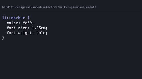
The ::marker pseudo-element targets the bullet or number box of a list item, allowing independent styling of markers without extra markup.
Marker pseudo element
The ::marker pseudo-element targets the bullet or number box of a list item, allowing independent styling of markers without extra markup.
-
 Modern pseudo classes
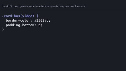
:has() selects an element based on its descendants, :is() matches any selector in a list, and :where() does the same with zero specificity.
Modern pseudo classes
:has() selects an element based on its descendants, :is() matches any selector in a list, and :where() does the same with zero specificity.
-
 Not selector
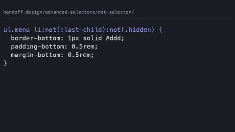
The :not() pseudo-class excludes elements matching its argument from a rule, letting you write inclusive selectors without separate override declarations.
Not selector
The :not() pseudo-class excludes elements matching its argument from a rule, letting you write inclusive selectors without separate override declarations.
-
 Nth child guide
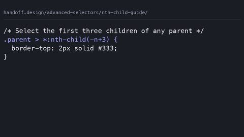
:nth-child selects by position among all siblings; :nth-of-type selects by position among siblings of the same element type, using the An+B formula.
Nth child guide
:nth-child selects by position among all siblings; :nth-of-type selects by position among siblings of the same element type, using the An+B formula.
-
 Pseudo elements
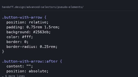
::before and ::after insert generated content before or after an element's actual content, enabling decoration without extra HTML elements.
Pseudo elements
::before and ::after insert generated content before or after an element's actual content, enabling decoration without extra HTML elements.
-
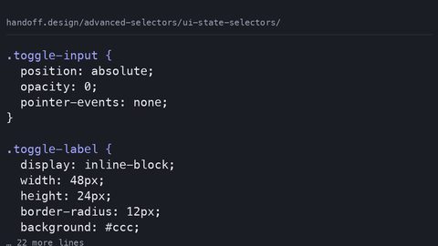 UI state selectors
 like :checked, :disabled, and :user-invalid style form controls based on their interactive state without JavaScript.
UI state selectors
UI state selectors like :checked, :disabled, and :user-invalid style form controls based on their interactive state without JavaScript.
Tools
Guide
-
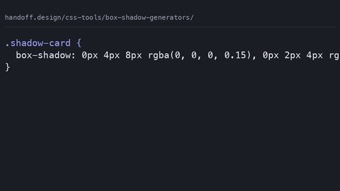 Box shadow generators
What CSS box-shadow generators actually emit, why verbose rgba() and absolute units hurt, and the hand-written equivalent using custom properties and layered shadows.
Box shadow generators
What CSS box-shadow generators actually emit, why verbose rgba() and absolute units hurt, and the hand-written equivalent using custom properties and layered shadows.
-
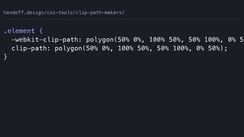 Clip path makers
What CSS clip-path makers emit: stale WebKit prefixes and absolute units that break on resize, with hand-written percentage-based replacements and accessible fallbacks.
Clip path makers
What CSS clip-path makers emit: stale WebKit prefixes and absolute units that break on resize, with hand-written percentage-based replacements and accessible fallbacks.
-
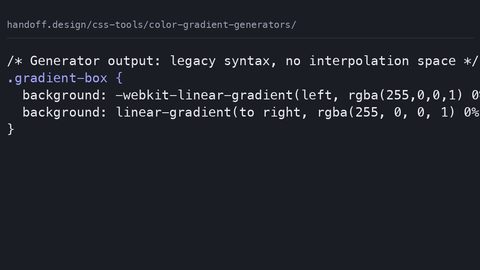 Color gradient generators
What CSS gradient generators emit: legacy WebKit syntax and hsl() stops, with modern oklch interpolation replacements and paint-cost warnings for animated gradients.
Color gradient generators
What CSS gradient generators emit: legacy WebKit syntax and hsl() stops, with modern oklch interpolation replacements and paint-cost warnings for animated gradients.
-
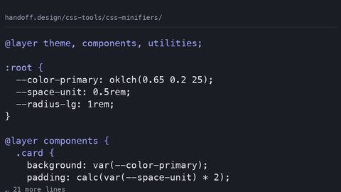 CSS minifiers
Lightning CSS and CSSNano output compared: byte savings before and after gzip, identifier shortening risks for custom properties, and why compression reduces the gain.
CSS minifiers
Lightning CSS and CSSNano output compared: byte savings before and after gzip, identifier shortening risks for custom properties, and why compression reduces the gain.
-
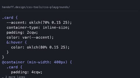 CSS playgrounds
What CodePen, JSFiddle, and Playcode actually emit when you export CSS: autoprefixer bloat, hidden feature-support gaps, and the production-ready equivalent with fallbacks.
CSS playgrounds
What CodePen, JSFiddle, and Playcode actually emit when you export CSS: autoprefixer bloat, hidden feature-support gaps, and the production-ready equivalent with fallbacks.
-
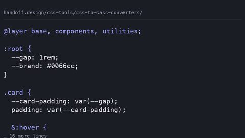 CSS to Sass converters
What CSS-to-Sass converters emit and what they lose: custom properties become frozen build-time constants, native nesting breaks, and cascade layers are stripped.
CSS to Sass converters
What CSS-to-Sass converters emit and what they lose: custom properties become frozen build-time constants, native nesting breaks, and cascade layers are stripped.
-
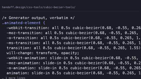 Cubic bezier tools
What cubic-bezier generator tools emit versus what you should ship: auditing the verbose output, stale prefixes, and unnecessary paint costs in generated easing CSS.
Cubic bezier tools
What cubic-bezier generator tools emit versus what you should ship: auditing the verbose output, stale prefixes, and unnecessary paint costs in generated easing CSS.
-
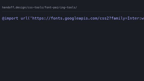 Font pairing tools
What font pairing tools generate for @font-face and Google Fonts imports, and the hand-written production CSS with font-display, preload, and fallback stacks that prevents FOIT and CLS.
Font pairing tools
What font pairing tools generate for @font-face and Google Fonts imports, and the hand-written production CSS with font-display, preload, and fallback stacks that prevents FOIT and CLS.
-
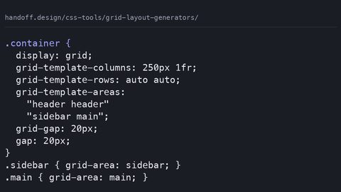 Grid layout generators
-
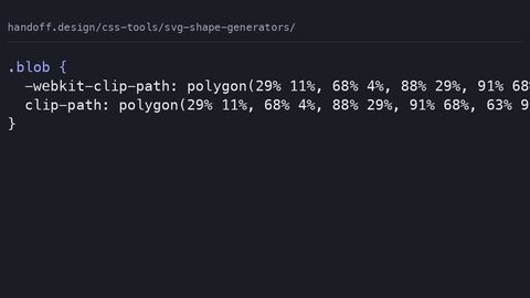 SVG shape generators
Typography
Guide
-
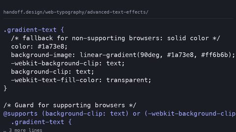 Advanced text effects
Create gradient text, text strokes, and layered shadows with CSS background-clip, mask-image, and paint-order—with fallbacks that work when the effect doesn't.
Advanced text effects
Create gradient text, text strokes, and layered shadows with CSS background-clip, mask-image, and paint-order—with fallbacks that work when the effect doesn't.
-
 Choosing pairing fonts
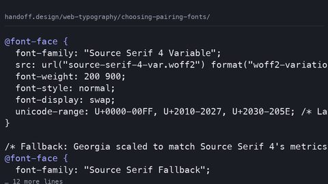
Choose and pair web fonts systematically: match x-height, budget loading cost in bytes, and use size-adjust fallback stacks to prevent layout shift.
Choosing pairing fonts
Choose and pair web fonts systematically: match x-height, budget loading cost in bytes, and use size-adjust fallback stacks to prevent layout shift.
-
 Fluid typography guide
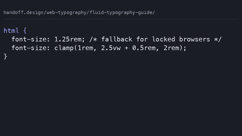
Implement fluid typography with CSS clamp() that respects WCAG zoom requirements, includes rem fallbacks, and states the loading cost of every typeface.
Fluid typography guide
Implement fluid typography with CSS clamp() that respects WCAG zoom requirements, includes rem fallbacks, and states the loading cost of every typeface.
-
 Font face performance
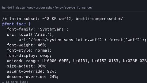
Configure @font-face for performance: self-host woff2 subsets, use font-display swap with size-adjust fallbacks, and measure the byte cost of every typeface decision.
Font face performance
Configure @font-face for performance: self-host woff2 subsets, use font-display swap with size-adjust fallbacks, and measure the byte cost of every typeface decision.
-
 Font variant
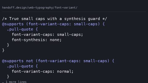
Control small caps, tabular numerals, and ligatures with the font-variant CSS property—and know the fallback when the font lacks the OpenType feature.
Font variant
Control small caps, tabular numerals, and ligatures with the font-variant CSS property—and know the fallback when the font lacks the OpenType feature.
-
 Readability spacing
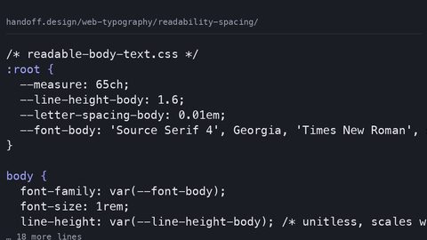
Set line-height, letter-spacing, and measure in CSS for readable text that meets WCAG text-spacing requirements—and state the typeface loading cost.
Readability spacing
Set line-height, letter-spacing, and measure in CSS for readable text that meets WCAG text-spacing requirements—and state the typeface loading cost.
-
 Styling lists links blockquotes
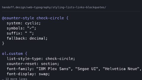
Style lists with ::marker, blockquotes with the quotes property, and links with text-decoration-thickness—modern CSS for semantic HTML elements with fallbacks.
Styling lists links blockquotes
Style lists with ::marker, blockquotes with the quotes property, and links with text-decoration-thickness—modern CSS for semantic HTML elements with fallbacks.
-
 Text wrap balance
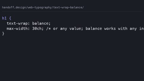
Use CSS text-wrap: balance for multi-line headlines and text-wrap: pretty for body copy widow prevention, replacing JavaScript text-balancing polyfills with a single declaration.
Text wrap balance
Use CSS text-wrap: balance for multi-line headlines and text-wrap: pretty for body copy widow prevention, replacing JavaScript text-balancing polyfills with a single declaration.
-
 Underlines drop caps
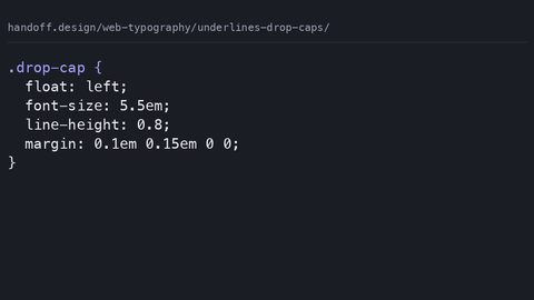
Create cross-browser drop caps with the CSS initial-letter property and style precise underlines using text-decoration-thickness and text-underline-offset.
Underlines drop caps
Create cross-browser drop caps with the CSS initial-letter property and style precise underlines using text-decoration-thickness and text-underline-offset.
-
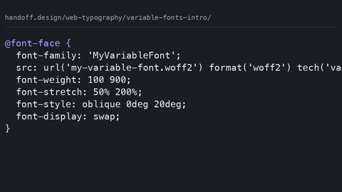 Variable fonts intro
Serve one variable font file instead of multiple static files using CSS font-variation-settings and the mapped axis properties for weight, width, and slant.
Variable fonts intro
Serve one variable font file instead of multiple static files using CSS font-variation-settings and the mapped axis properties for weight, width, and slant.