How CSS Affects Core Web Vitals: LCP, CLS, and INP
CSS directly affects all three Core Web Vitals: render-blocking stylesheets delay LCP, un-sized content causes CLS, and main-thread animations block INP; each has a measurable fix.
The exact phrase CSS impact on Core Web Vitals is the subject of this page, and it is a mechanic’s view: not what the metrics measure at a high level, but which specific CSS declarations and loading strategies move each number, and by what causal chain. Every declaration you write either adds bytes to the critical rendering path, triggers layout or paint on the main thread, or reserves space before content arrives. There is no neutral CSS. The three metrics, Largest Contentful Paint, Cumulative Layout Shift, and Interaction to Next Paint, respond to different parts of that chain. The tools that isolate the cause are the Chrome DevTools Performance panel for traces, Lighthouse for lab scores, and the Web Vitals extension for field data. What follows maps each mechanism to the metric it moves, names the measurement that proves it, and gives you the exact code to fix it.
Render-Blocking CSS: The LCP Delay You Can Measure in the Request Chain
Render-blocking CSS keeps the network and parser idle because the browser cannot paint above-fold content until the stylesheet is downloaded, parsed, and applied. The LCP node, often a text block or an <img>, cannot render until that happens. The causal chain is explicit: a <link rel=”stylesheet”> in the <head> pauses rendering, the LCP timer starts at navigation, and every round-trip for that stylesheet adds to the Resource Load Delay sub-part of LCP. Lighthouse shows this as “Eliminate render-blocking resources” with a list of URLs and their byte costs.
Inline Critical CSS and Defer the Rest
The fix is to inline critical CSS, the styles needed for above-fold layout and typography, and load the rest asynchronously. The media=”print” onload=”this.media=’all’” pattern is the classic non-render-blocking technique: it tells the browser the stylesheet is for print, so it downloads without blocking, then switches to all after load. For a single critical stylesheet, keep the inlined portion under 14 KB compressed. That is the threshold for one round-trip on typical connections. Each @import in a stylesheet creates a serial request chain: the browser cannot fetch the imported file until the parent sheet is parsed. The LCP delay compounds with every @import in the critical path. Replace @import with <link> tags. The measurement that isolates this is the Performance panel’s Network section: the LCP element’s render timestamp sits after the stylesheet’s download bar in the waterfall.
/* Render-blocking fix: split critical from non-critical */
/* In the HTML head, inline the above-fold styles: */
<style>
  header { display: flex; justify-content: space-between; }
  .hero { font-size: clamp(2rem, 5vw, 4rem); }
</style>
<!-- Load the rest without blocking -->
<link rel="stylesheet" href="/styles.css" media="print" onload="this.media='all'">
The Web Vitals extension in the field shows your LCP at the 75th percentile, but it will not tell you why. The Performance panel trace will. Find the LCP element in the Timings track, then look at the bars above it. If the stylesheet download and parse sit between the start of navigation and the LCP render, that CSS is your delay. The fix is not to minify or compress. That helps bytes but not round-trips. Remove the stylesheet from the critical path entirely. Inline what the LCP element needs, defer the rest, and re-measure. The exact phrase CSS impact on Core Web Vitals applies here because the stylesheet’s mere presence, not its content, is the cause.
CSS Layout Shift CLS Prevention: Space Is the Only Cure
Cumulative Layout Shift scores every unexpected movement of visible elements. CSS is the primary cause when newly inserted content pushes existing content down. The classic case is an <img> without width and height attributes: the browser reserves zero space, the image loads, and the layout reflows. The CLS score contribution is the impact fraction, the portion of the viewport that moved, multiplied by the distance fraction. The fix is to reserve space before the content arrives.
Reserve Space with Aspect-Ratio and Size Containment
The aspect-ratio declaration does this for replaced elements like images and videos, but only if you also set one explicit dimension. Setting aspect-ratio: 16/9 without width or height leaves the ratio unresolved on a replaced element. Provide a width, and the height derives from the ratio. For broader support, the padding-top percentage hack on a wrapper defines an aspect ratio in older engines: padding-top: 56.25% for 16/9. A @supports (aspect-ratio: 1) guard lets you use the modern declaration where available and fall back to the hack elsewhere. Dynamically injected content, banners, ads, cookie notices, must also reserve space. If you insert an element above the fold, give it an explicit height or min-height so nothing below moves. The Chrome DevTools Performance panel’s Layout Shift track highlights every shift in red, and the Web Vitals extension reports the CLS score in the field. The causal chain: missing dimensions → zero reserved space → load event → style recalc → layout → shift. Break the chain with a dimension or a ratio.
/* CLS fix: reserve space for images with aspect-ratio */
img {
  width: 100%;
  aspect-ratio: 16 / 9;
  object-fit: cover;
}

/* Fallback for older browsers */
@supports not (aspect-ratio: 1) {
  .media-frame {
    position: relative;
    padding-top: 56.25%; /* 9 / 16 * 100 */
  }
  .media-frame img {
    position: absolute;
    top: 0; left: 0;
    width: 100%; height: 100%;
  }
}
The CLS sub-parts affected by CSS are the impact fraction, which CSS determines by the size of the moved element relative to the viewport, and the distance fraction, which CSS determines by how far the element travels. An element that shifts from the bottom to the top of the viewport has a distance fraction near 1. The font-display descriptor also drives CLS: when a webfont loads with font-display: swap, the fallback renders first, then swaps. If the fallback and webfont have different metrics, line height, letter spacing, glyph widths, the text reflows. The size-adjust descriptor in @font-face matches the fallback’s metrics to the webfont’s, so the swap is invisible. Without size-adjust, font-display: swap trades invisible text (FOIT) for a layout shift (FOUT). The measurement tool is the Performance panel’s Layout Shift track: every red rectangle is a shift, and the summary at the bottom gives the total CLS score for the trace. A score above 0.1 fails the threshold. The fix is always the same: reserve the space before the content exists.
CSS Animation INP Main Thread: Transform and Opacity Are the Only Free Passes
Interaction to Next Paint measures the delay from a user gesture, a click, a tap, a key press, to the next frame that shows the response. CSS animations contribute to INP when they occupy the main thread. That thread runs event handlers and style recalculation. Animating width, height, top, left, margin, or padding triggers layout on every frame, and layout work on the main thread blocks the event handler from running. The causal chain: animation reads a layout-triggering declaration → style recalc → layout → paint → composite → the next frame is delayed. The fix is to animate only transform and opacity, which run on the compositor thread. Compositor-only animations do not touch the main thread, so an interaction during the animation is not delayed.
Containment and the Compositor: Practical INP Wins
The Chrome DevTools Performance panel shows this as long animation frames: a frame whose duration exceeds 50 milliseconds blocks interactions. The will-change declaration promotes an element to its own compositor layer, which can reduce paint cost on interaction. Overusing will-change creates memory pressure and can itself cause jank. Use it sparingly, on elements that you know will animate. The contain declaration, contain: layout style paint, isolates an element’s subtree from the rest of the document, limiting the style recalculation scope when an interaction changes a declaration inside that subtree. This is a direct INP win: the engine does not need to recompute styles for the whole page, only the contained subtree. A common mistake is animating box-shadow or filter continuously; both trigger paint on the main thread on every frame, and the paint cost grows with the element’s size. The transform and opacity pair is the only compositor-eligible animation path in CSS.
/* INP fix: animate transform, not top or left */
.element {
  transition: transform 200ms ease;
}
.element:hover {
  transform: translateX(20px);
}

/* Avoid this: layout on every frame */
.bad {
  transition: left 200ms ease;
}
.bad:hover {
  left: 20px;
}
The :has() selector, powerful as it is, can trigger style invalidation across ancestor chains, increasing the style recalculation scope on interaction. A :has() that matches a child changes the parent’s style. The engine must recalculate the parent’s box, then re-layout the descendants. The Performance panel’s Main thread track shows the style recalc and layout bars after a click event; if they exceed the frame budget of 16.7 milliseconds, the interaction is delayed. Forced synchronous layouts are a separate INP killer: when JavaScript reads a layout-inducing value like offsetHeight or scrollTop after a style change, the engine must flush the pending style and layout work synchronously. CSS itself cannot prevent this. The JavaScript is the trigger. But CSS can reduce the cost by containing the layout scope. The contain declaration is the practical tool. The CSS animation mistake to avoid is animating box-shadow or filter continuously; the paint cost on every frame is what delays INP, not the animation’s visual appeal. Use the Performance panel’s “Long animation frames” experiment to spot them.
Font-Display Swap LCP CSS: Invisible Text Is the Enemy
When a webfont is on the critical path, the LCP node, typically a text block, cannot render until the font is ready or the fallback is shown. The font-display descriptor in @font-face controls this. font-display: swap renders the fallback immediately and swaps in the webfont when it loads. This is the correct choice for LCP because the text is visible at the earliest possible time. The LCP timer stops when the text is painted, not when the webfont lands. font-display: auto, the default, uses a short block period during which text is invisible. That invisible period delays LCP. font-display: block hides text for a block period, which is worse for LCP. font-display: optional gives the engine the choice to skip the webfont entirely on slow connections. The fallback renders and LCP is fast, but the visual design loses the webfont.
Stop the Layout Shift with Size-Adjust
The trade-off: swap is the best for LCP, but it causes CLS if the fallback metrics differ. The size-adjust descriptor in @font-face matches the fallback’s advance widths and line heights to the webfont’s, so the swap does not move the text. Without size-adjust, a common mistake is using font-display: swap and then watching the CLS score climb. The correct pattern: define the @font-face with font-display: swap, add size-adjust, and measure the CLS in the Performance panel before and after. font-display has been widely available since 2020, so there is no reason to use a JavaScript Font Loading API fallback. Check caniuse for current support details. The fetchpriority=”high” attribute on a <link rel=”preload”> for the LCP image or critical CSS prioritizes the download, which helps the Resource Load Delay sub-part of LCP. This is not a CSS declaration but it interacts with CSS loading, and it is worth naming here because it is the one attribute that moves the LCP request chain.
/* Font-display swap fix with size-adjust to prevent CLS */
@font-face {
  font-family: 'Inter';
  src: url('/fonts/inter.woff2') format('woff2');
  font-display: swap;
  size-adjust: 100%; /* adjust to match fallback */
  ascent-override: 90%;
  descent-override: 22%;
  line-gap-override: 0%;
}

body {
  font-family: 'Inter', system-ui, sans-serif;
}
The CSS Fonts Module Level 4 specification defines the font-display descriptor and the metric overrides. The size-adjust descriptor is the one that prevents CLS; the other overrides, ascent-override, descent-override, line-gap-override, refine the fallback metrics. A font-display: swap mistake to avoid is applying it to icon fonts, where the fallback text renders as unreadable glyphs during the swap period, boxes or mojibake. The user sees garbage before the icons load. For icon fonts, font-display: block or font-display: optional is better, because invisible icons are less disruptive than wrong glyphs. The measurement tool: the Web Vitals extension in the field shows LCP and CLS, and the Performance panel’s Timings track shows the LCP element’s render time. If the LCP node is text and the render time sits after the font download bar, the font is the cause. The size-adjust fix is the one that turns a CLS-positive swap into CLS-negative.
Content-Visibility Core Web Vitals: Skipping Work You Do Not Need
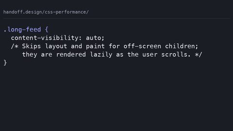
The content-visibility: auto declaration skips rendering of off-screen elements, reducing the initial layout and paint work. This is a direct LCP win when the LCP element is above the fold and the off-screen content is large. The engine applies containment, layout, style, paint, and size, to the element’s subtree, so it does not compute styles or layout for nodes outside the viewport. The causal chain: fewer elements to style and lay out → faster first render → LCP happens earlier. The declaration is not Baseline as of 2026-09-16; it has limited availability, so you must guard it with @supports (content-visibility: auto). In non-supporting engines, the declaration is ignored and the content renders normally without optimization.
Guard It, Size It, and Avoid the Measurement Trap
The common mistake is applying content-visibility: auto to an element that needs to be measured for layout elsewhere on the page, for example a scroll container whose height is read by JavaScript. The skipped rendering means the engine cannot compute the correct scroll position, causing incorrect scroll positions. Use it on sections that are far down the page, not on the main content or the footer if the footer’s height matters. The contain declaration is the underlying mechanism, and content-visibility: auto is the high-level shortcut that brings contain: layout style paint plus size containment. The Performance panel’s Summary track shows the reduction in Layout and Paint milliseconds after applying the declaration. The @supports (content-visibility: auto) guard is the exact syntax to detect support. The CSS Containment Module Level 2 specification, a W3C Working Draft from 2022, defines the behavior. A fallback for older engines is the JavaScript-based Intersection Observer that toggles display: none for off-screen sections, but that is more code and more main-thread work than the CSS declaration.
/* Content-visibility fix with @supports guard */
@supports (content-visibility: auto) {
  .section-below-fold {
    content-visibility: auto;
    contain-intrinsic-size: 1px 500px; /* reserve approximate height */
  }
}
The contain-intrinsic-size declaration is essential when the element has no intrinsic height because the engine skips its rendering. Without it, the element collapses to zero height, causing a layout shift when it scrolls into view. The value 1px 500px tells the engine the element will eventually be about 500 pixels tall, so the scrollbar is stable. This is a CLS prevention trick that pairs with content-visibility: auto. The trade-off: the estimated height may be wrong, and the engine adjusts when the element renders, which can cause a shift. The safest approach is to set contain-intrinsic-size to a value close to the real height, measured from a rendering with the declaration disabled. The content-visibility: auto mistake to avoid, applying to elements that need measurement, is the one that breaks pages. content-visibility: auto replaces the older JavaScript pattern of lazy rendering with Intersection Observer and display: none toggling. The JavaScript approach runs on the main thread and can itself jank, so the CSS declaration is the better tool where supported. The final practical step: apply content-visibility: auto to the sections below the fold that you are certain do not affect the layout above them, guard with @supports, and set contain-intrinsic-size to the rendered height. Then measure LCP and CLS in the Performance panel before and after.
| Render-blocking <link> | LCP | Stylesheet download and parse pause first paint | Lighthouse; Performance panel waterfall |
| Missing width/height on <img> | CLS | Zero reserved space; image load triggers reflow | Performance panel Layout Shift track |
| Animating top/left/width | INP | Layout on main thread blocks event handler | Performance panel long animation frames |
| font-display: swap without size-adjust | CLS | Fallback metrics differ; text reflows on swap | Performance panel Layout Shift track |
| content-visibility: auto | LCP | Skipped off-screen rendering reduces initial paint work | Performance panel Summary track |
| contain: layout style paint | INP | Isolates style recalc scope on interaction | Performance panel Main thread track |
How to Isolate CSS as the Cause in a Performance Trace
The question this page answers is not just which CSS declarations matter, but how you prove that CSS, not JavaScript, not network latency, not server response, is the cause. The method is the Performance panel trace. Record a trace, then inspect the Main thread track. The bars are color-coded: yellow for scripting, purple for rendering (style recalculation and layout), green for painting, and grey for composite. If a long bar appears in the rendering category immediately after an interaction, CSS is the cause. For LCP, find the LCP element in the Timings track, it is marked with a red flag, and look at the bars above it. If the stylesheet download and parse sit between navigation and the LCP render, the CSS file size or the number of render-blocking stylesheets is the cause. For CLS, the Layout Shift track shows red rectangles at the moment of each shift; click one and the summary shows the impact fraction and distance fraction. The fix is to reserve the space. The Web Vitals extension in the field gives you the real user scores, but it cannot tell you why. The trace tells you why. The exact phrase CSS impact on Core Web Vitals is the lens: every metric has a CSS lever, and the trace is the tool that shows which lever is stuck.
The Five-Step Isolation Sequence
The practical isolation sequence is always the same. First, record a trace with the Performance panel. Second, identify the metric in question: the LCP element’s render time, the first red layout shift rectangle, or the longest interaction’s processing time. Third, look at the Main thread track above the event. If you see a long rendering bar, style recalc, layout, or paint, then a CSS declaration or a stylesheet is the cause. Fourth, apply the specific fix from this page: inline critical CSS for LCP, add aspect-ratio for CLS, switch to transform and opacity for INP. Fifth, re-record and compare the metric. The improvement should be visible in the trace before the field data catches up. This is the route: measure, isolate, fix, re-measure. When the normal route, the field data, is closed because your traffic is low and the Web Vitals extension shows nothing, the trace is the way. It works on a staging server with a throttled network at any hour. The one thing to remember: CSS is the cause only when the trace shows the rendering bars, not the scripting bars. If the long bar is yellow, the problem is JavaScript, and CSS will not fix it. A common mistake is blaming CSS for a layout shift that is actually caused by a script inserting content without dimensions. The trace tells the truth.