How to Write Performant CSS Animations That Stay on the Compositor Thread
Only transform and opacity animate on the compositor thread. Learn which CSS properties trigger layout or paint, how to measure the cost, and how to write animations that stay at 60fps.
The claim that “CSS animations are hardware-accelerated” is only true for two properties: transform and opacity. Animate width, height, left, or margin and the browser does not skip the main thread. It runs layout, then paint, then composite. The frame budget of 16.67 milliseconds at 60fps is consumed by the first two stages. This guide walks the actual browser rendering pipeline, layout, paint, composite, and shows which declarations stay on the compositor thread and which force the main thread to redo geometry. The compositor advantage is lost the moment you animate anything that changes the box model or the painted pixels.
The Browser Rendering Pipeline: Layout, Paint, Composite
Every frame the browser runs three stages in sequence. Layout computes geometry: where elements sit, how wide and tall they are, and how they push siblings. Paint fills in pixels: colours, borders, shadows, text glyphs, backgrounds. Composite places the already-painted layers onto the screen, moving them with the GPU. Only the composite stage runs on the compositor thread, separate from the main thread where JavaScript and layout execute. The practical consequence: a property that changes layout or paint forces the main thread to redo that work. The compositor thread waits. The frame budget is 16.67 milliseconds. If layout plus paint plus composite exceed that, the frame drops. The animation janks.
Compositor-Only CSS Properties: Transform and Opacity
Why Only These Two Are Guaranteed
The only two properties that animate entirely on the compositor thread without touching the main thread are transform and opacity. transform moves, scales, rotates, or skews an element without changing layout. opacity changes transparency without repainting the element’s pixels in a new way. Both create a stacking context. That is why they are safe: the browser can promote the element to its own layer, move that layer with the GPU, and never ask the main thread for new geometry. The compositor thread runs independently of main thread JavaScript execution and layout recalculations.
What About Filter?
filter is partially supported on the compositor thread in Blink and WebKit. Gecko’s support is partial. Simple filters like blur may stay composited; complex filters or backdrop-filter can fall back to the main thread. Treat transform and opacity as the guaranteed pair and filter as engine-dependent.
Sample: Compositor-Safe Animation (Transform + Opacity)
The following animation moves a card and fades it in. Both transform and opacity are animating, so the compositor thread handles everything. The element is promoted to its own layer and the main thread stays idle during the animation. The prefers-reduced-motion query respects the reader’s system setting: when reduced motion is requested, the animation runs instantly or not at all.
.card {
  transform: translateX(0) scale(1);
  opacity: 1;
  transition: transform 300ms ease, opacity 300ms ease;
}
.card.is-entering {
  transform: translateX(24px) scale(0.9);
  opacity: 0;
}

@media (prefers-reduced-motion: reduce) {
  .card,
  .card.is-entering {
    transition: none;
    transform: none;
    opacity: 1;
  }
}
Open Chrome DevTools Performance panel to confirm: record the animation, and the Main thread section shows no layout or paint work during the frames. The Compositor section shows the animation as a green bar.
Avoid Layout Thrashing CSS: Width, Height, Top, Left
The failure case is animating properties that trigger layout. width, height, top, left, right, bottom, margin, padding, and border-width all change the containing block or reflow siblings. Transition width and the browser recalculates layout for every frame, then repaints, then composites. The main thread is busy for the entire animation. Any JavaScript running during the same frames, scroll handlers, React renders, event listeners, competes for the same 16.67 milliseconds. This is layout thrashing in its most literal form: each frame invalidates the layout, and the cost compounds with the number of elements affected. The CSS Triggers reference categorises properties by what they trigger: width triggers layout, paint, and composite. height does the same. top and left do the same. The classification remains accurate in current engines, even though the reference itself is no longer maintained.
Sample: Animation That Triggers Layout (Width Transition)
This width transition on a flex item forces layout every frame. The flex container’s siblings reflow because the item’s size changes. The main thread runs layout, then paint, then hands to composite. The result is jank on any moderately complex page.
.flex-item {
  width: 100px;
  transition: width 300ms ease;
}
.flex-item.is-expanded {
  width: 200px;
}

@media (prefers-reduced-motion: reduce) {
  .flex-item {
    transition: none;
  }
}
This animation runs on the main thread. In Chrome DevTools Performance panel you will see Layout and Paint events on the Main thread for every frame. Enable paint flashing (Rendering tab > Paint flashing) and the entire flex container flickers green, not just the item.
Paint-Triggering Properties: Box-Shadow, Color, Background
When Paint Runs Without Layout
Between layout and composite sits paint. Properties like color, background-color, box-shadow, and outline-color do not change geometry, so they skip layout. But they still force the browser to repaint the element’s pixels. Repainting is not free. A box-shadow pulse animating the shadow’s blur radius or spread requires the browser to re-raster the element and its shadow region every frame.
The Real Paint Cost
The paint cost is qualitative: none, low, medium, high. box-shadow is high because the shadow region can extend well beyond the element’s bounds and overlap other elements, forcing a larger paint area. color and background-color are low because the change is local and the browser can often take a fast path. But low is not zero. The main thread still runs paint. Paint flashing reveals the affected region.
Sample: Animation That Triggers Paint (Box-Shadow Pulse)
The box-shadow pulse below animates the shadow’s spread and opacity. No layout is triggered, but paint runs every frame. The element is not promoted to its own layer because paint happens on the main thread. The compositor thread cannot help until the painted pixels are final.
.pulse {
  box-shadow: 0 0 0 0 rgba(0, 0, 0, 0.5);
  animation: pulse 1s infinite;
}

@keyframes pulse {
  0%, 100% {
    box-shadow: 0 0 0 0 rgba(0, 0, 0, 0.5);
  }
  50% {
    box-shadow: 0 0 0 12px rgba(0, 0, 0, 0);
  }
}

@media (prefers-reduced-motion: reduce) {
  .pulse {
    animation: none;
  }
}
This animation runs on the main thread for the paint step. Paint flashing shows the shadow region repainting each frame. To keep it on the compositor thread, replace the box-shadow animation with a transform scale on a pseudo-element that holds the shadow.
Will-Change CSS Performance: What It Actually Does
Layer Promotion Ahead of Time
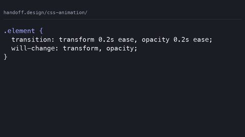
The will-change property tells the browser to prepare for a change before it happens. Setting will-change: transform on an element promotes it to its own layer ahead of time, so the compositor is ready when the animation starts. The real cost is memory: each promoted layer consumes GPU memory. Too many layers exhaust the budget, causing the browser to evict layers and jank.
When to Use It
Use will-change sparingly, on the element you are about to animate, not on everything. A common misuse is applying will-change permanently to all elements in a grid. That defeats the purpose and degrades performance. The @supports guard checks support before applying it:
@supports (will-change: transform) {
  .element {
    will-change: transform;
  }
}
In Chrome DevTools, check the layer count under the Layers tab. If layers exceed a few dozen, reduce the will-change declarations.
The Claimed-Vs-Real Gap: Hardware Acceleration Is Not Universal
Only transform and opacity fully run on the compositor thread. Every other property, width, height, color, box-shadow, border-radius, triggers layout or paint on the main thread. The compositor advantage is lost entirely. The term “hardware-accelerated” is accurate only for the composite stage, and composite is the last step. If layout or paint run first, the frame budget is already consumed before the GPU gets the layer. This is the single most important fact: a transition on transform is cheap. A transition on width is not. No amount of CSS syntax changes that. The CSS Triggers reference names the property costs: width triggers layout, box-shadow triggers paint, and transform triggers composite only. Check any property against that reference before you animate it.
Using Chrome DevTools Performance Panel to Diagnose
Record and Read the Timeline
When an animation janks, open Chrome DevTools Performance panel and record a few seconds. The Main thread section shows JavaScript, Layout, Paint, and Composite events as coloured bars. If you see Layout or Paint events during the animation, the property you animated is not compositor-only. Enable paint flashing (Rendering tab > Paint flashing) to see exactly which regions repaint. Green flashing regions are the paint cost. A compositor-only animation shows no Main thread activity during the frames. It appears only as a Compositor section bar.
Fix What You Find
The Layers tab shows the layer count and which elements are promoted. To fix a janking animation, find the property in the event summary and replace it with a transform or opacity equivalent. A width transition becomes a transform: scaleX() animation. A top transition becomes transform: translateY(). The visual result is the same. The thread usage is not.
Avoiding Layout Shift and Cumulative Layout Shift Score
Animating width or height changes the layout, which can cause a Cumulative Layout Shift contribution. CLS measures how much the visible content moves during the page’s lifetime. An animation that expands a card on hover pushes the content below it down, adding to the CLS score. The fix: animate transform and opacity only. A scale on hover does not move siblings, so it contributes zero CLS. Reserve space before content loads. Use aspect-ratio or explicit dimensions on images and embeds. The distinction is between changing the element’s own pixels, paint, and changing its position or size in the flow, layout. transform and opacity never change layout. They are the safe choice for any animation that must not shift content. If you must animate layout-affecting properties, accept the CLS cost and test with Lighthouse to see the score.
Common Mistakes with Performant Animations
Animating the Wrong Properties
The first mistake is animating width, height, top, or left instead of transform for movement and scaling. The older technique, animating left and top with position: absolute or position: relative, forces layout every frame. The replacement is transform: translateX() and transform: scale(), which run on the compositor thread. The second mistake is toggling visibility: hidden and visible for fade effects. Animate opacity instead. It transitions smoothly and does not cause a paint jump.
Layer and Accessibility Failures
The third mistake is applying will-change to every element, which exhausts GPU memory. The fourth is ignoring prefers-reduced-motion. The user has explicitly asked for less motion. An animation that ignores that setting is an accessibility failure and a performance failure on low-end devices. The fifth mistake is using box-shadow for a hover glow when a pseudo-element with transform: scale() achieves the same effect at a fraction of the paint cost.
The Frame Budget and the Main Thread
The frame budget at 60fps is 16.67 milliseconds per frame. The compositor thread can move a layer in under a millisecond, leaving the rest of the budget for other work. When the main thread runs layout and paint, the time available for JavaScript shrinks. A complex Angular page with many DOM nodes can spend 10 milliseconds on layout alone, leaving 6 milliseconds for paint and JavaScript. That is not enough. The result is dropped frames and a visible stutter. The solution is not to optimise JavaScript. Keep animations on the compositor thread so the main thread has a full budget for the rest of the page. Use opacity for fades. Use transform for moves and scales. Reserve layout-affecting animations for cases where the visual outcome genuinely requires them, and then test with the Performance panel to see if the frame budget holds.
FAQ: Four Questions About Animation Performance
Does animating filter trigger layout? No, filter does not trigger layout, but it can trigger paint. Simple filters like blur may run on the compositor in Blink and WebKit. Gecko is partial. Treat filter as potentially paint-triggering and test with paint flashing.
Can I animate transform on an element with a transition on width? Yes, but the transition on width will still trigger layout when it fires. Use transform for the animation and remove the width transition entirely, or the layout cost remains.
How many layers are too many? There is no fixed number. Check the Layers tab in Chrome DevTools. If the layer count exceeds a few dozen, or if the GPU memory usage is high, reduce will-change declarations and promote only the elements you are animating.
Does prefers-reduced-motion affect the compositor thread? The media query is evaluated on the main thread. When it matches, the animation is disabled or shortened, so the compositor thread never receives the animation. Always include it to respect the user’s setting and to reduce work.
What a Front-End Developer Should Do Next
The rule: for any animation that moves or fades an element, use transform and opacity. Do not animate width, height, margin, padding, top, or left unless the layout change is the entire point and you have measured the cost. Use will-change only on the element you are about to animate and only for the property you will animate. Check every property you are unsure about against the CSS Triggers reference. Test with Chrome DevTools Performance panel and paint flashing. Always include a prefers-reduced-motion query that disables or simplifies the animation for users who request it. This is the difference between a page that runs at 60fps and one that janks on a mid-range phone.
An Honest Caveat About This Subject
The CSS Triggers reference is from 2018, and engine optimisations have shifted since. The categorisation, layout, paint, composite, is still the right framework. But the exact cost of a specific property in a current engine is not published in a single up-to-date table. Measure with the Performance panel in the browser you actually target. What is true in Chrome may differ in Firefox or Safari, especially for filter and backdrop-filter. The principle holds: transform and opacity are compositor-safe, and everything else has a main thread cost. The magnitude of that cost is engine-specific and page-specific. Do not trust a blog post that gives you a fixed list. Trust the Performance panel on your own page. That is the only way to know whether your animation stays within the frame budget.