Web Typography: Loading, Pairing, and Spacing Type for the Modern Browser
The typography hub for handoff.design: variable fonts, pairing, the loading cost of a typeface, and the spacing that decides whether a paragraph is read.
The page is loading. The engine has parsed the HTML, hit the first , and is now blocked on a request to a font CDN in a data centre 3,000 kilometres away. In the first 100 milliseconds, the reader sees nothing but a white screen and a favicon. Then the fallback stack kicks in: Georgia for the body, Arial for the headings. The layout jumps 14 pixels down when the real file arrives. This is the moment modern web typography techniques either earn their keep or fail silently. What follows is a map of what ships in 2026, what costs real money in layout and paint, and how to make the engine do the right thing without pretending it is a PDF.
What the Modern Stack Demands
You cannot ship a single font file and call it done. You cannot ship three weights of the same family and call it done either. A variable font gives you a continuous range of weight, width, slant, and optical size axes from one file, controlled with the font-variation-settings property. The cost is real: a single variable file at roughly 250kB of brotli-compressed woff2 is common, and that is before you ask the engine to pass it through the network. The gain is that one file replaces six static files. The optical size axis alone is worth the switch.
Optical Size: One Axis That Earns Its Keep
The optical size axis, controlled by font-optical-sizing: auto, tells the engine to choose the cut of the letterforms that matches the rendered size. A 14px body text gets a different, more open set of shapes than a 72px display headline, and neither looks like the other one was scaled. That is the modern way. The old way, shipping three weights of a single family as separate files, is the 2015 answer to a question nobody is asking anymore. The new question is: what does one file cost, and can I afford to let it block the first paint? The answer is usually no.
Variable Fonts CSS Performance: What the Axes Actually Cost
A variable font is not free. The file is bigger than any single static weight, but smaller than the sum of the weights it replaces. The real cost, and the one nobody labels, is the parsing and shaping time. A variable font with a large glyph set, say a Cyrillic and Greek extended family, can take 80 to 120ms to parse on a mid-range Android device, before a single frame is drawn. That is 80ms of main-thread time that has nothing to do with network.
Controlling the Network Cost
The network cost you can control with font subsetting, which strips out the glyphs you do not use, and unicode-range subsetting, which tells the engine to download only the slices it needs for the text on the page. The parsing cost you cannot avoid, but you can hide it. The font-display: swap descriptor is the tool. It tells the engine to render text with the fallback stack immediately, then swap in the real font when it arrives. That is the FOUT versus FOIT choice, and the FOUT is the one that reads as fast to a human. The FOIT, the invisible-text period, is the thing that makes a site feel broken. The swap is the thing that feels like the page loaded, even if the typography is not final for another 200ms. The honest trade is that swap causes cumulative layout shift. The next section is about how to kill that shift without going back to the invisible-text dark ages.
Fluid Typography clamp() CSS: Sizing That Does Not Snap
Here is the declaration that solves most fluid-type problems in one line. It is the clamp() function, and it replaces the media-query whack-a-mole of the 2010s. The pattern is font-size: clamp(1rem, 0.75rem + 1.5vw, 1.25rem), which says: never smaller than 1rem, never larger than 1.25rem, and between those bounds scale with the viewport width. The trick is the middle term: 0.75rem + 1.5vw. The 0.75rem is the base, the 1.5vw is the viewport-relative part, and the whole expression resolves against the root font size.
Getting the Math Right
Do not use vw alone. The type becomes unreadable on a 320px phone and comically large on a 2560px monitor. Do not use a media query for every breakpoint, either; that is how you end up with six font-size declarations for one paragraph. The math for the middle term is straightforward: pick your minimum size, pick your maximum, and pick the viewport width where the linear interpolation crosses your maximum. The engine does the rest. The failure mode is when you use clamp() with a unitless number in the middle term, which does not resolve against the root font size the way you expect. A unitless number is not a length. Use rem or em in the base and the viewport unit in the multiplier. Support is Baseline 2022: every engine released since then handles it. The fallback for older engines is the font-size property before the clamp() line, which the parser ignores if it does not understand the function.
Web Font Loading Best Practices: The One @font-face Declaration You Need
Stop writing six @font-face blocks for a single family. Stop copying a 2015 tutorial that lists eot, woff, woff2, and svg in the src descriptor. The svg format is dead and the eot is only for an engine from 2012. The modern pattern is one declaration, and it fits on a single screen. Here it is, in full:
@font-face {
  font-family: 'Inter Variable';
  src: local('Inter Variable'), url('/fonts/inter-var.woff2') format('woff2-variations') tech('variations');
  font-display: swap;
  font-weight: 100 900;
  font-stretch: 75% 125%;
  font-style: oblique -10deg 0deg;
  size-adjust: 105%;
  unicode-range: U+0000-00FF, U+0131, U+0152-0153, U+02BB-02BC, U+02C6, U+02DA, U+02DC, U+2000-206F, U+2074, U+20AC, U+2122, U+2191, U+2193, U+2212, U+2215;
}
Read that declaration in the order it appears. The src line has two parts: local(‘Inter Variable’) first, so the engine uses the locally installed version if it exists, then the url() with the woff2 file. The format(‘woff2-variations’) and the tech(‘variations’) are two ways of saying the same thing to two generations of engines; both are necessary because the older syntax was dropped in newer specs. The font-display: swap is the one descriptor that kills the invisible-text problem. The font-weight: 100 900 and the font-stretch: 75% 125% tell the engine what range of the variable axes this file covers, so it can use the fallback stack when you ask for a weight outside the range. The style descriptor with oblique -10deg 0deg is for the slant axis, and it is optional unless you actually use it. The size-adjust: 105% is the one that fixes the layout shift, and it deserves its own paragraph.
Font-Display Fallback Stack Strategy: The Size-Adjust Trick That Kills CLS
The problem with font-display: swap is that the fallback and the real font have different metrics. Georgia is wider and taller than Inter. When the engine swaps from Georgia to Inter, every line reflows. That reflow is cumulative layout shift, and it costs you a real Core Web Vitals score, which costs you search ranking and, on some sites, real revenue.
How Size-Adjust Works
The fix is the size-adjust descriptor in @font-face, a 2021 addition that became Baseline 2024. The descriptor tells the engine to scale the fallback font’s metrics to match the real font, so the swap does not move. The value is a percentage: 105% means the fallback is drawn 5% larger than its natural size. Get it right, and the two fonts have nearly identical line boxes. Find the number by measuring the real font’s x-height and cap-height and comparing them to the fallback. That is a job for a tool, not for hand-waving.
The Rule Everyone Gets Wrong
Once you have the number, the declaration looks exactly like the one above. It goes on the @font-face rule for the fallback font, not the real one. You are not adjusting the real font. You are adjusting the fallback so it looks like the real one, making the swap invisible. The result is a page that has no flash of invisible text, no layout shift, and a font that reads as the designer intended. That is the whole game.
What the Fallback Stack Strategy Cannot Fix
Here is the hard limit. It is the one thing the size-adjust descriptor cannot do. It cannot fix a font that is not loaded at all. If the network drops or the CDN is down, the fallback is the only thing the reader sees, and no amount of metric adjustment makes Arial look like Inter. The size-adjust value is a metric, not a style. It scales the box but it does not change the letterforms. The reader sees Arial’s a and e and g, just at the right size. That is the honest trade of the whole approach: you are optimising for the moment the real font arrives, not for the case where it never does.
Design the Fallback as the Real Thing
The practical rule: design the fallback stack as if it were the real thing, because for a reader with a slow connection or a blocked CDN, it is. Choose fallbacks with similar x-height and width. That is a job for the font-feature-settings property and the font-synthesis property, both older than the variable-font era but still relevant. The font-synthesis property tells the engine not to fake bold or italic with algorithmic transforms. A fake bold is worse than no bold. text-rendering: optimizeLegibility enables proper kerning and ligatures, but it costs paint time. Use it only on headings, not on body text. The unitless line-height value keeps spacing proportional when the font size changes. It is the single most important declaration you will write for readability.
The Spacing That Makes Text Readable
Readability is not a single property. It is a compound of four decisions, and each one has a right and a wrong answer in 2026.
Line-Height and Letter-Spacing
The first is line-height, and the rule is unitless. A unitless line-height, like line-height: 1.5, inherits as a ratio. A 16px paragraph inside a 1.25rem heading scales proportionally. A unit line-height, like line-height: 24px, does not inherit the ratio; it inherits the absolute value. The moment you change the font size, the spacing is wrong. That is the 2015 tutorial error that persists because it is invisible until you change a heading size. The second is letter-spacing, and the rule is to use the font’s own kerning first. The font-feature-settings property with the value “kern” 1 enables the font’s built-in kerning table, and it is on by default in most engines. The old trick of letter-spacing: 0.01em on headings is a workaround for when kerning is off. It is a bad one because it applies uniformly when the font’s kerning is not uniform.
Text-Wrap and Optical Size
The third is text-wrap, and the rule is to use the engine-native functions. text-wrap: balance distributes the text evenly across all lines of a multi-line heading, so there is no orphan on the last line. text-wrap: pretty is the same idea for body text, but it only affects the last line, and it is cheaper to compute. The fourth is optical size, and the rule is to let the font do the work with font-optical-sizing: auto. The combination of these four decisions, made deliberately and not by default, is what separates a page that reads well from a page that reads. The cost is in the layout engine, and the next section is about what that cost actually is.
The Cost of Good Typography: What the Engine Actually Does
Every typographic decision has a price in layout, paint, or composite. The honest developer wants to know the price before they pay it. The cheapest operation is the compositor-only one, which is animating transform or opacity. The engine can do that on the GPU without touching the layout tree. The most expensive is animating the font-size or line-height. Every change triggers a reflow of the entire paragraph. If the paragraph is inside a grid or flex container, the reflow propagates to the whole row or column.
What Each Property Costs
text-rendering: optimizeLegibility, for example, enables a more expensive shaping pass that can add 5 to 10ms per paragraph on a complex script. That is why you only use it on headlines. text-wrap: balance is worse: it requires the engine to do multiple layout passes to find the distribution that minimises the raggedness. On a long paragraph it can double the layout time. The good news: the engine caches the result, so the cost is paid once, not on every scroll. The bad news: the first render still pays it. The rule of thumb is to measure. The only measurement that matters is the Cumulative Layout Shift contribution. The unadjusted fallback swap is the single biggest contributor to CLS on most typography-heavy sites. The fix is the size-adjust descriptor from the earlier section. The failure mode is when you think you have fixed it and the font still jumps. That is almost always because you applied the size-adjust to the wrong @font-face rule.
The One Declaration That Causes Most Layout Shift
This is the declaration that is costing you your Core Web Vitals score, and you have probably written it a hundred times. It is not a single line of CSS, but a missing one:
/* The wrong way: no size-adjust, no fallback metric */
@font-face {
  font-family: 'Inter';
  src: url('/fonts/inter.woff2') format('woff2');
  font-display: swap;
}

h1 {
  font-family: 'Inter', 'Georgia', serif;
}
Read that and understand what happens. The engine loads the page, renders the h1 in Georgia because Inter is not there yet, and the h1 takes up 48px of height. Then the Inter file arrives, the engine swaps it in, and the h1 is now 44px tall. The shift is 4px. It happens on every page load, for every heading, for every paragraph, and it compounds. The fix is the size-adjust descriptor on the Georgia @font-face rule, which tells the engine to draw Georgia at a size where its line box matches Inter’s. The fallback metric strategy is the name for this. It is the single most effective thing you can do for CLS. The old font metric detection approach, a JavaScript-based technique that measured the fallback font’s metrics at runtime and applied a transform, worked but cost a layout pass and a frame. The @font-face size-adjust descriptor does the same thing in the CSS, with zero JavaScript, and it is Baseline 2024. The only reason to use the JavaScript approach now is if you support an engine from before 2021, and you should not do that.
Text-Rendering, Ligatures, and the Editorial Details
The difference between a site that looks professionally typeset and one that looks like a blog from 2008 is in the details. The details are all in CSS.
Ligatures and Numeric Controls
text-rendering: optimizeLegibility enables proper ligatures and kerning. It is off by default in some engines for performance reasons. font-feature-settings is the low-level way to enable OpenType features. The modern way is the font-variant-ligatures property, which is a high-level shorthand. The old tutorial that tells you to write font-feature-settings: “kern” 1, “liga” 1 is redundant. Kerning is on by default and ligatures are on by default for the most common cases. The font-variant-numeric property is the one that really matters. It controls tabular figures for numbers in tables and old-style figures for running text.
Synthesis and Text-Wrap
The font-synthesis property prevents the engine from faking bold and italic. It is the difference between a typeface that looks designed and one that looks like it was run through a filter. text-wrap: balance makes a three-line headline look like the designer intended. text-wrap: pretty makes a 40-line paragraph not have an orphan. The cost of all these is real. The honest answer is that engines have gotten fast enough that you should turn them on and measure, rather than assume they are too expensive.
What Shipped and What Is Still Broken
The support story for web typography in 2026 is mostly good, with one notable gap.
What You Can Use Now
Variable fonts support is Baseline 2019. Every engine you care about has it, and font-variation-settings is the same. font-optical-sizing is Baseline 2019 as well; it is the one that makes the optical size axis work automatically. The @font-face size-adjust descriptor is Baseline 2024, so it is safe to use. The two-value font-size-adjust syntax is Baseline 2024. text-wrap: balance is Baseline 2024 for the multi-line case, and text-wrap: pretty is the same.
The Gaps
The gap is text-spacing-trim, which shipped in Chrome 123 in March 2024 and Safari 18.2 in December 2024. Firefox has not shipped it as of version 136, which is September 2026. You cannot use it without a fallback. font-synthesis-position is the other gap: it shipped in Firefox 118 and Safari 17.0, but not in Chrome as of version 135, September 2026. The rule for all of these is the same: test the property in @supports, provide a fallback for the older behaviour, and do not build a design that depends on the missing feature.
Frequently Asked Questions
Question: Do I still need the eot and svg font formats? No. The eot format is for Internet Explorer 9 and earlier, which died in 2020. The svg format for fonts was dropped by every engine by 2016. The only formats you need are woff2, with woff as a fallback for older engines. The modern src descriptor can list them in the same url() with the format() hint.
Question: What is the difference between font-display: swap and font-display: fallback? Swap renders text with the fallback font immediately and swaps when the real font loads, even if it takes forever. Fallback does the same for the first block period, but if the font has not loaded after about three seconds, it stops using the fallback and waits for the real font. That means invisible text. Use swap for most content.
Question: How do I pick a fallback font for a variable font? Measure the variable font’s x-height and cap-height, then find a system font with similar metrics. The size-adjust descriptor can correct the difference, but it cannot change the letterforms. Choose a fallback with a similar overall character. Arial and Helvetica are wider than most modern fonts. Georgia or Times are usually wrong for body text.
Question: Why is my custom property not updating in my @font-face rule? The @font-face rule does not inherit custom properties; it is not an element. If you are trying to use a var() inside a src or a descriptor, it will not resolve. The fix is to use a static value or to generate the @font-face rule with a build step.
The Older Techniques That Are Holding You Back
If you are copying a tutorial from 2015, you are copying the wrong thing. The @import url() for Google Fonts is the most common mistake. It is a blocking render operation that delays the first paint. The fix is a <link rel=”preload”> in the head or a <link rel=”stylesheet”>. Both let the engine start the request earlier. The FOUT prevention via font-display: swap with a separate subset font load is the older technique that is now redundant. A single variable font file is smaller than the separate subset files.
Defaults and Hacks to Drop
The line-height: 1.4 on body is a universal default that is wrong for most fonts. The correct value is the one the font designer set inside the font file, which you can read with the font’s metrics. font-feature-settings: “kern” 1, “liga” 1 is redundant; both are on by default in modern engines. -webkit-text-size-adjust: 100% is a mobile hack no longer needed in any engine that supports text-size-adjust, which is all of them since 2023. letter-spacing: 0.01em on headings is a workaround for the lack of kerning. It is wrong. Kerning is on by default and the 0.01em is too small to matter. text-rendering: optimizeLegibility is the one that is still useful, but only on headings, because it costs paint time.
More in Typography
-
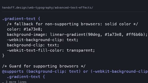 Advanced text effects
Create gradient text, text strokes, and layered shadows with CSS background-clip, mask-image, and paint-order—with fallbacks that work when the effect doesn't.
Advanced text effects
Create gradient text, text strokes, and layered shadows with CSS background-clip, mask-image, and paint-order—with fallbacks that work when the effect doesn't.
-
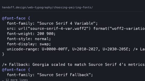 Choosing pairing fonts
Choose and pair web fonts systematically: match x-height, budget loading cost in bytes, and use size-adjust fallback stacks to prevent layout shift.
Choosing pairing fonts
Choose and pair web fonts systematically: match x-height, budget loading cost in bytes, and use size-adjust fallback stacks to prevent layout shift.
-
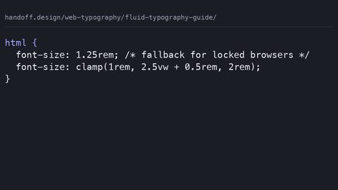 Fluid typography guide
Implement fluid typography with CSS clamp() that respects WCAG zoom requirements, includes rem fallbacks, and states the loading cost of every typeface.
Fluid typography guide
Implement fluid typography with CSS clamp() that respects WCAG zoom requirements, includes rem fallbacks, and states the loading cost of every typeface.
-
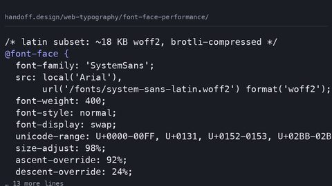 Font face performance
Configure @font-face for performance: self-host woff2 subsets, use font-display swap with size-adjust fallbacks, and measure the byte cost of every typeface decision.
Font face performance
Configure @font-face for performance: self-host woff2 subsets, use font-display swap with size-adjust fallbacks, and measure the byte cost of every typeface decision.
-
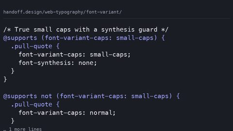 Font variant
Control small caps, tabular numerals, and ligatures with the font-variant CSS property—and know the fallback when the font lacks the OpenType feature.
Font variant
Control small caps, tabular numerals, and ligatures with the font-variant CSS property—and know the fallback when the font lacks the OpenType feature.
-
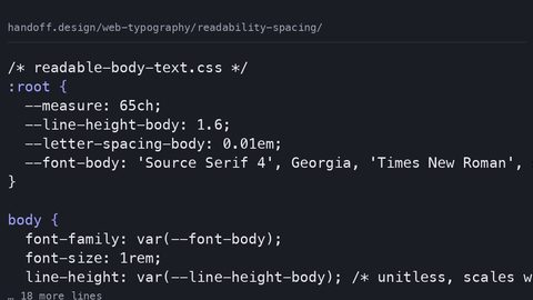 Readability spacing
Set line-height, letter-spacing, and measure in CSS for readable text that meets WCAG text-spacing requirements—and state the typeface loading cost.
Readability spacing
Set line-height, letter-spacing, and measure in CSS for readable text that meets WCAG text-spacing requirements—and state the typeface loading cost.
-
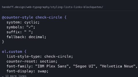 Styling lists links blockquotes
Style lists with ::marker, blockquotes with the quotes property, and links with text-decoration-thickness—modern CSS for semantic HTML elements with fallbacks.
Styling lists links blockquotes
Style lists with ::marker, blockquotes with the quotes property, and links with text-decoration-thickness—modern CSS for semantic HTML elements with fallbacks.
-
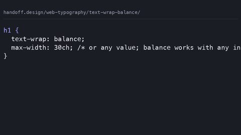 Text wrap balance
Use CSS text-wrap: balance for multi-line headlines and text-wrap: pretty for body copy widow prevention, replacing JavaScript text-balancing polyfills with a single declaration.
Text wrap balance
Use CSS text-wrap: balance for multi-line headlines and text-wrap: pretty for body copy widow prevention, replacing JavaScript text-balancing polyfills with a single declaration.
-
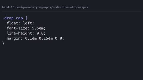 Underlines drop caps
Create cross-browser drop caps with the CSS initial-letter property and style precise underlines using text-decoration-thickness and text-underline-offset.
Underlines drop caps
Create cross-browser drop caps with the CSS initial-letter property and style precise underlines using text-decoration-thickness and text-underline-offset.
-
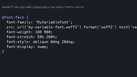 Variable fonts intro
Serve one variable font file instead of multiple static files using CSS font-variation-settings and the mapped axis properties for weight, width, and slant.
Variable fonts intro
Serve one variable font file instead of multiple static files using CSS font-variation-settings and the mapped axis properties for weight, width, and slant.
Read next
-
Readability spacing
Set line-height, letter-spacing, and measure in CSS for readable text that meets WCAG text-spacing requirements—and state the typeface loading cost.
-
Choosing pairing fonts
Choose and pair web fonts systematically: match x-height, budget loading cost in bytes, and use size-adjust fallback stacks to prevent layout shift.
-
Font face performance
Configure @font-face for performance: self-host woff2 subsets, use font-display swap with size-adjust fallbacks, and measure the byte cost of every typeface decision.
-
Advanced text effects
Create gradient text, text strokes, and layered shadows with CSS background-clip, mask-image, and paint-order—with fallbacks that work when the effect doesn't.
-
Styling lists links blockquotes
Style lists with ::marker, blockquotes with the quotes property, and links with text-decoration-thickness—modern CSS for semantic HTML elements with fallbacks.
-
Font variant
Control small caps, tabular numerals, and ligatures with the font-variant CSS property—and know the fallback when the font lacks the OpenType feature.