The Role of CSS in Semantic HTML: How Styles Affect the Accessibility Tree
How CSS properties like display, visibility, content, and order affect the accessibility tree and what assistive technology exposes to users.
The Role of CSS in Semantic HTML: How Styles Affect the Accessibility Tree
When you write CSS, you are computing what assistive technology will perceive. HTML provides the semantic meaning. CSS decides what of that meaning survives into the visual and aural presentation. The accessibility tree, the browser's internal model that screen readers consume, is not a fixed mirror of your DOM. It is a derived structure. Properties like display, visibility, content, and order directly prune or graft branches onto it. This is a practical tour of what ships, what breaks, and what the specifications require. It is for the developer who writes CSS daily and needs the fallback, not the theory.
The Accessibility Tree: Your CSS Is a Constraint Solver, Not a Painter
Understand this before you write another rule. The accessibility tree is not a separate DOM you maintain. It is computed from the DOM, the CSS box tree, and the Accessibility Object Model (AOM) extensions you add via ARIA. The CSS Display Module Level 3 spec is explicit. Certain display values remove elements from the accessibility tree entirely. Others merely hide them visually. This is normative behaviour, not a browser whim. Every declaration you write has a cost. The accessibility cost is the one that silently excludes users. The document order in your HTML is the default reading order. When you change visual order without changing DOM order, you risk creating a screen reader experience that contradicts what sighted users see. That conflict is a WCAG 2.2 failure.
display: none vs visibility: hidden, What Disappears from the Tree
The single most common mistake in CSS accessibility is assuming display: none and visibility: hidden behave the same. They do not. display: none removes the element and all its descendants from the accessibility tree, the box tree, and the visual rendering. The element is gone. visibility: hidden is subtler. The element stays in the accessibility tree but is marked as hidden. Most screen readers will not announce it. The difference matters when you need an element present for programmatic purposes, like a label or a focus target, but not visible. Here is a complete example you can test with a screen reader or the Accessibility Inspector in DevTools.
<!DOCTYPE html>
<html lang="en">
<head>
  <meta charset="UTF-8">
  <title>display vs visibility accessibility demo</title>
  <style>
    .hidden-display { display: none; }
    .hidden-visibility { visibility: hidden; }
  </style>
</head>
<body>
  <p>This text is visible.</p>
  <p class="hidden-display">I am display:none, removed from the accessibility tree.</p>
  <p class="hidden-visibility">I am visibility:hidden, still in the tree but hidden from screen readers.</p>
  <button aria-label="This button is focusable despite hidden label">Click</button>
</body>
</html>
Open this in a browser and run the accessibility audit. The second paragraph is not even in the tree. The third paragraph is there but flagged as hidden. A common failure pattern is using visibility: hidden on a parent to hide overflow text, only to find that a child with visibility: visible still exposes content unexpectedly. Or the child is not readable because the parent's hidden state is inherited by the accessibility tree in ways the visual rendering does not mirror. The lesson: if you want content gone from assistive tech, use display: none or the HTML5 hidden attribute. If you want it visually hidden but still focusable, use a visually-hidden class with clip-path, not visibility.
CSS Content Property Accessibility: Generated Text and the Spec
The content property is a double-edged sword in the accessibility tree. The CSS Generated Content Module Level 3 spec, a W3C Recommendation from 2019, defines what happens. For content on ::before and ::after pseudo-elements, all modern engines include the generated text in the accessibility tree by default. That is why you can put an icon font's glyph in content and hear it announced as a character. Usually a problem, because the unicode replacement character gets read aloud. But the spec also allows content on non-pseudo elements. That behaviour is less consistent. Here is the sample that shows the difference between a pseudo-element and a real element using content.
<!DOCTYPE html>
<html lang="en">
<head>
  <meta charset="UTF-8">
  <title>Generated content accessibility demo</title>
  <style>
    .decorative::before { content: "★ "; color: gold; }
    .real-content { content: "Important: "; font-weight: bold; }
  </style>
</head>
<body>
  <p class="decorative">This is a rating.</p>
  <p class="real-content">Read this sentence.</p>
</body>
</html>
In the first case, the star is announced as a bullet point or a star character, depending on the screen reader and its punctuation settings. In the second case, the content property on the <p> element is not part of the accessibility tree in most engines. The property is not meant for flowing text on real elements. It is for replaced elements like <img> or <input>. The spec says generated text should be included for pseudo-elements. For other elements, it is implementation-defined. The practical result: you cannot rely on it. The common mistake is using content to convey meaning and expecting it to be read aloud. It will be read on ::before and ::after content. It will not be read on a <span> with content set. The safe fallback: put the text in the HTML, or use an aria-label only when the text is redundant visual fluff.
Flexbox Order Property and Visual vs DOM Order Failures
Here is the failure pattern that breaks real sites. The flexbox order property, and its cousin the grid order property, changes visual position without changing the DOM order. A screen reader follows the DOM order unless you also adjust the reading order. You cannot do that in flexbox. This creates a visual vs DOM order mismatch that violates WCAG 2.2 Success Criterion 1.3.1 (Info and Relationships). The reading order no longer preserves the meaning. Consider this example: a card layout where the action button should be first visually but second in the DOM.
<!DOCTYPE html>
<html lang="en">
<head>
  <meta charset="UTF-8">
  <title>Flexbox order accessibility failure demo</title>
  <style>
    .card { display: flex; flex-direction: column; gap: 1rem; }
    .card .action { order: -1; }
  </style>
</head>
<body>
  <div class="card">
    <p>Product description.</p>
    <button class="action">Buy Now</button>
  </div>
</body>
</html>
Visually, the button appears above the description because of order: -1. A screen reader reads the description first, then the button. That is confusing for a keyboard user who tabs to the button and hears the description after. Or a screen reader user who thinks the product has no call-to-action until the end. The fix is not to add aria-label or role hacks. Reorder the DOM so the visual order matches the logical order. The flexbox order property is not for accessibility. It is for visual reordering of non-essential sequences. If you must use it, test with a screen reader and ensure the content order still makes sense without CSS. Success Criterion 2.4.3 (Focus Order) also applies. Keyboard focus must follow a logical order, which is the DOM order by default. When you reorder visually, you break focus order too. The tab sequence is derived from the DOM, not the visual layout.
display: contents Accessibility Impact, The Fix and Its Limits
What display: contents Does to the Tree
The display: contents property removes an element from the box tree while keeping its children as if they were in the parent. It had a notorious accessibility bug: before Firefox 113 (May 2023), the element was removed from the accessibility tree too. A <button> or <ul> with display: contents lost its semantic role and keyboard focus. That is fixed in modern browsers. The property is now widely available. Check caniuse for current support details.
Where the Fix Still Fails
The CSS Display Module Level 3 spec says the element's own box is not generated. The element's children are treated as if they were children of the parent. For accessibility, this means the element's semantics are also removed. Only the children are exposed. If you use display: contents on a <button>, you lose the role. There is no box to click and no role to announce. The button will not stay interactive. The fallback is to use display: block or display: inline on the element and manually add ARIA roles. That is a hack. A better fallback: avoid display: contents on interactive or semantic elements entirely. Use it only on a <div> or <span> that wraps layout-only styling. Never on elements that carry meaning. This technique replaced the old JavaScript approach of moving children in the DOM or using absolute positioning hacks to visually remove a wrapper.
CSS Speech Module and the Aural Rendering Fallacy
If you have ever read about the CSS Speech Module and thought it could control screen readers, stop now. The CSS Speech Module, a W3C Candidate Recommendation from March 2020, defines properties like speak, speak-as, pause, and voice-family for aural styling. No major browser engine has shipped it as of late 2025. There is no CSS-only fallback. The mobile-first, web-native alternative is the Web Speech API for synthetic speech, or semantic HTML with ARIA for screen reader content. The common mistake is assuming speak: never will silence a screen reader. It will not. Screen readers do not consume the CSS aural rendering model. They consume the accessibility tree. The CSS Speech Module remains a theoretical spec. Any article that implies otherwise is out of date. The older technique it was meant to replace was the aural media type and vendor-prefixed -xv- properties from CSS2 in 1998. Those also never shipped meaningfully. For aural content, your options are the HTML aria-label, role, and the Web Speech API for non-critical audio. Do not waste debug time on speak-as. It will do nothing in any engine you test.
Forced Colors and Focus Styles, Where the Old Empty-Out Has a New Cost
Forced Colors Mode Is Not Optional
Forced colors mode, triggered by the user's OS setting, changes the way your CSS paints. The forced-color-adjust property lets you opt out. Setting forced-color-adjust: none on a large block is a common mistake. It can break contrast for users who rely on forced colors to see the interface. The fallback is to use system color keywords like Canvas, CanvasText, and LinkText from CSS Color Module Level 4. Ensure your default design meets WCAG 2.2 contrast minimums: 4.5:1 for normal text, 3:1 for large text.
Focus Styles That Actually Work
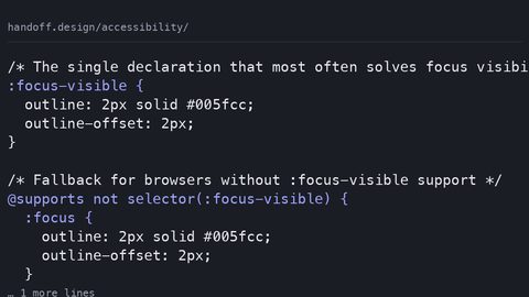
Focus styles are a legal and practical requirement. The modern technique is to use :focus-visible to style keyboard focus without affecting mouse clicks. The common mistake is removing the default outline with :focus and only providing a custom style on :focus-visible. In browsers that do not support :focus-visible, which includes most legacy and some modern configurations, the element gets no focus indicator at all. That violates WCAG 2.4.7 Focus Visible. The safe pattern: set a strong default focus style on :focus. Then suppress it only inside :focus:not(:focus-visible) in supporting browsers. This is a subtle, testable detail. It separates a page that ranks for accessibility queries from one that only talks about it.
CSS Semantic HTML Accessibility: What the Specs Say and What You Must Do
Let us pull the thread together. The CSS and accessibility relationship is defined by a small set of specifications. The CSS Display Module Level 3 governs how display values affect the accessibility tree. The CSS Generated Content Module Level 3 covers pseudo-element content. The CSS Speech Module is the one that does not ship. WCAG 2.2 Success Criteria 1.3.1 and 2.4.3 are the legal and practical benchmarks. The question this page answers has a direct answer. display: none removes. visibility: hidden hides but keeps in the tree. content on pseudo-elements adds. order rearranges visual but not logical order. For the working developer, the instruction is to test every layout with a screen reader and a keyboard, not just with a visual diff. The accessibility tree is not a simulation. It is the source of what your users experience. When you use display: contents, verify it is on a generic element. When you use content for icons, add an aria-hidden="true" and a textual alternative in the HTML. When you use flexbox or grid order, reorder the DOM first. Use the property only for visual tweaks that do not change meaning. These are not optional refinements. They are the cost of doing business in a web that must work for everyone.
FAQ: Common Missteps and Straight Answers
How do I check if an element is in the accessibility tree?
Open the Accessibility tab in Firefox or DevTools in Chrome, and inspect the element. If it is not listed, it is not exposed. You can also run a Lighthouse accessibility audit for a quick scan. It will not catch every ordering issue.
Does opacity: 0 remove an element from the accessibility tree?
No. opacity: 0 keeps the element in the accessibility tree and it remains focusable. If you want to hide it from screen readers, use display: none or aria-hidden="true". The pitfall: opacity does not suppress the element's presence, so keyboard users can still tab to it.
What is the difference between aria-hidden and display: none?
aria-hidden="true" removes the element from the accessibility tree but keeps it visible and focusable. display: none removes it from both. Using aria-hidden on a focusable element is a failure. The element is announced as hidden but still receives focus.
Can I use CSS to reorder content for screen readers?
No. Screen readers follow the DOM order, not the visual order. The only ways to change reading order are to reorder the DOM or use ARIA properties like aria-posinset in limited cases. Flexbox and grid order properties do not affect the accessibility tree.
Is the CSS content property safe for icons?
It is safe for decorative icons only if you set aria-hidden="true" on the pseudo-element or the parent. For meaningful content, put the text in the HTML. The exception is ::before and ::after on li or q elements, where the spec defines the content as part of the element's text.
What does WCAG 2.2 Success Criterion 1.3.1 actually require?
It requires that information, structure, and relationships conveyed through presentation can be programmatically determined. This is why visual order tricks fail. They convey meaning only visually, not programmatically. The criterion is about the accessibility tree, not the visual rendering.
How do I handle forced colors mode in CSS?
Use the forced-colors media query to test for it, and prefer system colors. Do not set forced-color-adjust: none unless you have thoroughly tested contrast. Instead, let the browser swap your colours to the user's scheme. Ensure your layout has sufficient borders or contrast differences to remain usable.
The Honest Caveat About CSS and the Accessibility Tree
Here is the truth you will not find in a spec summary or a Twitter thread. The accessibility tree is still the least-understood layer of the web platform. The tooling around it is years behind the visual DevTools you use daily. You cannot inspect the accessibility tree as fluently as you inspect the box model. The CSS Speech Module remains a paper tiger. This page has given you the rules that ship, the failures that recur, and the fallbacks that work. But the real lesson is this: whenever you are about to hide something, reorder something, or generate text purely with CSS, assume it will break for a screen reader user. Then test to prove it wrong. The web is not a canvas. It is a conversation. Your CSS is one part of that conversation, and the accessibility tree is the microphone. If you do not check what your styles are saying, you are speaking into a void.