UI Design Tools from the Developer's Side of the Handoff
Evaluate design tools from the developer's side: what the design file must contain before it can be built, and which exports produce usable CSS.
The handoff is where design-to-code stops being a metaphor and becomes a file transfer. The common wrong assumption is that a design file is a preview of the finished page, and that the developer’s job is to make the browser match the pixels. That is backwards. The design file is a spec, and the preview is the rendering of that spec in one particular context. The developer’s job is to translate the spec into production code. The quality of that translation depends entirely on what the design file contains and what the design tool exports. A Figma file that uses auto layout and design tokens will produce a different, and better, build than one that uses constraints and hardcoded hex values. The tool does not matter as much as the discipline of the person who built the file, but the tool’s export pipeline is where that discipline is either preserved or destroyed.
Figma Developer Handoff CSS Output
The most valuable thing Figma exports is not the CSS it generates for a single layer. It is the design tokens. When a designer defines a spacing scale as a set of variables in Figma, and the export pipeline converts those variables to CSS custom properties, the developer gets something that maps directly to the design system. The alternative, Figma generating a pixel value for every margin and padding, produces a pile of magic numbers that will rot on the first responsive pass.
What A Good Export Looks Like
Here is what the good export looks like. The design file defines a spacing token called space-4, and the export produces this:
:root {
  --space-1: 0.25rem;
  --space-2: 0.5rem;
  --space-3: 0.75rem;
  --space-4: 1rem;
  --space-5: 1.5rem;
  --space-6: 2rem;
  --space-8: 3rem;
  --space-10: 4rem;
  --space-12: 6rem;
}

.card {
  padding: var(--space-4);
  gap: var(--space-3);
}
That one declaration set solves the category’s most common problem: spacing that does not scale and cannot be themed. The custom properties inherit, cascade, and update at runtime. Preprocessor variables are frozen at build time. The distinction is the whole point. When the design system changes its spacing scale, update the token file and everything that uses var(–space-*) follows. When the design file exports raw pixel values, you edit each component by hand and the design system drifts within a week.
Design Tool CSS Code Generation Quality
The honest version of CSS code generation quality is that you judge a tool by what it emits, not by what it shows. Figma’s code panel is a starting point, not a deliverable. It will generate a flexbox layout from an auto layout frame. It will generate absolute positioning from a frame that used constraints. The difference is the designer’s workflow, not the tool’s capability.
When Auto Layout Exports As Absolute Positioning
The problem case is Figma auto-layout export that generates absolute positioning instead of flexbox. This happens when the designer used constraints instead of auto layout. A constraint-based frame in Figma anchors elements to edges and corners, which maps to absolute positioning in CSS. An auto layout frame distributes elements along an axis, which maps to flexbox. The developer who receives the constraint-based file gets this:
.container {
  position: relative;
}

.element {
  position: absolute;
  top: 24px;
  left: 32px;
  right: 0;
  bottom: 16px;
}
That is not a responsive layout. It is a screenshot with coordinates. The fix is to ask the designer to convert the frame to auto layout before the handoff, or to rebuild the component in CSS. The export quality is a direct function of the design file’s construction. A file built with auto layout and design tokens produces clean, responsive CSS. A file built with constraints and hardcoded values produces absolute positioning and magic numbers. You cannot fix the second with a better export setting.
Design Token Export CSS Custom Properties
The design token export is where the tool either earns its place or becomes a glorified screenshot generator. A design tool that exports design tokens as CSS custom properties gives the developer a system to build on. A tool that exports raw values gives the developer a list of numbers to copy and paste.
Token Names Versus Flattened Values
The difference is visible in the output. Sketch and Figma both support design tokens through plugins or native variables, but the export format varies. Penpot exports tokens natively. The good export maps the token name to a variable name, preserving the semantic meaning. The bad export flattens the token into a value.
This is what a proper token export looks like for color, including the perceptually uniform color space that modern CSS supports:
:root {
  --color-text-primary: oklch(0.2 0.03 260);
  --color-text-secondary: oklch(0.4 0.02 260);
  --color-surface: oklch(0.98 0.005 260);
  --color-border: oklch(0.85 0.01 260);
  --color-accent: oklch(0.7 0.15 40);
  --color-accent-hover: oklch(0.65 0.15 40);
  --color-danger: oklch(0.55 0.2 25);
}

.button {
  background-color: var(--color-accent);
  color: var(--color-surface);
  border: 1px solid var(--color-border);
}

.button:hover {
  background-color: var(--color-accent-hover);
}

.error-message {
  color: var(--color-danger);
  border-color: var(--color-danger);
}
Why Oklch Matters
The oklch color format is the correct choice for design token export because it is perceptually uniform. HSL and hex are not. When a designer tweaks a color in oklch, the perceived lightness change matches the numeric change. In HSL, the same numeric change can produce a jarring shift. The export pipeline should preserve the color space, not flatten it to hex. A tool that only exports hex is discarding information the developer needs for accessible contrast work.
Design File Requirements Front-End Build
Before the handoff, the design file must meet a minimum bar. The requirements are not about aesthetics. They are about what the front-end build needs to avoid rework. A design file that meets these requirements produces a smooth build. One that does not produces a week of back-and-forth.
The Five Non-Negotiables
The first requirement is that every component uses auto layout, not constraints. Auto layout maps to flexbox and grid. Constraints map to absolute positioning. The second requirement is that spacing and sizing come from a defined scale, not from arbitrary numbers. The third is that typography uses a type scale, not ad-hoc sizes and weights. The fourth is that colors come from a palette, not from an eyedropper. The fifth is that responsive behavior is defined for the breakpoints the product supports.
What The Requirements Produce
The effect of these requirements is visible in the CSS that gets written. A component built from a well-structured design file uses the box model deliberately. The padding, border, and margin each have a token. The layout uses flexbox or grid with explicit gap values. The component responds to container changes without media queries because it was built with flexible sizing from the start.
Here is what a component looks like when the design file met the requirements. The card uses auto layout, a spacing token, and a color token:
.card {
  display: flex;
  flex-direction: column;
  gap: var(--space-3);
  padding: var(--space-4);
  background-color: var(--color-surface);
  border: 1px solid var(--color-border);
  border-radius: 0.5rem;
  max-width: 24rem;
}

.card__title {
  font-size: 1.25rem;
  font-weight: 600;
  color: var(--color-text-primary);
}

.card__content {
  font-size: 0.875rem;
  color: var(--color-text-secondary);
}
That CSS is boring. It does exactly what it says. It does not need a comment explaining why the margin is 17 pixels. The design file requirements exist to produce this kind of boring, maintainable CSS. The alternative is the file that needs a design-system rescue, and your time is spent asking questions instead of writing code.
Design-to-Code Workflow CSS Accuracy
The design-to-code workflow is where the gap between the design file and the browser becomes visible. The accuracy of the CSS depends on how much context the export preserves. A design tool that exports only the final computed values loses the logic. A design tool that exports the structure, the relationships between elements, the spacing scale, the color tokens, gives the developer what they need to write accurate CSS.
The Structural Mismatch Problem
The most common inaccuracy is not a visual mismatch. It is a structural mismatch. The design file shows a frame that looks like a flexbox layout, but the export produces absolute positioning because the frame used constraints. The developer has to rebuild the layout from scratch. This is the design-to-code workflow CSS accuracy problem: the tool reports what it rendered, not what the designer intended.
The fix is to check the export against the structure. When you receive a file, the first step is to look at the layers panel, not the canvas. The layers panel shows whether the frame is an auto layout frame or a constraint-based frame. It shows whether the spacing comes from a token or a hardcoded value. It shows whether the responsive behavior is defined or assumed.
Variant Handling In The Export
The accuracy of the final CSS is also a matter of the component variant handling. A design file that uses variants, a button in primary, secondary, and danger states, should export those states as CSS classes or as a component with modifier classes. The export should preserve the variant structure, not flatten it into three separate components. A design system relies on the variant structure to keep the CSS small and the behavior consistent.
Comparison Table: Design Tool Export Capabilities
When you are choosing a design tool for the handoff, the export capabilities matter more than the editing features. The table below compares the export behavior for the things a front-end developer needs. Read the table in this order: first, does the tool export design tokens as CSS custom properties, because that is the foundation; second, does it preserve oklch colors, because that is the future-proof color space; third, does it map auto layout to flexbox, because that is the layout accuracy that saves rework; fourth, does it handle grid layout export; fifth, does it annotate WCAG contrast and responsive breakpoints.
| Tool | Token Export as CSS Variables | Preserves oklch() | Auto Layout → Flexbox | Grid Layout Export | Component Variants |
|---|---|---|---|---|---|
| Figma | Yes, via variables + plugins | Yes, via variables | Yes, with correct setup | Partial, via auto layout → grid | Yes, as CSS classes |
| Penpot | Yes, native | Yes | Yes, native | Yes, native | Partial |
| Sketch | Partial, via plugins | No, hex only | Partial | No | Partial |
Figma is the industry default for a reason: its variable system exports clean CSS custom properties, and its auto layout produces flexbox when the designer uses it correctly. Penpot is the credible open-source alternative, with native token support and honest grid layout export. Sketch is the legacy option, and the developer should expect to rebuild layout and colors from the export. The table shows a clear ranking, and the ranking matches the tooling investment. A team that uses Figma with a disciplined auto-layout workflow gets a design-to-code handoff that is close to production-ready. A team that uses Sketch gets a screenshot with coordinates.
Handoff Specification Practices That Protect the Build
The design handoff specification is the contract between designer and developer. It is not the design file itself. It is not the developer’s memory of the kickoff meeting. It is the written record of what the design means, and it is what saves the build from interpretation drift.
WCAG Contrast Annotation
The specification must include the WCAG contrast annotation. Every color pair in the design system needs a contrast ratio, and the designer should annotate which pairs meet AA and which are only for large text. This is not a legal requirement in every jurisdiction, the Web Content Accessibility Guidelines are adopted into law differently across countries, with Section 508 in the United States, EN 301 549 in the European Union, and AODA in Ontario, but it is a practical requirement for a build that does not get rejected in review.
Responsive Breakpoint Rules
The specification must also include responsive breakpoint annotation. The design file shows the layout at the breakpoints the designer defined, but it does not show the rules for what happens between them. The specification should state which components collapse, which grids change from multi-column to single-column, and which spacing scales adjust.
Here is the shape of a responsive breakpoint annotation:
:root {
  --breakpoint-sm: 640px;
  --breakpoint-md: 768px;
  --breakpoint-lg: 1024px;
  --breakpoint-xl: 1280px;
}

@media (min-width: 640px) {
  .card-grid {
    grid-template-columns: repeat(2, 1fr);
  }
}

@media (min-width: 1024px) {
  .card-grid {
    grid-template-columns: repeat(4, 1fr);
  }
}
Asset Export Format
The annotation gives the developer the guardrails. The asset export format is the last piece of the specification. Icons should be SVG, not PNG. Images should have a defined compression target and dimensions for each breakpoint. The specification is what turns a design file from a suggestion into a buildable document.
When the Famous Tool Is the Wrong One
The famous tool is Figma, and for most teams it is the right tool. But there is a case where it is the wrong one, and that case is a team that does not use auto layout. A team that uses Figma with constraints instead of auto layout is paying for a tool that they are not using. The export produces absolute positioning, which means the developer has to rebuild every layout. The design token system sits unused because the designers reach for the eyedropper. The handoff is a screenshot with coordinates.
Switch To Penpot
That team should switch to Penpot. Penpot is open source, so there is no per-seat cost. It enforces a clearer separation between the design structure and the visual styling. And because it is less famous, the designers are less likely to have learned bad habits from ten-year-old Figma tutorials. The switch will be painful for a week, and then the design file will be in better shape than before.
When To Skip The Design Tool
There is also a case where the design tool does not matter at all. A developer who is building a component library from scratch, without a designer, should skip the design tool entirely and write CSS directly. The design tool is a communication medium, and when the designer and the developer are the same person, the communication cost is zero. The tool only adds a layer of indirection between the idea and the code.
Runtime Performance Is Your Problem
The performance-conscious developer will also notice that the design tool export is irrelevant to runtime performance. The CSS custom properties, the flexbox layout, and the grid layout are what the browser renders. The design tool is the source, but the output is what costs the user’s battery. Your responsibility is to write CSS that triggers layout, paint, and composite efficiently. transform and opacity are the only properties that animate on the compositor. The design tool neither helps nor hinders that.
Who This Design Tool Discussion Suits
This discussion suits the working front-end developer who writes CSS daily and needs to know what the handoff will deliver. It suits the design-system author who needs the vocabulary to defend the auto layout requirement to stakeholders. It suits the technical writer who needs accurate statements about tool behavior without laundering guesses into facts.
It does not suit someone learning to code from zero. That reader should start with the MDN CSS first-steps guide and web.dev/learn/css, and return here after they understand the box model and the document flow. It does not suit a designer who wants to learn why a layout works visually; that reader should go to Every Layout or Refactoring UI for the visual reasoning, then return here for the mechanics of the export. It does not suit someone debugging a React state bug, this is not a JavaScript topic, and the file extension is irrelevant to the layout question.
A Figma file built with constraints instead of auto layout is a liability that no export setting can fix, and the developer should send it back before writing a single line of CSS.
More in Design tools
-
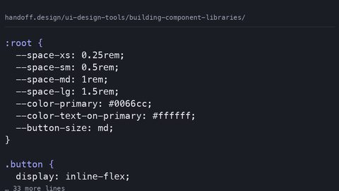 Building component libraries
Structure design tool component libraries so variants map to CSS states and design tokens export as custom properties, not absolute-positioned frames.
Building component libraries
Structure design tool component libraries so variants map to CSS states and design tokens export as custom properties, not absolute-positioned frames.
-
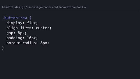 Collaboration tools
Evaluate design collaboration tools by what they export for developers: usable CSS snippets, design tokens, and component state documentation.
Collaboration tools
Evaluate design collaboration tools by what they export for developers: usable CSS snippets, design tokens, and component state documentation.
-
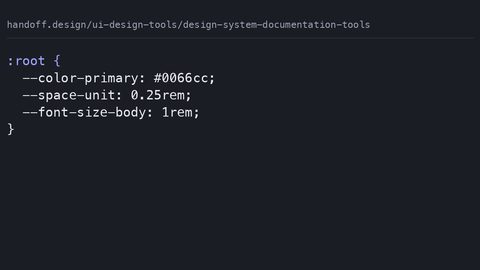 Design system documentation tools
Compare design system documentation tools by what they actually export: CSS custom properties, JSON tokens, and code snippets a developer can use without manual translation.
Design system documentation tools
Compare design system documentation tools by what they actually export: CSS custom properties, JSON tokens, and code snippets a developer can use without manual translation.
-
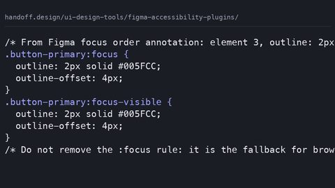 Figma accessibility plugins
Evaluate Figma accessibility plugins by what they catch before code exists: contrast violations, missing focus orders, and heading structure errors that CSS alone cannot fix.
Figma accessibility plugins
Evaluate Figma accessibility plugins by what they catch before code exists: contrast violations, missing focus orders, and heading structure errors that CSS alone cannot fix.
-
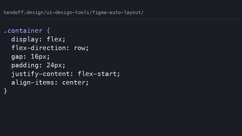 Figma auto layout
Audit the CSS that Figma auto layout actually generates: where it produces clean flexbox, where it falls back to absolute positioning, and what a developer must rewrite.
Figma auto layout
Audit the CSS that Figma auto layout actually generates: where it produces clean flexbox, where it falls back to absolute positioning, and what a developer must rewrite.
-
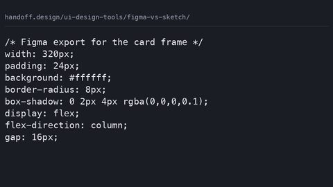 Figma vs sketch
Compare Figma and Sketch solely on developer handoff output: which tool's CSS snippets, design tokens, and asset exports require fewer manual corrections.
Figma vs sketch
Compare Figma and Sketch solely on developer handoff output: which tool's CSS snippets, design tokens, and asset exports require fewer manual corrections.
-
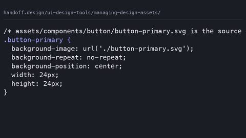 Managing design assets
Establish the asset handoff contract: naming conventions, export formats, and folder structures that let developers drop design files directly into a CSS codebase.
Managing design assets
Establish the asset handoff contract: naming conventions, export formats, and folder structures that let developers drop design files directly into a CSS codebase.
-
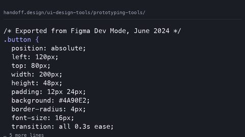 Prototyping tools
Evaluate prototyping tools by the CSS they export: which tools produce animation and interaction code that survives the transition to production without a rewrite.
Prototyping tools
Evaluate prototyping tools by the CSS they export: which tools produce animation and interaction code that survives the transition to production without a rewrite.
-
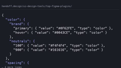 Top figma plugins
Rank Figma plugins by developer handoff output quality: which produce CSS snippets, design tokens, and assets that require no manual cleanup before production.
Top figma plugins
Rank Figma plugins by developer handoff output quality: which produce CSS snippets, design tokens, and assets that require no manual cleanup before production.
-
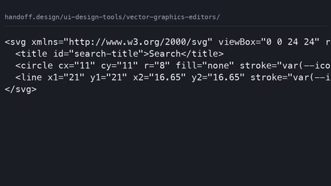 Vector graphics editors
Compare vector graphics editors by the SVG they emit: which produce clean markup with correct viewBox attributes that CSS can style without manual cleanup.
Vector graphics editors
Compare vector graphics editors by the SVG they emit: which produce clean markup with correct viewBox attributes that CSS can style without manual cleanup.
Read next
-
Managing design assets
Establish the asset handoff contract: naming conventions, export formats, and folder structures that let developers drop design files directly into a CSS codebase.
-
Figma vs sketch
Compare Figma and Sketch solely on developer handoff output: which tool's CSS snippets, design tokens, and asset exports require fewer manual corrections.
-
Building component libraries
Structure design tool component libraries so variants map to CSS states and design tokens export as custom properties, not absolute-positioned frames.
-
Vector graphics editors
Compare vector graphics editors by the SVG they emit: which produce clean markup with correct viewBox attributes that CSS can style without manual cleanup.
-
Prototyping tools
Evaluate prototyping tools by the CSS they export: which tools produce animation and interaction code that survives the transition to production without a rewrite.
-
Figma accessibility plugins
Evaluate Figma accessibility plugins by what they catch before code exists: contrast violations, missing focus orders, and heading structure errors that CSS alone cannot fix.