CSS Centering Guide: The Fewest Declarations for Horizontal and Vertical Centering
Shows the two-declaration CSS centering techniques that replaced the twelve hacks developers needed in 2014, using flexbox, grid, and place-items.
CSS Centering Modern Techniques Flexbox Grid Place-Items
The shortest path to centered content in 2026 is two declarations: place-items: center on a grid or flex wrapper, or margin: auto on the child when the wrapper is flex or grid. You are about to learn exactly when each one applies. The core answer, and the sentence this guide exists to defend, is that CSS centering modern techniques flexbox grid place-items reduce every 2014 hack to a single line. You will learn the two declarations that replace twelve hacks. You will also learn why the old tricks fail. No padding, no fluff: keep this open while you work.
CSS Horizontal Vertical Centering Flexbox
One-Axis Versus Two-Axis Rules
Use flex for one-axis alignment. Use grid for two-axis. Use margin: auto for a single item in either. For both axes at once, place-items: center on a grid wrapper is the fewest declarations that work everywhere modern. Flexbox does it with display: flex; justify-content: center; align-items: center;. That is three declarations, not two. Grid does it with display: grid; place-items: center;. That is two.
If you need only the horizontal centre, text-align: center for inline content or margin-inline: auto for a block with a width. If you need only vertical, flexbox align-items: center or grid align-content: center, depending on context. The mistake beginners make is reaching for transform: translate(-50%, -50%) with position: absolute. That was the 2014 answer. It is now the extra step you do not need. You will see why in the sections below, each covering one axis and its modern replacement.
Flexbox Centring In Full
Flexbox centres a single item or a group along the main axis with justify-content and along the cross axis with align-items. For horizontal and vertical centring of one child, the wrapper needs display: flex. The two alignment properties handle the rest. Here is a complete runnable example:
.container {
  display: flex;
  justify-content: center; /* horizontal in row direction */
  align-items: center;     /* vertical in row direction */
  min-height: 100vh;      /* for demonstration, replace with your layout */
}
<div class="container">
<p>This text is centred both ways.</p>
</div>Why flexbox and not table-cell? The old table method used display: table-cell with vertical-align: middle and text-align: center. It forced a table layout on non-table content and broke the moment you needed responsive behaviour. Flexbox is Baseline since July 2015. No fallback is needed for any browser you support. The common mistake is applying justify-content or align-items to the child instead of the wrapper. Those properties have no effect on a flex child. Put them on the flex wrapper. The child moves. If you have a single child, you can also set margin: auto on that child inside the flex wrapper. This is the flexbox plus margin auto centring syntax, specified in the CSS Flexible Box Layout Module Level 1, Section 8.1. That is one declaration on the child, three on the parent.
CSS Centering Without Transform Hack
The transform hack was position: absolute; top: 50%; left: 50%; transform: translate(-50%, -50%);. It worked when the child had unknown dimensions. But it required the parent to be a containing block with position: relative. It broke the moment you wanted to animate the child with transform for other reasons, because transform now had two jobs. In 2026, you do not need it.
Grid centring with place-items: center and flexbox centring with justify-content plus align-items both handle unknown child sizes without any transform. For a single child in a grid, place-self: center on the child achieves the same with one declaration on the child and display: grid on the parent. The transform hack is not invalid. It is more declarations, more moving parts, and it forces a position: relative that pollutes the cascade. The modern replacement is two declarations. It works in every Baseline browser. Here is the grid version:
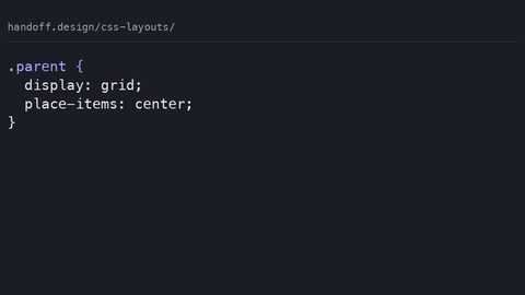
.parent {
  display: grid;
  place-items: center; /* shorthand for align-items and justify-items */
  height: 100vh;
}
<div class="parent">
<div>Centred without a transform in sight.</div>
</div>If you are centring in the viewport, use min-height: 100dvh instead of 100vh to account for mobile browser chrome. Fall back to 100vh first, then override with @supports (height: 100dvh). The transform hack has no such dynamic viewport support built in.
CSS Place-Items Center Grid Centering
The Two-Declaration Answer
Grid centring with place-items: center is the two-declaration answer for both axes. The wrapper needs display: grid. place-items is the shorthand for align-items: center and justify-items: center. It centres each grid item within its grid area. This is not place-content: center. That centres the grid tracks themselves within the wrapper, not the items within their cells. The distinction matters when your grid has more than one track or the tracks do not fill the wrapper.
Here is the complete sample:
.grid-center {
  display: grid;
  place-items: center;
  height: 100vh;
}
<div class="grid-center">
<div>Centred by grid.</div>
</div>The specification is CSS Grid Layout Module Level 1, which reached Candidate Recommendation Snapshot on 18 December 2020. display: grid and place-items are both Baseline widely available since March 2017. No @supports guard is needed for browsers from 2017 onward.
Common Mistakes And The Fix
Two mistakes appear repeatedly. Using place-content: center when you mean place-items. Setting place-items on the child instead of the grid wrapper. If you have a single child, place-self: center on the child achieves the same with one declaration on the child. It also works in flexbox. For any grid with more than one item, place-items centres each in its own area. That is what you want when the items have different sizes. This is the technique to use for full-page centring: display: grid; place-items: center; min-height: 100dvh;.
CSS Centering Text-Align Margin Auto Replaced
What Still Works And What Replaced It
Two older techniques still work. They are now one-trick ponies, and here is what replaces them. text-align: center centres inline content within a block. It is the replacement for the deprecated <center> element and the align attribute. It remains the correct choice for a line of text, an inline image, or an inline-block child. But it does not centre the block itself. It has no vertical effect.
margin: auto, specifically margin-inline: auto or margin: 0 auto, centres a block-level element horizontally when the element has a declared width or max-width. The 2021 baseline for margin-inline makes it the modern spelling. margin: 0 auto remains the fallback for older browsers. What replaced the old table-cell vertical centring is flexbox and grid. The 2014 pattern was display: table-cell; vertical-align: middle; text-align: center; on a parent. It forced table layout and broke when you wanted a flex child. The modern replacement is flexbox or grid. vertical-align: middle works only on inline or table-cell boxes. It fails on a plain block.
Here is what still uses text-align:
p {
  text-align: center; /* centres the text inside the <p> */
}
And here is the modern block centring:
.block {
  width: fit-content; /* or a fixed width, or max-width */
  margin-inline: auto; /* centres the block itself */
}
The failure case: expecting margin: auto to centre vertically. It never does. Vertical centring requires flex, grid, or absolute positioning. The last one is the one you no longer need.
Why Percentage-Based Centering Collapses When the Parent Has No Explicit Height
Percentage height resolves against the containing block's computed height. When the parent has height: auto, the computed height is auto. A percentage then resolves to auto. That computes to 0 in most cases. This is why position: absolute; top: 50%; margin-top: -25%; fails on a parent without an explicit height. The 50% is calculated against a height of auto, which is 0 or the content height, not the viewport.
The containing block for an absolutely positioned element is the nearest ancestor with a position other than static. If that ancestor has no height, the percentage has nothing to resolve against. Flexbox and grid do not use this mechanism. They align items within the wrapper's content box, determined by the flex or grid layout algorithm, not by a percentage of the parent. The 2014 transform hack avoided this by using the element's own dimensions. It still required the parent to be a containing block.
In 2026, you do not test this. You reach for place-items: center or align-items: center. You never wonder whether the parent has a height. The exception is when you genuinely need the child to be a percentage of a parent with a real height. Set the parent's height explicitly. The percentage then works as expected.
FAQ
- What is the fewest CSS to centre a block horizontally?
margin-inline: autoon a block with a declared width ormax-width, plusmargin-left: auto; margin-right: autoas a fallback for older browsers. One line if you use the shorthand, two declarations in the longhand. - What is the fewest CSS to centre vertically?
display: flex; align-items: center;on the wrapper, ordisplay: grid; align-content: center;if the wrapper has a fixed height. For a single line of inline text,line-heightequal to the wrapper height still works but is fragile. - Does place-items: center work on a flex wrapper? Yes, but it is not the shorthand for flex. In flexbox,
place-itemsis a shorthand foralign-itemsandjustify-items.justify-itemshas no effect in a row-direction flex wrapper. Usejustify-content: centerandalign-items: centerinstead. - What is the difference between place-items and place-content?
place-itemsaligns items within their grid areas or flex lines.place-contentaligns the tracks or lines themselves within the wrapper. For a single item filling the wrapper, both appear to do the same. They are not interchangeable. - Can I use margin: auto on a grid child? Yes. It is the recommended way to centre a single grid item without using
place-itemson the wrapper. The CSS Grid Layout Module Level 1, Section 10.2 specifies auto margins for grid items. - Is the transform hack still needed for unknown-size children? No. Grid and flexbox centre unknown-size children without transform. The only time transform retains a use: nudging an element by a percentage of its own size for a visual effect, not for centring.
- What about vertical-align: middle? It works only on inline, inline-block, or table-cell boxes. It does not centre a block or a flex child. Use it for aligning an image with a line of text, not for centring a layout.
Centering Without a Fallback: What to Do When the Grid Is Overkill
You have the two-declaration answer. Sometimes flexbox or grid feels heavy for a single inline element. In that case, text-align: center on the parent and vertical-align: middle on the inline-block child is the 2014 pattern. It still works. It requires the child to be inline-block. It fails if the child is a block. The modern replacement for that specific case: keep text-align for the horizontal and use line-height matching the wrapper height for a single line of text. This is a hack. It depends on the font's leading and breaks with multi-line text.
The reliable route is flexbox or grid. Use grid for any wrapper that might hold more than one item. Grid's alignment is more predictable. If the grid feels heavy, use margin: auto on the child inside a flex wrapper. That is the flexbox plus margin auto centring syntax. It is the lightest two-line solution for a single item. The failure mode: a multi-line text block. line-height centring fails there. text-align does nothing vertical. You are back to flex or grid.
Centering in the Viewport and Dynamic Viewport Units
For full-page centring, the modern pattern is display: grid; place-items: center; min-height: 100vh;. Upgrade to 100dvh for mobile browsers where the URL bar collapses. The fallback order matters. Write min-height: 100vh first. Then @supports (height: 100dvh) { min-height: 100dvh; }. This replaces the absolute positioning method, which requires the parent to be the viewport or a positioned ancestor. It fails when the viewport changes size during scroll.
The dynamic viewport unit 100dvh tracks the visible viewport. It is Baseline since 2022. If you skip the @supports guard, older browsers ignore the dvh declaration and use the vh fallback. That is acceptable but not ideal. Browser support for dvh without prefix is strong; check caniuse for the current gap on older device-locked browsers. Do not use 100vh alone if you want a sticky footer or a full-height hero. It creates a scroll jump on mobile. The practical takeaway: use grid for the centring, dvh for the height. Done.
Centering vs. Aligning: The One-Axis vs. Two-Axis Distinction
The popular claim that grid is for page layout and flexbox is for components is a clean separation. The real gap is that subgrid makes grid the correct choice for many component-internal alignments. The distinction is not macro versus micro. It is one-axis versus two-axis. Flexbox is a one-dimensional layout system for a row or a column. Grid is a two-dimensional system with explicit column and row tracks. When you align a single item, both work. Grid's place-items is more concise. When you have a complex layout with rows and columns, grid is the only choice.
The mistake is to think of grid as a page-level tool only. It is not. You have seen the fewest declarations for each axis. The one sentence that would not appear on a competitor's page is this: the transform hack was never about centring; it was about compensating for the containing block's height being unknown, and flexbox and grid remove that compensation entirely, so the hack persists only in code written before 2017. If you take one thing away, let it be that.