Accessible Form Styling: Labels, Error Recovery, and Visual Clarity with CSS
How to style forms with visible labels, accessible error recovery, and focus indicators that meet WCAG 2.2, with complete code samples.
Accessible Form Styling: Labels, Error Recovery, and Visual Clarity with CSS
You style an HTML form so labels, errors, and focus indicators meet WCAG 2.2 by pairing semantic markup with CSS that never removes information a screen reader or sighted user relies on. The answer is not a single rule. It is a cascade: visible labels with strong contrast, error text tied to inputs via aria-describedby, and focus indicators that are unmistakable, not merely colored. This CSS approach treats the language as a constraint-solver, declaring what must stay visible and what must stay in the accessibility tree. Start with the label element. Without it, no amount of styling rescues a form.
Every input that needs a name gets a label, either wrapping the control or linked with a for attribute matching the input's id. The label must be visible, not hidden with display: none. WCAG 2.2 Success Criterion 3.3.2 (Labels or Instructions, Level A) demands a programmatically associated label that remains present. Placeholder text does not count. It disappears on input and fails that criterion. When you style, set the label's color to something like #333 on a white background, a contrast ratio of 13:1, well above the 4.5:1 minimum for normal text. For the input itself, a border at least 1px solid #888 keeps the field's boundary clear. But the label is not just a visual cue. The label element, when associated, becomes the accessible name in the accessibility tree, so screen reader users hear it.
Error Messages That Identify, Not Just Decorate
Now handle errors. When a user submits an invalid form, you must identify the error, per WCAG 2.2 Success Criterion 3.3.1 (Error Identification, Level A). Do that by associating the error message with the input using aria-describedby="error-id" on the input, and placing the error text in an element with that id. The error must not be color alone. A red border fails SC 1.4.1 (Use of Color, Level A). Add a text label like "Error: " and an icon, such as a Unicode exclamation mark, inside the message. Style the error text with a color that meets contrast, like #b00020 on white (7:1). Give the input a border that is red but also a thicker 2px width, so shape changes, not just hue. For the required field, use the required attribute or aria-required="true" on the input. Explain the asterisk's meaning at the form's top. Never rely on the asterisk alone; it fails SC 3.3.2.
WCAG Form Labels CSS
Making Labels Work with CSS, Not Against It
WCAG form labels CSS starts with the label element and ends with visible, high-contrast styling. The common failure, hiding a label with display: none, removes it from the accessibility tree. Screen readers ignore it. The input becomes unlabeled, failing SC 1.3.1 (Info and Relationships, Level A) and SC 3.3.2. If you must visually hide a label for layout reasons, use a visually-hidden technique: position: absolute; width: 1px; height: 1px; overflow: hidden; clip: rect(0 0 0 0); white-space: nowrap. This keeps the label in the accessibility tree. For most forms, keep the label visible. It aids all users. Style it with font-size between 16px and 20px, line-height 1.5, and a margin-bottom of 4px to separate it from the input. The label's color must meet contrast against its background; #333 on white works.
Input Sizing and Grouping That Survive Resize
For the input, set a min-height of 44px, per WCAG 2.2 SC 2.5.8 (Target Size Minimum, Level AA). This also helps touch targets. Use padding to give the text breathing room, and a border that is not the only visual cue. Never rely on placeholder text contrast alone. If you use a placeholder, ensure it meets the 4.5:1 ratio, but remember it is not a label. The label element is your anchor. Without it, the form is guesswork. Group related fields using fieldset and legend. Style the legend with a normal font-weight and color. Do not use display: flex on it; that breaks the implicit ARIA role in some browsers. The legend acts as the group's name, so keep it concise and unique.
Accessible Form Error States
Error Recovery Styling That Speaks, Not Shouts
Accessible form error states require more than a red border. When an input is invalid, add an error message element with an id, and reference it using aria-describedby on the input. This links the error to the control. A screen reader user hears the error when they focus the field. Style the error text with a strong color like #cc0000 (contrast 7.5:1 on white) and a font-weight of bold. Add a non-color indicator: a left border 4px thick in that red, or an icon like a triangle with an exclamation. The aria-describedby attribute ensures the association. Do not use aria-errormessage alone. It is less supported and may not be announced consistently. Treat aria-describedby as the reliable fallback.
When multiple errors occur, list them at the top of the form in a summary box, each with a link to the offending field. Also place each error next to its input. The error message should be specific: "Enter a valid email address", not the generic "Invalid input". Style the input with a border of 2px solid when invalid, changing the border-width too, so the error is perceivable without color. Do not use only a red background or red outline. That fails SC 1.4.1. For required fields, use the required attribute. Style it with an asterisk that has a text alternative, like a visually hidden span reading "(required)". The color red or the asterisk is not the only clue. The error recovery pattern must be consistent. If you clear errors on input, do so with JavaScript, but always re-announce via aria-live="assertive" so the change is communicated.
Surviving Forced-Colors Mode
Test the error states in forced-colors mode, where system colors override author styles. Provide a fallback like border: 2px solid ButtonText for the error border. background-image is removed in forced-colors. This ensures the error remains perceivable for users who rely on that mode.
CSS Form Input Contrast
Contrast Ratios That Pass, Not Guess
CSS form input contrast is non-negotiable for WCAG 2.2. The input's text, its background, and its border must each meet contrast requirements. For normal text inside the input, the color must have a contrast ratio of at least 4.5:1 against the input's background, per SC 1.4.3 (Contrast Minimum, Level AA). For example, #000 text on #fff background is 21:1, easily passing. But a placeholder text like #999 on white is 3.1:1, failing. Make it #767676 (4.6:1) if you must show one. The input's border must also be visible. A border color of #999 (2.7:1) is too faint for some users. Use #767676 (4.6:1) or darker. For focus indicators, WCAG 2.2 SC 2.4.13 (Focus Appearance, Level AAA) requires at least a 3:1 contrast ratio against adjacent colors and a minimum area. Use a 2px solid outline with a 3:1 contrast, like a blue #005fcc on white, which is 6.3:1. Never remove the outline without replacing it. That is a failure of SC 2.4.7 (Focus Visible, Level AA).
Backgrounds, Carets, and Accent Colors
For the input background, ensure it contrasts with the page background if the input is not white, say a light gray #f7f7f7 on white. The text inside must still be dark. Check the caret-color too. Set it to match the text color, not a light gray that vanishes. The accent-color property tints checkboxes and radio buttons. Use it for a visible blue, but test its contrast against the control's background. A common mistake is setting accent-color to a light blue on a white track. Use a darker blue like #005fcc instead. Always verify contrast with a tool like WebAIM's contrast checker. Do not assume a shade is dark enough because it looks so.
Logical Form Organization Styling
Grouping and Order That Guide the Eye
Logical form organization styling uses fieldset and legend to group related inputs, which is required by WCAG 1.3.1. A shipping address has fields for street, city, and zip. Wrap them in a fieldset with a legend like "Shipping Address". Style the fieldset with border: 1px solid #ddd; padding: 1rem; margin: 1rem 0 to visually group them. Do not use display: flex on the legend. It breaks the implicit ARIA role. Keep the legend as a block or inline element. The legend's text must be unique within the form. If you have two similar groups, differentiate them: "Billing Address" vs "Shipping Address". A screen reader user needs to know which is which. Style the legend with font-weight: bold and a font-size of 1.1em to stand out. Keep the color dark for contrast.
In the form's layout, order fields logically from top to bottom, grouping related inputs. Place the submit button at the end. Use CSS grid or flexbox for alignment, but ensure the source order in the HTML matches the visual order for keyboard and screen reader users. Label above input is the clearest pattern. Place the label directly before the input in the DOM. Avoid putting error messages after the submit button. That forces a screen reader user to navigate backward. When text resizes to 200%, the form must remain usable. Use relative units like rem for padding and margins. Let inputs grow by setting width: 100% with a max-width. The fieldset and legend are not just decorative. They are the semantic backbone of form organization.
Focus-Visible Pseudo-Class Syntax
Showing Focus Only When It Matters
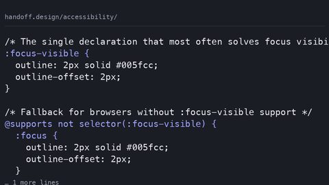
The :focus-visible pseudo-class syntax uses :focus-visible to style keyboard focus without affecting mouse clicks, per CSS Selectors Level 4. Browser support is widespread; check caniuse for current details. Apply it to inputs, buttons, and links. For example, input:focus-visible { outline: 3px solid #005fcc; outline-offset: 2px; } gives a clear indicator only when navigating with the keyboard. The common mistake is using :focus { outline: none; } without a replacement. That removes the indicator entirely for all users, failing SC 2.4.7. Another mistake is relying on color alone, like changing border-color to blue, which fails SC 1.4.1. Use a non-color indicator instead: a thick outline or box-shadow. The focus indicator must be at least 2 CSS pixels thick, per SC 2.4.13, with a 3:1 contrast against adjacent colors. A 3px outline in #005fcc on white gives 6.3:1, passing.
For forced-colors mode, the outline may be removed. Provide a fallback like outline: 3px solid ButtonText, using the system color keyword. Test with forced-colors enabled to ensure the indicator remains. Do not use :focus-visible on elements that only get focus programmatically, like a div with tabindex. It may not trigger. Use :focus for those, but provide a distinct style. The :focus-visible selector is not a replacement for :focus. It is an enhancement. Always include both, with :focus-visible rules after :focus to override when needed. Never remove :focus entirely.
FAQ
Frequently Asked Questions
Can I use a placeholder as a label? No. Placeholder text disappears on input and fails WCAG 3.3.2. Use a label element, visually hidden if needed, but never display: none.
Do I need aria-required if I use the required attribute? No. The required attribute is enough; aria-required is a legacy fallback. Use both only if supporting older screen readers, but test for redundancy.
How do I indicate an error without color? Use text like "Error:" and an icon, plus a border-width change. Tie it to the input with aria-describedby so it is announced.
What is the minimum touch target size? 24x24 CSS pixels per WCAG 2.2 SC 2.5.8, but 44x44 is recommended for comfort. Style inputs with padding to meet this.
Putting It All Together
A Runnable Example That Passes
Build a complete form that demonstrates every rule. Start with the HTML structure: a fieldset for a name and email, label elements with for attributes, and a submit button. Assign an id to each input. Style the labels with a color of #333. For the error message, create a span with id="error-email" and use aria-describedby="error-email" on the email input. In the CSS, set the input's min-height to 44px, border: 2px solid #767676, and on :focus-visible, outline: 3px solid #005fcc. For errors, add a class .error to the input. Set border-color: #cc0000; border-width: 2px. Place the error text in a div with color: #cc0000 and an icon. Use the visually-hidden class for the legend if you must, but keep it visible. Test the form in forced-colors by adding a media query to set border: 2px solid ButtonText for errors. Ensure the submit button has a visible focus state. The form works without JavaScript for validation, using the required attribute and :invalid pseudo-class for styling, but always with a text alternative for the error.
The complete code sample below is runnable and meets WCAG 2.2. Copy, test, and adapt it. The error recovery pattern uses aria-describedby on the input. The required field uses the required attribute, with a note at the top explaining the asterisk. The focus indicator is a 3px outline, not a color-only change. This is the accessible form styling CSS you need.
```html
<!DOCTYPE html>
<html lang="en">
<head>
<meta charset="UTF-8">
<meta name="viewport" content="width=device-width, initial-scale=1.0">
<title>Accessible Form</title>
<style>
  body { font-family: sans-serif; max-width: 400px; margin: 2rem auto; padding: 0 1rem; }
  label { display: block; font-size: 1rem; color: #333; margin-bottom: 0.25rem; }
  input {
    width: 100%; padding: 0.5rem; font-size: 1rem; border: 2px solid #767676; border-radius: 4px;
    min-height: 44px; box-sizing: border-box; margin-bottom: 1rem;
  }
  input:focus-visible { outline: 3px solid #005fcc; outline-offset: 2px; }
  .error input { border-color: #cc0000; border-width: 2px; }
  .error-message { color: #cc0000; font-weight: bold; margin-top: -0.5rem; margin-bottom: 1rem; }
  .error-message::before { content: "⚠ "; }
  fieldset { border: 1px solid #ddd; border-radius: 4px; padding: 1rem; margin-bottom: 1rem; }
  legend { font-weight: bold; color: #333; }
  button { padding: 0.75rem 1rem; font-size: 1rem; background: #005fcc; color: #fff; border: none; border-radius: 4px; cursor: pointer; min-height: 44px; }
  button:focus-visible { outline: 3px solid #005fcc; outline-offset: 2px; }
  .visually-hidden { position: absolute; width: 1px; height: 1px; overflow: hidden; clip: rect(0 0 0 0); white-space: nowrap; }
  @media (forced-colors: active) { input.error, .error input { border: 2px solid ButtonText; } .error-message { color: ButtonText; } }
</style>
</head>
<body>
<h1>Contact Form</h1>
<p>Fields marked with <span aria-hidden="true">*</span> are required.</p>
<form novalidate>
  <fieldset>
    <legend>Personal Information</legend>
    <label for="name">Name *</label>
    <input type="text" id="name" required>
    <label for="email">Email *</label>
    <input type="email" id="email" required aria-describedby="email-error">
    <div id="email-error" class="error-message">Please enter a valid email address.</div>
  </fieldset>
  <button type="submit">Submit</button>
</form>
</body>
</html>
```
The Failure Case: What Not to Do
When display: none Destroys Accessibility
The most common failure is using display: none on a label element. When you set a label to display: none, you remove it from the accessibility tree. A screen reader user hears "input, edit" with no context. This fails WCAG 3.3.2 and SC 1.3.1. The fix is straightforward: use the visually-hidden technique instead, which keeps the label accessible while visually hiding it. Another failure is indicating errors with color alone, like a red border, without text. A user with colorblindness sees no change. Always pair color with an icon or text. Avoid placing error messages after the submit button. Put them right next to the field, as in the example above. When you style, never set outline: none without a replacement. That removes the focus indicator for keyboard users, failing SC 2.4.7. These three failures account for most form accessibility issues.