CSS Color: Modern Spaces, Functions, and Building Accessible Palettes
Build accessible, perceptually uniform colour palettes with modern CSS color spaces like oklch, functions like color-mix, and wide-gamut fallback strategies.
The single most useful fact about modern CSS color spaces, functions, and accessible palettes is that a single oklch() declaration, wrapped in an @supports fallback to hsl(), gives you perceptually uniform lightness steps that older color models cannot deliver. It degrades gracefully in every browser that shipped before 2023. If you take nothing else from this page, take that. The modern CSS color story is not about abandoning the past. It is about giving the present a better default. The cascade is not your enemy. It is the mechanism that makes this work: you describe what should happen under which conditions, and the browser is the final renderer. This hub routes you to the specific questions you are asking, from which function to reach for first to how wide a gamut you actually need.
Why oklch() and oklab() Are the Perceptually Uniform Answer
HSL Lies About Lightness
The most common mistake in systematic colour work is reaching for hsl() because it looks intuitive: a cylinder of hue, saturation, and lightness. But hsl() is built on sRGB, and sRGB is not perceptually uniform. Equal numerical steps in lightness do not look like equal visual steps. A palette built with hsl() will have a light gray that reads as washed out and a dark shade that reads as black far too early. The one declaration that most often solves this category’s problem is defining a palette in oklch() with a fallback in hsl() for older browsers. oklch() and oklab() are perceptually uniform colour spaces where the same numerical change looks like the same visual change, and they give you access to the wider display-p3 and rec2020 gamuts. The one declaration that most often causes the problem is using hsl() for systematic work, because its lightness channel lies to you.
A Three-Step Scale Compared
For a working example, consider a simple three-step scale:
:root {
  --step-1: hsl(250 50% 90%);
  --step-2: hsl(250 50% 50%);
  --step-3: hsl(250 50% 10%);
}

@supports (color: oklch(50% 0.1 250)) {
  :root {
    --step-1: oklch(90% 0.03 250);
    --step-2: oklch(60% 0.1 250);
    --step-3: oklch(30% 0.1 250);
  }
}
In that sample, the hsl() values look like they should be evenly spaced, but the 90% and 10% steps appear far more disparate than 50% to 30% because hsl lightness is not perceptually uniform. The oklch() values, by contrast, are engineered so that a 10-point shift in lightness is the same visual step anywhere in the range. For most readers, this is the single most important shift to make in their colour workflow.
Why Perceptual Uniformity Matters for Contrast and Accessibility
Perceptual uniformity is not an aesthetic nicety. It is the foundation of accessible contrast ratios. The WCAG contrast ratio is calculated from relative luminance, and relative luminance is derived from the linearisation of sRGB. If you use hsl() to lighten a colour for a text background, you are guessing at the resulting contrast ratio. With oklch(), you can reason about lightness directly. Two colours with the same lightness in oklch() will have a similar perceived lightness, which means you can predict their contrast relationship without a calculator. The relative color syntax, available in all modern color functions, takes this further: you can take a single base colour and derive a whole accessible ramp from it. Use color-mix() to create a tint of your primary colour against the background. This is a more reliable way to meet WCAG AA than relying on opacity, because opacity blends against whatever is behind the element, which is not guaranteed to be white. The color-mix() function shipped in all major engines, and its interpolation color space defaults to oklab, making it the correct tool for opacity-relative-to-background adjustments.
The One That Solves It: color-mix() CSS Function for Mixing and Tinting
Why color-mix() Replaces Preprocessor Functions
The color-mix() CSS function is the modern replacement for preprocessor darken() and lighten() functions. It is strictly more powerful because it operates in a colour space you choose. The function takes two colours and a percentage, and it can interpolate in any of the predefined color spaces, with oklab as the default. This is not a micro-optimisation. Mixing two colours in oklab produces a perceptual midpoint. Mixing in sRGB produces a muddy brown in the middle of many pairs. For building a palette, you rarely need to invent a new hue. You start from a brand colour and use color-mix() to generate tints and shades that are uniform in perceived lightness.
A Tonal Ramp from One Hue
Consider this runnable sample that creates a tonal ramp from a single hue:
:root {
  --brand: oklch(60% 0.15 25);
  --brand-tint: color-mix(in oklab, var(--brand), white 30%);
  --brand-shade: color-mix(in oklab, var(--brand), black 30%);
  --brand-soft: color-mix(in oklab, var(--brand), transparent 70%);
}

body {
  background: var(--brand-soft);
  color: var(--brand-shade);
}

.card {
  background: var(--brand-tint);
  border: 1px solid var(--brand);
}
That single technique, defining one base colour and deriving the rest, is what a working developer needs to ship a consistent design system. The fallback for older browsers is to use a preprocessor, but you can test for color-mix() directly with @supports. If you are using a CSS-in-JS library, you are paying the cost of runtime computation for something the browser now does natively, and you are likely to lose the benefit of the cascade because the styling is applied via JavaScript rather than as declarative rules.
Color-Mix and Relative Color Syntax: The Replacement for Preprocessor Darken and Lighten
How Relative Color Syntax Works
The relative color syntax is the quiet workhorse of modern colour manipulation. It lets you take any colour and derive a new one by expressing a channel value relative to the original. You can take a base colour and produce a slightly lighter version by increasing the lightness channel, all in a single declaration, without knowing what the base colour’s channels are. This is a superset of what color-mix() does, but it is more direct for single-colour adjustments. The syntax requires the from keyword before the original colour value. The channel keywords depend on the colour space: r, g, b, alpha for rgb(); h, s, l, alpha for hsl(); and so on.
Browser Support and a Caveat
Its Baseline status is Widely available. It shipped in Safari 16.4, Chrome 119, and Firefox 128. This is not a speculative feature. It is a production tool. The one caveat is that the cascade still applies. If you set a custom property to a relative colour value, the computed value is resolved at the point of use. This can be a source of confusion if you expect the custom property to hold a static colour. The older technique, using Sass darken() and lighten(), is replaced by this because the browser does it better and with less shipping code.
Display-P3 Wide Gamut CSS: When sRGB Is Not Enough
How Much Bigger Wide Gamut Really Is
Display-P3 is a wide gamut colour space that offers roughly 50% larger color volume than sRGB. Rec.2020 is even larger still, at about 150% more. If you are designing for modern displays, especially mobile devices and high-end monitors, you are leaving vividness on the table by staying in sRGB. The color() function is the way to specify a Display-P3 colour directly. It is Baseline Widely available. You can also use oklch() or oklab() to define a colour and the browser will gamut-map it to the display’s capabilities. The CSS Color Level 4 specification recommends OKLCH chroma reduction as the gamut mapping algorithm.
When to Use Wide Gamut
The practical question is not whether to use wide gamut, but when. Use Display-P3 for brand colours, illustrations, and any graphic that must pop. Keep text and UI surfaces in sRGB or a narrow range of oklch(). The contrast ratio calculations in WCAG are based on sRGB values. A colour far out of sRGB gamut may not have a meaningful contrast ratio. The color() function with space-separated syntax is the replacement for hex-only values, which had no way to express a wide gamut colour. For detection, use the color-gamut media query. It is the modern, reliable way to test whether the user’s display can show more than sRGB.
CSS Color Contrast Accessibility: Meeting WCAG with Confidence
The Contrast Ratio and Perceptual Uniformity
CSS color contrast accessibility is not a separate feature. It is a property of the colours you choose and how you combine them. The WCAG contrast ratio is a number between 1 and 21. For text it must be at least 4.5:1 for normal size and 3:1 for large text, with stricter thresholds for AAA conformance. The modern way to meet this is to use oklch() for the palette. Its perceptual uniformity means that a lightness difference of 20 points will reliably produce a certain contrast ratio. The same difference in hsl() will not. But the contrast ratio itself is computed from relative luminance, which is a linear-light function of the sRGB components. This trips up many developers. Even if you specify a colour in Display-P3, the browser computes its relative luminance by converting to sRGB. A super-saturated colour may have a low luminance and thus a low contrast ratio against white, regardless of how vivid it looks.
Accessibility Tree and Legal Obligations
The accessibility tree is another concern. CSS can affect what is exposed to assistive technology. display: none removes an element entirely. Content generated with the content property may or may not be read out depending on the screen reader. For a reliable accessible palette, always test with a contrast checker that uses the WCAG formula. Do not rely on a colour alone to convey meaning. The legal requirements for accessibility are not uniform. The Web Content Accessibility Guidelines (WCAG) 2.2 are adopted into law differently across jurisdictions, including Section 508 in the United States, EN 301 549 in the European Union, AODA in Ontario, Canada, and JIS X 8341 in Japan. The CSS techniques for meeting WCAG success criteria are universal. The legal obligation to meet them is not. That is a reason to treat accessibility as a baseline, not a differentiator.
Building an Accessible Palette in oklch with an @supports Fallback
A Complete Palette with Fallback
Here is a complete, runnable sample that builds a small accessible palette in oklch() and then provides an @supports fallback that uses hsl() for older browsers. Define the palette once as custom properties. Then use the @supports rule to override those custom properties when oklch() is available. The rest of your CSS can use the custom properties without any conditionals, and the fallback works without extra effort. The sample below also includes a side-by-side comparison of equal numerical steps in hsl() vs oklch(), so you can see the difference for yourself.
:root {
  --primary: hsl(25 100% 50%);
  --primary-light: hsl(25 100% 90%);
  --primary-dark: hsl(25 100% 25%);
  --text: hsl(0 0% 20%);
  --bg: hsl(0 0% 100%);
}

@supports (color: oklch(60% 0.15 25)) {
  :root {
    --primary: oklch(60% 0.15 25);
    --primary-light: oklch(90% 0.03 25);
    --primary-dark: oklch(30% 0.1 25);
    --text: oklch(20% 0 0);
    --bg: oklch(100% 0 0);
  }
}

body {
  background: var(--bg);
  color: var(--text);
  font-family: system-ui, sans-serif;
}

.button {
  background: var(--primary);
  color: var(--bg);
  padding: 0.5rem 1rem;
  border-radius: 0.25rem;
}

.button:hover {
  background: var(--primary-light);
}
Side-by-Side: HSL vs oklch
Now, the side-by-side comparison. This is the most direct way to see that hsl() is not perceptually uniform. The sample renders two sets of three swatches each, one in hsl() and one in oklch(), with the same numeric steps in lightness. The oklch() swatches look evenly spaced. The hsl() ones do not.
<!DOCTYPE html>
<html lang="en">
<head>
  <style>
    .compare {
      display: grid;
      grid-template-columns: 1fr 1fr;
      gap: 1rem;
    }
    .swatch {
      display: flex;
      flex-direction: column;
      gap: 0.5rem;
    }
    .hsl-steps, .oklch-steps {
      display: grid;
      gap: 0.25rem;
    }
    .hsl-steps div, .oklch-steps div {
      height: 3rem;
      width: 100%;
    }
    .hsl-steps div:nth-child(1) { background: hsl(250 50% 90%); }
    .hsl-steps div:nth-child(2) { background: hsl(250 50% 50%); }
    .hsl-steps div:nth-child(3) { background: hsl(250 50% 10%); }
    .oklch-steps div:nth-child(1) { background: oklch(90% 0.05 250); }
    .oklch-steps div:nth-child(2) { background: oklch(60% 0.1 250); }
    .oklch-steps div:nth-child(3) { background: oklch(30% 0.1 250); }
  </style>
</head>
<body>
  <div class="compare">
    <div class="swatch">
      <h3>HSL Equal Steps</h3>
      <div class="hsl-steps">
        <div></div><div></div><div></div>
      </div>
    </div>
    <div class="swatch">
      <h3>OKLCH Equal Steps</h3>
      <div class="oklch-steps">
        <div></div><div></div><div></div>
      </div>
    </div>
  </div>
</body>
</html>
Run that sample. The HSL swatches are not evenly spaced: the 90% and 10% steps look closer to each other than either is to the 50% step. The OKLCH swatches are evenly spaced to the eye. That is the entire argument for oklch() in a single visual.
FAQ: The Five Questions You Actually Asked
Which modern CSS color space should I use by default? Use oklch() for all of your palette definition and oklab() for any interpolation or gradient. It is perceptually uniform, supports the wide gamut, and is Baseline Widely available.
Is color-mix() safe to use in production? Yes. It is Baseline Widely available, and you can use @supports to fall back to preprocessor output if you need to support browsers that are years old, but by 2025 you almost certainly do not.
How do I make a colour darker or lighter without a preprocessor? Use the relative color syntax, which lets you derive a new colour from an existing one by adjusting its channels. You can take a base colour and set its lightness in oklch() to a different value.
Does a wide gamut colour automatically look better? No. A colour is only as good as the display it is rendered on. If the user has a typical sRGB laptop screen, a Display-P3 colour will be gamut-mapped down, and the result may look duller than expected. Use wide gamut for brand and illustration. Do not rely on it for text.
What is the best way to test contrast ratios? Use a contrast checker that implements the WCAG formula, and always test your colours on a representative range of displays. The fact that oklch() is perceptually uniform makes it easier to predict contrast, but it does not remove the need to test.
The Honest Caveat: Browsers Are the Final Renderer
There is no such thing as a colour guaranteed to look the same on every screen. Even with oklch(), the display’s gamut, the ambient light, and the user’s colour vision all change what they see. The best you can do is choose colours robust across the range of typical displays. Use the cascade to provide a fallback that is at least acceptable everywhere. The @supports rule is your friend here, but it is not a silver bullet. It tests whether a property:value pair is parseable, not whether the resulting colour is going to look good. The color-gamut media query is a far more precise tool for detecting wide gamut support than any @supports hack. The honest caveat is that the web is a medium of low fidelity. Any colour you choose is a compromise. The skill is in knowing which compromises to make, and oklch() gives you the best starting point we have ever had. Start with a palette in oklch(). Fall back to hsl(). Test your contrast ratios. Then spend the rest of your time on the layout. That is where the user’s attention actually goes.
More in Color
-
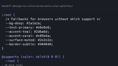 Accessible color palettes
Build WCAG-compliant color palettes in oklch with real contrast ratios for every swatch, hsl fallbacks for older browsers, and light-dark mode parity.
Accessible color palettes
Build WCAG-compliant color palettes in oklch with real contrast ratios for every swatch, hsl fallbacks for older browsers, and light-dark mode parity.
-
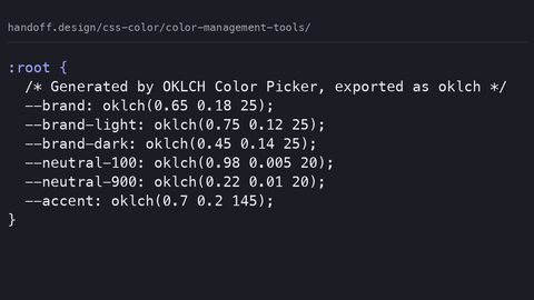 Color management tools
Evaluate color management tools by whether they output modern CSS like oklch and color-mix, with complete palette samples and real contrast ratios.
Color management tools
Evaluate color management tools by whether they output modern CSS like oklch and color-mix, with complete palette samples and real contrast ratios.
-
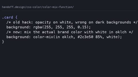 Color mix function
Use CSS color-mix() to blend colors dynamically in any color space, with a complete fallback pattern for browsers that do not support the function.
Color mix function
Use CSS color-mix() to blend colors dynamically in any color space, with a complete fallback pattern for browsers that do not support the function.
-
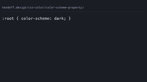 Color scheme property
The CSS color-scheme property tells the browser to render its own chrome, form controls, and scrollbars in light or dark mode, separate from your authored styles.
Color scheme property
The CSS color-scheme property tells the browser to render its own chrome, form controls, and scrollbars in light or dark mode, separate from your authored styles.
-
 Contrast ratios
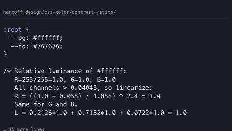
Calculate WCAG 2.2 contrast ratios from CSS colour values using the relative luminance formula, with exact AA and AAA thresholds for text and non-text content.
Contrast ratios
Calculate WCAG 2.2 contrast ratios from CSS colour values using the relative luminance formula, with exact AA and AAA thresholds for text and non-text content.
-
 CSS gradients
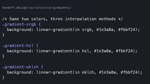
 now support color interpolation in oklch, hsl, and sRGB, producing visibly different results from the same color stops with a medium paint cost.
CSS gradients
CSS gradients now support color interpolation in oklch, hsl, and sRGB, producing visibly different results from the same color stops with a medium paint cost.
-
 Currentcolor guide
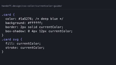
The CSS currentColor keyword inherits the computed color value and applies it to borders, shadows, and SVG fills without declaring custom properties.
Currentcolor guide
The CSS currentColor keyword inherits the computed color value and applies it to borders, shadows, and SVG fills without declaring custom properties.
-
 Dark light mode
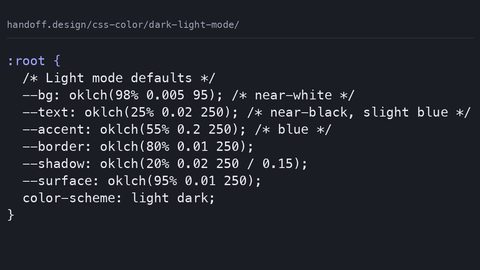
Build a dark and light mode theme with CSS custom properties, the light-dark() function, and the color-scheme meta tag to prevent a flash of the wrong theme.
Dark light mode
Build a dark and light mode theme with CSS custom properties, the light-dark() function, and the color-scheme meta tag to prevent a flash of the wrong theme.
-
 Hsla colors
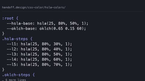
HSLA colors are perceptually uneven because they map to sRGB; OKLCH provides uniform lightness and wider gamut with a simple two-value fallback pattern.
Hsla colors
HSLA colors are perceptually uneven because they map to sRGB; OKLCH provides uniform lightness and wider gamut with a simple two-value fallback pattern.
-
 Modern color formats
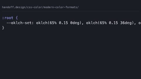
OKLCH is a perceptually uniform CSS color space where equal numerical steps look equal to the eye, with gamut mapping that LCH does not guarantee.
Modern color formats
OKLCH is a perceptually uniform CSS color space where equal numerical steps look equal to the eye, with gamut mapping that LCH does not guarantee.
Read next
-
Color scheme property
The CSS color-scheme property tells the browser to render its own chrome, form controls, and scrollbars in light or dark mode, separate from your authored styles.
-
Color management tools
Evaluate color management tools by whether they output modern CSS like oklch and color-mix, with complete palette samples and real contrast ratios.
-
Color mix function
Use CSS color-mix() to blend colors dynamically in any color space, with a complete fallback pattern for browsers that do not support the function.
-
CSS gradients
CSS gradients now support color interpolation in oklch, hsl, and sRGB, producing visibly different results from the same color stops with a medium paint cost.
-
Currentcolor guide
The CSS currentColor keyword inherits the computed color value and applies it to borders, shadows, and SVG fills without declaring custom properties.
-
Contrast ratios
Calculate WCAG 2.2 contrast ratios from CSS colour values using the relative luminance formula, with exact AA and AAA thresholds for text and non-text content.