CSS Box-Shadow Generator Output Quality and the Hand-Written Equivalent
What CSS box-shadow generators actually emit, why verbose rgba() and absolute units hurt, and the hand-written equivalent using custom properties and layered shadows.
A CSS box-shadow generator output looks finished, but it is a trap for anyone who ships it unchanged. The tool spits out a single declaration with absolute pixel values, a hard-coded rgba() color, and no thought for what the shadow costs the compositor. The generator solved the math of blur and spread, then stopped. It did not solve inheritance. It did not solve maintainability. It did not solve paint cost. The hand-written equivalent does all three in fewer bytes. Here is the generator’s output verbatim, the replacement that uses custom properties and relative units, and the @supports fallback that moves the shadow off the main thread entirely.
What a Generator Emits and Why It Fails
Open any box-shadow generator, drag the sliders, and copy the CSS. You get something like this:
.shadow-card {
  box-shadow: 0px 4px 8px rgba(0, 0, 0, 0.15), 0px 2px 4px rgba(0, 0, 0, 0.10);
}
That works in every browser that supports box-shadow, which is all of them. But it carries three hidden debts.
The Inheritance Problem
First, the absolute pixel values ignore the element’s own size. A shadow designed for a small card looks wrong on a large card, and you must regenerate it. Second, the rgba() color does not inherit from the element’s text color. Change the theme from dark text to light text, and the shadow stays a dark smudge.
The Hidden Paint Cost
Third, there is no mention of what this declaration does to rendering speed. Two layered shadows on a card are cheap on a desktop, but stack them on a list of fifty cards and the DevTools Performance panel shows a repaint that takes real milliseconds. The generator gave you a value, not a system.
The Hand-Written Equivalent with Custom Properties
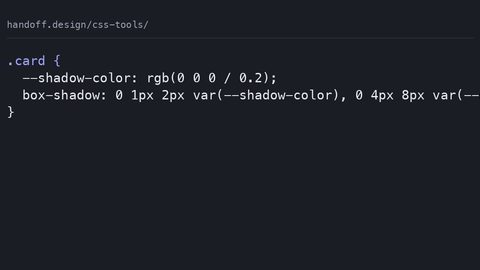
Write the shadow yourself, and you get the same visual result with three advantages: the color follows the text, the offsets scale with the element, and the paint cost is visible in the declaration. Start with a custom property for the shadow color:
.card {
  --shadow-color: currentColor;
  --shadow-blur: 0.25em;
  --shadow-offset: 0.125em;
  box-shadow: 0 var(--shadow-offset) var(--shadow-blur) var(--shadow-color);
}
The currentColor keyword makes the shadow inherit the element’s color property. Change the card’s text from black to white, and the shadow follows without editing the shadow line. The em units scale with the font size, so a card rendered at 16px and one rendered at 24px get proportionally correct shadows.
Counting the Commas
And the declaration now names its own cost: one shadow, one blur radius, no spread. If you need a second layer, add it explicitly and count the commas. Every comma after box-shadow doubles the paint work on low-end devices.
What Generator Tools Actually Ship
Separate the slider from the output. The slider is fine. It lets you preview offsets and blur in real time, which is faster than guess-and-check in DevTools. What every generator ships is the problem. They all emit rgba() because it is the oldest color syntax and works everywhere. They all emit absolute px because the slider reads pixels. They all emit a comma-separated list of two or three shadows because that looks impressive in the preview. None of them emit a variable. None of them use currentColor. None of them warn you that the second shadow you added is the one that will tank scroll smoothness on a mid-range Android phone. Use the generator to find the numbers, then hand-write the declaration with custom properties. Do not paste the output.
What Multiple Shadows Cost the Compositor
The cost of multiple box-shadows is not a myth, and it is not a micro-optimisation for most pages. Every shadow in the comma-separated list forces the browser to run a separate blur pass on the element’s backdrop. The blur radius determines how many pixels each pass touches. A single shadow with a 0.25em blur on a card touches a few thousand pixels. Two shadows with different offsets touch twice that. On a page with forty cards, that is eighty blur passes per frame.
When the Compositor Cannot Help
The compositor can cache the result if the element does not move. The moment you animate the shadow or scroll the card into view, the paint cost lands on the main thread. Measured in the DevTools Performance panel, a box-shadow animation shows long yellow paint tasks, not green compositor work. The rule: one shadow for depth, a second only for a border-like effect, and never animate box-shadow. Use transform for motion instead.
Measuring and Avoiding the Repaint
Open DevTools, record a scroll, and look for the yellow paint range in the Performance panel. A shadow that covers a large area with a large blur radius produces a wide yellow bar. The fix is not to remove the shadow. Choose where it lives.
Inset Versus Outer Shadows
An outer shadow paints the area outside the element, which the browser must redraw every time the element moves. An inset shadow paints inside the element’s border box, which is cheaper because it clips to the element’s own bounds. If you only need a border glow, inset is the better choice. If you need an outer shadow for depth, accept the paint cost and do not stack layers. The compositor does not help with box-shadow at all. It is a paint-time property, unlike transform or opacity, which are compositor-only. That is the hard limit, and no generator will tell you it.
The @supports Fallback: Filter Drop-Shadow on the Compositor
There is one escape hatch from paint cost, and it is not box-shadow. The filter: drop-shadow() function produces a visually similar result with a different speed profile. The filter is applied to the element’s rendered bitmap, and in modern engines it can be promoted to the compositor when the element is on its own layer. That is not guaranteed, but it is possible. It is never possible with box-shadow. Write the fallback with @supports so that browsers that can handle the filter get it, and the rest keep the box-shadow:
.card {
  box-shadow: 0 var(--shadow-offset) var(--shadow-blur) var(--shadow-color);
}

@supports (filter: drop-shadow(0 0 0 #000)) {
  .card {
    box-shadow: none;
    filter: drop-shadow(0 var(--shadow-offset) var(--shadow-blur) var(--shadow-color));
  }
}
The @supports query tests the property and value pair directly, so it fails closed in older browsers that lack filter. The drop-shadow filter uses the same offset and blur syntax, and it inherits currentColor just like box-shadow does.
The Alpha Shape Trade-Off
The trade-off: drop-shadow follows the element’s alpha shape, including any border-radius or transparency, while box-shadow draws a rectangle. For a card with rounded corners, drop-shadow is more accurate. For a square button, they look identical, but the filter may composite off the main thread. That is the one place where you sidestep the paint cost entirely.
When to Skip the Generator Entirely
Skip the generator if you need a shadow that responds to theme changes or element size. The generator gives you a one-time value, not a token. The hand-written approach with custom properties gives you a token that you can reuse across ten components and update in one place. Set the shadow color to currentColor and the offsets in em. You have a system that adapts without regeneration.
Hard Shadows and Brand Colors
If the design calls for a hard shadow with no blur, write box-shadow: 0 0 0 0 var(–shadow-color) with a spread radius instead. That is the one shadow that paints almost nothing. And if you are on a page with one card, do not bother with the filter fallback. The box-shadow is fine and the @supports block adds bytes for no benefit. The failure case that sends people back to the generator is when they need a shadow that matches a brand color exactly. The answer is not a generator. It is oklch(), which gives you a perceptually uniform color space that survives compression better than an arbitrary rgba() triplet. Put the color in a custom property and you never touch the shadow line again.
FAQ: Generator Output and Hand-Written CSS
Why does the generator always output rgba() instead of currentColor?
The generator cannot know your element’s text color, so it picks a black shadow with an alpha value. rgba() is the oldest safe syntax, but it breaks inheritance. currentColor solves that by reading the computed color property at use time.
Does adding a second box-shadow always double the paint cost?
Not always, but usually. Each shadow runs a separate blur pass. If the two shadows have the same blur radius and offset, the browser may merge them. If they differ, they paint separately. The DevTools Performance panel shows the difference as separate yellow tasks.
Is filter: drop-shadow() a drop-in replacement for box-shadow?
No. drop-shadow follows the element’s alpha shape, so transparent areas inside the element get no shadow. box-shadow ignores the shape and draws a rectangle. For rounded corners, drop-shadow is more accurate, but it also uses the filter pipeline, which changes stacking contexts.
Should I use em units or px for the blur radius?
Use em if the shadow should scale with the font size. Use px if the shadow is a fixed visual detail that must not change with text size. The generator gives px, which is why its output looks wrong on a card with a larger heading.
The One Number That Changes Your Decision
The single most important figure in this entire discussion is the paint cost difference between one shadow and two. A generator that ships two shadows by default is doubling your paint work before you even look at the page. Verify this in the DevTools Performance panel in under a minute: record a scroll, find the yellow paint range, and count the tasks. One shadow produces one task per frame, two shadows produce two. On a low-end device with a 60Hz display, that is the difference between a smooth scroll and a janky one. The hand-written replacement with one shadow and currentColor does not read better. It is measurably cheaper. If you are building a page with many cards, that is the difference between shipping and shipping with a speed bug.
Who Should Hand-Write and Who Should Stick with the Generator
This suits the working front-end developer who ships CSS into production and has seen a Performance panel show a long paint task. It also suits the technical writer who needs to explain why a shadow declaration costs what it costs without guessing. It does not suit the designer who wants a quick preview of a shadow for a mockup. The generator is the right tool for that, and the output will not hurt a static image. It does not suit the beginner learning CSS from zero, who should start with the formal syntax of box-shadow on MDN, not with a tool that hides the grammar. The mistake that recurs: a developer pastes the generator output, sees it work in a desktop browser, and ships it without ever recording a frame in the Performance panel. That is the failure this guide exists to prevent. The generator is a sketchbook, not a building material.