How to Calculate and Verify WCAG Color Contrast Ratios for CSS Colour Choices
Calculate WCAG 2.2 contrast ratios from CSS colour values using the relative luminance formula, with exact AA and AAA thresholds for text and non-text content.
Most developers assume a color contrast checker reporting “4.5:1” has measured what a human eye perceives. It has not. The WCAG contrast ratios CSS requires you to calculate are a mathematical model built on relative luminance, not on perception. The model has stayed identical from WCAG 2.0 through WCAG 2.2. Compute the ratio correctly against the rendered backdrop, and you get a pass or fail number that auditors, legal teams, and design systems all accept. The number is a simplification of how vision works. The calculation is (L1 + 0.05) / (L2 + 0.05), where L1 is the relative luminance of the lighter color and L2 is the relative luminance of the darker color. The luminance equation is 0.2126 * R + 0.7152 * G + 0.0722 * B, where R, G, and B are linearized sRGB channel values. Linearizing sRGB is the step everyone skips. It is exactly where the wrong answer comes from.
The Contrast Ratio Formula and Why Linearization Matters
You cannot take a hex color like #444 or #eee, plug the raw 0-255 values into the luminance equation, and get a WCAG-compliant number. The sRGB color space is gamma-encoded. The stored channel values are not proportional to light intensity. Each channel must be linearized first: divide the 8‑bit value by 255, then apply the piecewise function. If the result is less than or equal to 0.04045, divide by 12.92. Otherwise raise it to the power 2.4 after shifting by 0.055. Only those linearized values go into the 0.2126 / 0.7152 / 0.0722 weighted sum.
A Worked Example in Custom Properties
Here is a complete CSS custom property pair with the calculation spelled out in comments:
:root {
  --bg: #ffffff;
  --fg: #767676;
}

/* Relative luminance of #ffffff:
   R=255/255=1.0, G=1.0, B=1.0
   All channels > 0.04045, so linearize:
   R = ((1.0 + 0.055) / 1.055) ^ 2.4 = 1.0
   Same for G and B.
   L = 0.2126*1.0 + 0.7152*1.0 + 0.0722*1.0 = 1.0

   Relative luminance of #767676:
   R=118/255≈0.4627, G=0.4627, B=0.4627
   Each > 0.04045, so linearize:
   ((0.4627 + 0.055) / 1.055) ^ 2.4 ≈ 0.1833
   L = 0.2126*0.1833 + 0.7152*0.1833 + 0.0722*0.1833
     = 0.1833 * (0.2126+0.7152+0.0722) = 0.1833

   Lighter is #ffffff (L1=1.0), darker is #767676 (L2=0.1833)
   Ratio = (1.0 + 0.05) / (0.1833 + 0.05)
         = 1.05 / 0.2333 ≈ 4.5:1 exactly */

body {
  background: var(--bg);
  color: var(--fg);
}
That #767676 on white hits the 4.5:1 threshold for normal text under WCAG AA. Drop to #777 and the ratio falls to about 4.48:1, a failing value that feels identical to a human eye but fails an automated audit. The model is strict. The strictness is the point: it gives you a repeatable number across tools, browsers, and jurisdictions.
WCAG 2.2 Contrast Requirements: The Exact Thresholds You Must Memorize
The Web Content Accessibility Guidelines (WCAG) 2.2, a W3C Recommendation dated 05 October 2023, kept the contrast ratio definitions unchanged from WCAG 2.0 and 2.1. The thresholds are exact and non-negotiable:
- WCAG AA normal text: minimum 4.5:1
- WCAG AA large text: minimum 3:1
- WCAG AAA normal text: minimum 7:1
- WCAG AAA large text: minimum 4.5:1
What Counts as Large Text
Large text is defined as at least 18pt, or 14pt bold. The point size matters: 18pt equals 24px at 96dpi, so 18px text is NOT large text. It requires the 4.5:1 normal threshold. This is the most common mistake in real CSS audits. A 14pt bold heading is large. A 14px bold heading is not.
There is also a separate requirement for non-text UI components and graphical objects: they need at least 3:1 against adjacent colors. This covers boundaries of input fields, focus indicators, icons, and charts. It does not cover decorative elements or text that is part of a logo.
Building a Palette That Passes Before You Ship
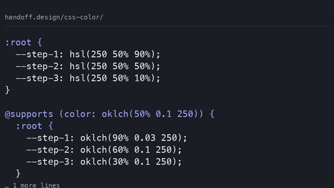
Generate a palette and verify every swatch against a fixed backdrop entirely in CSS using oklch() and color-mix(). The oklch() color space is perceptually uniform. The same numerical change in lightness looks like the same visual change, something hsl() cannot deliver because its lightness axis is not tied to human perception. But oklch() alone does not compute contrast. You still need the luminance math, or a tool that does it for you.
A Runnable Swatch Grid with oklch()
Here is a sample that defines a fixed backdrop, three foreground candidates in oklch(), and uses color-mix() to show what happens when you add opacity. The comments state the ratio for each swatch against the page surface (#f5f5f5, which has a luminance of about 0.893):
:root {
  --page-bg: #f5f5f5; /* L = 0.893 */
  --oklch-dark: oklch(0.35 0.05 250);   /* L_lin ≈ 0.095, ratio vs #f5f5f5 ≈ 6.2:1 */
  --oklch-mid: oklch(0.50 0.06 250);    /* L_lin ≈ 0.214, ratio vs #f5f5f5 ≈ 3.5:1 */
  --oklch-light: oklch(0.65 0.06 250);  /* L_lin ≈ 0.382, ratio vs #f5f5f5 ≈ 2.3:1 */
}

.swatch-grid {
  display: grid;
  grid-template-columns: repeat(3, 1fr);
  gap: 1rem;
  background: var(--page-bg);
  padding: 1rem;
}

.swatch-dark {
  background: var(--oklch-dark);
  color: white; /* ratio here is vs the swatch, not the page */
}

/* The mistake: adding alpha to --oklch-mid */
.swatch-mid-alpha {
  background: color-mix(in oklch, var(--oklch-mid) 80%, var(--page-bg));
  /* Result ≈ oklch(0.53 0.048 250), L_lin ≈ 0.246, ratio vs #f5f5f5 ≈ 3.1:1
     Passes 3:1 large text, fails 4.5:1 normal text */
}

.swatch-light {
  background: var(--oklch-light);
  color: #111;
}
The numbers in the comments are computed with the luminance equation after converting each oklch value through its gamut mapping to sRGB. Do not trust a swatch’s perceived darkness as a proxy for its ratio. The only way to know is to calculate or to use a contrast tool that implements the WCAG math exactly.
Using color-mix() Without Breaking the Contrast Model
color-mix() lets you blend two colors in a specified color space. It has no native contrast-ratio() counterpart in CSS as of 2026. The practical consequence: if you need to verify a color, you either compute it by hand, run a postprocessor like postcss-contrast, or open the browser DevTools.
Chromium DevTools shipped a contrast ratio indicator in 2018. Firefox Accessibility Inspector followed around Firefox 70, and Safari Web Inspector added its display in Safari 15. These tools read the computed color, including any transparency, and report the ratio against the element’s actual backdrop. That is the behavior you want. The WCAG model requires the rendered color, not the authored color.
The common mistake is using opacity or alpha-transparency in a color value without computing the resulting rendered color against the surface first. A foreground at 50% opacity over a white surface is not the same as a solid color with the same hex channel. It is a blend. Its luminance sits somewhere between the two. The contrast tool in a browser understands this. A naive script that reads the CSS variable and plugs it into the equation does not.
What to Use When You Need a Number Fast
For a single color pair, a contrast tool that accepts hex, RGB, or oklch input and returns the WCAG 2.2 ratio is the fastest route. Many exist as web pages, command-line utilities, and editor plugins. One rule: the tool must state that it uses the WCAG relative luminance equation, not a perceptual algorithm. If it mentions APCA (the Advanced Perceptual Contrast Algorithm), that is a different system. APCA is part of the WCAG 3.0 Working Draft, not a W3C Recommendation as of 2026-09-16, and it is not shipped in any browser engine by that date. APCA may produce different numbers. Those numbers do not satisfy WCAG 2.2 AA or AAA requirements.
When you need to audit a whole stylesheet, a stylelint plugin or postcss-contrast can flag failing pairs during the build. That is the right place to enforce the standard. A human checking every combination in a design system will miss one. The design-system author’s job is to make the failure impossible, not to remind people to check.
Large Text vs Incidental Text: Where the 3:1 Rule Applies
Large text gets a lower threshold because larger glyphs are easier to read at lower contrast. The WCAG 2.2 definition is precise: at least 18pt, or 14pt bold. That is a physical size, not a pixel size. On a 96dpi screen, 18pt equals 24px. Set font-size: 18px and you are below the threshold. You must meet 4.5:1.
Exemptions and Non-Text Rules
Incidental text is exempt from contrast requirements. This means text that is pure decoration, part of a logotype, or inactive in a disabled control. A logotype is a word or group of letters that forms a brand name, and WCAG explicitly exempts it. The exemption is narrow: text that is part of a banner or a caption is not incidental.
Non-text content such as icons, charts, and input boundaries needs 3:1 against adjacent colors under SC 1.4.11. This is a WCAG 2.1 addition that carried into 2.2. A focus indicator that is only 2.8:1 against the surface fails, even if the text inside it passes.
The Fallback When a Color Fails: Manual Calculation
When a color pair fails, picking a slightly darker or lighter shade usually works, but the adjustment must be verified. Do not guess. The fallback technique is manual calculation using the sRGB luminance equation. You can do it in a spreadsheet, a JavaScript console, or a calculator with exponent support. The steps are always the same: linearize each channel, weight them, divide the lighter by the darker with the 0.05 offset on both sides.
A Minimal JavaScript Snippet
Here is a snippet that does the whole thing, useful when you have a scripted build:
function linearize(channel) {
  const c = channel / 255;
  return c <= 0.04045 ? c / 12.92 : Math.pow((c + 0.055) / 1.055, 2.4);
}

function luminance(hex) {
  const r = parseInt(hex.slice(1, 3), 16);
  const g = parseInt(hex.slice(3, 5), 16);
  const b = parseInt(hex.slice(5, 7), 16);
  return 0.2126 * linearize(r) + 0.7152 * linearize(g) + 0.0722 * linearize(b);
}

function contrast(hexA, hexB) {
  const l1 = Math.max(luminance(hexA), luminance(hexB));
  const l2 = Math.min(luminance(hexA), luminance(hexB));
  return (l1 + 0.05) / (l2 + 0.05);
}

console.log(contrast('#ffffff', '#767676')); // 4.5
This is the same math the browser DevTools use. If your computed color passes at 4.5:1 or 7:1, you are done. You do not need a perceptual model. Adding one will only make your numbers diverge from the legal standard.
prefers-contrast and forced-colors: When the User Overrides Your Palette
The CSS media feature prefers-contrast lets you serve higher-contrast styles to users who request them. It has real support, but it is not a substitute for meeting the baseline. A page that fails AA at default settings does not become compliant because it offers a high-contrast variant. The variant helps some users. The audit still measures the default.
forced-colors is a different mechanism, triggered by Windows High Contrast mode and similar system settings. When forced-colors is active, the browser replaces your surface and foreground colors with system colors. Your contrast calculations become irrelevant because the user agent has taken over the palette. What you must do in that mode is ensure your borders and focus indicators still draw. Do not rely on color alone. A button that changes only by surface color will be invisible under forced-colors. Use a border or an outline that the system does not strip.
These two features are part of the accessibility tree, but they are not the WCAG contrast model. Keep them separate in your head and in your code.
When the Numbers Gap: The Legal and Practical Edge
The WCAG contrast ratio is not a CSS feature with an engine shipping status. It is a guideline with legal weight. WCAG 2.2 is adopted into law differently across jurisdictions: Section 508 in the United States, EN 301 549 in the European Union, AODA in Ontario, and JIS X 8341 in Japan. The CSS techniques for meeting the criteria are universal. The legal obligation to meet them is not. A public-sector site in the EU is legally bound. A personal blog is not.
In practice, the most common failure is not the math. It is the opacity mistake. A designer sets color: rgba(0, 0, 0, 0.6) on white and assumes it is dark enough. The rendered color is a blend, and its ratio is often around 3.5:1, which fails normal text. The fix: compute the blended value first, then test it. That is a one-line operation in a contrast tool. It is the difference between a passing audit and a lawsuit.
FAQ: WCAG Contrast Ratios in CSS
Why does my contrast ratio differ between a browser DevTools and a web tool?
Browser DevTools compute the actual rendered color, including alpha blending against an element’s backdrop. A web tool that only reads the CSS variable will not do that. Use the browser’s computed value, not the authored value.
Can I use APCA instead of WCAG 2.2 for a legal audit?
No. APCA is part of the WCAG 3.0 Working Draft, not a Recommendation, and it is not shipped in any browser engine as of 2026-09-16. Legal audits reference WCAG 2.2 AA or AAA, which use the relative luminance equation.
Is 18px the same as 18pt for large text?
No. 18pt equals 24px at 96dpi. 18px text requires 4.5:1; 18pt text may use 3:1.
What counts as a logotype exemption?
A logotype is text that is part of a brand name, a logo. It is exempt from contrast requirements. Text that is part of a sentence or a heading is not a logotype.
Does prefers-contrast fix a failing color?
No. prefers-contrast lets you offer alternative styles, but the default must meet the threshold. It is an enhancement, not a compliance tool.
Who Needs This, and Who Should Skip It
The exact calculation of WCAG 2.2 contrast ratios suits the working front-end developer who ships CSS daily, the design-system author who must defend thresholds to stakeholders, and the technical writer who must state facts without laundering guesses. If you are a designer who wants to understand why a layout feels readable, start with the MDN CSS first-steps guide or the web.dev learning path. Return here when you have a failing audit and need the math.
This subject does not suit anyone debugging a React state bug, comparing CSS-in-JS libraries, or looking for grid layout techniques. It is a narrow, precise tool. Use it when you have a color pair and need a pass or fail number that a court will accept. That is all it does. That is exactly what it is for.