Collaboration Tools for Design Teams and What They Export for Developers
Evaluate design collaboration tools by what they export for developers: usable CSS snippets, design tokens, and component state documentation.
Open a Figma file, copy a style, paste it into your editor. You get raw pixel values and no spacing scale. You already know the pain this page addresses. The gap between a designer’s collaboration tool and what a developer can actually use is real. The tool designers love for real-time editing is the tool that makes you rewrite everything. This page judges collaboration platforms strictly by what they export for developers, not by their multiplayer cursors or comment threads. You are not here for a feature tour. You are here to find out which tool emits CSS you can use without a rewrite. The answer is not the most polished one. It is the one that emits computed spacing in rem or token names, colours in the format your codebase already uses, and component states documented with selectors.
What a Handoff Tool Actually Owes a Developer
A design handoff platform is not a social network for designers. It is a contract between design intent and production code. Before you evaluate any tool, define what a usable specification means. The developer needs three things, in order of importance.
Computed Spacing In Rem Or Token Names
First, computed spacing values in rem or design-token names, not raw pixel measurements. A button with padding 16px is useless if your codebase uses a 4-point spacing scale and tokens like –space-4.
Colour Values In One Format
Second, colour values in the format the codebase uses, whether that is oklch or hex, and never both mixed in the same export.
Component States With Selectors
Third, component states documented with their CSS class or attribute selectors, not just visual screenshots of hover and focus. A screenshot of a hover state does not tell you whether the selector is .button:hover or [data-state=”hover”]. The best handoff tool emits a design token file that maps directly to CSS custom properties. That is the single most valuable export in the entire category.
Figma Collaboration Developer Handoff Output
Figma Dev Mode is the default starting point for most teams because Figma collaboration is the default design workflow. What Dev Mode exports for developers is better than the old copy-paste-from-canvas approach, but it has specific strengths and limits.
Auto Layout Inspection Works
When a frame uses auto layout with gap, Dev Mode emits flexbox with gap, not margins. Here is a real example of what Figma exports when a designer builds a button row with auto layout, gap 8, padding 16, and radius 8:
.button-row {
  display: flex;
  align-items: center;
  gap: 8px;
  padding: 16px;
  border-radius: 8px;
}
That snippet is usable as-is if your codebase accepts pixels, but the value is the structure.
Absolute Positioning Exports Break
The failure case appears when designers use absolute positioning inside a frame. Figma exports position: absolute with top, left, width, and height in pixels, and those values are almost never correct for responsive layouts. Here is what you get from a pinned element in Figma:
.pinned-badge {
  position: absolute;
  top: 48px;
  left: 32px;
  width: 120px;
  height: 24px;
}
That snippet must be rewritten for any breakpoint, any font-size change, or any content length change. Figma Dev Mode is excellent for flexbox generation from auto layout, but you must audit every absolute-position export.
Colour And Component Gaps
The colour export is where Figma falls short for modern codebases: it emits hex by default, and if your design system uses oklch, you will convert every value. The component documentation pane shows variant names and properties, but it does not emit the CSS class or attribute selectors automatically. You have to map those yourself. For a design review tool CSS specification export, Figma Dev Mode is a good baseline but not a complete solution.
Design Review Tool CSS Specification Export
When you move beyond Figma, the dedicated handoff platforms earn their keep.
Zeplin: Reference, Not Production Code
Zeplin has been the veteran in this space for years, and its design handoff platform CSS code generation has a specific character. Zeplin exports CSS with a focus on readability, but it has a known quirk: it outputs hex colours and pixel spacing by default, and it does not understand auto layout the way Figma Dev Mode does. If a designer uses a flexbox layout in Zeplin, the export often degenerates into fixed values. The strength of Zeplin is its section anatomy. It groups styles by component, shows typography scale export as a list of font-size and line-height pairs, and includes a spacing panel. The component documentation is visual-first, which means you get screenshots of states but not selector strings. For a developer, Zeplin is a reference for values, not a generator of production-ready CSS.
InVision DSM And The Open-Source Alternative
InVision DSM was the design-system manager that promised design token export and version control design files, but it has been sunset. Any team still on it is running unsupported software. The lesson from InVision DSM applies to every tool: if the platform stops shipping, your design token export dies with it. Penpot is the open-source alternative that has real-time collaboration, but its CSS output is still young. It emits basic properties but misses auto layout inspection nuances. The practical advice: if your team is already in Figma, stay there and use Dev Mode plus a token plugin. If you are evaluating a separate handoff platform, ask for a live demo of the CSS snippet generation for a component with responsive behaviour, not a static mock. The failure case is a tool that generates beautiful screenshots but no selectors.
Design Feedback Tool Developer Annotation
A design feedback tool that does not export developer annotation is a toy. The annotation layer is where the developer learns why a specific value exists, which breakpoint changes what, and which colour is semantic versus decorative. Figma’s comment annotation is thread-based and lives inside the file. It does not export to your codebase. Zeplin has a better approach: it lets a designer pin a note to a specific layer, and that note appears in the developer view alongside the CSS snippet. The annotation can include a note like “use –space-4 not 16px” or “this button uses [data-state=open]”, which is exactly the kind of developer annotation that saves a rewrite. The problem is that annotation is manual. If the designer forgets, you get the raw pixel value. The rule for a team adopting a feedback tool: make the annotation a required field for every component before it leaves the design review. The failure case is a tool that stores annotations in screenshots. Those are not searchable and not linked to the code export.
Version Control Design Files Developer Access
Version history in design files is not the same as version control in code, but the developer needs both. Figma’s version history lets you roll back a file, but it does not give you a diff of what changed in the CSS output. The developer access problem is real: when a designer changes a spacing value, you need to know which token changed and why. Figma Dev Mode shows the current value, but not the history of that value.
Export Tokens To A Repository
The practical workaround is to export design tokens to a repository. A design handoff platform that supports branching design files, like Figma’s branching in enterprise plans, lets you experiment without polluting the main file. That is a designer workflow, not a developer one. What the developer needs is a commit log of token changes. The most reliable approach is a token pipeline: a plugin exports tokens as JSON, you commit that JSON to your git repo, and a build step generates CSS custom properties from it. Here is an example of what that design token JSON export should look like:
{
  "color": {
    "background": {
      "primary": "oklch(0.95 0.01 220)",
      "hover": "oklch(0.92 0.015 220)"
    },
    "text": {
      "primary": "oklch(0.2 0.05 250)",
      "muted": "oklch(0.5 0.03 250)"
    }
  },
  "spacing": {
    "1": "0.25rem",
    "2": "0.5rem",
    "3": "0.75rem",
    "4": "1rem"
  },
  "radius": {
    "sm": "0.25rem",
    "md": "0.5rem"
  }
}
That token file maps directly to CSS custom properties, and it is the one export that is most worth having. It decouples the design tool from the codebase. A change in Figma does not require a CSS rewrite; it requires a token value change and a rebuild.
The Failure Case: What to Do When the Export Is Wrong
Every collaboration tool eventually fails you. The specific failure mode is an export that looks plausible but is wrong on inspection.
Three Common Failures
The most common case is a CSS snippet that uses position: absolute with pixel values from a fixed canvas. You paste it, and the layout breaks at the first viewport change. The rule: if the snippet contains position: absolute, treat it as a hint, not as code. The second failure mode is a colour value in hex when your codebase uses oklch. The conversion is not a simple mechanical step because oklch has a different gamut. The third failure mode is a component state documented as a screenshot. You have to guess whether the selector is a class, an attribute, or a pseudo-class.
Build A Post-Processing Step
When any of these happen, do not fight the tool. Check whether the tool has a code snippet accuracy setting that lets you choose the output format. Figma Dev Mode has a settings panel where you can toggle between px and rem, and some plugins can convert hex to oklch. Zeplin has a similar setting for colour formats. If the tool does not support your format, build a small conversion script in your build pipeline. Do not manually rewrite every value. No tool emits perfect CSS for every codebase. You need a post-processing step that maps tool output to your design tokens. The fastest path is to use the design token export as the source of truth, and ignore the per-component CSS snippets for anything beyond structure.
When the Tool Shuts Down or Changes Its Export
Software dies, and your handoff exports die with it. InVision DSM was the cautionary tale: teams that had built their entire design-system documentation on it lost the token export and the component documentation overnight. Never let a third-party tool own the only copy of your design tokens. The design token JSON export is a file. It should live in your repository, not in the tool’s cloud. If a tool changes its export format, you have a regression test: your build should fail when the token file no longer matches the expected schema. Set up a weekly job that pulls the latest token export from the design tool and commits it to a branch, so you can see the diff in a code review. That way, a designer changing a colour from hex to oklch becomes a visible, reviewable change, not a silent surprise in the next build. The failure case is a tool that exports tokens as a proprietary format. You are locked in, and you cannot migrate without a rewrite.
The One Export That Is Worth the Most
Take one thing from this page: the design token file that maps directly to CSS custom properties is the most valuable export in the entire collaboration-tool category. It is not a CSS snippet. It is a data file that your build pipeline can turn into CSS custom properties. Here is the final code sample, a complete token-to-CSS pipeline step that turns the JSON above into CSS custom properties, including a fallback for browsers that do not support oklch:
:root {
  --color-background-primary: oklch(0.95 0.01 220);
  --color-background-hover: oklch(0.92 0.015 220);
  --color-text-primary: oklch(0.2 0.05 250);
  --color-text-muted: oklch(0.5 0.03 250);
  --spacing-1: 0.25rem;
  --spacing-2: 0.5rem;
  --spacing-3: 0.75rem;
  --spacing-4: 1rem;
  --radius-sm: 0.25rem;
  --radius-md: 0.5rem;
}

@supports not (color: oklch(0 0 0)) {
  :root {
    --color-background-primary: #f2f2f2;
    --color-background-hover: #e6e6e6;
    --color-text-primary: #222;
    --color-text-muted: #666;
  }
}
The @supports block is your WCAG contrast check in code. It ensures the fallback colours meet contrast even when oklch is unsupported. The token file is what you version, what you review, and what you trust. The CSS snippets from the tool are the starting point. The token file is the contract.
Design Token Export, Spacing, and Responsive Breakpoints
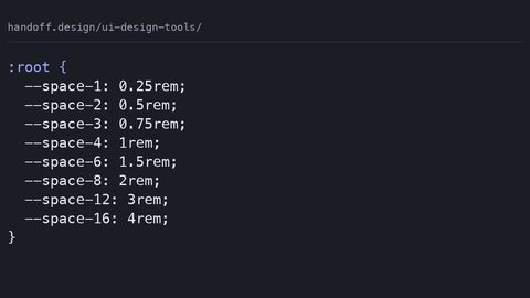
A design token export that includes a spacing scale and responsive breakpoint documentation is the difference between a handoff tool and a handoff platform. The spacing scale must use the same increments as your codebase. If your design uses an 8-point grid, the tokens are –space-1: 0.5rem, –space-2: 1rem, and so on.
Breakpoints Belong In The Token File
The responsive breakpoint documentation is where most tools fall short. They export a static design and no breakpoint information. The developer needs to know which token changes at which viewport width, and that requires the tool to support a breakpoint-aware export. Figma’s auto layout inspection does not handle breakpoints. It shows one layout. Zeplin has a breakpoint feature, but it requires the designer to set it up manually. If your team uses responsive design, do not rely on the tool to export breakpoints. Define them in your token file as a separate object, like this:
{
  "breakpoints": {
    "sm": "640px",
    "md": "768px",
    "lg": "1024px"
  }
}
That file becomes the single source of truth for both the designer and the developer. The failure case is a tool that exports a fixed-width layout and you have to guess the breakpoints.
Component Documentation and State Selectors
The component documentation pane in any handoff tool is only as useful as the selectors it emits. A design feedback tool that shows a hover state as a screenshot forces you to infer the selector. A tool that emits [data-state=”hover”] or .button:hover is doing its job. The developer annotation layer is where this gets decided. When you evaluate a tool, ask the vendor for a sample component with five states, and check whether the export includes the selector for each state. The most common failure is that the tool exports the base style and then a screenshot for hover, but no selector. The rule: if the state is not codified as a selector, it is not documentation; it is a decoration. The best tools let the designer annotate each state with the exact selector, and that annotation survives the export. This is also where the WCAG contrast check matters. A hover state that darkens the text may fall below the contrast ratio, and a tool that checks this against the exported colour values is worth its price. Most tools do not do this, so run your own contrast check in the build pipeline.
What This Guide Does Not Cover
Figma multiplayer editing, Penpot real-time collaboration, Zeplin handoff, Abstract version control, and design-system documentation platforms are not CSS specifications. They are tool features. The /ui-design-tools/ hub owns the category overview. This guide is about the CSS output, not the collaboration features. If you are looking for a comparison of comment threads or presence indicators, you are in the wrong place. If you are looking for what a tool emits that you can paste into a stylesheet, you are in the right place.
Who This Subject Suits and Who It Does Not
This subject suits the front-end developer who writes CSS daily and needs to know what shipped, what is safe to use, and what the fallback is. It suits the full-stack engineer who touches CSS occasionally and needs a reliable reference for the modern way. It suits the design-system author who needs precise specification behaviour and the vocabulary to defend choices to stakeholders. It suits the performance-conscious developer who needs to know what a declaration actually costs, and the technical writer who needs accurate statements. The subject does not suit someone learning to code from zero. Start with web.dev/learn/css or the MDN CSS first-steps guide. It does not suit a designer who wants to learn why a layout works. Read Every Layout or Refactoring UI. It does not suit someone debugging a React state bug, because that is a JavaScript question. And it does not suit anyone looking for CSS-in-JS library comparisons, because that is a JavaScript tooling question, not a CSS question.