Building Component Libraries in Design Tools for Developer Handoff
Structure design tool component libraries so variants map to CSS states and design tokens export as custom properties, not absolute-positioned frames.
Design tool users expect a component library’s CSS export to be a solved problem: draw a button, press export, get clean CSS. It is not. A Figma component with absolute-positioned layers and hard-coded pixel spacing exports as a nightmare of magic numbers. A Figma component built on auto layout and design tokens exports as flexbox with gap and custom properties. The difference is not the tool. It is the discipline applied before the export. What follows is a practical guide to that discipline, from variant properties to token pipelines, so the CSS your design tool generates is something a developer can ship without rewriting.
Variants Must Map to Classes or Custom Properties
A developer opening a design tool’s CSS export expects a component’s visual states to map to selectors and values, not to a series of one-off frames. Define a button variant in Figma as a boolean property named “primary”, and the export should inspire a class like .button–primary or a custom property like –button-variant: primary. It should not produce a distinct absolute-positioned frame for each state. CSS component states are either class-based (via data-attribute selectors) or value-based (via custom properties). A design tool variant property that maps to a data-attribute selector gives the developer a predictable hook. A variant that lives only as a visual layer in the file gives them nothing but a screenshot.
Name Every Variant for CSS
The Figma component library handoff becomes clean when every variant property has a named counterpart in CSS. A boolean variant for hover becomes a :hover pseudo-class or a data-state=”hover” attribute. A variant property for size (small, medium, large) becomes a custom property –size with values sm, md, lg. The CSS output then reads as a set of rules that a developer can extend, not a dump of pixel coordinates. The moment you open a design tool and see a variant named “hover” that is actually a separate frame with a different shadow, you know the export will be garbage.
The CSS a Well-Structured Figma Component Inspires
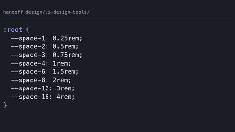
Here is the CSS output that a Figma component with auto layout and variant properties should inspire. The component uses a boolean variant for the disabled state and an enum variant for the size. The spacing comes from design tokens, not from individual pixel values. The container is a flexbox with gap for the internal spacing, and the variant values live as custom properties.
:root {
  --space-xs: 0.25rem;
  --space-sm: 0.5rem;
  --space-md: 1rem;
  --space-lg: 1.5rem;
  --color-primary: #0066cc;
  --color-text-on-primary: #ffffff;
  --button-size: md;
}

.button {
  display: inline-flex;
  align-items: center;
  justify-content: center;
  gap: var(--space-sm);
  padding: var(--space-sm) var(--space-md);
  font-size: var(--button-font-size);
  border-radius: var(--radius-sm);
  background: var(--color-primary);
  color: var(--color-text-on-primary);
}

.button[data-size="sm"] {
  --button-font-size: 0.75rem;
  padding: var(--space-xs) var(--space-sm);
}

.button[data-size="lg"] {
  --button-font-size: 1.125rem;
  padding: var(--space-md) var(--space-lg);
}

.button[data-disabled="true"] {
  opacity: 0.5;
  cursor: not-allowed;
}

.button:hover {
  filter: brightness(0.9);
}

.button:focus-visible {
  outline: 2px solid var(--color-primary);
  outline-offset: 2px;
}
This CSS uses flexbox with gap because the design tool’s auto layout exported as a flex container. The variant properties map to data-attribute selectors, which are the CSS equivalent of the design tool’s variant properties. The spacing uses design tokens, so a developer can change the entire component’s padding by editing one custom property. The auto layout component CSS flexbox export is what you get when the design file respects the tool’s layout engine.
The CSS a Poorly Structured Component Actually Generates
Now consider the same button drawn with absolute positioning. The designer dragged a text layer 12 pixels from the left edge and 8 pixels from the top. The background frame has a fixed width. The export gives you this:
.primary-button {
  position: relative;
  width: 120px;
  height: 40px;
  background: #0066cc;
  border-radius: 4px;
}

.primary-button__label {
  position: absolute;
  left: 12px;
  top: 8px;
  font-size: 14px;
  color: #ffffff;
}

.primary-button__icon {
  position: absolute;
  right: 8px;
  top: 10px;
  width: 16px;
  height: 16px;
}
This is the design tool component library CSS quality failure. The position: absolute and the left, top, right values are magic numbers; they only work at this exact width and height. Change the text to a longer label and the icon overlaps it. The spacing is not a token; it is a hard-coded pixel value. The component has no states: the designer exported the hover as a separate frame, so the developer has to write a :hover rule from scratch, guessing at the shadow and the color change. This is what happens when the design file ignores auto layout and treats every state as a static frame.
The Design Token Export That Bridges the Two
Build a Token Pipeline
The bridge between a well-structured and a poorly structured export is the design token pipeline. A design token component library export starts with a token file, usually in JSON, that defines the raw values and their semantic aliases. The Style Dictionary tool (maintained by Amazon) takes that JSON and transforms it into CSS custom properties. The W3C Design Tokens Community Group has a draft specification for the file format, with each token carrying $value, $type, and $description fields. Here is a token file and its CSS output:
{
  "color": {
    "primary": {
      "$value": "#0066cc",
      "$type": "color",
      "$description": "Primary action color"
    },
    "text": {
      "on-primary": {
        "$value": "#ffffff",
        "$type": "color"
      }
    }
  },
  "space": {
    "sm": { "$value": "0.5rem", "$type": "dimension" },
    "md": { "$value": "1rem", "$type": "dimension" }
  }
}
:root {
  --color-primary: #0066cc;
  --color-text-on-primary: #ffffff;
  --space-sm: 0.5rem;
  --space-md: 1rem;
}
The token names must survive translation to CSS custom property names. A token like “color/primary” becomes –color-primary; the slash is not valid in a custom property name, so the pipeline replaces it with a dash. The naming convention matters: a semantic name like –space-sm is usable in any component, while a raw name like –blue-500 couples the component to a specific palette. The design token to CSS pipeline is what makes the component library export maintainable. Without it, every component carries its own hard-coded values, and changing a spacing scale means editing every frame in the design tool.
What the Design File Must Contain for Clean Export
Three Non-Negotiable Rules
For the CSS export to be usable, the design file itself must satisfy three conditions. First, variant properties must be defined as boolean or enum properties, not as separate frames. A boolean variant for “disabled” maps directly to a data-disabled=”true” attribute in CSS. An enum variant for “size” with values sm, md, lg maps to data-size=”sm” and so on. Second, spacing must be defined as design tokens, not as pixel values typed into the inspector. The auto layout gap and padding should reference a token from the design system, so the export uses var(–space-sm) instead of 8px. Third, component states, hover, focus, disabled, must be defined as variants within the same component, not as separate components or frames. A hover state defined as a variant on the same button lets the design tool export a :hover rule. A hover state defined as a separate component forces the developer to guess the values.
States Are Part of the API
The variant component design tool CSS generation depends on this structure. When you define a disabled variant, you also define the visual changes: opacity, cursor, background. The export then produces a [data-disabled=”true”] rule. When you define a focus variant with an outline, the export produces a :focus-visible rule. The states are not afterthoughts; they are part of the component’s API. The design system component CSS output quality is a direct result of how the design file models state. A developer opening the export should see a selector for every state, not a pile of static frames that need manual styling.
Common Mistakes That Break the Export
There are five mistakes that routinely break a design tool component library export, and each has a direct CSS consequence. First, the spacing mistake: a designer types 12px into the input field instead of using a token. The export then contains padding: 12px instead of padding: var(–space-md). The component works but is not themeable. Second, the variant mistake: a designer creates a “hover” frame as a sibling of the “default” frame, both absolutely positioned. The export has no hover selector, and the developer has to guess the shadow from a screenshot. Third, the naming mistake: a token named color/primary is translated to –color-primary in CSS, but the designer uses the raw hex value in the component instead of the token. The export contains #0066cc in ten places, and a later palette change requires a find-and-replace. Fourth, the auto layout mistake: a designer disables auto layout on a container and manually positions children. The export uses position: absolute with magic numbers. Fifth, the state mistake: a designer forgets to define a focus variant, so the export has no :focus-visible rule, and the developer ships a component that is not keyboard accessible.
These mistakes are structural choices in the design file. A declaration with position: absolute forces a containing block and reflows siblings when the layout changes. The magic numbers are not just ugly; they are fragile. A token-based gap on a flex container is a single layout property that does not require absolute positioning. The distinction between flexbox and absolute positioning is the difference between a component that grows with its content and one that breaks when the text is two words too long.
CSS Custom Properties and @property in Component Export
Register Properties That Do Math
The design tool export produces custom properties, but the developer controls how they behave. A custom property like –button-size is unregistered by default, meaning the browser treats any value as a token. If you want calc() to use that value as a number, you must register the property with @property. For example, a token that defines a spacing multiplier needs registration:
@property --multiplier {
  syntax: "<number>";
  initial-value: 1;
  inherits: true;
}

.button {
  padding: calc(var(--space-sm) * var(--multiplier));
}
Without registration, calc(var(–multiplier) * 1rem) fails because the browser sees –multiplier as a string, not a number. The @property rule is the fix, and the JavaScript fallback is CSS.registerProperty(). The design token component library export should include the @property declarations for any token that is used in a calculation. A token file can carry a $type of number for the multiplier, and the pipeline can generate the corresponding @property block. This is the difference between a custom property that is a dumb token and one that participates in the layout math.
Fix Token Names Before They Break
The custom properties also need a naming convention that survives translation. A token named –space-sm is fine, but a token named –Spacing/4 becomes –Spacing-4 at best and a broken selector at worst. The naming convention must be decided before the token file is written, and it must align with CSS syntax: lowercase, dashes, no slashes. The style dictionary export handles this automatically, but only if the source token names are already clean.
@scope and Component Scoping in the Export
Component libraries generate CSS that can leak. A class name like .button is fine in isolation but collides with any other .button on the page. The traditional fix is BEM: .button__icon, .button–primary. The design tool export can follow that naming convention, but it has a modern alternative: @scope. The @scope CSS containment at-rule limits selector reach to a DOM subtree, so a component’s styles do not leak out.
@scope (.component-button) {
  :scope {
    display: inline-flex;
    gap: var(--space-sm);
  }

  .label {
    font-weight: bold;
  }

  .icon {
    width: 1em;
    height: 1em;
  }
}
The @scope rule takes an upper boundary (the .component-button root) and an optional lower boundary. Styles inside the scope apply only to elements within that boundary. This replaces BEM-style class namespacing because the scope itself provides the containment. The design tool export can generate @scope rules if the component is a single root element with a unique class. Browser support is now broad: Blink shipped it in Chrome, WebKit in Safari 17.4, and Gecko in Firefox. Check caniuse for the current support matrix before shipping. The fallback is a descendant combinator: .component-button .label works everywhere but is more verbose.
There is a common mistake with @scope: expecting it to create a Shadow DOM boundary. It does not. The scoped styles do not prevent outer styles from inheriting into the component, and they do not prevent the component’s own styles from inheriting out. The @scope rule is a selector containment mechanism, not an isolation mechanism. The design tool export can use it, but the developer still needs to control inherited properties like color and font-size at the component root.
Style Queries for Component Variants
A design tool component library with many variants can produce a large amount of CSS. Every data-size value generates a rule, and every boolean variant adds another. The style query is a container query that responds to the computed value of a custom property on the container. Instead of writing [data-size=”lg”] { … }, you can write a style query that checks the value of –size:
.component-button {
  --size: md;
}

@container style(--size: lg) {
  .component-button {
    font-size: 1.125rem;
    padding: var(--space-md) var(--space-lg);
  }
}
The style query is a conditional that fires when the custom property on the container matches. This is useful for a component library because the variant value is a custom property, not a class. The design tool export can set –size on the component root, and the developer can change it via a data attribute or a class. The style query keeps the variant logic in one place instead of scattering it across multiple attribute selectors.
The style query is not a replacement for the attribute selector in all cases. The attribute selector is simpler and has broader support. The style query becomes valuable when the variant value is a token that is set by a parent container or a theme. The design tool export can produce either, but the developer must choose based on the actual runtime need. The style query is part of the CSS containment module, and it works in modern browsers that support container queries. The fallback for older browsers is the attribute selector, which is fine for most component libraries.
The Performance Cost of the Export
Every CSS declaration in the export has a cost. position: absolute forces a containing block and causes reflows when the layout changes. A flexbox with gap does not have that cost; it is a single layout property that the browser optimises. The export from a well-structured component is cheaper to render than the export from a poorly structured one. The difference is measurable in layout time.
Animate the Right Properties
The animation cost is another factor. Animating transform or opacity is cheap because the browser can composite. Animating left or width triggers layout and paint, which is expensive. The design tool export should avoid animating properties that trigger layout. The common mistake is exporting a hover effect that changes left from 0 to 10px to slide an icon. The better export uses transform: translateX(10px), which is compositor-friendly. The design tool does not know the developer’s animation intent, so the export is a starting point. Rewrite the animation to use transform and opacity where possible.
Keep Custom Property Changes Local
The custom property update is cheap, but the way it is used matters. A custom property change that causes a reflow in a large subtree is expensive. The design tool export should avoid setting custom properties on high-level containers unless the entire subtree needs to re-render. The style query responds to the computed value, and the browser can skip the reflow if nothing in the subtree depends on it. The performance lesson is the same as the layout lesson: keep the component’s dependencies local, and use transform and opacity for animation.
Text Wrapping and Component Copy
The design tool export also includes text styles. A component with a button label has a font-size, a font-weight, and a line-height. The modern CSS feature for headlines is text-wrap: balance, which distributes the text evenly across lines. This is a multi-line-only property; it has no effect on a single line. The design tool export can include text-wrap: balance on a heading component, but verify that the heading is indeed multi-line. The fallback is text-wrap: stable, which prevents the last line from being a single orphan word. The text-wrap: pretty value is for body text and has a similar effect. The design tool export is a starting point; test the wrapping behaviour with real content.
The component library export should not include text-wrap: balance on a button label, because a button label is a single line. The property has no effect and adds noise to the CSS. The export is clean when it includes only the properties that actually change the layout. Add text-wrap at the application level, not the component level.
The text size is another token. A heading component might have a token –font-size-display that is larger than a button label’s –font-size-md. The design tool export should use the token, not a hard-coded pixel value. The token allows the application to change the heading size globally without editing the component. The design system’s typographic scale lives in the token file, and the component export references it.
The :has() Selector in Component Composition
The relational pseudo-class :has() selects an element based on its descendants or subsequent siblings. In a component library, this is useful for a card component that has an image and one that does not. The design tool export could include a rule like .card:has(.image) { padding-top: 0; } to adjust spacing when the image is present. The :has() selector replaces JavaScript class toggling on ancestors, which is a common pattern in older component libraries. Style the parent based on the child without adding a class.
The common mistake is using :has() to style the matched ancestor. It cannot do that. The selector matches an element only when the argument is true, but the styles apply to the matched element, not the argument. The second common mistake is nesting :has() inside another :has(), which some engines do not support. The fallback for unsupported browsers is a JavaScript class toggle: add a class like .card–has-image and style against that. The :focus-within pseudo-class is a special case of :has() for focus states, and it has broad support. The design tool export can use :has() for component composition, but test the target browser set first.
The :has() selector is not free. It can be expensive if the argument is a complex selector that requires traversal of a large subtree. Keep the argument simple, like a single class or tag selector. The design tool export should not generate a :has() selector with a descendant combinator that traverses the entire component tree. The cost is in the selector matching, not in the rendering.
Table: Design Tool Export vs. Clean CSS
This table compares what a design tool generates from an unstructured file versus a structured file, and what the developer should do in each case.
| Design File State | Generated CSS | Developer Action |
|---|---|---|
| Absolute-positioned layers | position: absolute; left: 12px; top: 8px; |
Rewrite with flexbox; use tokens for spacing |
| Variant as separate frame | No hover or focus rule | Add :hover and :focus-visible manually |
| Pixel value in inspector | padding: 12px |
Replace with var(–space-md) |
| Boolean variant property | [data-disabled=”true”] |
Use attribute selector directly |
| Enum variant property | [data-size=”sm”] |
Use attribute selector or style query |
| Auto layout with tokens | display: flex; gap: var(–space-sm) |
Ship as-is; the CSS is clean |
| Token exported as numeric | –multiplier: 2 |
Register with @property for calc() |
| Component root class | .component-button |
Use @scope for containment |
| Text with multiple lines | text-wrap: balance |
Verify the line count; keep or remove |
| Parent styled by child | .card:has(.image) |
Test browser support; fallback to class |
Start with One Component
Take one component from your design system, preferably the button, and rebuild it in your design tool with auto layout, variant properties, and design tokens. Do not touch the whole library. Do not try to convert every component at once. Pick the button because it is small, it has states, and it is used everywhere. Open your design tool, create a new component, and apply these rules: use auto layout for the internal content, define a boolean variant for disabled, define an enum variant for size, set the spacing to reference a token, and add hover, focus, and disabled variants. Then run the export. If the CSS output contains any position: absolute or a hard-coded pixel value, you have made a mistake. If the output contains display: flex with gap and custom properties, you have succeeded.
This practice is the fastest way to learn the discipline. You will make mistakes, and you will see them in the CSS. The error is the feedback. Once the button exports cleanly, apply the same rules to a card component, then to a navigation bar, then to the rest of the library. The design tool component library CSS export is not a magic feature; it is a reflection of the design file’s structure. The structure is what you control.