CSS Layouts: Flexbox, Grid and the Patterns That Replace Framework Layouts
The CSS layout hub covering flexbox, grid, and the patterns that replace framework layouts in the fewest declarations that work across engines.
You are not here to learn CSS. You are here to stop writing the same 2014 layout code for the eighth year in a row. The modern CSS layouts, flexbox and grid, need fewer declarations than you think. The habits that keep you reaching for a framework are older than the features that replaced them. This page is the map. It routes you to the exact pattern for each problem, tells you whether flexbox or grid the pattern calls for, and names the hack you are copying so you can stop. If you need the mechanics of a specific property, the child pages answer the question the pattern raises. If you need the vocabulary to defend the choice to a stakeholder, it is here too. The one thing you will not get is a paint-by-numbers recipe book. Recipe books are how you end up fighting the cascade instead of leveraging it. Start with the two lines that solve more layout problems than any framework you have ever imported.
The One Declaration That Solves Most Layout Problems
Grid Centering In Two Lines
The most common layout problem is centering something inside something else. The fewest declarations that solve it are two, and the first one does the heavy lifting:
.parent {
  display: grid;
  place-items: center;
}
That is it. No absolute positioning, no transform translate, no negative margins, no table-cell trick. place-items is the shorthand for align-items and justify-items. In a grid container it centers the item on both axes. Grid is a two-dimensional system. The same declaration works for a single child or a stack of children. The same property with place-content: center centers the whole group when the children do not fill the track. This is the pattern that replaces the old position: absolute; top: 50%; left: 50%; transform: translate(-50%, -50%); hack. That hack required the parent to be positioned and the child to be exactly as wide as its content. The grid version needs neither. It works because the grid container establishes a new formatting context, and place-items distributes the child within the containing block defined by the tracks. If you have been copying the transform hack from a 2013 Stack Overflow answer, this is the line that retires it.
Grid Or Flexbox: The Axis Test
Where does this pattern call for grid instead of flexbox? The rule is simple: if you need alignment on both axes at once, use grid. Flexbox is a one-dimensional system. It distributes along a single axis, and centering on the cross axis requires a second property. Grid gives you both in one shorthand. The confusion pair here is the old claim that grid is for page layout and flexbox is for components. That distinction died with subgrid. The real question is whether you need to align items across rows and columns simultaneously. If yes, grid. If you are distributing a row of buttons with space between them, flexbox. If you are centering a modal, grid.
The One Declaration That Most Often Causes Layout Problems
The declaration that breaks more layouts than any other is height: 100% on a child of an auto-height parent. It looks harmless. It looks like it should work. It does not. Percentage heights resolve against the parent’s height, and an auto-height parent has no defined height to resolve against. The child collapses to zero or ignores the declaration entirely. You spend an hour inspecting the cascade to find out why.
/* This fails silently */
.child {
  height: 100%;
}
The fix is to stop asking for a percentage height and let the layout system do the work. If the parent is a flex container, the child stretches by default with align-items: stretch. If the parent is a grid container, the child fills the track by default. If you genuinely need the child to match the parent’s height and the parent is auto, the problem is usually that you are using the wrong layout context. The containing block for a percentage height is the parent’s content box, and an auto parent has no content box height to reference.
The Stretch Default And The JavaScript You Can Delete
The failure mode is so common that it has a name: the height: 100% trap. The fix is to swap the parent to display: grid or display: flex and let the default stretch behaviour replace the percentage. This is the pattern that replaces the old JavaScript equal-height columns script. That script measured the tallest column and set all others to match. Flexbox align-items: stretch does it in one declaration, and grid does it by default. If you are still running a $(window).resize() handler to equalise column heights, this is the line that retires it.
Where does this pattern call for flexbox instead of grid? If you need one axis of stretch and the other axis is free, flexbox with align-items: stretch is the lighter choice. If you need both axes to stretch, grid. The confusion pair is the claim that flexbox is for components and grid is for pages. Subgrid makes grid correct for many component-internal alignments. The distinction is about one-axis versus two-axis, not macro versus micro. Decide on the axis count, not the component size.
Flexbox Grid Layout Decision Guide
When you stare at a blank layout and ask whether to reach for flexbox or grid, there is a decision guide that ends the debate in one question: do you need to align items across rows and columns simultaneously? If yes, grid. If no, flexbox.
Flexbox is a one-dimensional distribution system. It lays out items along a single axis, either row or column, and handles spacing, alignment, and order along that axis. The gap property in flexbox shipped later than grid gap. Grid had it first, and flexbox caught up. If you are writing margin hacks to space flex items, you are using an old technique. The gap property is the replacement.
Grid is a two-dimensional layout system with explicit row and column tracks. You define the tracks, and the browser places items into them. The power is not the tracks themselves but the alignment that comes with them: justify-content and align-content distribute the tracks within the container, and place-items aligns the items within their cells. Subgrid, widely available since September 2023, lets a child grid inherit the parent’s tracks. It solves alignment problems that used to require matching pixel values across separate grids.
The Decision Guide In Practice
The decision guide in practice:
- A nav bar with a logo left and links right: flexbox. It is one axis and
justify-content: space-betweendoes it in one line. - A card grid that wraps at breakpoints: grid with
repeat(auto-fit, minmax(240px, 1fr)). The two-axis alignment of equal-height cards is the requirement. - A modal that centers itself: grid with
place-items: center. Two-axis centering is the requirement. - A row of buttons that should stretch to equal width: flexbox with
flex: 1. The cross axis does not need alignment. - A page with a header, main, and footer that should fill the viewport: grid with
grid-template-rows: auto 1fr auto. The main needs to stretch on the block axis while the header and footer stay at content height.
The guide replaces the old framework approach, where Bootstrap’s 12-column grid was the answer to every layout question. Native grid and flexbox cover the same ground without the CSS that came with the framework. The old technique of copying a framework for its layout grid is retired.
CSS Centering Modern Techniques
Centering is the layout problem with the most legacy hacks attached. The modern techniques are fewer and cleaner. The modern set is three patterns, each with a clear use case.
Three Patterns That Replace The Old Hacks
First, grid centering: display: grid; place-items: center;. This centers a single child or a stack of children on both axes. It is the replacement for the absolute-position-plus-transform hack, and it is the one you will use most. Second, flexbox centering: display: flex; justify-content: center; align-items: center;. This centers on both axes in a one-dimensional context. It is the right choice when the centering is happening along a row or column that also distributes other items. Third, block-axis centering: align-content: center in a block container. This became widely available across all engines in March 2025. It centers a block’s content vertically without making the container a flex or grid context. It is the lightest option when you only need vertical centering in a block layout.
The old techniques that these replace are worth naming so you can recognise them in old code: text-align: center plus line-height tricks for vertical centering, the display: table-cell; vertical-align: middle hack, and the absolute-position-plus-transform combination. Each of those required either a fixed height, a wrapper element, or a transform that created a stacking context. The modern techniques need none of those.
The Stacking Context Trap
The failure mode for centering is usually the stacking context. When you use a transform to center, the transform creates a stacking context. Any z-index on the child is local to that context. The modern grid and flexbox centering techniques do not create a stacking context, so z-index behaves as expected. If you have ever wondered why a centered modal’s close button would not sit above the overlay, the transform hack was the cause.
CSS Layout Browser Support Baseline
Browser support is no longer a table of vendor prefixes and caniuse percentages. The Baseline project, run by the Web Platform team, groups features into two states: newly available and widely available. A feature is widely available when it is stable across all three engines, Chromium’s Blink, Firefox’s Gecko, and Safari’s WebKit, for at least 30 months. The 2025 cutoff is features stable across all three engines by December 1, 2025. The 2026 cutoff updates annually.
Baseline Status For Layout Features
The layout features this page depends on are all baseline, and most are widely available:
| Feature | Baseline status | Engine ship dates |
|---|---|---|
| CSS Grid Level 1 | Widely available since 2017-03 | Chromium 57, Firefox 52, Safari 10.1 |
| CSS Grid Level 2 (subgrid) | Widely available since 2023-09 | Chromium 117 (2023-09), Firefox 71 (2019-12), Safari 16 (2022-09) |
gap property in Flexbox |
Widely available since 2021-04 | Chromium 84, Firefox 63, Safari 14.1 |
| Container queries | Widely available since 2024-02 | Chromium 105, Firefox 110, Safari 16 |
| Style queries | Widely available since 2025-03 | Chromium 123 (2024-03), Firefox 125 (2024-04), Safari 17.4 (2024-03) |
align-content in block layout |
Widely available since 2025-03 | Chromium 123 (2024-03), Firefox 125 (2024-04), Safari 17.4 (2024-03) |
clamp() |
Widely available since 2020-09 | Chromium 79, Firefox 75, Safari 13.1 |
Interop Gaps And Dead Prefixes
The real interop gap is not the feature shipping but the subtle differences in edge cases. Container units cqw and cqh have interop bugs in older versions of Safari that shipped container queries. The feature is baseline, but the units were not fully interoperable at the same moment. If you rely on container units, test in the browser versions your users actually run. Check caniuse for the latest per-engine status.
The old technique of writing @supports queries to detect flexbox or grid is unnecessary. Both are widely available. The old technique of writing vendor-prefixed flexbox, display: -webkit-box and display: -ms-flexbox, is also unnecessary. The prefixes were retired with IE11. If you are still writing them, you are maintaining dead code.
CSS Layout Patterns Without Frameworks
The patterns in this category replace the frameworks you imported for layout. Bootstrap’s grid, Foundation’s grid, and every CSS framework that sold a 12-column system are the old technique. Native grid and flexbox cover the same ground with fewer bytes and no dependency on a toolchain.
Five Patterns That Replace Framework Grids
The pattern library without a framework is short:
- The holy grail layout: header, footer, and three columns with the main content in the middle. Grid with
grid-template-columns: 200px 1fr 200px; grid-template-rows: auto 1fr auto;andmin-height: 100vhon the container. This is the replacement for the float-based holy grail, which required negative margins and a clearfix. - The card grid:
grid-template-columns: repeat(auto-fit, minmax(240px, 1fr));. The cards stretch to equal height by default. Grid items fill their track. This is the replacement for JavaScript equal-height columns. - The sticky footer:
grid-template-rows: auto 1fr autowith the main content in the middle row. The1frrow absorbs the extra space, pushing the footer to the bottom. This is the replacement for themin-height: 100vhplus negative margin footer hack. - The split nav: flexbox with
justify-content: space-between. The logo sits left, the links sit right, and the space between them flexes. This is the replacement for the float-and-clearfix nav. - The stacked card: flexbox with
flex-direction: columnandmargin-top: autoon the action button. The button pushes to the bottom of the card regardless of content length. This is the replacement for the absolute-positioned button that broke when the card grew.
The old techniques that these replace are the clearfix, the inline-block centering hack, and the float-based grid. The clearfix was a hack to make a parent contain its floated children. display: flow-root on the parent does it in one declaration. Inline-block centering required whitespace hacks and font-size resets. Flexbox and grid replace it. Float-based grids required clearing after every row. Grid tracks handle the rows natively.
Container Queries and the Component That Responds to Its Container
The layout pattern that frameworks could never solve is the component that needs to change layout based on the size of its container, not the viewport. Media queries cannot do this. They respond to the viewport. Container queries respond to the container element’s size. They are widely available since February 2024.
The pattern is two declarations on the container:
.card-shell {
  container-type: inline-size;
}
Then the component queries its container:
@container (min-width: 400px) {
  .card-inner {
    display: grid;
    grid-template-columns: 120px 1fr;
  }
}
This is the replacement for the JavaScript ResizeObserver pattern. That pattern required a script to watch the element and toggle classes. Container queries do it in CSS. The failure mode is forgetting container-type on the container element. Without it, the query has no container to measure.
Container Queries Versus Media Queries
The confusion pair with media queries is the core distinction: container queries respond to the container element’s size, media queries respond to the viewport. The pattern calls for container queries when the component is reused in different contexts at different sizes. The pattern calls for media queries when the page layout itself needs to change.
Style queries, widely available since March 2025, extend the pattern to custom properties. A style query responds to the computed value of a custom property on the container. This enables component-variant logic. The combination of custom properties, calc(), and @container style queries forms a constraint-solving system that behaves like a limited logic language. If you treat it as dumb, you over-engineer JavaScript solutions for problems CSS already solves.
Text Wrapping, Aspect Ratio, and Fluid Type
The layout patterns that do not involve positioning are the ones that make a page look finished. Text wrapping and fluid type are part of layout. They determine where the content breaks.
Line Clamp And Text Balance
Multi-line text truncation is a layout problem. The old technique was a JavaScript library that measured the text and added an ellipsis. The modern technique is -webkit-line-clamp, widely available across all engines and standardised as line-clamp in CSS Overflow Level 4:
.clamp {
  display: -webkit-box;
  -webkit-box-orient: vertical;
  -webkit-line-clamp: 3;
  overflow: hidden;
}
Three declarations, no JavaScript. The failure mode is applying it to single-line text. It has no effect. Clamping needs multiple lines to truncate.
Text balancing is a different problem. text-wrap: balance distributes text evenly across lines for headlines, avoiding widows and ragged edges. text-wrap: pretty does the same for body text. The failure mode is applying balance to single-line text. Both properties are the replacement for the manual line-break insertion that content editors used to do.
Fluid Type And Aspect Ratio
Fluid type is a layout problem. It determines how much vertical space the text occupies. The modern technique is clamp():
h1 {
  font-size: clamp(1.5rem, 1rem + 2vw, 3rem);
}
clamp() is widely available since September 2020. The old technique was a media query for every breakpoint, or a JavaScript function that calculated the font size on resize. The clamp() version is two declarations and no script.
Aspect ratio is the last layout pattern that used to require JavaScript. The old technique was the padding-top hack. It set a percentage padding to create a box with a fixed aspect ratio. The modern technique is aspect-ratio:
.video {
  aspect-ratio: 16 / 9;
}
aspect-ratio is widely available. It also reduces layout shift. The browser reserves the space before the content loads. If you are still using the padding-top hack, this is the line that retires it.
Cascade Layers, Nesting, and the Vocabulary to Defend Choices
The layout patterns above are the mechanics. The vocabulary to defend them to a stakeholder is the cascade system that manages them. @layer is the feature that gives you explicit priority control across author, framework, and third-party stylesheets. It is widely available across all engines.
@layer base, components, utilities;

@layer components {
  .card { display: grid; }
}
Layers End The Specificity War
Layers solve the specificity war. Without layers, a framework’s !important beats your specificity. With layers, you define the order, and the framework’s layer is lower than yours. The key detail is that specificity within a layer does not escape the layer. A #id selector in a lower layer loses to a .class selector in a higher layer. This is the replacement for the !important cascade hack.
CSS Nesting is the other vocabulary feature. It is widely available across all engines, and it replaces preprocessor nesting. The relaxed parsing behaviour, allowing element selectors without &, shipped later and inconsistently. Some valid nested CSS is rejected by older implementations that shipped the earlier spec text. If you write nested CSS, use the & token explicitly to be safe.
The Performance Vocabulary
The performance conversation is part of the vocabulary. A declaration has a cost in layout, paint, and composite. box-shadow and filter are frequently underestimated sources of paint work. Any property that triggers a containing block or reflows siblings has a cost that compounds. Animating any property other than transform and opacity triggers layout or paint. The compositor advantage is lost. If you defend a layout choice to a stakeholder, the defence is the axis count, the Baseline status, and the paint cost.
FAQ
Why does my grid gap not appear?
The legacy grid-gap syntax may be dropped in the engine you are testing, or the gap property may be overridden by a more specific declaration. Use gap and check the cascade.
Why does my z-index not work?
The element is not participating in the same stacking context as the target. Check for opacity, transform, or filter on an ancestor. All three create a new stacking context.
Why does my transition not fire?
The property value is not changing in a way that produces computed-value interpolation. auto to 0 does not transition. display does not transition. The initial value must be set before the target value.
Why does my container query not respond?
You did not declare container-type on the container element. The query has no container to measure without it.
Why does my text-wrap: balance have no effect?
You applied it to single-line text. balance only distributes multi-line text evenly across lines.
Start Here
The single most practical thing you can do next is open your codebase. Find the oldest layout hack you are still copying. The clearfix, the transform centering, the JavaScript equal-height columns. Replace it with the modern declaration. Start with the clearfix. display: flow-root on the parent is the most direct replacement with the fewest moving parts. Then replace the transform centering with place-items: center. Then delete the JavaScript equal-height script and let flexbox or grid stretch by default. Each replacement is one or two declarations. Each one removes a path to a cascade failure.
The page you are on is the map. The child pages answer the questions the patterns raise: what a containing block is, how a formatting context works, what the stacking context does to your z-index. But the map is only useful if you walk it. Pick the hack, replace it, and move to the next one. That is the whole course.
More in Layout
-
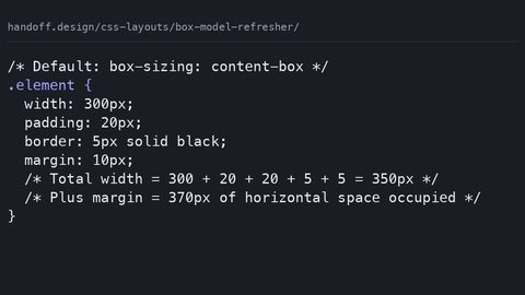 Box model refresher
Explains the CSS box model's actual dimension calculation rules, margin collapse, and why box-sizing: border-box replaced the 2014 width-calculation hacks.
Box model refresher
Explains the CSS box model's actual dimension calculation rules, margin collapse, and why box-sizing: border-box replaced the 2014 width-calculation hacks.
-
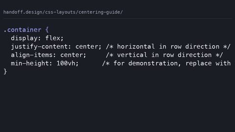 Centering guide
Shows the two-declaration CSS centering techniques that replaced the twelve hacks developers needed in 2014, using flexbox, grid, and place-items.
Centering guide
Shows the two-declaration CSS centering techniques that replaced the twelve hacks developers needed in 2014, using flexbox, grid, and place-items.
-
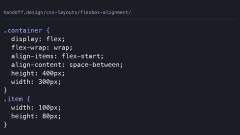 Flexbox alignment
Explains flexbox alignment properties justify-content and align-items with complete code samples, naming the 2014 hacks each value replaces.
Flexbox alignment
Explains flexbox alignment properties justify-content and align-items with complete code samples, naming the 2014 hacks each value replaces.
-
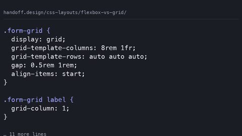 Flexbox vs grid
Replaces the 'grid for page, flexbox for component' rule with the actual decision criterion: one-axis distribution versus two-axis row-and-column alignment.
Flexbox vs grid
Replaces the 'grid for page, flexbox for component' rule with the actual decision criterion: one-axis distribution versus two-axis row-and-column alignment.
-
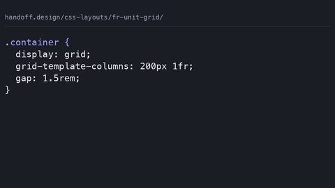 Fr unit grid
The CSS Grid fr unit distributes remaining space after fixed tracks and gaps are accounted for, not a percentage of total width. Learn how available space is calculated and when content minimums override fr sizing.
Fr unit grid
The CSS Grid fr unit distributes remaining space after fixed tracks and gaps are accounted for, not a percentage of total width. Learn how available space is calculated and when content minimums override fr sizing.
-
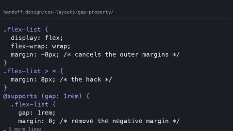 Gap property
The CSS gap property provides spacing between flexbox and grid items without margin hacks or negative container margins. Use it with a fallback for older browsers.
Gap property
The CSS gap property provides spacing between flexbox and grid items without margin hacks or negative container margins. Use it with a fallback for older browsers.
-
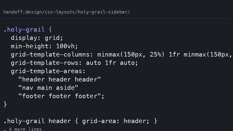 Holy grail sidebar
CSS Grid replaces float-based holy grail layouts with grid-template-areas, automatic equal-height columns, and source-order independence. Build a sidebar layout that works without hacks.
Holy grail sidebar
CSS Grid replaces float-based holy grail layouts with grid-template-areas, automatic equal-height columns, and source-order independence. Build a sidebar layout that works without hacks.
-
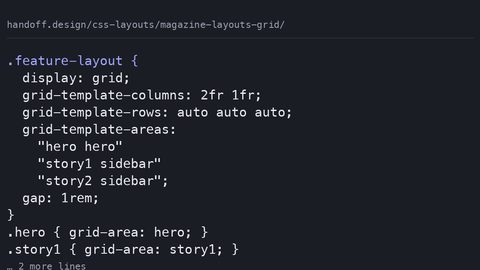 Magazine layouts grid
CSS Grid enables magazine-style editorial layouts with grid-template-areas, spanning items, and dense packing. Visual placement separates from source order without restructuring HTML.
Magazine layouts grid
CSS Grid enables magazine-style editorial layouts with grid-template-areas, spanning items, and dense packing. Visual placement separates from source order without restructuring HTML.
-
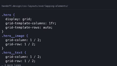 Overlapping elements
CSS Grid places multiple items in the same cell for overlapping layouts without position: absolute. Control stacking with z-index and manage stacking contexts with isolation.
Overlapping elements
CSS Grid places multiple items in the same cell for overlapping layouts without position: absolute. Control stacking with z-index and manage stacking contexts with isolation.
-
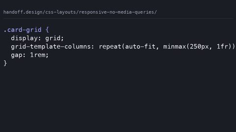 Responsive no media queries
CSS Grid auto-fit with minmax and flexbox wrapping create responsive layouts that adapt to container size without @media queries. Breakpoints follow content, not device widths.
Responsive no media queries
CSS Grid auto-fit with minmax and flexbox wrapping create responsive layouts that adapt to container size without @media queries. Breakpoints follow content, not device widths.
Read next
-
Box model refresher
Explains the CSS box model's actual dimension calculation rules, margin collapse, and why box-sizing: border-box replaced the 2014 width-calculation hacks.
-
Magazine layouts grid
CSS Grid enables magazine-style editorial layouts with grid-template-areas, spanning items, and dense packing. Visual placement separates from source order without restructuring HTML.
-
Gap property
The CSS gap property provides spacing between flexbox and grid items without margin hacks or negative container margins. Use it with a fallback for older browsers.
-
Flexbox alignment
Explains flexbox alignment properties justify-content and align-items with complete code samples, naming the 2014 hacks each value replaces.
-
Responsive no media queries
CSS Grid auto-fit with minmax and flexbox wrapping create responsive layouts that adapt to container size without @media queries. Breakpoints follow content, not device widths.
-
Fr unit grid
The CSS Grid fr unit distributes remaining space after fixed tracks and gaps are accounted for, not a percentage of total width. Learn how available space is calculated and when content minimums override fr sizing.