The CSS Half of Web Accessibility: Focus States, Color Contrast, and the Accessibility Tree
The CSS half of accessibility: focus states a keyboard user can see, contrast that survives dark mode, and the display properties that quietly remove an element from the accessibility tree.
Most developers believe accessibility is an HTML and ARIA problem, and that CSS only gets in the way. That belief is backwards. CSS is not the afterthought. CSS is the enforcement mechanism. A page can carry perfect semantic markup and still fail WCAG 2.2. A single declaration removes the focus cue. A background color sits below the contrast threshold. An element is hidden in a way that leaves it half-present in the accessibility tree. The genuinely useful frame: CSS accessibility techniques are the layer where design decisions become legal obligations. The accessibility tree is built from the DOM, but CSS decides what survives the trip. This hub connects you to everything on this site about that trip: focus states, color contrast, and what gets exposed to a screen reader. It routes you to the deeper articles, names the WCAG success criterion by number where one applies, and ends with the one declaration that fixes the most common failure on the web. Read this one first, then follow the links to the specific questions you came to answer.
Focus-Visible As The Default Cue
The single declaration that most often solves this category's problem is a :focus-visible style that meets WCAG 2.4.7 Focus Visible. That success criterion requires a visible cue for keyboard navigation. The pseudo-class is the precise tool because it only matches when the input modality is keyboard, not mouse. The trap: many sites still use :focus for everything, which shows an outline on every click and forces developers to remove it. Or they use outline: none without a replacement, which removes the cue entirely. The correct approach is short, complete, and runnable on its own.
:focus-visible {
  outline: 2px solid #005fcc;
  outline-offset: 2px;
  border-radius: 2px;
}
That declaration satisfies WCAG 2.4.7, the newer 2.4.11 (focus appearance minimum contrast 3:1 against adjacent colors), and 2.4.13 (minimum area 2 CSS pixels thick). It works in every engine that supports :focus-visible, which is Baseline widely available. The fallback for older browsers: add a plain :focus rule with the same outline before the :focus-visible rule, and let the cascade upgrade it. For the rare case where a component has a custom focus style that replaces the outline, keep the outline anyway. Removing it without a replacement fails the criterion.
Killing The Outline Without Stranding Users
The declaration that most often causes this category's problem is outline: none on interactive elements without a :focus-visible fallback. It is still copied from 2015-era tutorials that used outline: none inside :focus to kill the default ring on click, and then never restored it. For a keyboard user, that means the element receives focus, the browser draws nothing, and the page gives no signal where they are. WCAG 2.4.7 exists because that failure is common and severe. The fix is not to avoid removing the outline. Remove it only for mouse users, using the :focus:not(:focus-visible) technique, and keep a visible cue for keyboard users. Here is the complete replacement:
a:focus:not(:focus-visible) {
  outline: none;
}

button:focus-visible {
  outline: 2px solid #005fcc;
  outline-offset: 2px;
}
That approach removes the outline on click without ever leaving a keyboard user stranded. It is the single most important CSS accessibility technique on this page, and it is the one that most legacy codebases still get wrong. Audit one file today. Search for outline: none and replace every instance with this approach. The cost is a few lines. The benefit: a keyboard-only user can actually navigate your site.
Accessible Focus States CSS
Beyond The Outline Property
Accessible focus states CSS covers more than the outline property. It includes the size, the offset, the color, and the animation of the cue. WCAG 2.2 specifies the minimums: 2 CSS pixels thick, a contrast ratio of 3:1 against adjacent colors. No requirement that the cue be an outline, only that it be visible. The outline-offset property, Baseline widely available, lets you place the cue outside the element's border, which avoids clipping in tight layouts. The caret-color property, also Baseline, controls the text cursor in inputs and textareas. A low-contrast caret fails the same criterion as a missing outline.
Testing Focus Without A Mouse
The practical rule: test focus states with a keyboard only, never with a mouse. :focus matches both; :focus-visible is the only way to separate them. A small but useful trick is to use transition: outline-color 150ms on the focus state. It does not affect the visibility, only the color change, so it is safe under prefers-reduced-motion. The deeper article on this site answers how to build a focus cue that works across browsers, including the @supports selector(:focus-visible) feature detection for legacy engines. The one thing that costs nothing and helps everyone: offset the cue at least 2px from the element, so it does not touch the background and lose contrast.
WCAG Color Contrast CSS
The Ratios You Must Meet
Color contrast is the most audited WCAG criterion, and the CSS side is where it lives. WCAG 2.2 Success Criterion 1.4.3 requires a contrast ratio of 4.5:1 for normal text and 3:1 for large text, defined as at least 18px or 14px bold. Criterion 1.4.11 requires 3:1 for UI components, including focus cues, borders, and icons that convey meaning. The CSS that most often fails: a background color set on a parent and a text color set on a child, where the actual contrast is computed against the child's background, which might be the parent's background or a nested one.
Tools And Traps
The color-mix() function, shipped in all major browsers, lets you derive accessible colors programmatically. The oklch() color space gives predictable lightness for contrast calculations. The old color-contrast() function was removed from the CSS Color Level 6 draft, so do not rely on it. Compute the ratio with a tool like the WebAIM contrast checker, then set the colors as CSS custom properties so you can adjust them in one place. For large text at 3:1, the margin for error is small. A font-weight: bold declaration can push a 13px font into the large-text category, changing the required ratio. The most common failure is not the ratio itself but the assumption that a color is accessible because it looks fine on your monitor. A low-end display with a different gamma can drop it below threshold. Always test with the browser's forced colors mode and a high-contrast theme.
CSS Display Property Accessibility Tree
What Gets Announced
The display property is the single most powerful tool for controlling what appears in the accessibility tree. It is also the most misused. display: none removes an element from both layout and the accessibility tree, so a screen reader does not announce it. visibility: hidden also removes it from the tree but preserves its layout space, which is useful when you want to reserve room without exposing the content. The modern alternative for hiding content visually while keeping it available to assistive technology is the .sr-only technique. It uses position: absolute; width: 1px; height: 1px; overflow: hidden; clip-path: inset(50%). That technique keeps the element in the accessibility tree because it is not display: none and not visibility: hidden.
Opacity And Generated Content
The trap: opacity: 0 does not remove anything from the accessibility tree. A screen reader still announces the content. Visually hidden text that should be read out should use opacity: 0 only if it is also positioned off-screen. The generated content properties ::before and ::after with the content property are not consistently exposed to screen readers. They are not a reliable way to convey meaning. WCAG 1.3.1 requires that information and relationships be programmatically determinable, and generated text is often not. The rule: use display: none for content that should be completely absent. Use the .sr-only technique for content that is visually hidden but must be read. The deeper article on this site answers when to use aria-hidden="true" in combination with CSS. It is redundant when display: none already removes the element. It matters when the element is visually present yet should be excluded from the accessibility tree, such as a decorative icon.
Keyboard Navigation Styling
Making The Tab Order Visible
Keyboard navigation styling is the intersection of focus states and layout. A keyboard user moves through the page in tab order. The CSS must make that order visible and the focus target large enough to hit. WCAG 2.2 does not specify a minimum target size for focus, but it requires that the focus cue be visible and that the order follow the visual layout. The :focus-visible pseudo-class, discussed above, is the primary tool. The secondary tool is the outline property with a non-zero value. The tertiary is box-shadow as a fallback for browsers that do not support outline-offset.
Common Failures To Fix
A common failure: overflow: hidden on a parent that clips the focus cue. Use outline-offset with a positive value and ensure the parent does not have overflow: hidden that cuts it off. Another failure: user-select: none on body text. It prevents users from selecting content but does not affect focus. That property is not a focus technique and should not be used to imply interaction. The tabindex="0" attribute with CSS-only interactive widgets is insufficient without ARIA roles and keyboard event handling. The styling must be paired with the correct semantics. Test with Tab and Shift+Tab through every interactive element. Verify that the focus cue is visible at 2px minimum thickness and with a contrast ratio of at least 3:1 against the adjacent background. The prefers-reduced-motion media query is also part of keyboard navigation styling. Moving focus cues can cause motion sickness. Use @media (prefers-reduced-motion: reduce) to set animation-duration: 0s and transition-duration: 0s on any focus animation.
When CSS Hides Content Wrong: The Screen Reader Failure
A screen reader reads the accessibility tree, not the visual page. Any CSS that changes visibility without affecting the tree creates a split between what sighted users see and what a screen reader announces. The content property with url() for images is a classic failure: it displays an image but provides no text alternative. The screen reader says nothing. Fix it with a real <img> element with an alt attribute, or the .sr-only technique with a text alternative. Another failure: aria-label on non-interactive elements without a role. The label is ignored because the element is not in a role that supports naming. The clip property for visually hidden content is outdated. The current technique uses clip-path: inset(50%) combined with position: absolute and overflow: hidden. font-display: block with a long swap period can cause invisible text that waits for a custom font. If the font never loads, the text fails. The accessible approach is font-display: swap with a short block period or a fallback font that meets contrast. The hard rule: any meaning conveyed by CSS alone, whether through content, color, or position, must also be conveyed in text. That is WCAG 1.3.1. It is the criterion most frequently cited in accessibility lawsuits.
FAQ: The Five Questions That Matter
What is the minimum focus indicator size under WCAG 2.2? The focus cue must be at least 2 CSS pixels thick on the perimeter of the element, or an equivalent area that is at least as large. That is Success Criterion 2.4.13, and it is a measurable, testable number.
Does display: none remove content from the accessibility tree? Yes, it removes it from both layout and the accessibility tree. If you need to hide content visually but keep it readable, use the .sr-only technique instead.
Can I use outline: none if I have a custom focus style? Only if the custom style is visible and meets the 2px and 3:1 contrast requirements. The safest practice is to keep the outline and supplement it with a box-shadow or background-color change.
What is the difference between :focus and :focus-visible? :focus matches when an element is focused by any input modality, including mouse. :focus-visible only matches when the input modality is likely keyboard. Use :focus-visible for visible cues and :focus:not(:focus-visible) to suppress the cue for mouse users.
Does prefers-reduced-motion affect focus indicators? It should. If a focus cue animates, such as a pulsing ring, the animation should be disabled under prefers-reduced-motion: reduce. The cue itself must remain visible, but it should not move.
The One Thing to Do Next
Start your audit with the outline: none search. That single fix is the most effective change on this page. It is the one that most often causes a WCAG 2.4.7 failure and the one that is easiest to correct. Replace every instance with the :focus-visible approach shown in the second code sample. Verify with a keyboard-only pass through the entire page. Then run a contrast check on all text and UI components against WCAG 1.4.3 and 1.4.11. If you have a component that uses display: none to hide content that should be read, switch it to the .sr-only technique. Those three changes will bring most sites into conformance at the AA level for the CSS-only success criteria. The deeper articles on this site answer the specific questions: how to build a focus cue that works in every browser, how to compute contrast ratios with oklch(), and how to use prefers-reduced-motion correctly. Start there, and you will have covered the practical half of CSS accessibility techniques in one afternoon.
More in Accessibility
-
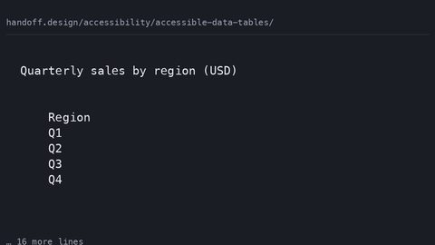 Accessible data tables
How to build data tables that are semantically correct for screen readers and visually usable on narrow viewports, with complete CSS and HTML samples.
Accessible data tables
How to build data tables that are semantically correct for screen readers and visually usable on narrow viewports, with complete CSS and HTML samples.
-
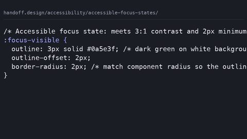 Accessible focus states
How to design focus states that meet WCAG 2.4.7, with complete CSS samples showing :focus-visible, contrast requirements, and the outline: none anti-pattern.
Accessible focus states
How to design focus states that meet WCAG 2.4.7, with complete CSS samples showing :focus-visible, contrast requirements, and the outline: none anti-pattern.
-
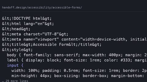 Accessible forms
How to style forms with visible labels, accessible error recovery, and focus indicators that meet WCAG 2.2, with complete code samples.
Accessible forms
How to style forms with visible labels, accessible error recovery, and focus indicators that meet WCAG 2.2, with complete code samples.
-
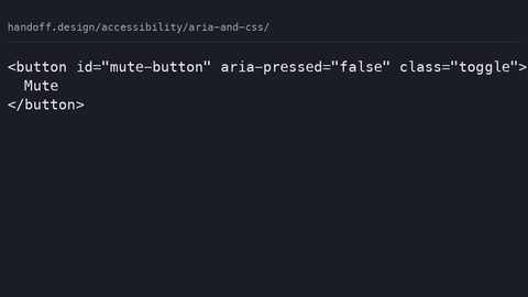 ARIA and CSS
How to use CSS attribute selectors to style component states based on ARIA attributes like aria-expanded and aria-current, with complete code samples.
ARIA and CSS
How to use CSS attribute selectors to style component states based on ARIA attributes like aria-expanded and aria-current, with complete code samples.
-
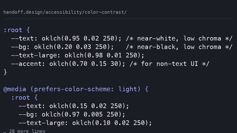 Color contrast
How to meet WCAG 2.2 color contrast requirements with modern CSS, using oklch(), prefers-color-scheme, and color-mix() to maintain AA and AAA ratios.
Color contrast
How to meet WCAG 2.2 color contrast requirements with modern CSS, using oklch(), prefers-color-scheme, and color-mix() to maintain AA and AAA ratios.
-
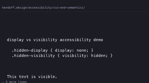 CSS and semantics
How CSS properties like display, visibility, content, and order affect the accessibility tree and what assistive technology exposes to users.
CSS and semantics
How CSS properties like display, visibility, content, and order affect the accessibility tree and what assistive technology exposes to users.
-
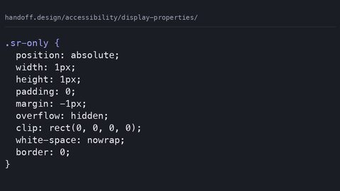 Display properties
How display: none, visibility: hidden, and CSS-generated content each affect the accessibility tree, with the WCAG success criteria that govern them.
Display properties
How display: none, visibility: hidden, and CSS-generated content each affect the accessibility tree, with the WCAG success criteria that govern them.
-
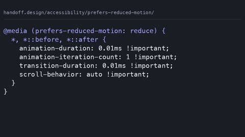 Prefers reduced motion
Write CSS that respects the prefers-reduced-motion media query, with WCAG 2.3.3 guidance on essential versus non-essential animation.
Prefers reduced motion
Write CSS that respects the prefers-reduced-motion media query, with WCAG 2.3.3 guidance on essential versus non-essential animation.
-
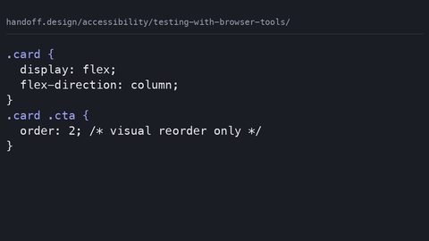 Testing with browser tools
Use Chrome DevTools and Firefox Accessibility Inspector to test how CSS affects the accessibility tree, contrast, and focus order.
Testing with browser tools
Use Chrome DevTools and Firefox Accessibility Inspector to test how CSS affects the accessibility tree, contrast, and focus order.
-
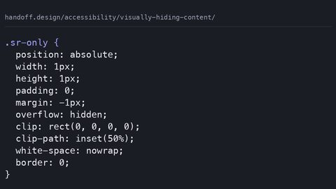 Visually hiding content
The CSS clip-rect pattern for hiding content visually while keeping it in the accessibility tree, and why display: none is the wrong tool.
Visually hiding content
The CSS clip-rect pattern for hiding content visually while keeping it in the accessibility tree, and why display: none is the wrong tool.
Read next
-
Prefers reduced motion
Write CSS that respects the prefers-reduced-motion media query, with WCAG 2.3.3 guidance on essential versus non-essential animation.
-
Accessible focus states
How to design focus states that meet WCAG 2.4.7, with complete CSS samples showing :focus-visible, contrast requirements, and the outline: none anti-pattern.
-
Color contrast
How to meet WCAG 2.2 color contrast requirements with modern CSS, using oklch(), prefers-color-scheme, and color-mix() to maintain AA and AAA ratios.
-
ARIA and CSS
How to use CSS attribute selectors to style component states based on ARIA attributes like aria-expanded and aria-current, with complete code samples.
-
CSS and semantics
How CSS properties like display, visibility, content, and order affect the accessibility tree and what assistive technology exposes to users.
-
Accessible forms
How to style forms with visible labels, accessible error recovery, and focus indicators that meet WCAG 2.2, with complete code samples.