The Key Differences Between CSS Transitions and CSS Animations
CSS transitions respond to property state changes; CSS animations run independently. Learn the performance cost of each and when to choose one over the other.
Most developers reach for CSS transition vs animation as if they were two speeds of the same tool. They are not. A CSS transition is a state-change responder: it interpolates between the initial computed value and the target computed value when a trigger, a hover, a class flip, a :focus, changes the property. A CSS animation is a self-contained timeline: it runs its keyframe loop from animation-name regardless of whether any state changed, on page load, on element mount, or when you toggle animation-play-state. The decision rule: if the motion answers a user interaction, use a transition; if the motion is a show that starts on its own, use an animation. That rule is the spine of this page, and the cost difference between the two mechanisms is what makes the rule matter.
The cost question is where most advice goes vague, and it is the reason the rule exists. A transition interpolates between two computed values on a single property, and the browser does that interpolation on a per-frame basis. An animation runs keyframes, which can be a loop of any number of stops. The browser can offload that loop to the compositor thread, but only if every animated property in the keyframes is compositor-eligible. The compositor eligibility list is short and stable: transform, opacity, and filter (in most engines) are compositor-only; everything else, width, height, top, left, margin, padding, box-shadow, background-color, triggers layout, paint, or both on the main thread. The CSS Triggers reference documents this per-property cost, but the authoritative source is the browser engine’s own property cost categorisation; a blog post is not the spec, and the spec does not dictate what is composited. So when you write a transition on width, you are paying a layout cost every frame; when you write an animation on transform, you are paying nearly nothing.
The Failure Case That Makes the Distinction Concrete
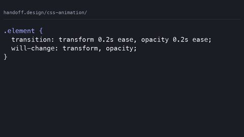
You have a card that expands on hover. The naive CSS is transition: all 0.3s on the card, and the hover rule sets width: 120% and height: auto. That works, but it triggers layout on every frame of the transition, because width and height are layout-triggering properties. On a low-end device the frame rate drops from 60fps to 10fps, and the page janks. The fix is to stop animating layout properties entirely: animate transform with a scale, and let the card's size change happen instantly or not at all. Here is the runnable baseline, including the accessibility guard you need on every motion sample on this page:
.card {
  transition-property: transform, opacity;
  transition-duration: 0.3s;
  transition-timing-function: cubic-bezier(0.4, 0, 0.2, 1);
  transition-delay: 0s;
  will-change: transform; /* hint, not a promise */
}
.card:hover {
  transform: scale(1.05);
  opacity: 0.9;
}

@media (prefers-reduced-motion: reduce) {
  .card {
    transition-duration: 0.01s; /* effectively instant, not disabled */
  }
}
This sample animates transform and opacity, both compositor-only, so the browser runs the transition on the compositor thread without touching layout or paint. The transition-property is explicit, which avoids the transition: all mistake that would catch a layout-triggering property change. The prefers-reduced-motion query does not remove the state change, the card still scales when hovered, but it collapses the motion to a near-instant snap, which is the correct accessibility behaviour for users who need vestibular safety.
The Animation Side: Where the Mistake Pattern Differs
Animations do not need a trigger, so developers often use them for entrance effects, loading spinners, or continuous loops. The common mistake is forgetting that the animation's final state does not persist unless you set animation-fill-mode: forwards. Without it, the element snaps back to its initial state when the animation ends. The second mistake is reusing the same animation-name for multiple elements in a component without scoping, which causes unintended shared keyframe behaviour. Two buttons with the same name but different durations will still use the same keyframe definitions, and if one has a different transform origin, the other inherits the confusion. Here is a compositor-safe entrance animation that also respects reduced motion:
@keyframes slide-in {
  0%   { transform: translateX(-100%); opacity: 0; }
  100% { transform: translateX(0); opacity: 1; }
}

.hero {
  animation-name: slide-in;
  animation-duration: 0.5s;
  animation-timing-function: cubic-bezier(0.4, 0, 0.2, 1);
  animation-delay: 0.2s;
  animation-iteration-count: 1;
  animation-direction: normal;
  animation-fill-mode: forwards; /* keeps the final state */
  animation-play-state: running;
}

@media (prefers-reduced-motion: reduce) {
  .hero {
    animation-duration: 0.01s;
    animation-delay: 0s;
  }
}
This animation uses transform and opacity only, so it runs compositor-only. The animation-fill-mode: forwards is what keeps the hero in its final position; without it, the element would snap back to translateX(-100%) after 0.5 seconds, which looks like a bug. The animation-iteration-count is 1, so the loop does not repeat, and animation-direction is normal, so it plays forward. The reduced-motion query shortens the duration to a snap, which is not the same as disabling the animation. The user still sees the content appear, just without the slide.
When to Use CSS Transitions Over Animations
The Operational Decision Rule
Use a transition when the motion is a response to a state change: a hover, a focus, a class toggle from JavaScript, a :checked checkbox. Transitions are the right tool because they are inherently reversible. When the trigger is removed, the transition plays backwards to the initial state. Animations can reverse too, but only if you set animation-direction: reverse or alternate, and even then the reverse is a separate keyframe play, not a natural consequence of the trigger leaving. Transitions also have no fill-mode concept; the values revert when the trigger is removed, which is exactly what a hover effect should do. The practical cost check: if the property you are animating is not transform or opacity, you are paying a layout or paint cost per frame. Switch the property or switch to a compositor-only equivalent.
What Transitions Cannot Do
The failure case for transitions is when you try to animate something that cannot interpolate. The classic trap is display. It is not animatable, so transition: display 0.3s is a no-op. Another is height: auto: the computed value of auto is not a number, so the transition cannot interpolate between 0 and auto. The property must have a numeric computed value at both endpoints for the interpolation to run. If you need an expanding accordion, do not fight the transition; animate transform: scaleY or use a grid-template-rows: 0fr to 1fr trick, which modern browsers can interpolate because the track size is numeric. And never use transition: all. It makes every property change animate, including layout-triggering ones, and it is the single most common source of jank on hover-heavy pages.
When to Use CSS Animations Instead of Transitions
Keyframe Control and Compositor Safety
Animations are the tool when the motion must start without a user interaction. Page-load entrance effects, auto-playing carousels, infinite spinners, and progress indicators all use animation-name with keyframes. The keyframe control is the big difference: a transition interpolates between two states, but an animation can define any number of stops, 0%, 25%, 75%, 100%, and the browser interpolates between each consecutive pair. This is how you get a bounce (a keyframe that overshoots then settles), a three-step colour pulse, or a staggered reveal across an array of elements. The cost check is the same: every property in every keyframe must be compositor-only for the animation to run on the compositor thread. If one keyframe animates width, the whole animation falls to the main thread and pays layout costs.
Three Failures That Ship Broken Animations
The failure case for animations is the missing fill-mode. If you do not set animation-fill-mode: forwards, the element returns to its initial state after the last keyframe, which is often visually wrong. A faded-in element disappears. A slid-in panel snaps back. Use forwards when the final state must persist, backwards when the initial state must apply during the delay, and both when you need both. The second failure is the shared keyframe name problem: if two elements on the page use the same animation-name but different animation-duration, they share the same keyframe definitions, which is usually fine. But if one element has a different transform-origin, the shared keyframe will produce different visual results, and debugging that is confusing. Scope the names with a prefix per component. The third failure is the infinite loop on a property that is not compositor-only: an infinite width animation is a perpetual layout trigger, and the page will never be smooth.
CSS Animation Performance and the Compositor Thread
What the Compositor Thread Actually Does
This section is where the performance-conscious developer should camp. The compositor thread is a separate rendering pipeline that handles scrolling, pinch-zoom, and, crucially, animations of compositor-only properties. When you animate transform or opacity, the browser can promote the element to its own layer and run the animation on the compositor without touching the main thread, which is where JavaScript, layout, and paint live. The result is 60fps even on modest hardware. Animating width, height, top, left, margin, padding, or box-shadow forces the main thread to recompute layout and repaint the affected region every frame. That is the difference between 60fps and 10fps on low-end devices. The will-change property is a hint that tells the browser to prepare a layer, but it is not a guarantee; the browser may ignore it, and using it on too many elements can exhaust memory. The CSS Triggers reference lists per-property costs, but the authoritative source is the browser engine's own implementation. What is composited today may change tomorrow, so test with the DevTools performance panel on the actual target device.
The DevTools Test
The practical test for whether an animation is compositor-only is to open the DevTools performance panel, record a few seconds of the animation, and look for a long task on the main thread or a layout/paint spike in the frame timeline. If the frame rate is green and the main thread is idle, you are compositor-only. If you see a yellow layout bar or a red paint bar, you are paying the cost. The fix is usually to change the property: instead of animating top and left to move an element, use transform: translate. Instead of animating width to expand a box, use transform: scale. The visual result is often indistinguishable, and the performance is categorically better.
How to Honor prefers-reduced-motion in Both Mechanisms
Every sample on this page has included the prefers-reduced-motion media query, and this section explains why and how to do it without breaking the experience. The query is a user preference signal that tells the browser the user wants less motion. It is not a signal to remove all animation, but to remove or minimise the motion itself. The correct pattern is to shorten the duration to a near-instant snap (like 0.01s) rather than to set animation: none, because setting none also removes the opacity fade, which can cause content to appear abruptly and flash. For transitions, the same logic applies: shorten the duration so the state change is instant but still happens. This preserves the accessibility of the interaction, the user still knows the state changed, while removing the vestibular trigger. The failure case is a developer who sets animation: none inside the reduced-motion query and leaves the element in an invisible initial state; the user never sees the content. Always test with the reduced-motion checkbox in DevTools and with a real screen reader to confirm the content is present.
Common Mistakes That Break Both Transitions and Animations
A numbered list serves the scanning reader here, but the prose carries the detail. The first mistake is using transition: all, which makes every property change animate, including layout-triggering ones; the fix is to list the specific transition-property values. The second mistake is animating a property that is not compositor-only and then blaming CSS for jank; the fix is to switch to transform or opacity. The third mistake is forgetting animation-fill-mode: forwards, which causes the element to snap back to its initial state when the animation ends; the fix is to set the fill-mode explicitly. The fourth mistake is using the same animation-name in multiple components without scoping, causing shared keyframe behaviour; the fix is a unique prefix per component. The fifth mistake is ignoring prefers-reduced-motion, which excludes a measurable minority of users from your site; the fix is the media query with a shortened duration, as shown in every sample above.
| Trigger | Requires a property value change (hover, class, state) | Runs automatically on load or via play-state control |
| Iterations | Once per trigger; no iteration-count control | Configurable via animation-iteration-count (number or infinite) |
| Direction | Plays forward on trigger, reverses when trigger is removed | Configurable via animation-direction (normal, reverse, alternate, alternate-reverse) |
| Keyframes | Two states only (start and end) | Arbitrary keyframes via @keyframes (0% to 100%, any number of stops) |
| Fill mode | None; values revert when trigger is removed | Configurable via animation-fill-mode (none, forwards, backwards, both) |
| Shorthand | transition: property duration timing-function delay; | animation: name duration timing-function delay iteration-count direction fill-mode play-state; |
The table condenses the spec differences into one glance, but the prose rule still applies: if you are reading this page, you already know the syntax; the table is a cheat sheet for the moment you forget whether an animation supports fill-mode (it does) or a transition does (it does not). The one axis the table does not show is cost, because cost is not a spec property, it is an engine behaviour. Repeating the rule one last time: transitions interpolate between two computed values; animations run keyframe loops. If the property is transform or opacity, both can run compositor-only. If you animate anything else, you pay layout and paint on the main thread, and no amount of will-change will save you.
The last practical step is the one that separates a page that works from a page that janks. Open your DevTools performance panel, find any element that animates on your page, and record a three-second interaction. Look at the frame rate and the main thread activity. If you see layout or paint bars, change the animated property to transform or opacity. Then add the prefers-reduced-motion query to every animation and transition you wrote, shortening the duration to a snap. Do that, and you have shipped a page that is both fast and accessible. Skip it, and you are betting your user’s battery and patience on a hover effect that costs 60fps.
Common Questions
What is the difference between CSS transition and animation?
A transition fires in response to a property value change and interpolates between two states. An animation runs keyframes with any number of stops and can start automatically. Use a transition for hover and focus effects, an animation for entrance loops and page-load motion.
Can I use a transition on the same property as an animation?
Yes, but the animation takes precedence while it is running. The transition will only apply when the animation is not active. If you need both, set the animation-play-state to paused and use a transition on the same property; the transition will fire on the paused state.
Why is animating width slower than animating transform?
Width is a layout-triggering property; changing it forces the browser to recompute layout and repaint every frame on the main thread. Transform is compositor-only; the browser offloads it to the compositor thread, which keeps the main thread idle and the frame rate at 60fps.
What does animation-fill-mode: forwards do?
It makes the element retain the computed values from its last keyframe after the animation ends. Without it, the element returns to its initial state. Use forwards when the final state must persist, backwards for the initial state during the delay, and both for both.
How do I disable animations for users who prefer reduced motion?
Use the prefers-reduced-motion media query and set animation-duration and transition-duration to 0.01s, not to none. That preserves the state change without the motion. Test with the reduced-motion checkbox in DevTools and verify content is visible.