Animating Buttons, Toggles and Form Controls with Compositor-Safe Properties
Animate UI elements at 60fps by restricting motion to transform and opacity. Learn compositor-safe techniques for buttons, toggles and form controls with reduced-motion fallbacks.
The cursor blinks in a username field. The submit button sits one finger-width away. You press it. For a beat the button does nothing. No scale, no colour shift, no feedback. Then the page jumps to a loading spinner. That dead zone is not a network issue. It is a CSS transition that never fired because the property you animated triggered a layout pass on every frame. The rule for animating UI elements is blunt: animate only transform and opacity on interactive controls. Everything else, padding, border-width, left, top, color, box-shadow, costs layout or paint on the main thread. The compositor thread, which can move pixels at 60fps without asking the renderer for permission, never gets involved. This guide covers the three controls you style daily: buttons, toggles, form inputs. Each sample wraps in prefers-reduced-motion, because respecting the user’s motion setting is not optional.
CSS Button Hover Effect That Never Reflows
Why Padding Animations Fail
A button hover that changes padding from 12px to 16px feels responsive because the text moves. But the browser must recalculate the element’s box, then the siblings around it, then the parent’s height, and paint the entire region. The CSS Triggers reference maintained by the Chrome DevTools team lists padding as a layout-affecting property: changing it invalidates the layout tree and forces a paint. On a form with forty fields, that is forty reflows per hover. At 60fps you have 16.6 milliseconds to do all of it. You will miss that budget on any mid-range phone.
Scale Instead of Padding
Use transform: scale instead. Scaling is a compositor-only operation. The element’s layout box stays fixed, the transform matrix is applied by the compositor thread, and the only cost is a texture update. The visual effect is identical. The button appears to grow, but the browser skips layout and paint entirely.
.button-primary {
  transition: transform 150ms cubic-bezier(0.4, 0, 0.2, 1);
  will-change: transform;
}

@media (prefers-reduced-motion: reduce) {
  .button-primary {
    transition: none;
  }
}

.button-primary:hover,
.button-primary:focus-visible {
  transform: scale(1.04);
}

.button-primary:active {
  transform: scale(0.97);
}
The active state is not decorative. A scale-down on press gives tactile feedback that the click registered. Because transform does not affect layout, the button’s neighbours never shift. The older technique, animating padding, sits in thousands of codebases. It is a measurable main-thread cost. If you need the button to grow and push content, that is a layout change. It should happen with a transition on the container, not the button, and even then, you are asking for paint.
Toggle Switch CSS Motion on the Thumb Only
Move the Thumb, Not the Layout
The canonical toggle is a track and a thumb. The naive implementation animates the thumb’s left property from 2px to 22px. That triggers layout on every frame because left is a layout property: the browser must recalculate the thumb’s position relative to the track, then repaint both. The compositor-safe version animates transform: translateX on the thumb. It moves the thumb at composite time without touching layout or paint. The track’s background-color change is a paint operation, but it is a single frame, not a per-frame animation. Paint once, not sixty times a second.
.toggle-track {
  width: 44px;
  height: 24px;
  border-radius: 12px;
  background-color: #ccc;
  transition: background-color 120ms linear;
  pointer-events: none;
}

.toggle-thumb {
  width: 20px;
  height: 20px;
  border-radius: 10px;
  background-color: #fff;
  transform: translateX(2px);
  transition: transform 180ms cubic-bezier(0.4, 0, 0.2, 1);
}

.toggle-input:checked + .toggle-track {
  background-color: #2d7d46;
}

.toggle-input:checked + .toggle-track .toggle-thumb {
  transform: translateX(22px);
}

@media (prefers-reduced-motion: reduce) {
  .toggle-thumb {
    transition: none;
  }
  .toggle-track {
    transition: none;
  }
}
The thumb travels 20 pixels. At 180ms the eye reads it as snappy without being a blur. The older technique used left or right positioning, which carries the same layout cost as padding animation. The pointer-events: none on the track ensures the click target is the input itself, not the visual track, so the accessibility tree sees a real checkbox, not a styled div. If you need to know whether the toggle is on or off for a screen reader, the input’s checked state is what the accessibility tree exposes, not the transform.
Form Input Focus Ring with outline-offset
Stop the Jitter on Focus
A text input’s focus ring should be visible. A border-width transition from 1px to 2px is a layout change: the input’s box grows, the padding compresses, and the placeholder shifts. The result is a visible jitter on every focus. The compositor-safe pattern transitions outline-offset instead. It moves the focus ring outward without touching the input’s box. outline-offset is a paint property, but the transition is a single paint per frame, not a layout recalculation. The ring’s movement is handled by the compositor as a visual offset.
.input-field {
  border: 1px solid #aaa;
  padding: 8px 12px;
  outline: 2px solid transparent;
  outline-offset: 0px;
  transition: outline-offset 140ms ease, outline-color 140ms ease;
}

@media (prefers-reduced-motion: reduce) {
  .input-field {
    transition: none;
  }
}

.input-field:focus-visible {
  outline-color: #1a73e8;
  outline-offset: 4px;
}
The focus ring sits 4 pixels outside the border. It is clear against any background and does not shift the text. The older technique transitioned border-width, which reflowed the input and its label. The label’s movement was a second layout pass. If you need a stronger visual, pair the outline-offset transition with a background-color change on the input itself. Colour is a paint property, and a single paint per frame is acceptable. Keep the duration for focus short, 140ms to 200ms. A slow focus ring feels like a stutter. The focus-visible selector ensures the ring appears only for keyboard users, not for mouse clicks. That keeps the mouse interaction clean and the keyboard interaction accessible.
What the Compositor Thread Actually Does
Two Threads, One Budget
Every CSS motion runs on one of two threads. The compositor thread (sometimes called the compositor process or the GPU process) handles layers, textures, and the final draw call. It can move a layer’s position, scale it, rotate it, and change its opacity entirely on its own, without asking the main thread for anything. The main thread runs JavaScript, calculates layout, and performs paint. When you animate transform or opacity, the browser marks the element as compositor-eligible, puts it on its own layer, and the compositor animates that layer. The main thread is free to handle the next interaction.
When you animate any other property, color, background, border, height, margin, the main thread must recalculate the style, then the layout, then paint, and then hand the frame to the compositor. That is the layout cost and the paint cost. They compound when the element has sibling content that shifts. The result is jank: a frame that takes 40ms instead of 16.6ms, visible as a stutter.
Compositor-Safe Is Not Free
A compositor-safe property is not free. transform on an element with a very large box-shadow or a filter can still cost paint because the compositor must re-render the texture. But transform and opacity are the only properties that are guaranteed to skip layout and paint. The transition-property shorthand defaults to all. That means if you write transition: 200ms, every animatable property, including those that cost layout, will transition. Always list the properties you intend to animate. Leave out the rest.
Why prefers-reduced-motion Is Not a Suggestion
The WCAG 2.2 success criterion 2.3.3 (Animation from Interactions) requires that any motion triggered by a user interaction can be disabled. The prefers-reduced-motion media query is the CSS mechanism for that. It reads the user’s OS-level setting. If they have requested reduced motion, the query evaluates to reduce, and you must suppress or replace the animation.
The Safe Pattern
Wrap all animation rules in @media (prefers-reduced-motion: no-preference) and leave the base state static. That is what the samples in this guide do. Do it for every control.
There is a failure case to know. When the media query is not supported (old browsers), the @media block is ignored, and the base state, no animation, applies. That is the correct fallback. If you write the animation outside the query and then try to undo it inside the query, you risk a transition from the animated state to the static state. That is itself motion. The safe pattern is animation inside the no-preference block only.
The browser does not decide what is too much motion. The user does. The duration that feels fine to you at 200ms may be a trigger for someone with a vestibular disorder. If you cannot test with a real user, ship the reduced-motion version and trust the setting.
Property Costs for Interactive Elements
The following table summarises the cost of animating each property, based on the CSS Triggers reference and the practice of compositor-safe UI motion. Layout cost means the browser recalculates the element’s box and possibly its siblings. Paint cost means the browser redraws the pixels. Composite cost is always present but is cheapest.
| Property | Layout cost | Paint cost | Compositor-safe? |
|---|---|---|---|
| transform | none | none | Yes |
| opacity | none | none | Yes |
| background-color | none | low | No (paint on every frame) |
| color | none | low | No (paint on every frame) |
| box-shadow | none | medium to high | No (paint on every frame) |
| border-width | high | high | No (layout and paint) |
| padding | high | high | No (layout and paint) |
| left / top | high | high | No (layout and paint) |
| outline-offset | none | low | No (paint on every frame) |
Use this table as a quick reference when a developer on your team proposes a transition on a new property. If the property is not transform or opacity, ask whether the effect can be redesigned to use one of them, or whether the paint cost is acceptable for a one-frame change.
FAQ: Animating UI Elements CSS
Why Is Transform Faster Than Left or Top?
transform is applied by the compositor thread as a matrix multiplication on the element’s layer. Changing left or top requires the main thread to recalculate the element’s position in the layout tree, then recalculate any sibling positions, then repaint. transform skips all of that.
Can I Animate Width and Height on a Button?
You can, but every frame triggers layout and paint. If the button is in a flex or grid container, the siblings reflow too. If the size change is a hover effect, use transform: scale. If it is a real layout change, like expanding an accordion, accept the cost and keep the animation short, or use the View Transitions API for a declarative morph.
What Does will-change Do?
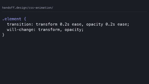
will-change: transform tells the browser to expect a transform animation and promote the element to its own layer in advance. It helps, but it is not a magic fix. Overusing it, on every element, consumes memory and can slow down scrolling. Use it only on the specific element you are animating. Remove it after the animation finishes.
Is Animating Opacity Always Safe?
Opacity is compositor-safe for the element itself. If the element has a background image or a complex box-shadow, the compositor must re-render the texture each frame, which is a paint cost. A plain text or solid-colour element is fine. A drop-shadow filter is not.
What Is the Best Duration for a Button Hover?
Between 100ms and 200ms. Shorter than 100ms feels like a state change with no feedback. Longer than 300ms feels sluggish. Start at 150ms and tune for your design. The cubic-bezier(0.4, 0, 0.2, 1) easing, the Material Design standard, gives a fast start and a gentle finish.
How Do I Test for Jank?
Open the browser’s performance panel. Record a profile while triggering the animation. Look for long frames, over 16.6ms. The panel shows whether the work happened on the main thread, layout and paint, or the compositor. If you see a red bar in the layout or paint section, your property is not compositor-safe.
Do I Need will-change on Every Animated Element?
No. The browser promotes elements to their own layer when a transform animation starts. Using will-change excessively creates too many layers, which the compositor must manage. Use it only when the element is large or when you see a performance issue in the profiler.
The One Rule That Covers All Three Controls
If you take a single rule from this guide, it is this: for any interactive element, button, toggle, input, slider, checkbox, the hover, focus, and active states must animate only transform and opacity. The animation must be wrapped in @media (prefers-reduced-motion: no-preference). That is the rule. It is not a style preference. It is a performance budget. Animating padding or border-width on a form with forty controls is a guaranteed 10fps experience on a low-end Android device. It is a measurable accessibility failure for motion-sensitive users.
The next time you write a transition, ask yourself: is the property I am about to animate one of the two compositor-safe ones? If not, redesign the effect. A button can grow with scale. A toggle can slide with translateX. A focus ring can appear with outline-offset. No interactive control requires a layout-triggering property to feel responsive. The browser is the final renderer. It will do exactly what you ask. It will charge you for every layout pass.