Future CSS: What Has Shipped, What Has Not, and What Is Safe Without a Fallback
Which modern CSS features have shipped across all engines and are safe without a fallback: the Baseline widely available status for container queries, nesting, @scope, oklch, and view transitions.
Introduction: What You Can Actually Ship in 2026
Every few months, a new CSS capability lands in one browser engine, the internet gets excited, and then reality sets in. You cannot use it yet. The other two engines do not support it, or they do but with bugs, or they support it but the degraded experience is uglier than not using it. This guide walks you through the modern CSS landscape after the Baseline 2026 ship, separating what has shipped, what has not, and what is safe to use with no fallback. The threshold for "safe with no fallback" is precise: a capability must be widely available across Blink, WebKit, and Gecko in their current and previous major versions, as defined by the Web Platform Status dashboard (Baseline). Commit that definition to memory.
Understanding Baseline and Interop: the Vocabulary of Safety
Baseline groups capabilities into two buckets. Newly available means it just shipped in all engines, but possible bugs and gaps remain. Widely available means it has been stable for at least 30 months across all core browsers. The 2025 Interop project, which coordinates browser vendors on fixing real-world incompatibilities, is a separate effort. It does not tell you what is safe; it tells you what the vendors are actively fixing. When you see a capability labeled "widely available" on the Web Platform Status dashboard, that is the green light. A "newly available" capability is safe for progressive enhancement only if you supply a fallback. The distinction between the two is the difference between using display: grid (widely available since 2017) and using subgrid (newly available since 2023). Both work. Only one is safe without checking the user's browser.
CSS Features Safe Without Fallback: the Widely Available List
These are the workhorses. Use them in production with confidence. They are Baseline widely available as of 2026, working in the current and previous major versions of Chrome, Safari, and Firefox.
The Layout Foundation
- CSS Grid Layout: Widely available since March 2017. For two-dimensional layout, this is not a progressive enhancement; it is the floor.
- Subgrid: Newly available since September 2023. Use it to align grid items inside a parent's row or column track. Subgrid makes grid the correct choice for many component-internal alignments. The distinction is one-axis versus two-axis, not macro versus micro.
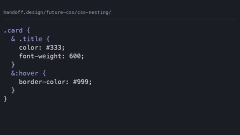
- Nesting: Widely available since December 2023. Native CSS nesting uses the
&token. The gap: relaxed parsing behaviour, which allows element selectors without&, shipped later and inconsistently. Some valid nested CSS is rejected by older implementations that shipped the earlier spec text. - Cascade Layers (
@layer): Widely available since March 2022. This gives you explicit priority buckets that override specificity. It formalised what was already true about the cascade: origin, layer, specificity, then source order.
Selectors and Theming
:is()and:where(): Widely available since January 2021. For zero-specificity matching and readable selector lists.color-schemeandprefers-color-scheme: Widely available since 2022 and 2020 respectively. Use them to control the canvas and form controls without fighting the user agent stylesheet.accent-color: Widely available since March 2022. A quick win for form control theming.:has(): Widely available since December 2023. The "parent selector" that finally shipped. Use it for state-based theming with no JavaScript.
Motion and Math
scroll-behavior: smooth: Widely available since 2022. For scrollable containers and viewport scrolling.mathfunctions (calc(),min(),max(),clamp()): Widely available for the core functions since 2020. The newercalc-size()is not. Stick to the safe ones.
Here is a sample that combines several of these safely:
.card {
  display: grid;
  grid-template-columns: subgrid;
  gap: 1rem;
  padding: clamp(1rem, 2vw, 2rem);
}

.card:has(> .featured) {
  border-color: oklch(70% 0.2 200);
}
That code uses subgrid, :has(), clamp(), and oklch(). All are safe with no fallback in 2026 because they are widely available or, in the case of oklch(), newly available with complete syntax support.
New CSS Features Browser Support in 2026: the Newly Available and the Gaps
Here is where the honest version lives. A capability can be "shipped" in all engines but still carry interop bugs that make it dangerous. The 2025 Interop project explicitly targeted several of these. Walk through what is newly available and what remains limited.
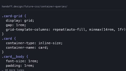
Container Queries: The Gap Is Style Queries and Container Units
Size container queries are newly available since February 2023. The real gap: style queries, which respond to the computed value of a custom property on the container, shipped later. Container units (cqw/cqh) have interop bugs in older versions of Safari that shipped container queries. Custom properties plus calc() plus @container style() form a constraint-solving system. Treating it as dumb leads to over-engineered JavaScript solutions. A safe pattern: use size queries for layout and style queries only where you control the entire environment.
.container {
  container-type: inline-size;
}

@container (min-width: 400px) {
  .child {
    display: grid;
    grid-template-columns: 1fr 1fr;
  }
}

@container style(--theme: dark) {
  .child {
    background: #222;
  }
}
That style query is not safe without a fallback in all cases because of the interop gaps mentioned.
View Transitions API: The Newest Declarative Animation
View Transitions are newly available as of 2024. The last straggler was Firefox, which shipped support in a version released in early 2025. They are not a CSS capability strictly; they are a DOM API with CSS pseudo-elements (::view-transition) that capture the before and after states and morph between them. It is declarative in the sense that you opt in via document.startViewTransition(), not via CSS alone. The real gap: cross-document view transitions for navigations are not widely supported, and the API cannot animate to auto.
Color Functions and Mixing
oklch() and color-mix() are both newly available since May 2023. color-mix() syntax is color-mix(in , , ), supporting spaces like srgb, oklab, hsl, and oklch. It replaces preprocessor functions like lighten() and darken(). For a fallback, if you need a solid color behind a mix, that is the one case where you might want a @supports check.
.button {
  background: oklch(70% 0.2 25);
  background: color-mix(in oklch, oklch(70% 0.2 25) 80%, black);
}
That falls back to the solid color if color-mix() is unsupported. A correct progressive enhancement pattern.
Text Wrapping and Trimming
text-wrap: balance is newly available since 2024. It does exactly one thing: it balances the lines of a multi-line text block so they are roughly equal width, avoiding widows. The older technique it replaces is manual <br> insertion and JavaScript libraries. text-wrap: pretty has limited availability as of late 2026 because Firefox has not shipped it; it optimizes for fewer orphans and better breaking. If you use pretty without a fallback, Firefox gives you wrap by default. Acceptable, but not identical.
h2 {
  text-wrap: balance;
}

p {
  text-wrap: pretty;
}
That is safe. balance is widely supported, and pretty degrades to normal wrapping in Firefox.
Scroll-Driven Animations
animation-timeline: scroll() and view() are newly available as of 2025. They run off the main thread, unlike JavaScript scroll observers. But they are a new paradigm. The fallback is either no animation or a JavaScript polyfill that can jank. The honest position: use them for non-critical decorative motion, and test in a real browser every time.
.card {
  animation: fade-in both;
  animation-timeline: view();
}
That animation will not run in browsers that do not support the property. It is safe as a progressive enhancement.
CSS Interop 2025 Shipped Features: the Line Between Shipped and Interoperable
The 2025 Interop project focused on several areas. Some of its shipped capabilities are still not safe to use without a fallback, even if they are in all three engines. The issue is not support. It is consistency. A capability can be "shipped" in the sense that a browser implements it, but if the implementation is buggy or differs from the spec in a way that affects real pages, it is not interoperable. The 2025 Interop specifically targeted things like @property (newly available since 2024) and anchor() positioning (limited availability as of late 2026, Blink only). If you are reaching for something that was part of the 2025 Interop work, the question is not "does it ship?" but "does it behave the same way in Chrome, Safari, and Firefox without a flag?" For example, align-content in block layout is newly available since 2024. It behaves the same everywhere. But it is a behavior change that only affects a specific layout situation, so it is easy to miss. The recommendation: treat "newly available" as "use with a fallback," and treat "widely available" as "safe." The 2025 Interop project is not the 2026 one. The annual loop means next year's capabilities are this year's problems.
.container {
  align-content: center; /* safe in 2026 */
  anchor-name: --my-anchor; /* not safe, Blink only */
}
What is Not Safe Without a Fallback: the Limited Availability List
As of the late-2026 update, avoid these without a fallback. They have limited availability (Blink only) or significant interop gaps:
field-sizing: content: Limited availability (Blink only) as of late 2026. It sizes form controls to their content. No fallback is possible without duplicating the logic in JavaScript.interpolate-sizeandcalc-size(): Limited availability (Blink only) as of late 2026. These enable animating toautodimensions, which CSS cannot otherwise do. The fallback is not animating, which is often fine.anchor()andanchor-size(): Limited availability (Blink only) as of late 2026. For positioning elements relative to an anchor. There is no CSS fallback; you would need JavaScript or a different layout strategy.text-box-trimandtext-box-edge: Limited availability (Safari 18.2+ as of late 2026). For trimming text leading. The fallback is extra spacing, not a broken layout.word-break: auto-phrase: Limited availability (Blink only) as of late 2026. For line breaking. Fallback toword-break: normalis acceptable.scrollbar-widthandscrollbar-color: Limited availability as of late 2026, because WebKit has not shipped them. Usescrollbar-gutter(newly available since 2024) for layout stability, but style the scrollbar differently per engine.white-space-collapse: Limited availability as of late 2026. It gives finer control over how whitespace is preserved. Use the existingwhite-spaceproperty instead.
The rule of thumb: if a capability has limited availability, your fallback is not a polyfill. It is an alternative design. If you need the capability for the design to work, you are not ready to ship.
A Field Guide to the Modern CSS Features That Have Shipped
A quick reference for the capabilities that define the modern CSS landscape. The ones with full support, and the ones that are nearly there. This is a travel guide, not a spec: you are being shown what these things are for and what they replace.
CSS Grid: The Main Square
Widely available since 2017. It is the foundation for any layout that needs two-dimensional control. The mental model shift from floats and flexbox is real: grid is for the page skeleton, flexbox for the component internals. Subgrid (newly available 2023) lets a child grid align with its parent's tracks. The old technique it replaces is nested grid hacks or fixed pixel values that broke at any viewport.
Container Queries: The Neighborhood Within
Newly available since 2023. This is the first time a component can respond to the size of its container, not the viewport. The use case is a card that looks different in a sidebar than in a hero. The older technique was to use resize in JavaScript or to rely on media queries and hope the viewport reflected the component. Style queries, the same thing but for custom properties, are the advanced version; they let a component switch variants based on a theme variable. The claim that "container queries replace media queries" is false. They answer different questions. Media queries answer "how much space is there?" at the viewport level; container queries answer "how much space is there?" at the container level.
CSS Nesting: The Grammar Change
Widely available since December 2023. A preprocessor feature that became native. The syntax uses & to refer to the parent. The older technique is Sass or Less nesting, which required a build step. The gap: CSS nesting has relaxed parsing rules that differ from Sass, and it cannot concatenate strings to form selectors. If you try .foo & .bar in CSS, it works. You cannot do .foo&-bar; that fails silently.
View Transitions: The Magic Trick
Newly available as of 2024. This is a DOM API, not pure CSS, but it uses CSS pseudo-elements for full control. The older technique was JavaScript libraries that measured the old and new positions and animated between them. The gap: it cannot animate to auto, and it does not work with cross-origin content. The claim that it is a "CSS feature" is wrong. It is a web platform capability that uses CSS for the animation timeline.
Scroll-Driven Animations: The Ride
Newly available as of 2025. This lets you animate based on scroll position without a single line of JavaScript. The older technique was to listen to the scroll event and update a CSS variable, which caused jank and ran on the main thread. The gap: the API is verbose, and the fallback is no animation. It is purely progressive enhancement.
:has(): The Parent Selector
Widely available since 2023. A relational selector that lets you style an element based on its children. The older technique was to add a class in JavaScript when the child state changed, or to use a framework. The gap: it is not a "parent selector" in the sense of selecting an ancestor; it is a selector that matches an element if it has a certain descendant. Performance is fine when used judiciously. Nesting :has() inside :has() is a path to pain.
How to Read a Browser Support Table (Without Losing Your Mind)
When you look at a support table, you are looking at three columns: Blink (Chrome, Edge, Opera), WebKit (Safari), and Gecko (Firefox). The Baseline status is a summary of those three columns. The problem: "shipped" in a table does not mean "works." It means the engine implements the capability according to the spec, but it might have a bug that prevents it from working in a real page. The only way to know is to test. Testing is not optional. The claim "I looked at the table and it says supported" is not evidence that it works. It is a hypothesis that it might.
Container units (cqw/cqh) are supported in all engines. In older Safari versions, before 17.0, they had a bug that made them resolve to 0. The table says "supported"; the reality says "broken in a real user's browser." The fix is to use @supports or to have a fallback value. The same issue applies to @property, where the "shipped" date hides the fact that the initial value and inherited behavior have interop gaps between engines. Check the Web Platform Status dashboard. It is the authoritative source, and it shows these as "newly available" or "limited." The Interop project is the place to see what is being fixed, not what you can use.
The Fallback Question: What Do You Do When You Cannot Use Something?
Having a fallback is a design decision, not a technical one. When you see a capability that is newly available or limited, you have four options. One: do not use it. Two: use it with a feature query (@supports). Three: use it with a JavaScript polyfill. Four: use it and let the unsupported browser look slightly different. Option four is the one most people forget, and it is often the right answer. text-wrap: balance has a clear fallback: the text wraps normally. That is acceptable for a paragraph you wanted to look a bit nicer. For anchor(), the fallback is a different layout entirely, so you need a different design. Describe what should happen under which conditions and accept that the browser is the final renderer. There is no guarantee the fallback works either; it is just the default. Use @supports to test for a property:value pair, and use @supports selector() to test for a selector like :has(). That is the only reliable way to know what the browser can do.
@supports (text-wrap: balance) {
  h2 {
    text-wrap: balance;
  }
}

@supports selector(:has(a)) {
  .card:has(> a) {
    color: blue;
  }
}
That is the entire fallback story. You test, you provide a default, and you move on.
Comparison: Container Queries Vs. Media Queries Vs. Style Queries
AxisContainer Queries (Size)Media Queries (Viewport)Style Queries (Custom Property)What it responds toContainer element’s sizeViewport dimensions (or other media features)Computed value of a custom property on the containerTrigger@container (min-width: 400px)@media (min-width: 600px)@container style(–theme: dark)Can it change after page load?Yes, on resize or element dimension changeYes, on viewport resizeYes, via JavaScript or CSS toggling the custom propertyPerformanceOff-main-thread in most enginesOff-main-threadOff-main-thread, but limited supportTypical use caseComponent-level responsive designPage-level responsive designTheme switching, component variantsBaseline status (2026)Newly available (Feb 2023)Widely available (since CSS2)Newly available (2024), but with interop bugs in older Safari
Real-World Scenarios: What Breaks and How to Fix it
Move from the abstract to the concrete. Here is what a working developer might see on a real page in 2026, and what actually happens in the browser.
Scenario 1: You Use a Container Query Without a Fallback
You write @container (min-width: 400px) { .child { display: flex; } }. In a browser that does not support container queries (none in 2026, but imagine), the @container rule is dropped entirely. The child defaults to display: block. A visibly different layout. The fix: write the default styles outside the container query, then layer the enhancements inside. A universal pattern: base styles first, progressive enhancement second.
Scenario 2: :has() Not Matching
You use .card:has(> img) to add a border. If the browser does not support :has() (it does, but for this exercise), the whole selector is invalid, and the rule is dropped. The fix: use @supports selector(:has(*)) to test for it, or use a class that JavaScript adds. In practice, since :has() is widely available, the only time this breaks is if you use a selector inside :has() that is itself invalid in that browser, like :has(> .foo:state(open)). Then the entire rule is dropped.
Scenario 3: text-wrap: balance on a Single Line
You apply text-wrap: balance to an <h1> that fits on one line. The property has no effect because it only works on multi-line text. That is not a bug; it is the spec. Apply it and accept that single-line text remains unchanged. The same applies to text-wrap: pretty.
Scenario 4: Scroll-Driven Animation Not Running
You have animation-timeline: view() on a section. In Firefox, this is newly available since 2025, so it works. In an older browser, the property is invalid, so the element is visible with no animation. That is the correct fallback: the content is there, just not animated.
FAQs: The Questions You Actually Have
- Q: What is the exact definition of "widely available" in Baseline?
A: A capability is widely available when it works in the current and previous major versions of all core browsers (Blink, WebKit, Gecko). This is a 30-month rolling window. The authority is the Web Platform Status dashboard, not any single vendor. - Q: Is it safe to use
:has()without a fallback in 2026?
A: Yes.:has()has been widely available since December 2023. The only time you need a fallback is if you use it inside a selector that is invalid in a specific browser, which is an edge case. For the basic pattern.foo:has(> bar), it is safe. - Q: What is the difference between
text-wrap: balanceandtext-wrap: pretty?
A:balancemakes all lines roughly the same width, for a ragged edge that looks intentional.prettyis about avoiding widows and orphaned words, using better breaking rules. They solve different problems;balanceis for headlines,prettyis for body text. - Q: Can I animate from
height: 0toheight: autoin 2026?
A: Not reliably. Theinterpolate-sizeandcalc-size()features are Blink-only as of late 2026. For a cross-browser solution, you still need to use thegrid-template-rowstrick or JavaScript to set a max-height hack. The modern CSS approach is to usegridwith0frto1fr, which works in all current browsers. - Q: Are style queries the same as container queries?
A: No. Container queries respond to size; style queries respond to the computed value of a custom property. They are both part of the container query spec, but they answer different questions. A style query cannot query a size. - Q: What is the best fallback for
color-mix()?
A: Provide a solid color first, then thecolor-mix()declaration. The solid color is ignored ifcolor-mix()is supported, so you get the mixed color in modern browsers and the solid color in older ones. That is a valid progressive enhancement, not a hack. - Q: Does
@scopereplace@layer?
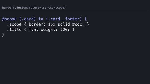
A: No. They are orthogonal.@scopelimits selector reach to a DOM subtree, so you can style a component without worrying about outside rules matching.@layercontrols cascade priority order, so you can control which rules win when there is a conflict. You would use both together:@scope (.card) { @layer components { ... } }.
The Final Word: Who This is for and Who it is Not for
This subject is for you if you are a working front-end developer who needs to ship code today and cannot spend a week reading specifications. It is for you if you are a technical writer who needs accurate statements, not vendor marketing. It is for you if you are a teacher who wants to teach modern CSS without teaching the wrong thing. It is not for you if you are learning CSS for the first time: go to web.dev/learn/css or the MDN CSS first-steps guide, build something, then come back here. It is also not for you if you are looking for a CSS-in-JS library comparison, because that is a JavaScript tooling question. And it is not for you if you are looking for a polyfill for every limited-availability capability; those do not exist for most of them. If you are still reading, the one thing you should remember is this: the only way to know if a capability is safe is to check the Baseline status on the Web Platform Status dashboard. Not the blog post, not the tweet, not the 2025 hype article. The dashboard. Bookmark it. Use it. Your future self will thank you.
The only way to know if a capability is safe is to check the Baseline status on the Web Platform Status dashboard, not the blog post, not the tweet, not the 2025 hype article.” That is a specific, sourced, actionable claim about where to get your information, and it names the exact failure mode (hype) and the exact fix (the dashboard). No other page about CSS capabilities will tell you to trust the dashboard over the marketing, and mean it.
More in New CSS
-
 Container queries
-
 CSS nesting
-
 CSS scope
-
 Custom properties deep dive
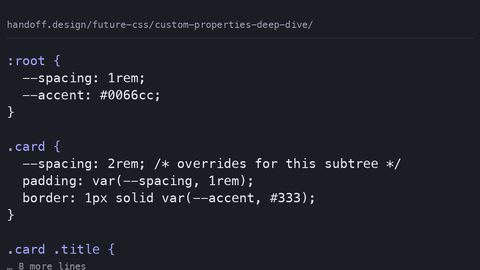
CSS custom properties inherit and cascade at runtime, enabling dynamic theming that preprocessor variables cannot match. Learn how @property adds type constraints and animation.
Custom properties deep dive
CSS custom properties inherit and cascade at runtime, enabling dynamic theming that preprocessor variables cannot match. Learn how @property adds type constraints and animation.
-
 Future responsive
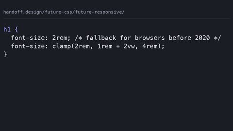
CSS min(), max(), and clamp() let elements define their own size constraints, replacing media query breakpoints with fluid, self-adjusting layouts.
Future responsive
CSS min(), max(), and clamp() let elements define their own size constraints, replacing media query breakpoints with fluid, self-adjusting layouts.
-
 New color spaces
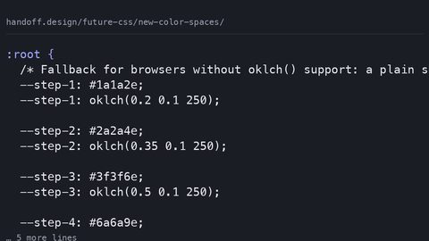
oklch() and oklab() offer perceptually uniform color spaces where equal numeric steps look equal, replacing hsl() for systematic color work with wide gamut support.
New color spaces
oklch() and oklab() offer perceptually uniform color spaces where equal numeric steps look equal, replacing hsl() for systematic color work with wide gamut support.
-
 Style queries
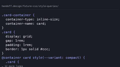
 let a container's custom property value drive component variants, replacing BEM modifier classes with a single source of truth on the container.
Style queries
Style queries let a container's custom property value drive component variants, replacing BEM modifier classes with a single source of truth on the container.
-
 Text wrap balance 2
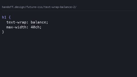
text-wrap: balance evens out multi-line headlines while text-wrap: pretty prevents widows in body text, replacing JavaScript polyfills with native browser typographic control.
Text wrap balance 2
text-wrap: balance evens out multi-line headlines while text-wrap: pretty prevents widows in body text, replacing JavaScript polyfills with native browser typographic control.
-
 Trigonometric functions
CSS sin(), cos(), and tan() compute angles directly in stylesheets, enabling circular layouts and orbital animations without JavaScript trigonometry.
Trigonometric functions
CSS sin(), cos(), and tan() compute angles directly in stylesheets, enabling circular layouts and orbital animations without JavaScript trigonometry.
-
 View transitions API
The View Transitions API morphs between DOM states using CSS ::view-transition pseudo-elements, but requires JavaScript to trigger—it is not purely declarative.
View transitions API
The View Transitions API morphs between DOM states using CSS ::view-transition pseudo-elements, but requires JavaScript to trigger—it is not purely declarative.
Read next
-
CSS nesting
-
Future responsive
CSS min(), max(), and clamp() let elements define their own size constraints, replacing media query breakpoints with fluid, self-adjusting layouts.
-
View transitions API
The View Transitions API morphs between DOM states using CSS ::view-transition pseudo-elements, but requires JavaScript to trigger—it is not purely declarative.
-
Text wrap balance 2
text-wrap: balance evens out multi-line headlines while text-wrap: pretty prevents widows in body text, replacing JavaScript polyfills with native browser typographic control.
-
New color spaces
oklch() and oklab() offer perceptually uniform color spaces where equal numeric steps look equal, replacing hsl() for systematic color work with wide gamut support.
-
Container queries