How cubic-bezier Defines Custom Easing Curves for CSS Transitions and Animations
cubic-bezier defines custom easing curves with four control points for CSS transitions and animations. Learn to design curves that feel natural using complete code samples.
Most developers assume the four numbers in a cubic-bezier CSS easing are two independent points on a graph. That is wrong. The function accepts exactly four values, and they are the x and y coordinates of two control points: cubic-bezier(x1, y1, x2, y2). The curve always starts at P0, fixed at (0,0), and ends at P3, fixed at (1,1). What you actually control are P1 and P2, and those two control points bend the path between the fixed endpoints. This single correction changes how you read every easing curve you have ever copied from a library.
The mathematical structure is a cubic Bézier curve, the same kind used in vector graphics and font outlines. Time is the x-axis, progress is the y-axis. P0 at (0,0) means zero elapsed time and zero progress. P3 at (1,1) means full duration and full completion. Your P1 and P2 values are the only freedom you have, and their x-coordinates must stay in the range [0,1]. If they do not, the curve becomes non-monotonic and time moves backward, which most browsers reject. The y-coordinates can go outside [0,1], and that is how you create overshoot, where progress exceeds 100% before settling back to the final state.
The transition-timing-function property accepts this function directly. The animation-timing-function property does the same for keyframes. Both properties share the same grammar, and both resolve to a computed style that shows the literal cubic-bezier string, not the keyword you wrote. Set transition-timing-function: ease, and the browser computes it to cubic-bezier(0.25, 0.1, 0.25, 1.0). That resolved value is what DevTools displays, and it is what you copy when you want to tweak a preset.
The predefined keywords are shortcuts, not separate features. linear equals cubic-bezier(0.0, 0.0, 1.0, 1.0), a straight diagonal line with no acceleration. ease-in equals cubic-bezier(0.42, 0.0, 1.0, 1.0), starting slow and ending fast. ease-out equals cubic-bezier(0.0, 0.0, 0.58, 1.0), starting fast and ending slow. ease-in-out equals cubic-bezier(0.42, 0.0, 0.58, 1.0), symmetric acceleration and deceleration. The default for any transition or animation shorthand is ease, which is not linear and surprises developers who expect uniform motion.
Custom Easing Curve CSS: Designing the Control Points
A custom easing curve always starts with the same four control points, but the y-values are where you express intent. To make a card overshoot on hover, push P1’s y above 1.0. To make an entrance feel snappy, pull P2’s y below 0.0. The x-values control how quickly the curve reaches those extremes. A low x1 means the overshoot happens early; a high x2 means the recovery happens late. No rule says the curve must be symmetric, and most natural motion is not.
Here is a transition that overshoots and settles, the classic spring-like feel without any JavaScript:
.card {
  transition-property: transform;
  transition-duration: 300ms;
  transition-timing-function: cubic-bezier(0.34, 1.56, 0.64, 1);
}

.card:hover {
  transform: scale(1.05);
}

@media (prefers-reduced-motion: reduce) {
  .card {
    transition-duration: 0.01ms;
    transition-timing-function: linear;
  }
}
The y-value 1.56 is the overshoot. The card scales past 1.05, reaches roughly 1.07, then settles back. The x-values 0.34 and 0.64 keep the curve asymmetric, so the overshoot fires early and the recovery lingers. Change 1.56 to 0.0 and the curve becomes a standard ease-out. Change it to 2.0 and the overshoot becomes a visible bounce. The exact number is a matter of taste, but the direction is always the same: above 1.0 overshoots, below 0.0 anticipates.
Cubic-bezier Function Syntax: What the Four Arguments Mean
The cubic-bezier function syntax is unforgiving about argument order. The first value is always P1’s x, the second is P1’s y, the third is P2’s x, and the fourth is P2’s y. Swapping the first two values changes the curve from accelerating to decelerating. Swapping the middle two reverses the timing entirely. The x-values must be between 0 and 1, or the browser drops the entire declaration and falls back to the previous timing function. The y-values have no such constraint, and going outside [0,1] is the only way to get overshoot or anticipation.
The specification is CSS Easing Functions Level 2, and the production is <cubic-bezier-easing-function>. The initial value in any shorthand is ease, which resolves to cubic-bezier(0.25, 0.1, 0.25, 1.0). That default is a compromise, not a design choice. For motion that feels intentional, write the function explicitly. The accepted fallback pattern is to declare a keyword first, then the cubic-bezier override, so older browsers still get a working easing:
.element {
  transition-timing-function: ease;
  transition-timing-function: cubic-bezier(0.34, 1.56, 0.64, 1);
}
The second declaration wins in every browser that supports cubic-bezier, which is every modern browser. The first declaration is the fallback for the tiny population of devices locked to older engines. You can also guard with @supports, but the double-declaration pattern is shorter and covers the same ground. The @supports form exists for cases where you need to test a specific curve before applying it:
@supports (transition-timing-function: cubic-bezier(0.34, 1.56, 0.64, 1)) {
  .element {
    transition-timing-function: cubic-bezier(0.34, 1.56, 0.64, 1);
  }
}
CSS Transition Timing Function: Choosing Between Keywords and Custom Curves
The transition-timing-function property accepts both keywords and cubic-bezier, and the choice is not aesthetic. Keywords are single-purpose: ease-in accelerates, ease-out decelerates, ease-in-out does both. Custom curves give you asymmetry, overshoot, and anticipation. For a modal that slides in from the top, ease-out feels right because the motion starts fast and coasts to a stop. For a button that grows on hover, a custom curve with overshoot makes the interaction feel alive. For any motion that repeats, linear avoids the robotic stutter of ease-in-out at the loop point.
Here is an animation with an asymmetric ease curve for an entrance effect, where the element drops in and settles with a slight bounce:
@keyframes drop-in {
  0% {
    transform: translateY(-100%);
    opacity: 0;
  }
  100% {
    transform: translateY(0);
    opacity: 1;
  }
}

.hero {
  animation-name: drop-in;
  animation-duration: 600ms;
  animation-timing-function: cubic-bezier(0.22, 1.2, 0.36, 1);
  animation-fill-mode: both;
}

@media (prefers-reduced-motion: reduce) {
  .hero {
    animation-duration: 0.01ms;
    animation-timing-function: linear;
  }
}
The curve here is asymmetric on purpose. The y1 of 1.2 makes the element overshoot downward past its final position, then the y2 of 1.0 keeps the recovery fast. The x2 of 0.36 means the curve reaches the overshoot early in the timeline, so the bounce reads as a single gesture rather than a wobble. Use ease-in-out and the entrance accelerates and decelerates symmetrically. The element never overshoots. It feels like a machine lowering a weight, not a natural drop.
Animation Easing Curve Design: Controlling the Feel
Animation easing curve design is the difference between motion that guides the eye and motion that distracts it. The curve’s shape tells the user how much time has passed and how much remains. A curve that starts flat and ends steep says the animation is building toward a finish. A curve that starts steep and ends flat says the animation is a quick response that relaxes. A curve with overshoot says the animation is energetic and playful. A curve with anticipation, where progress goes negative before it goes positive, says the animation is drawing back before it strikes.
The same movement with linear versus custom easing shows the difference immediately. Linear progress moves at a constant speed, so a card sliding across the screen covers the same distance every millisecond. Custom easing with overshoot accelerates, passes the target, comes back, and settles. The linear version feels like a train on rails. The custom version feels like a hand placing the card. Neither is wrong, but they communicate different things about the interface: linear says mechanical, custom says considered.
Here is the comparison, two identical elements moving the same distance with different timing functions:
.move-linear {
  transition-property: transform;
  transition-duration: 400ms;
  transition-timing-function: linear;
}

.move-custom {
  transition-property: transform;
  transition-duration: 400ms;
  transition-timing-function: cubic-bezier(0.34, 1.56, 0.64, 1);
}

.move-linear:hover,
.move-custom:hover {
  transform: translateX(200px);
}

@media (prefers-reduced-motion: reduce) {
  .move-linear,
  .move-custom {
    transition-duration: 0.01ms;
    transition-timing-function: linear;
  }
}
Run this in any browser and hover both elements. The linear one moves at a constant pace. The custom one accelerates, shoots past 200px, and then settles back. The difference is not subtle. The custom curve adds roughly 40-60ms of perceived motion beyond the declared duration because the overshoot extends the visual movement. That is why you must account for overshoot in the duration: a 300ms transition with a y-value of 1.5 feels longer than a 300ms linear transition.
Building Curves in Chrome DevTools Easing Editor
The Chrome DevTools easing editor is the fastest way to design a curve without guessing numbers. Open the Styles pane, find a transition-timing-function or animation-timing-function declaration, and click the curve icon next to it. A visual editor appears with a draggable cubic-bezier graph. Drag P1 and P2, watch the curve update live, and copy the resulting function directly into your stylesheet. The editor also shows the predefined keywords as presets, so you can start from ease-out and then push the y-value up to create overshoot.
When you inspect an element with a transition or animation, the computed style tab shows the resolved cubic-bezier string. Write ease-in and the computed value appears as cubic-bezier(0.42, 0.0, 1.0, 1.0). This is useful for debugging: you can see exactly what the browser is using, and you can copy that string into the editor to tweak it. The editor also displays the curve’s maximum and minimum progress values, which tells you how much overshoot a given y-value produces before you commit to it.
Performance and Accessibility of Custom Easing
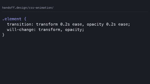
Animating anything other than transform or opacity with these curves still triggers layout or paint. A cubic-bezier curve does not change the property’s compositor eligibility. Animate width, height, top, or left, and the browser must recalculate layout on every frame, even with the smoothest curve. The animation compositor only runs on the compositor thread for transform and opacity. For any other property, the main thread does the work, and the curve determines the timing of that work.
The compositor-only claim is categorical: transform and opacity are the canonical compositor-safe properties. Everything else is partial or main-thread. A custom cubic-bezier with overshoot on a width animation causes layout thrash, because the width changes each frame and the overshoot pushes the width beyond the target before it settles. The fix is to animate transform instead. Use scale for size changes, translate for movement, and opacity for fading. The curve stays the same. The performance profile changes from janky to smooth.
Accessibility is not optional. The prefers-reduced-motion media query is the standard way to respect a user’s system setting. Every custom easing curve needs a fallback that reduces or eliminates motion. The pattern: set the transition or animation duration to 0.01ms and the timing function to linear inside the media query. This preserves the state change while removing the visual movement. A 0.01ms duration is effectively instant, but it still allows the transition to complete, so the element reaches its final state.
FAQ: Cubic-bezier and Custom Easing
What is the difference between cubic-bezier and the keyword easings?
The keywords are predefined cubic-bezier curves. ease is cubic-bezier(0.25, 0.1, 0.25, 1.0), linear is cubic-bezier(0.0, 0.0, 1.0, 1.0), and the others are their own fixed curves. The function lets you create any curve between the fixed endpoints.
Can the x-values in cubic-bezier be negative or greater than 1?
No. The x-values represent time, and they must stay within [0,1]. Use an x-value outside that range, and the browser rejects the declaration. The y-values can go outside [0,1], which is how overshoot and anticipation work.
Why does my transition not fire when I use a custom curve?
The transition only fires if the property value changes. Animate from a non-interpolable value, such as auto to 0, and no transition occurs regardless of the timing function. The curve does not force a transition; it only shapes one that is already happening.
How do I make a curve that overshoots?
Set the y-value of P1 or P2 above 1.0. For example, cubic-bezier(0.34, 1.56, 0.64, 1) overshoots because the y1 is 1.56. The higher the y-value, the larger the overshoot. Values above 2.0 start to look bouncy rather than springy.
Does cubic-bezier work in all browsers?
Yes, for the practical purpose of web development. It shipped in Chrome 1.0 in 2008 and has been in every browser since. The only gap is very old devices that do not receive updates. The double-declaration fallback covers those cases.
What is the best way to learn curve design?
Use the Chrome DevTools easing editor. Drag the control points, watch the preview, and copy the values. Start from a keyword preset and modify one y-value at a time. The editor shows the curve and its overshoot, so you can see the result before you commit.
Should I use steps() instead of cubic-bezier?
No, unless you need discrete jumps. steps() divides the animation into equal intervals, which is for progress bars or typewriter effects. Cubic-bezier is for smooth motion. They solve different problems, and mixing them confuses the timing model.
Real Interop Gaps and What to Do About Them
The claim of universal browser support for cubic-bezier is nearly true. The real gap is the small fraction of users on older device-locked browsers. iOS Safari on unsupported devices and Android WebView in apps that do not update are the usual culprits. These browsers still understand the function, but they may not support the latest easing features like using the function in animation-timing-function with a sub-property fallback. The practical mitigation is the double-declaration pattern, which costs nothing.
The performant animation claim is the one that bites. CSS animations are not inherently hardware-accelerated. The compositor only accelerates transform and opacity. Any other property, including those animated with a custom cubic-bezier, triggers layout or paint on the main thread. The curve does not change that. If you need to animate a property that cannot be expressed as transform or opacity, accept the performance cost or reconsider the interaction.
The “CSS for all animations” claim has a similar gap. CSS cannot animate to auto, cannot sequence complex timelines without the Web Animations API, and cannot respond to JavaScript state without flipping custom properties. A cubic-bezier curve does not fix any of those. The gap is any animation that depends on layout-computed values. If you need to animate a height from 0 to auto, you cannot use cubic-bezier alone; you need a workaround like max-height or the WAAPI.