Managing Your Design Assets for Developer Handoff
Establish the asset handoff contract: naming conventions, export formats, and folder structures that let developers drop design files directly into a CSS codebase.
Most teams treat the design-to-development asset handoff as a delivery problem: the designer exports a few PNGs, drops them in a folder, and the developer figures out the rest. That assumption is exactly backwards, and it is why so many handoffs fail. The real work is not in the export button. It is in defining the workflow before a single file is created. When you name, organise, and export assets the way CSS actually consumes them, the developer stops renaming, resizing, and reformatting, and starts writing styles that match the intent. This page specifies the contract from the developer’s perspective: the naming convention that maps to CSS class names, the export formats that match what the browser can render without hacks, and the folder structure that mirrors a component directory. If an asset cannot be dropped into a stylesheet as-is, the handoff has already failed.
Naming That Matches The Selector
The first mistake teams make is treating filenames as cosmetic. A file called "final_logo_v3_updated.png" tells the developer nothing about where it belongs in the CSS. The naming convention must map directly to the CSS class or component name, so that the file path and the selector are one and the same. For a button component, name the asset "button-primary.svg" and the class ".button-primary". For an icon set, use the icon's purpose, not its visual description: "search.svg" not "magnifying-glass-blue.svg". The developer should never have to translate a filename into a selector; the translation should already be done. This is the foundation of a naming convention the developer can consume, and it is the difference between a handoff that takes an afternoon and one that takes a week. When the name matches the class, the developer can write the CSS without opening the design file, since the contract is implicit in the file system.
Export Formats The Browser Understands
The second failure is exporting everything as PNG, or worse, as JPG, and expecting the developer to make it work. CSS consumes different formats for different jobs, and choosing the wrong one forces the developer to either overlay hacks or request new exports. The rule is straightforward: vector for icons and logos, raster for photographs and complex gradients. For vector, use SVG, and make sure the viewBox is set to the icon's actual bounding box, not the artboard's padding. For raster, export at the exact resolution the CSS will use, and if you must support high-DPI screens, export at 2x and let the browser downscale via CSS. Never rely on background-size to shrink a large image down; that wastes bytes and blurs the result. The correct pattern is to export at the target size or at 2x for retina, and then let the CSS reference that file with no overrides. This is the core of an export format CSS can implement: the format and dimensions must match what the CSS property expects, or the developer is doing the designer's job.
Folder Structure That Mirrors The Components
The folder structure is where most handoffs collapse into chaos. A flat folder with two hundred files named "icon-1.svg" through "icon-200.svg" is not an asset library; it is a scavenger hunt. The structure must mirror the component directory that the CSS uses. If the project has a "components/button/" folder, then the assets live in "assets/components/button/". The developer should be able to look at the CSS rule for ".button-primary" and know the file is at "assets/components/button/button-primary.svg" without checking. This is the discipline of file organisation the handoff depends on, and it is not optional. Version control is part of this structure: the assets live in the same repository as the CSS, so a change to an SVG appears in the same commit as the change to the stylesheet. If the assets live elsewhere, the developer cannot trace the change, and the handoff becomes a guessing game. A version-controlled asset library with a mirror-image folder structure is the only structure that survives contact with a real codebase.
Runnable Sample: The Background Image Rule
Now that the naming, format, and structure are defined, the developer must be able to drop the assets into the CSS without thinking. Here is the first runnable sample: a CSS rule that references a background image with the correct path and format, and no overrides. The path is relative to the stylesheet, and the file is named to match the class. This is what the developer should be able to write without opening the design file.
/* assets/components/button/button-primary.svg is the source of truth */
.button-primary {
  background-image: url('./button-primary.svg');
  background-repeat: no-repeat;
  background-position: center;
  width: 24px;
  height: 24px;
}
Notice what is absent: no background-size, because the SVG's viewBox already controls the rendered size; no format guessing, because the filename and extension are definitive; no path traversal, because the asset is in the component's own folder. The developer writes this rule, and it works. If the asset were a raster image, the same rule would reference a WebP file with a PNG fallback, as the next section covers.
Runnable Sample: WebP With A PNG Fallback
The second sample shows the modern raster pattern: WebP as the primary format with PNG as a fallback, declared via the CSS background-image property. WebP gives better compression than PNG for photographs and complex gradients, but older browsers, specifically Safari versions released before 2020, do not support it. The @supports rule is the clean way to provide the fallback without duplicating the entire rule. Here is the pattern, and it is complete and runnable on its own.
/* Use WebP when supported, fall back to PNG for older engines */
.photo-header {
  background-image: url('./photo-header.png');
  background-size: cover;
  background-position: center;
}

@supports (background-image: url('./photo-header.webp')) {
  .photo-header {
    background-image: url('./photo-header.webp');
  }
}
This is not a perfect pattern: @supports tests the value, not the file, so a missing WebP file would still fail. The honest version is that you must ensure the WebP file actually exists, and if it does not, the browser falls back to the PNG. But this is the right pattern for a raster asset that must support both modern and legacy browsers. The alternative, using a <picture> element with multiple <source> elements, is better for HTML-embedded images, but it does not work for CSS background images. So the developer is stuck with this pattern, and it works if the files are named correctly and the build process does not rename them.
Runnable Sample: Inline SVG For Interface Icons
The third sample addresses SVG icon usage, which is different from background images. An icon that is part of the UI chrome, not the content, can be inlined directly into the HTML, which avoids a network request and allows CSS styling of the fill and stroke. The SVG must be exported with the correct viewBox, which is the coordinate system of the icon's artwork, not the artboard's padding. Here is a complete example: an inline SVG icon used in a button, with CSS controlling its size and colour.
.icon-button {
  display: inline-flex;
  align-items: center;
  justify-content: center;
  width: 40px;
  height: 40px;
  border: none;
  background: transparent;
  cursor: pointer;
  color: #333;
}

.icon-button:hover {
  color: #007acc;
}

.icon-button svg {
  width: 24px;
  height: 24px;
}
This is the inline SVG pattern done right: the SVG is inline, so there is no HTTP request; the viewBox matches the icon's geometry, so the size is defined by the CSS width and height; and the colour is inherited via currentColor, so a hover state changes the icon without a second file. Never use a background-image with an SVG for an interface icon when inline SVG is this much simpler and more performant. The only reason to use a background-image for an SVG is when the SVG is a complex illustration with a fixed aspect ratio that does not need to respond to the text colour.
Runnable Sample: Build-Time Automation
The fourth sample covers the build-time automation that makes the handoff sustainable. A manual export process is a single point of failure: someone forgets to run the export, or exports at the wrong size, or saves a PNG when the spec said WebP. The solution is an automated export process that takes the design-exported assets and optimises them for production without manual intervention. Here is a complete build script, written for Node.js and using the sharp library, that takes a folder of PNGs and SVGs and outputs optimised WebP and minified SVG versions.
// build-assets.mjs
import sharp from 'sharp';
import { promises as fs } from 'node:fs';
import path from 'node:path';

const inputDir = 'src/assets';
const outputDir = 'dist/assets';

async function optimizeAssets() {
  await fs.rm(outputDir, { recursive: true, force: true });
  await fs.mkdir(outputDir, { recursive: true });

  const files = await fs.readdir(inputDir, { recursive: true });
  for (const file of files) {
    const ext = path.extname(file).toLowerCase();
    const fullPath = path.join(inputDir, file);
    const relativePath = path.relative(inputDir, fullPath);
    const outputPath = path.join(outputDir, relativePath);

    if (ext === '.png') {
      const webpPath = outputPath.replace(/\.png$/i, '.webp');
      await sharp(fullPath).webp({ quality: 80 }).toFile(webpPath);
    } else if (ext === '.svg') {
      const svg = await fs.readFile(fullPath, 'utf8');
      const optimized = svg.replace(/\s+/g, ' ').replace(/> <').trim();
      await fs.mkdir(path.dirname(outputPath), { recursive: true });
      await fs.writeFile(outputPath, optimized, 'utf8');
    }
  }
  console.log('Assets optimised in', outputDir);
}

optimizeAssets().catch(console.error);
This script is the heart of the automated export process: it reads the source assets, converts PNGs to WebP with a controlled quality level, minifies SVGs by removing whitespace, and preserves the folder structure so the CSS paths remain valid. The developer runs one command, and the assets are production-ready. No manual optimisation, no forgotten files, no mismatched resolutions. This is the asset process that the handoff contract requires, and it is the only way to guarantee that what is in the repository is what is in the design.
The Resolution Scaling Trap
With the samples in place, the next concern is resolution scaling. A common belief is that exporting at 2x and letting CSS downscale via background-size is a safe default. It is not. If the CSS sets a fixed width and height on a 2x image, the browser decodes the image at its full resolution and then scales it down, which wastes memory and bandwidth. The correct approach is to export at the exact target size for 1x displays, and at 2x only for high-DPI screens, using the image-set function or a media query. The CSS background-image property supports image-set for this exact purpose. Here is the pattern.
.logo {
  width: 100px;
  height: 50px;
  background-image: url('./logo.png');
}

@media (-webkit-min-device-pixel-ratio: 2), (min-resolution: 192dpi) {
  .logo {
    background-image: url('./[email protected]');
  }
}
The developer must know whether the asset is 1x or 2x, and the naming convention must encode it: "logo.png" for 1x and "[email protected]" for 2x. This is the only way to keep the file size budget reasonable without sharpness loss. If the design tool exports 2x by default, the developer either writes a media query for every image or accepts the waste. The better answer is to set the export resolution to 1x in the design tool and let the build script generate the 2x version only when needed. The file size budget is not a constraint on creativity; it is a budget on the user's data plan, and it is the developer's job to enforce it, which means the designer must provide the right input.
Design Tokens As Part Of The Handoff
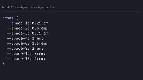
Now that the asset formats and resolutions are settled, the design token question arises. Design tokens are the named values that define the visual language: colours, spacing, typography. They are not assets in the image sense, but they are part of the same handoff, and they deserve the same rigour. A colour called "$brand-primary" in a Sass file is a build-time constant, not a design token; it cannot change at runtime. A custom property called "--brand-primary" is a real token, because it can be overridden in a media query, a class, or a shadow DOM. The developer should receive design tokens as CSS custom properties, not as preprocessor variables, because only custom properties have the runtime behaviour that modern CSS requires. The file naming convention for tokens follows the same rule as assets: the token name matches the CSS property it feeds, so "--spacing-unit" is in a file called "tokens.css" and is referenced as var(--spacing-unit). This is the design token format specification that the W3C Design Tokens Community Group has been drafting, and it is the standard to follow.
The file organisation for tokens mirrors the asset structure. A "tokens/" folder at the root of the stylesheet directory, containing "colors.css", "spacing.css", "typography.css", and "layering.css", is the modern pattern. Each file defines custom properties on the :root or on a scoped selector. The developer imports these files in order, and the cascade works as expected. This is where CSS @layer becomes relevant: the token definitions should live in a layer named "tokens" so that they have lower specificity than component styles, but the layer order is established at first declaration, so the developer must define the layer order once, at the top of the stylesheet, and then use the layers consistently. A common mistake is to assume that @scope creates a new stacking context; it does not. @scope only affects selector matching, not the visual stacking order. The developer needs to know this distinction when reading a design file that uses scoped styles, because the design tool's "grouping" feature is not the same as CSS containment.
The automated export of tokens is the next step. The build script written earlier can be extended to read a JSON file of tokens and generate a CSS file of custom properties. This is what Style Dictionary does, and it is the right tool for the job because it separates the token values from the output format. The designer maintains a JSON file, and the developer runs the build script to generate the CSS. This is the asset process applied to tokens, and it removes the manual error of transcribing a colour value. The same script can also generate the Sass variables for legacy codebases, but the target should be custom properties. The failure mode to avoid is defining tokens in multiple places: once in the design tool, once in a JSON file, and once in CSS. That is three sources of truth, and they will drift. The single source of truth is the design tool's export, and the build script is the only thing that touches it.
CSS Modules And Scoping
Now that the asset process is automated, the question of CSS Modules and scoping is separate but related. CSS Modules, a bundler convention since 2015, scope classes by hashing them, so ".button" becomes ".button_3f2a". This is a legitimate alternative to BEM for manual scope isolation, and it is the default in many React and Vue projects. However, it introduces a constraint: the asset filenames and the class names must match at build time, because the bundler resolves the class name in the HTML to the hashed name in the CSS. If the design asset is named "button-primary.svg" and the CSS module is ".button-primary", the bundler must understand that mapping. The failure mode is when a developer uses a CSS module to import an asset, and the bundler's asset process renames it, breaking the background-image URL. The solution is to use the asset import feature of the bundler, which gives you a URL that is stable and versioned. This is a build-time concern, not a runtime one, and it is the developer's job to configure it correctly. The designer does not need to know about hashing; they need to name the file correctly.
Version Control And The File Size Budget
The version control aspect of the handoff cannot be overstated. Assets live in the same repository as CSS, and every change to an SVG or PNG is a commit. This is the only way to trace a visual regression to a specific change. A common mistake is to commit binary files to a git repository and expect the history to stay clean; git is not great at binary diffs, but it is still better than not versioning them at all. The alternative, storing assets in a separate DAM (digital asset management) system, breaks the link between the source of truth and the codebase. The developer cannot review a pull request that changes an SVG if the SVG lives outside the repository. The honest version is that git will bloat if you commit large binaries, but the solution is to use Git LFS for files over a certain size, not to avoid versioning them. The file size budget should be a concern at design time: an SVG that is 10KB after optimisation is fine; a PNG that is 2MB is not. The developer should have a budget and enforce it with a linter that fails the build if a file exceeds it.
Cross-Browser Fidelity
A final piece of the handoff is the understanding that the browser is the final renderer, and no design tool can predict every rendering engine's behaviour. An SVG that renders correctly in Chrome may have a gradient that does not fill in Safari if the gradientUnits are not set correctly. A WebP file that is crisp on a Retina display may be soft on a standard monitor if the browser applies its own scaling. The developer must accept this and test in multiple engines, but the designer can reduce the risk by following the export guidelines: use explicit viewBox values, avoid filters that are computationally expensive, and provide a PNG fallback for any raster effect that is not essential. The failure mode is when a designer exports a single SVG and expects it to work everywhere, without testing the fallback. No export process can guarantee cross-browser fidelity for every asset, but the contract defined here, naming, format, structure, and automation, is the best chance of getting close. The developer who follows this contract will spend their time solving rendering bugs, not renaming files.
Icon Fonts Are A Legacy Solution
The next section addresses a common question: should the developer use an icon font instead of inline SVG or background images? The short answer is no, not for new projects. Icon fonts have been a historical fallback because they were the only way to get scalable, colour-controlled icons in the pre-SVG era, but they have several failure modes that make them unsuitable for modern development. First, an icon font is a single file that must be downloaded in full, even if the page uses only one icon. Second, the browser renders the font as text, which means it is subject to font loading and anti-aliasing issues; an icon can display as a blank square if the font fails to load. Third, the unicode codepoints are opaque; a developer cannot look at a character and know which icon it is. Fourth, the glyph rendering can be inconsistent across platforms, with different default line-heights and metrics. The modern alternative is inline SVG for interface icons, which gives the developer full control over the colour and size via CSS, and SVG references for multiple instances of the same icon, which avoids duplicating the markup. The only case where an icon font might be acceptable is a legacy codebase that already uses one and is not being refactored, but even then, the migration path is to inline SVG.
Image Sprites In The HTTP/2 Era
The subject of image sprites is worth a brief mention, because it is a technique that is often misunderstood. An image sprite is a single file that contains multiple images, positioned via CSS background-position. This was a critical optimisation in the HTTP/1.1 era, when each request had a high latency cost, but it is largely unnecessary today with HTTP/2 multiplexing. The modern advice is to avoid creating a sprite manually; instead, use the automated export process to generate individual files, which the browser can cache independently. The failure mode is when a developer creates a sprite for two small icons and then has to update the CSS every time the sprite changes. The build script can, in theory, generate sprites, but the complexity is not worth it when you can serve individual SVGs that are tiny and cacheable. The file size budget is the deciding factor: if the total weight of the sprite is less than the weight of the individual files, the sprite wins, but with HTTP/2, the overhead per request is near zero, so the individual files are usually the better choice. The only exception is for a hero image that is a single photograph and is used across multiple breakpoints; there, a responsive image approach with the srcset attribute on an <img> element is better than a CSS background-image, because the browser can select the right resolution based on the viewport.
Export Settings In Design Tools
Now we turn to the practical matter of what the developer does with the assets when the design tool is Figma, Sketch, or Adobe XD. The export from these tools should be configured to match the contract: the naming convention, the format, and the folder structure. This is where the design tool's export settings matter. Figma, for example, allows you to set a prefix for the export, and you can name the layer to match the desired filename, but the designer must be disciplined about it. The honest version is that design tools are not built for this; they are built for visual editing, not for managing a codebase. The designer must treat the asset library as a code artifact, not as a collection of pretty pictures. This is why larger teams use a dedicated tool like Style Dictionary or a design token manager to generate the assets and the CSS, and the design file is only the source of truth for the visual composition, not for the code. The developer should not be expected to open the design file to find a filename; the filename should be derivable from the component name and the property it represents.
Regression Testing For Assets
The failure case is when the design tool's export is not reproducible. The designer changes the artboard size, and the next export has a different set of dimensions, so the CSS background-size is suddenly wrong. The developer must be able to detect this drift automatically. This is where the automated export process steps in again: the build script can read the dimensions of the input image and compare them to a manifest of expected values; if they differ, the build fails. This is a regression test for assets, and it is the only way to guarantee that the handoff does not silently break. The manifest can also store the file size budget, so the build fails if the asset grows beyond a certain byte count. This is the practical application of the file size budget: it is not a guideline, it is a hard constraint enforced by the CI process. The developer who implements this is the one who never gets a surprise in production.
CSS-Generated Effects Over Images
At this point, the reader has a complete picture of the asset handoff contract. But there is one more question that is rarely asked: what happens when the asset is not a static file but a CSS-generated effect? A gradient, a box-shadow, a border-radius, a filter, these are all CSS properties that the developer can write directly, without an asset. The designer should prefer these over exporting an image whenever possible, because CSS-generated effects are resolution-independent, they load instantly, and they can be animated. The only reason to export an image for a gradient is if the gradient is so complex that the CSS would be unmaintainable, but that is rare. The modern CSS features, such as color-mix() for blending colours relative to a background, and aspect-ratio for reserving space before the image loads, have reduced the need for pre-composited images. The developer should be able to look at a design and identify which parts are CSS and which are assets, and the handoff should make that distinction explicit. A design file that marks the styleguide with "this is a gradient" or "this is an SVG" is already halfway to a good handoff.
CSS Nesting And @layer
The section on CSS nesting and @layer is relevant here because it affects how the developer writes the styles that consume the assets. Native CSS nesting, shipping in all engines, allows the developer to write nested selectors without a preprocessor. This is a direct replacement for Sass and Less nesting, and it means the developer can write a component's styles in a single block, with the asset references in the right place. The failure mode with nested CSS is when the developer uses an element selector without the & prefix, which is invalid per spec; the browser throws away the rule, and the asset is never referenced. The build process must also handle this correctly; Lightning CSS, a Rust-based tool, can transform nested CSS to plain CSS for older browsers, but it may not warn about the & omission. The developer must know the spec, not just the tool. The advice is to write the & explicitly, even when it feels redundant, because it removes ambiguity and matches the spec. The same discipline applies to @layer: the asset styles, the component styles, and the utility styles should each live in their own layer, and the order of the layers is declared once. The @layer rule is a cascading primitive, not a design pattern, and it is not a replacement for a naming convention like BEM; it is a complement to it.
The Silent 404 Problem
The role of the CSS background-image property and its interaction with the asset process deserves a specific note on the fallback behaviour. When the developer writes a background-image with a URL, the browser does not check whether the file exists before applying the rule; it attempts to load it. If the file is missing, the background is not painted, and the element appears with no background. This is a silent failure, and it is why the manifest-based regression test is so important. The developer can also use the onerror attribute on an <img> element to detect a missing asset, but that does not work for CSS background images. The only way to catch a missing background image is to check the network console, which is not a realistic test for a production page. The build process is the only reliable place to catch this, and it should be configured to fail on a 404 for a referenced asset. The build should fail if any background-image URL returns a non-200 status. This is a straightforward check to implement, and it saves hours of debugging.
Documenting The Contract
The final piece of the asset handoff is the documentation. A README in the assets folder that explains the naming convention, the format decisions, and the build process is not optional; it is the contract made explicit. The developer who inherits the codebase must be able to understand why a file is named a certain way and why a WebP file exists next to a PNG. The README should also record the file size budget and the resolution scaling rules, so that future changes do not regress. This is the asset library as living documentation, and it is the difference between a handoff that is a one-time event and a handoff that is a sustainable process. The true test is whether the developer can pick up the phone and call the designer, or open the design file, and have the same vocabulary. The handoff is not a transaction; it is a conversation, and the asset process is the shared language. When the naming is consistent, the formats are modern, the structure is predictable, and the build is automated, the conversation is short. When any of those is missing, the conversation becomes a series of questions that should have been answered in advance.
Who This Guide Is For
This guide is written from the perspective of the developer who writes CSS daily, because that is the person who feels the pain of a bad handoff most acutely. The designer who reads it will also benefit, because it clarifies what the developer needs and why. The full-stack engineer who touches CSS occasionally will find a reliable reference for the modern way, not the 2014 StackOverflow answer. The design-system author will find the vocabulary to defend choices to stakeholders, such as why a WebP with a PNG fallback is superior to a single PNG, or why inline SVG is better than an icon font. The technical writer or educator will find accurate, sourced statements about CSS features without guessing. But this guide is not for the absolute beginner; it assumes a working knowledge of CSS syntax and the developer tools. It is not for someone debugging a React state bug, and it is not for someone choosing between CSS-in-JS libraries; those are separate concerns. It is for the person who has been handed a folder full of assets and a design file and needs to ship, without spending a week renaming files and writing hacky overrides. The reader who is that person will find the answer here, and the reader who is not should skip it and come back when the problem is the handoff, not the code.
The subject also suits the full-stack engineer who is building an internal tool and needs to integrate a design system's assets without depending on a designer to hand-hold them. It suits the design-system author who is defining the asset process for a large organisation and needs to specify the exact export settings and build steps. It does not suit the hobbyist who is building a personal site and can hand-optimise a few images; the overhead of a manifest and CI check is overkill for a single page. It also does not suit the designer who is primarily concerned with visual creativity and considers the export button the end of their responsibility; that person will find this guide frustrating, because it demands discipline and consistency that not every designer is willing to commit to. Think of it as a guide for the traveller who wants to avoid the tourist trap of a handoff that looks good in the demo but falls apart in production. It is not for the traveller who wants to wander without a map, because the map is the asset process, and without it, the journey is a series of wrong turns.
The Browser Is The Final Judge
To be clear about the fallback and the browser's role, we return to the honest version: no asset process can guarantee that a CSS background-image will render identically in every browser, because the final rendering depends on the engine's implementation of gradient rendering, SVG filters, and colour spaces. The design tool can provide the source, but the browser is the judge. The developer must accept this and build in the fallbacks, but the process can reduce the number of surprises. The @supports rule, the image-set function, and the manifest check are the tools for this. The failure mode is when a developer assumes that because the asset is correct in Chrome, it will be correct in Safari, and then ships an SVG with a filter that Safari does not support; the filter is silently ignored, and the image looks different. It is impossible to enumerate every such quirk, because the engine versions change every few weeks, but the developer should test in at least two engines and use the @supports rule to provide a fallback for any effect that is not universally supported. The file size budget and the format choices already include the fallback logic; the developer has to honour it.
A final note on the section headings, because they are the road map for the reader who is scanning. The headings tell the story: the opening corrects the wrong assumption, then the guide walks through naming, formats, structure, build automation, and the failure cases. Each section answers a specific question, so the reader who searches for a naming convention the developer can consume lands on the heading that covers exactly that. The guide does not bury the lead; it is a manual for the handoff, and the manual is organised by the order in which the developer works: name, format, structure, automate, test. The reader who follows the headings in order will have the full contract by the end. The reader who skips to a specific section will still find what they need, because each section is self-contained. The vocabulary of the subject appears throughout: asset process, SVG optimisation, PNG export, WebP format, CSS background-image, image sprite, icon font, design token, naming convention, version control, file organisation, asset library, export settings, resolution scaling, file size budget, automated export. They are not dumped in a list; they are used in sentences that need them, because a guide about managing design assets cannot be written without them.
FAQ: Common Failure Modes In The Asset Handoff
1. Why does my CSS background-image not show up, even though the file exists?
The most common cause is a path mismatch: the URL in the CSS is relative to the stylesheet, not to the page. If the stylesheet is in "css/main.css" and the asset is in "assets/button.svg", the correct URL is "../assets/button.svg". A second cause is the file being renamed by the build tool; if you use a hashed filename, you must use the bundler's asset import to get the correct URL. A third cause is a missing MIME type on the server, but that is rare.
2. Should I use SVG or PNG for a logo?
Use SVG for any logo that has flat colours and simple shapes. Use PNG only if the logo contains a photograph or a complex gradient that cannot be reproduced in vector. For a logo with a gradient, SVG is still possible but the file size may be larger than a PNG. The decision is about the file size budget and the rendering fidelity, not about the tool.
3. How do I handle high-DPI (Retina) screens?
Export at 1x and 2x, and use a media query or the image-set function in CSS. Name the 2x file with the "@2x" suffix so the developer can see the resolution. Never rely on CSS to downscale a 2x image to 1x; that is a waste of bytes.
4. What is the difference between a design token and a CSS custom property?
A design token is a named value in a source format, such as JSON, that is transformed into CSS. A custom property is the CSS syntax (--name: value). The token is the source of truth; the custom property is the output. The automated process transforms one to the other.
5. Is it acceptable to use an icon font for a new project?
No, except in legacy codebases. Icon fonts have rendering and accessibility issues, and inline SVG is superior. If you must use one, provide a fallback for the font loading failure, but plan to migrate to SVG.
6. How do I know if my SVG is optimised?
Run it through a minifier like svgo, and set your editor to not add unnecessary whitespace. Check the file size; a simple icon should be under 1KB. If it is larger, look for embedded raster images or excess path data.
7. What should the build script check before deploying?
The manifest check: verify that every asset referenced in the CSS exists, that its dimensions match the expected values, and that its size is under the budget. Fail the build otherwise. This prevents a silent 404 in production.