The JavaScript a CSS Developer Needs and the CSS That Replaces It
The smallest JavaScript a stylesheet needs today, and the modern CSS features—scroll-driven animations, View Transitions, custom properties—that have made JS unnecessary.
The boundary between CSS and JavaScript has moved more in the last three years than in the previous fifteen. Most working front-end developers have not redrawn their mental map. The JavaScript a CSS developer needs today is not a library, not a framework, not a build step. It is a short list of browser APIs that handle what CSS cannot: reading computed values, observing mutations, and triggering transitions between document states. Everything else that used to require a script has a declarative equivalent now. This guide names the few places where JavaScript is still the only tool, the many places where CSS has taken over, and the one sentence that tells you which side of the line you are on: if you can describe the outcome as a constraint on the document, CSS can probably do it; if you need to respond to an event and change state, JavaScript is still there.
The JavaScript a CSS Developer Needs and the CSS That Replaces It
Start with the honest version of what CSS is. CSS is a declarative constraint-solver. It computes the visual presentation of a document from a cascade of rules, not a procedural programming language. You describe what should happen under which conditions, and you accept that the browser is the final renderer. That acceptance is the whole job. The moment you try to make CSS behave like JavaScript, by writing complex state machines in custom properties, or by fighting the cascade with ever-higher specificity, you are fighting the tool instead of using it.
The minimum needed JavaScript is smaller than most developers believe. It is four APIs: getComputedStyle for reading, ResizeObserver for watching size, MutationObserver for watching the DOM, and document.startViewTransition() for changing state with a morph. IntersectionObserver is still useful, but scroll-driven motion has taken over its most common use case. requestAnimationFrame is still there for custom loops, but the compositor handles transform and opacity already. matchMedia is still there for media queries in script, but prefers-reduced-motion is a CSS query first and a JavaScript query second. What remains is a thin layer of glue between the DOM and the stylesheet.
Layout Thrashing And The One Fix That Pays For Itself
That glue has one dominant failure mode, and it is worth naming early because it costs real money in performance budgets. Reading element.offsetHeight in a loop causes layout thrashing. The browser has to flush the layout tree on every read, then invalidate it on every write, and the cost compounds quadratically. The fix is to batch reads and writes, or to use ResizeObserver for the size and let CSS handle the visual response. A single ResizeObserver callback that sets a custom property on the container replaces a scroll handler, a resize handler, and a rAF loop in one move.
CSS Features That Replace JavaScript
The catalogue of CSS features that take over from JavaScript is long enough to be a map of its own. Each feature below has a section on this page, and each section points to a deeper article that answers the specific question. The pattern is always the same: the CSS feature names the constraint, the JavaScript it replaces names the cost.
Grid, Flexbox And Container Queries
Grid Layout replaces the float-and-clear hack and the flexbox-wrap hack for two-dimensional layout. Grid is the two-axis tool. If you need rows and columns at the same time, grid is the answer, and the subgrid keyword extends that to component-internal alignment. The one-line replacement for a decade of float layouts is display: grid; grid-template-columns: repeat(12, 1fr);, that one declaration replaces the float grid.
Flexbox replaces the JavaScript width-calculation libraries for one-dimensional distribution. gap in flexbox and grid replaced the margin-hack for spacing. align-content in block layout, now Baseline 2025, replaces the flexbox-wrapping hack for vertical centering in non-flex contexts. The one-line replacement for margin: auto vertical centering inside a block is align-content: center;.
Container Queries replace ResizeObserver for responsive components. The pattern is @container (min-width: 400px) { … }, and it is Baseline 2023. Style queries extend the idea: @container style(–variant: primary) { … } responds to a custom property value on the container, not its size. That is the component-variant logic that used to require classList.toggle and a media query per breakpoint.
Scroll-Driven Motion Without JavaScript
The single CSS declaration that most often solves a problem that used to require JavaScript is the animation-timeline property with a scroll() or view() function. animation-timeline: scroll(); makes a motion effect progress with the scroll position of the nearest scroll container. animation-timeline: view(); makes it progress as an element enters and exits the viewport. Both are Baseline 2024. Check caniuse for current browser support. The one declaration replaces a scroll event listener, a requestAnimationFrame loop, and a getBoundingClientRect() call per frame.
.reveal {
  animation: fade-in linear both;
  animation-timeline: view();
  animation-range: entry 0% entry 100%;
}

@keyframes fade-in {
  from { opacity: 0; transform: translateY(2rem); }
  to   { opacity: 1; transform: none; }
}
That block replaces a JavaScript scroll observer, a class toggle, and a transition trigger. The motion runs off the main thread on the compositor, so it does not jank. The fallback for browsers without scroll-driven motion is the @supports (animation-timeline: scroll()) query, and the effect still works as a normal CSS animation on page load if the timeline is unsupported.
CSS Custom Properties And The JavaScript Bridge
CSS custom properties are the runtime variables of the cascade. They inherit, they cascade, and they update at runtime. The JavaScript side is element.style.setProperty(‘–name’, value), and the reading side is getComputedStyle(element).getPropertyValue(‘–name’). That pair is the bridge between the two worlds. The pattern that works is this: JavaScript sets a custom property on a container, and CSS reads it in a var() reference. The browser does the rest.
const panel = document.querySelector('.panel');
const progress = document.querySelector('input[type="range"]');

progress.addEventListener('input', () => {
  panel.style.setProperty('--progress', progress.value + '%');
});
.panel::before {
  width: var(--progress, 0%);
  transition: width 0.2s ease;
}
That is the entire pattern. The @property at-rule makes it more powerful by giving the custom property a type, an initial value, and inheritance behaviour. @property –progress { syntax: ‘<percentage>‘; inherits: false; initial-value: 0%; } lets the browser interpolate the property in transitions and animations, which untyped custom properties cannot do. Before @property, animating a custom property required CSS.registerProperty() in JavaScript or a requestAnimationFrame loop. Both are now obsolete for new code.
IntersectionObserver For State Changes
IntersectionObserver is the JavaScript API for watching an element enter or leave the viewport. It was the standard tool for lazy-loading and reveal-on-scroll effects. Scroll-driven motion has replaced its most common use case, but IntersectionObserver is still the right tool for one thing: when you need to change state, not just animate. If you need to set a custom property when an element becomes visible, and that custom property drives a whole component’s behaviour, IntersectionObserver is the way.
const observer = new IntersectionObserver((entries) => {
  for (const entry of entries) {
    entry.target.style.setProperty('--visible', entry.isIntersecting ? '1' : '0');
  }
}, { threshold: 0.2 });

document.querySelectorAll('.lazy-section').forEach((el) => observer.observe(el));
.lazy-section {
  opacity: var(--visible, 0);
  transform: translateY(calc(var(--visible, 0) * 1rem));
  transition: opacity 0.3s ease, transform 0.3s ease;
}
That is the pattern: observe, set a custom property, and let CSS handle the rest. The alternative, an IntersectionObserver that toggles a class and a CSS transition that reads that class, is the same thing with extra steps. The custom property version is more composable because the value can be used in calc(), not just as a selector hook.
Killing The Scroll Event Listener
The scroll event listener is the most misused JavaScript API on the web. Every scroll listener runs on the main thread, and every scroll event fires at the frame rate, so a single listener that reads layout values and writes styles can jank the whole page. Scroll-driven motion moves that work to the compositor. The browser knows the scroll position without asking the main thread, and it can update transform and opacity directly.
.parallax {
  animation: rise linear both;
  animation-timeline: scroll(root);
}

@keyframes rise {
  from { transform: translateY(0); }
  to   { transform: translateY(-10rem); }
}
That replaces a scroll listener, a getBoundingClientRect() call, and a requestAnimationFrame loop. The animation-range property controls when the effect starts and ends relative to the scroll position. The fallback is a @supports query that disables the motion or provides a static version. The prefers-reduced-motion note applies here: if you are using a scroll-driven effect for decoration, wrap it in a @media (prefers-reduced-motion: no-preference) query so users who ask for reduced motion get a static page.
The Small Set Of Things CSS Still Cannot Do
The minimal JavaScript stylesheet interaction is the set of things you cannot do in CSS, and it is small. You cannot read a computed value in CSS. You cannot observe a DOM mutation in CSS. You cannot trigger a view transition in CSS. Those three things are the JavaScript you still need. Everything else has a CSS equivalent.
The getComputedStyle API is the reading side. getComputedStyle(element).getPropertyValue(‘–custom’) returns the computed value of a custom property, which is the resolved value after the cascade. The ResizeObserver API is the watching side. It fires when an element’s size changes, and it gives you the new size as a contentRect. The MutationObserver API is the structural side. It fires when the DOM changes, and it lets you re-run a style computation or update a custom property.
The pattern that works in practice is this: write CSS that expresses the layout as a constraint system with custom properties as the knobs. Write JavaScript that only turns the knobs. Do not write JavaScript that reads layout values and sets inline styles. The browser is better at that than you are, and the compositor is faster than the main thread.
The Final List: What A Stylesheet Still Needs From JavaScript
Here is the full list of what a stylesheet still needs from JavaScript, and it fits in one paragraph. You need getComputedStyle to read a custom property value. You need document.startViewTransition() to trigger a view transition. You need ResizeObserver when you must know an element’s exact size in pixels, which is rare, because container queries handle most responsive sizing. You need MutationObserver when you must react to a DOM change that CSS cannot see, like a node being added. You need matchMedia when you want the media query result as a boolean in script, which is useful for branching logic. And you need IntersectionObserver when you must know if an element is in the viewport to change state, not just to animate.
That is the list. Everything else is a CSS feature with a JavaScript name attached to it. The requestAnimationFrame loop is still there for custom motion logic, but the compositor handles transform and opacity. The scroll event listener is obsolete for visual effects. The resize event listener is obsolete for layout. The classList.toggle pattern for state is obsolete when a custom property can hold the state and a style query can read it.
When JavaScript Is Still The Right Tool For Motion
You still need JavaScript for motion when the effect depends on a value that only exists at runtime in script. That includes effects that respond to user input in real time, like dragging a slider or moving a pointer, beyond what a single custom property update can express. It includes effects that sequence complex timelines across many elements with precise timing control, where the WAAPI timeline API is the right tool. It includes effects that read a computed value mid-flight and branch on it, which CSS cannot do.
const el = document.querySelector('.card');
const animation = el.animate(
  [
    { transform: 'scale(1)', opacity: 1 },
    { transform: 'scale(1.5)', opacity: 0.5 },
    { transform: 'scale(1)', opacity: 1 }
  ],
  { duration: 1000, easing: 'ease-in-out' }
);
That is a WAAPI animation, and it is the right tool when you need to pause, seek, reverse, or play at a rate that depends on script state. CSS keyframes are the right tool when the motion is a fixed timeline that plays once or loops. The WAAPI and CSS keyframes share the same underlying model, so the compositor treats both the same way. The difference is control, not performance.
Reading A Custom Property Value From JavaScript
You read a custom property value with getComputedStyle. The syntax is getComputedStyle(element).getPropertyValue(‘–custom-property’). The return value is a string, and it is the computed value after the cascade, so it respects inheritance and specificity. If the custom property is not set, you get the initial value, which is the empty string unless @property defines one.
const root = document.documentElement;
const accent = getComputedStyle(root).getPropertyValue('--accent-color').trim();
console.log(accent); // 'oklch(0.7 0.2 30)'
The .trim() matters because the computed value can include leading and trailing whitespace. The other way to read a custom property is from the style attribute directly, element.style.getPropertyValue(‘–custom-property’), but that only reads inline styles, not the cascade. In practice, getComputedStyle is the API you want. It is the same API you use for any other property, and it works for custom properties because they are real properties with computed values.
What Replaced The Scroll Event Listener
Scroll-driven motion replaced the scroll event listener for visual effects. The animation-timeline property with scroll() or view() is the replacement. The scroll() function uses the scroll position of the nearest scroll container, and the view() function uses the element’s visibility in the viewport. Both are Baseline 2024. The JavaScript that this replaces is a scroll event listener that calls requestAnimationFrame to read getBoundingClientRect() and set a style.
The failure mode of the old pattern is exactly the layout thrashing described earlier. A scroll listener reads layout values on every frame, and the browser has to flush the layout tree to answer. Scroll-driven motion does not read layout values. It runs on the compositor, which already knows the scroll position, and it updates transform and opacity directly. The result is a smooth effect that does not jank, even on low-end devices.
The fallback for browsers without scroll-driven motion is a @supports query that provides a static version. The page still works, just without the parallax or reveal effect. The prefers-reduced-motion query is the other fallback: users who request reduced motion should get the static version by default.
The Cost Of Getting It Wrong
The failure modes are the same ones that have always existed, but the cost is higher now because the expectations are higher. Reading offsetHeight in a loop is still the most common way to introduce layout thrashing. Setting a style on every scroll event is still the most common way to jank a page. Toggling a class in JavaScript to trigger a transition is still the most common way to cause a style invalidation that repaints the whole subtree.
The replacements are not theoretical. content-visibility replaces JavaScript virtual scrolling libraries and IntersectionObserver lazy-rendering for long lists. overscroll-behavior replaces JavaScript touchmove event prevention for scroll chaining. scroll-behavior replaces JavaScript element.scrollIntoView({ behavior: ‘smooth’ }) polyfills. @starting-style replaces JavaScript-triggered entry effects and the transition on first render workaround. transition-behavior replaces JavaScript setTimeout-based display toggling for transitions. Each of these is a one-line CSS declaration that replaces a non-trivial amount of JavaScript.
The Full Replacement Catalogue
The table below is the complete map of what replaces what. The left column is the CSS feature, the middle column is the JavaScript it replaces, and the right column is the status. This is not a complete list of every CSS feature; it is the list of features that exist because JavaScript was doing the job before.
The Accessibility Boundary
The prefers-reduced-motion media query is the one place where CSS and JavaScript share a legal boundary. When you access it via matchMedia in JavaScript, it is subject to the same WCAG 2.3.3 conformance requirements as its CSS counterpart. That means if you use matchMedia(‘(prefers-reduced-motion: reduce)’) to branch your JavaScript, you must honour it the same way you honour the CSS @media block. WCAG 2.3.3 requires that motion triggered by user interaction can be paused, stopped, or hidden unless the motion is fundamental to the function. A scroll-driven effect that ignores prefers-reduced-motion is a conformance failure, whether it is written in CSS or JavaScript.
The other media query that matters is prefers-reduced-data. Check caniuse for current support, as it is not yet Baseline. Treat it as progressive enhancement. The light-dark() function, which is Baseline 2025, replaces the prefers-color-scheme media query with duplicated property blocks. It lets you write color: light-dark(black, white) in a single declaration.
How To Use This Guide
This is a routing map, not an exhaustive reference. Each section above points to a deeper article that answers the specific question. If you write CSS daily, start with the scroll-driven motion section and the custom properties section. Those are the two places where the biggest performance wins live. If you author a design system, start with the style queries section and the @property section. Those are the two places where component-variant logic lives. If you care about performance above all, start with the layout thrashing failure mode and the compositor note. Those are the two places where the cost is highest.
If you are learning to code from zero, this is not the guide for you. Go to web.dev/learn/css or the MDN CSS first-steps guide, and return here when you have written a few stylesheets. If you are a designer who wants to know why a layout works, go to Every Layout or Refactoring UI, and return here for the mechanics. If you are debugging a React state bug, the answer is in your state management, not in your CSS. If you are looking for a CSS-in-JS library comparison, that is a JavaScript tooling question, and this is not the guide for it.
The Boundary, Stated Plainly
The boundary between CSS and JavaScript is not a line you draw; it is a line the browser draws, and it has been moving. The compositor owns transform and opacity. The cascade owns layout and paint. The accessibility tree owns what is exposed to assistive technology. JavaScript owns the glue between them. The skill is knowing which side of the line your problem lives on, and the test is straightforward: if you can express the outcome as a constraint, CSS does it; if you need to respond to an event and change state, JavaScript does it. That is the JavaScript a CSS developer needs. Everything else is a CSS feature with a JavaScript name attached to it.
More in JavaScript for CSS
-
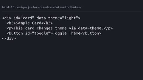 Data attributes
Use HTML data-* attributes as the single source of truth for component state, styled with CSS attribute selectors and read by JavaScript via dataset, replacing class-toggling patterns.
Data attributes
Use HTML data-* attributes as the single source of truth for component state, styled with CSS attribute selectors and read by JavaScript via dataset, replacing class-toggling patterns.
-
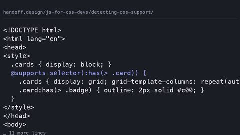 Detecting CSS support
Use @supports in CSS as the primary feature-detection mechanism, with CSS.supports() in JavaScript only for the gaps that the at-rule cannot cover, per the CSS Conditional Rules specification.
Detecting CSS support
Use @supports in CSS as the primary feature-detection mechanism, with CSS.supports() in JavaScript only for the gaps that the at-rule cannot cover, per the CSS Conditional Rules specification.
-
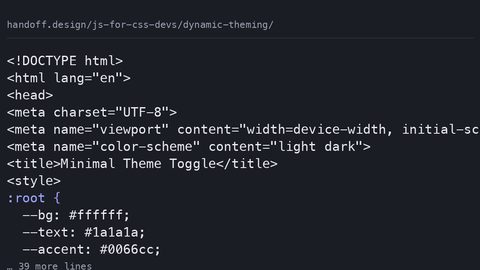 Dynamic theming
Build a theme toggle that reads prefers-color-scheme on first visit, persists user overrides in localStorage, and sets a data-theme attribute before first paint to prevent flicker.
Dynamic theming
Build a theme toggle that reads prefers-color-scheme on first visit, persists user overrides in localStorage, and sets a data-theme attribute before first paint to prevent flicker.
-
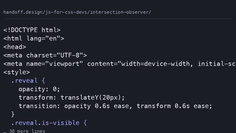 Intersection observer
Use IntersectionObserver to trigger CSS animations and lazy loading when elements enter the viewport, and know when the CSS-only view() timeline replaces the JavaScript approach entirely.
Intersection observer
Use IntersectionObserver to trigger CSS animations and lazy loading when elements enter the viewport, and know when the CSS-only view() timeline replaces the JavaScript approach entirely.
-
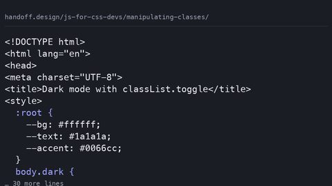 Manipulating classes
Use the classList API to add, remove, toggle, and replace CSS classes, and know when a data-* attribute or custom property is the better choice for component state that JavaScript needs to read.
Manipulating classes
Use the classList API to add, remove, toggle, and replace CSS classes, and know when a data-* attribute or custom property is the better choice for component state that JavaScript needs to read.
-
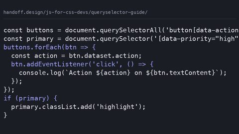 Queryselector guide
Use document.querySelector and querySelectorAll with full CSS selector syntax to find DOM elements, and understand when right-to-left selector matching makes a complex query cost more than a targeted one.
Queryselector guide
Use document.querySelector and querySelectorAll with full CSS selector syntax to find DOM elements, and understand when right-to-left selector matching makes a complex query cost more than a targeted one.
-
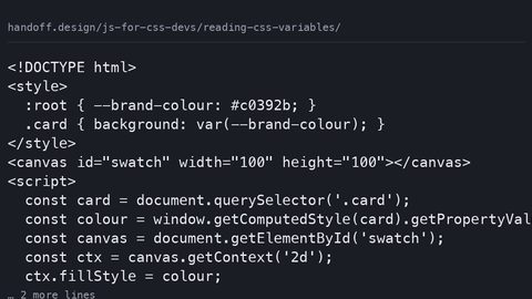 Reading CSS variables
Read CSS custom property computed values with getComputedStyle and getPropertyValue, write them with setProperty, and register types with @property so JavaScript receives parsed values instead of strings.
Reading CSS variables
Read CSS custom property computed values with getComputedStyle and getPropertyValue, write them with setProperty, and register types with @property so JavaScript receives parsed values instead of strings.
-
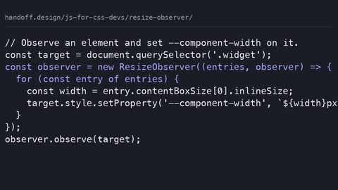 Resize observer
Use ResizeObserver to detect element size changes and drive CSS breakpoints via custom properties, and know when native container queries eliminate the JavaScript dependency and the main-thread cost.
Resize observer
Use ResizeObserver to detect element size changes and drive CSS breakpoints via custom properties, and know when native container queries eliminate the JavaScript dependency and the main-thread cost.
-
 Simple tabs component
Build a tabs component where JavaScript only toggles data-state attributes and ARIA, leaving the visual logic to CSS cascade, scroll-driven animations, and container queries.
Simple tabs component
Build a tabs component where JavaScript only toggles data-state attributes and ARIA, leaving the visual logic to CSS cascade, scroll-driven animations, and container queries.
-
 Triggering animations
Trigger CSS animations from JavaScript only when CSS cannot detect the state itself: class toggles, scroll-driven timelines, and WAAPI calls that read custom properties.
Triggering animations
Trigger CSS animations from JavaScript only when CSS cannot detect the state itself: class toggles, scroll-driven timelines, and WAAPI calls that read custom properties.
Read next
-
Detecting CSS support
Use @supports in CSS as the primary feature-detection mechanism, with CSS.supports() in JavaScript only for the gaps that the at-rule cannot cover, per the CSS Conditional Rules specification.
-
Intersection observer
Use IntersectionObserver to trigger CSS animations and lazy loading when elements enter the viewport, and know when the CSS-only view() timeline replaces the JavaScript approach entirely.
-
Manipulating classes
Use the classList API to add, remove, toggle, and replace CSS classes, and know when a data-* attribute or custom property is the better choice for component state that JavaScript needs to read.
-
Dynamic theming
Build a theme toggle that reads prefers-color-scheme on first visit, persists user overrides in localStorage, and sets a data-theme attribute before first paint to prevent flicker.
-
Data attributes
Use HTML data-* attributes as the single source of truth for component state, styled with CSS attribute selectors and read by JavaScript via dataset, replacing class-toggling patterns.
-
Simple tabs component
Build a tabs component where JavaScript only toggles data-state attributes and ARIA, leaving the visual logic to CSS cascade, scroll-driven animations, and container queries.