Advanced Text Effects with CSS: background-clip, mask-image, and paint-order
Create gradient text, text strokes, and layered shadows with CSS background-clip, mask-image, and paint-order—with fallbacks that work when the effect doesn't.
You are here because someone told you that advanced text effects require a canvas, an SVG, or a JavaScript library. That is a half-truth that costs you performance and accessibility. The other half is that CSS has grown up. With background-clip: text, mask-image, and paint-order, you can build gradient text, stroked outlines, and layered shadows that are fast, maintainable, and, with the right safety nets, work for everyone. This is a technical brief, not a tutorial for beginners. If you are new to CSS, start with web.dev/learn/css or the MDN CSS first-steps guide, then return here. If you are debugging a React state bug or comparing CSS-in-JS libraries, you want a JavaScript tooling resource. If you are looking for flexbox, that is a different brief about one-dimensional distribution; this one is about the typography layer. The exact phrase CSS advanced text effects background-clip mask is the promise and the limit of what we cover. We will walk the supported properties, the exact syntax, the failure modes, and the honest performance budget. By the end, you will know when to reach for a clip, when to reach for a stroke, and when to walk away.
CSS Advanced Text Effects With Background-clip Mask: The Core Technique
Gradient Text: The One Property That Does The Work
Let us start with the single most common request: gradient text. The technique is deceptively straightforward. Paint a background (usually a gradient) on the element, then clip that background to the shape of the text, and finally make the text fill transparent so the clipped background shows through. The syntax is background-clip: text, and it ships with a -webkit- prefix in most engines: -webkit-background-clip: text, plus the unprefixed background-clip: text. The color: transparent is mandatory; without it, the text fill paints over the clipped background. A common mistake is using the background shorthand, which resets background-clip to border-box. Use the longhand background-image or reset the clip after the shorthand. Another mistake is background-attachment: fixed on the gradient, which breaks the clip in most engines because the fixed attachment changes the painting coordinate space. Here is a complete, runnable sample:
.gradient-text {
  /* fallback for non-supporting browsers: solid color */
  color: #1a73e8;
  background-image: linear-gradient(90deg, #1a73e8, #ff6b6b);
  -webkit-background-clip: text;
  background-clip: text;
  -webkit-text-fill-color: transparent;
}

/* Guard for supporting browsers */
@supports (background-clip: text) or (-webkit-background-clip: text) {
  .gradient-text {
    color: transparent; /* redundant if -webkit-text-fill-color is set, but harmless */
  }
}
In the safety net, the solid color declaration is the baseline; in supporting engines, -webkit-text-fill-color: transparent overrides it. The @supports guard is optional here because the backup is invisible to non-supporters: they see solid blue. The critical detail is that -webkit-text-fill-color is a vendor-prefixed property that is not on the Baseline track; every other modern property has a standards path, but this one lives forever in prefixed land. The older technique this replaces is image-based text, rasterized PNGs with gradients baked in, which fails on zoom, on high-DPI screens, and for screen readers. The performance cost of background-clip: text is low: the compositor clips the background once, and the text glyphs are not repainted per frame. But there is a catch. If you animate the background position, you force a paint each frame. Keep the background static, and you are fine.
CSS Text Gradient Clip Effect: Syntax, Fallbacks, and Failure Modes
Getting The Guard Right
Now you have the basics; let us get precise. The background-clip: text value is defined in CSS Backgrounds and Borders Module Level 3, and it is Widely Available per MDN’s Baseline. The vendor-prefixed era started with -webkit-background-clip: text in Chrome 4, Safari 4, Firefox 49, and Edge 12. The backup is straightforward: outside the @supports guard, provide a solid color. Inside the guard, you can safely set the gradient and the transparent fill. The most common failure is forgetting the -webkit- prefix in the guard itself; older Safari and iOS engines only understand the prefixed version, so the guard must test both: @supports (background-clip: text) or (-webkit-background-clip: text). A second failure: setting background: linear-gradient(…) in shorthand resets background-clip to border-box; you must set background-image separately or re-declare the clip after the shorthand. A third failure: using background-attachment: fixed on the gradient breaks the clip in most engines because the fixed attachment forces a different painting coordinate space internally. Here is a runnable sample that handles all of this:
.gradient-text-safe {
  color: #333; /* fallback */
}

@supports (background-clip: text) or (-webkit-background-clip: text) {
  .gradient-text-safe {
    background-image: linear-gradient(135deg, #667eea 0%, #764ba2 100%);
    -webkit-background-clip: text;
    background-clip: text;
    -webkit-text-fill-color: transparent;
    color: transparent; /* safety for engines that support text-fill-color but not background-clip */
  }
}
The Invisible Text Problem
The color: transparent inside the guard is a belt-and-suspenders: a few engines support -webkit-text-fill-color but not background-clip: text (rare but real). The gradient text effect replaces the old trick of embedding a gradient image as a background and using a transparent PNG of the text on top, a technique that broke on any change to the text content. The failure case: if you are on a browser that does not support background-clip: text and your backup is missing, you get invisible text. That is the 1 a.m. problem: you are troubleshooting a blank heading, and the culprit is a missing color backup. Always test in a non-supporting engine (an old Firefox install) with the solid color visible first, then add the progressive enhancement.
CSS Text Stroke Paint-Order: The Outline That Does Not Swallow the Fill
Stroke Syntax And The Paint-Order Trap
The second effect people ask for is a text outline. The property is -webkit-text-stroke, a vendor-prefixed property from the CSS Fill and Stroke Module Level 3. It is not on the Baseline track; no engine has shipped the unprefixed text-stroke property. The syntax: -webkit-text-stroke: 1px black; sets a 1-pixel stroke centered on the glyph edge, half inside, half outside. The common mistake is using a large stroke width (5px) which fills the letterform inward, making the text illegible. The second mistake is expecting the stroke to paint behind the fill; by default, the stroke paints on top of the fill, which can obscure thin strokes. That is where paint-order comes in. paint-order: stroke fill tells the engine to paint the stroke first, then the fill on top, so the stroke appears as an outline around the outside rather than a blob over the letters. The syntax: paint-order: normal | [ fill || stroke || markers ];. Shipping: Firefox 60, Chrome 35, Safari 8, Edge 79. The backup: engines that do not support paint-order render the stroke on top of the fill (default), which is acceptable for thin strokes. The older technique this replaces is stacking multiple text-shadow values (four directional shadows) to fake an outline; that technique is brittle and costly. Here is a runnable sample:
.stroked-text {
  font-size: 3rem;
  font-weight: 700;
  -webkit-text-stroke: 2px #2c3e50;
  color: #ecf0f1;
  paint-order: stroke fill; /* Firefox, Chrome, Safari, Edge */
}

/* Fallback for non-paint-order browsers: use a thinner stroke */
@supports not (paint-order: stroke fill) {
  .stroked-text {
    -webkit-text-stroke-width: 1px; /* thinner so the fill is not obscured */
  }
}
Why Paint-Order Fails On HTML
The failure case: applying paint-order to HTML text elements expecting it to affect -webkit-text-stroke rendering. paint-order only works on SVG text elements, not on HTML headings or paragraphs. If you try it on an HTML element, nothing happens, and the stroke defaults to painting over the fill. The real answer for HTML text is to use a thin stroke (1px or 2px) so the fill remains legible. The failure mode at 1 a.m.: you have set paint-order: stroke fill on an <h1>, the stroke looks fat, and you cannot figure out why. The answer is that paint-order is an SVG property; it has no effect on HTML text. For HTML, the stroke paints over the fill regardless of paint-order. If you need a true outline behind the fill in HTML, your options are SVG <text> with stroke and fill attributes plus paint-order, or a layered text-shadow trick.
CSS Text Shadow Layered Effect: Depth Without a Canvas
Stacking Shadows For The 3D Extrusion
The third effect in the toolkit is the layered text shadow. Unlike the previous two, text-shadow enjoys universal support and needs no backup. The syntax: text-shadow: <offset-x> <offset-y> <blur-radius>? <color>;. The power is in stacking multiple shadows, comma-separated. The classic 3D extrusion effect uses incrementing offsets and decreasing color lightness. A common mistake is using the same blur radius on every layer, which flattens the extrusion; the sharp 3D look requires blur 0 on the first few layers, then increasing blur only on the last. The second mistake is not accounting for the shadow’s total extent in layout: if the parent has overflow: hidden, the shadow gets clipped. The performance limit: more than about 20 shadow values per element causes measurable paint performance degradation per Chromium rendering documentation. Here is a runnable sample:
.text-3d {
  font-size: 4rem;
  font-weight: 900;
  color: #3498db;
  text-shadow:
    1px 1px 0 #2980b9,
    2px 2px 0 #2471a3,
    3px 3px 0 #1f618d,
    4px 4px 0 #1a5276,
    5px 5px 0 #154360,
    6px 6px 8px rgba(0, 0, 0, 0.3);
}
Scaling And The Performance Budget
This renders a sharp extrusion (blur 0 on the first five layers) with a soft drop shadow at the end. The failure case: if the blur radius is identical across all layers, the effect looks like a fuzzy mess; you lose the crisp 3D extrusion. The other failure: using px blur values that do not scale with font-size. At font-size: 1rem, a 4px shadow is a subtle lift; at font-size: 6rem, it is a barely visible sliver. Use em units for the offsets and blur so the effect scales: text-shadow: 0.05em 0.05em 0 #2980b9; and so on. The performance cost is real: each shadow layer is painted as a separate pass on the compositor. At 20 layers, you will see jank on scroll, especially on mobile. The honest budget: keep it under 10 layers for static text, under 5 if you are animating the text position. The older technique this replaces is image-based text shadows, a rasterized text layer with a baked-in shadow, which fails on high-DPI screens and cannot be tinted with CSS. For the 1 a.m. failure: the shadow is clipped, and the text looks cut off. The fix is to add padding to the parent or remove overflow: hidden.
Accessible CSS Text Effects: Color Contrast and the Accessibility Tree
Here is where most tutorials stop, and where you will earn your keep. Every text effect you add, gradient, stroke, shadow, can break accessibility if you ignore color contrast and the accessibility tree. The accessibility tree is what screen readers expose to users; it derives from the DOM, not from what is painted on screen. display: none removes content from the tree, but color: transparent does not. That is both a blessing and a trap: a screen reader will read your gradient text correctly, which is what you want. But if you set color: transparent and forget to provide a backup color, a sighted user with low vision sees nothing, while a screen reader user hears the text. The WCAG 2.2 contrast ratio requirement applies to the rendered text color, not the background behind it. For gradient text, the rendered color is the gradient’s colors, which can vary across the glyph. The safe approach: choose gradient colors that all meet a 4.5:1 contrast ratio against the background. For a light background, that means dark gradient stops; for a dark background, light stops. A common failure: using a mid-tone gradient (gray to light gray) on a white background, which fails contrast even though the solid backup passes. The mix-blend-mode property is a related trap: mix-blend-mode: difference on text over a mid-tone background can make the text invisible when the background color equals the blend midpoint. The backup: always test with mix-blend-mode disabled, and provide an alternative via @supports. The guard for mix-blend-mode is: @supports (mix-blend-mode: multiply) { … }. WCAG 2.2 requires a minimum contrast ratio of 4.5:1 for normal text and 3:1 for large text (18pt or 14pt bold). For gradient text, compute the contrast of the darkest gradient stop against the background; if that fails, the effect is not accessible. The failure case at 1 a.m.: you have a beautiful gradient heading, and a client reports it is unreadable. The fix: darken the gradient stops until the darkest one passes contrast, not just the solid backup.
CSS Text Gradient Clip Effect with Background-clip: Fallback and Progressive Enhancement
Build The Baseline First
You have the technique; now you need the discipline. The golden rule of advanced CSS is progressive enhancement: build the solid-color baseline first, then layer the effect inside an @supports guard. The reason is not nostalgia; it is resilience. A browser that does not support background-clip: text will ignore the entire rule inside the guard and use the baseline. A browser that supports it but has JavaScript disabled (or the gradient image fails to load) still shows the gradient because the background is painted regardless of scripting. The failure case: if you put the backup inside the guard (color: red inside @supports), you have inverted the logic; non-supporting engines get the default color from the UA stylesheet, which is black on white, potentially unreadable. The correct order: first, declare color: #333; (or any high-contrast solid). Then, in the guard, override with background-image, background-clip, and -webkit-text-fill-color: transparent. The spec for background-clip: text is in CSS Backgrounds and Borders Module Level 3, and it is Widely Available per MDN. The vendor-prefixed era: -webkit-background-clip: text in Chrome 4, Safari 4, Firefox 49, Edge 12. The older technique this replaces: rasterized text as PNG/GIF with the gradient baked in. The common mistake: using the background shorthand inside the guard, which resets background-clip to border-box. Always use background-image for the gradient, and set background-clip as a separate declaration. Here is a production-worthy sample:
.hero-title {
  /* baseline */
  color: #1a1a1a;
  font-size: clamp(2rem, 5vw, 4rem);
}

@supports (background-clip: text) or (-webkit-background-clip: text) {
  .hero-title {
    background-image: linear-gradient(90deg, #1a73e8 0%, #ff6b6b 100%);
    -webkit-background-clip: text;
    background-clip: text;
    -webkit-text-fill-color: transparent;
    color: transparent; /* redundant but harmless */
  }
}

/* Do NOT set background-attachment: fixed on the gradient; it breaks the clip. */
This pattern is bulletproof: it works in every browser, degrades gracefully, and passes automated accessibility checks as long as the solid baseline has a 4.5:1 contrast ratio. The failure case: a developer who copies this pattern but forgets the color: #1a1a1a baseline, leaving text invisible in a non-supporting engine. Test by disabling JavaScript and using an old browser; you should see solid dark text.
CSS Text Shadow Layered Effect Performance and the Paint Cost
Let us talk about the hidden tax of layered text shadows: paint cost. The engine must composite each shadow layer as a separate pass over the glyphs. The qualitative cost is low for a couple of layers, medium for a dozen, and high beyond that. Chromium’s rendering documentation warns that more than about 20 shadow values per element causes measurable paint performance degradation. The problem is not the shadows themselves; it is that the engine cannot cache them as textures because the text content can change (on hover, or with a font loading event). The result is jank during scroll, especially on low-end mobile devices. The professional approach: use the filter: drop-shadow() property as an alternative, which has a different compositing path. The syntax: filter: drop-shadow(2px 2px 4px rgba(0,0,0,0.5));. Unlike text-shadow, filter: drop-shadow respects the alpha of the text glyph, so it can create a shadow that follows the shape of the letters, not just the bounding box. But filter is a compositor-costly property: it creates a new stacking context and can force the element to be composited on its own layer. The practical rule: for a 3D extrusion, use text-shadow with blur 0 on the first layers; for a soft glow, use filter: drop-shadow. The failure case: you stack 15 shadows for a neon effect, and the page drops to 30 frames per second on scroll. The fix: reduce to 5 layers, or move the shadow to a pseudo-element that does not repaint. The honest budget: keep the total shadow count under 10 per element, and under 20 per page section. The reason is not arbitrary; each shadow is a separate pass in the painting pipeline, and the compositor must re-rasterize the text layer if the text changes. If you are animating the text position (a ticker), the shadows animate with it, and the cost multiplies.
Mix-blend-mode for Text Effects and the Color Contrast Trap
You might be tempted to add mix-blend-mode to your text for a modern overlay effect. It solves a real problem: making text legible over a busy background without a solid backing plate. The syntax: mix-blend-mode: multiply; blends the text color with the background. Shipping: Chrome 41, Firefox 32, Safari 8, Edge 79, and it is Widely Available per MDN’s Baseline. The backup: @supports (mix-blend-mode: multiply) { … }; outside the guard, use flat color. The common mistake: applying mix-blend-mode to text without setting a background on the text’s containing block, resulting in blending against the default transparent background (no visible effect). The second mistake: using mix-blend-mode: difference on text over a mid-tone background, causing the text to become invisible when the background color equals the midpoint of the blend. For example, difference of 50% gray on 50% gray yields black, which is invisible on a dark background. The professional rule: never rely on mix-blend-mode alone for legibility; always provide a solid color backup that passes contrast. The WCAG contrast ratio is computed on the blended result, which is nearly impossible to guarantee across all background colors. So, use mix-blend-mode for decorative text (a watermark) where legibility is secondary, and keep it away from body copy. The failure case at 1 a.m.: a hero section with white text and mix-blend-mode: multiply over a photo; the text disappears because the photo is too dark. The fix: switch to screen blend mode for dark backgrounds, but test each one. The honest advice: if you cannot guarantee the blend does not break contrast, do not use it for essential content. The accessibility tree will still read the text, but a sighted low-vision user is your responsibility.
Paint Cost, Font Loading, and the Variable Font Grade Axis
The Real Cost Of A Custom Typeface
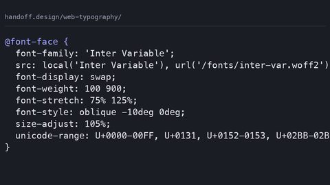
All these effects assume you have a font loaded that supports the glyphs. The decision of which typeface to use carries a loading cost in bytes and requests. A single weight of a variable font typically ships as one file, but that file can be 100 to 300 KB for a Latin-only subset, or 1 to 2 MB for a full Unicode set. The loading cost is not just the file size; it is the number of requests. A typical webfont stack: @font-face with font-display: swap and a fallback stack like ‘Inter’, ‘Segoe UI’, Roboto, system-ui, sans-serif. The font-display: swap means the engine paints the fallback text immediately and swaps in the webfont when it is ready; this prevents invisible text but causes a flash of unstyled text (FOUT). The alternative is font-display: optional, which gives the engine a short window to load the font and, if it fails, uses the fallback for the entire page visit; this avoids FOUT but may mean your custom font never appears. The professional approach for advanced text effects: use a variable font with a grade axis to adjust weight without changing the layout. The grade axis (accessed via font-variation-settings: “GRAD” 400;) changes the thickness of the strokes without affecting the advance width, which is perfect for hover effects that would otherwise cause layout shift. The opsz axis (optical size) adjusts the glyph shapes for small versus large sizes; setting font-variation-settings: “opsz” 144 on a heading can make it look better at display sizes. The text-rendering: geometricPrecision property can improve the rendering of stroked text by disabling certain optimizations, but it comes at a paint cost; use it only when the stroke looks jagged. The failure case: you use a variable font with a wght axis, but the engine does not support variable fonts (IE11), so the text falls back to the regular weight. The fix: provide a @supports (font-variation-settings: ‘wght’ 700) guard with a static font fallback. The honest budget: if you are adding a custom font purely for an effect, consider using a system font stack; system fonts have zero loading cost and render consistently. The 1 a.m. failure: the page flashes a fallback font, then swaps, then the gradient text appears misaligned because the fallback has different metrics. The fix: use size-adjust and ascent-override to normalize the fallback metrics, or accept the FOUT.
If You Cannot Use the Effect: The Honest Fallback Chain
Every advanced technique has a failure mode where the effect is closed, sold out, or it is 1 a.m. Here is your decision tree. If background-clip: text is unsupported or the gradient fails to load, the backup is solid color. Do not fight it. If the solid color fails contrast, you have a bigger problem than typography: fix the color. If -webkit-text-stroke is unsupported, the backup is a layered text-shadow to fake an outline; use four directional shadows with zero blur for a 2px stroke. If paint-order is unsupported, the stroke paints over the fill, so use a thinner stroke width (1px) to preserve legibility. If mix-blend-mode is unsupported, the text renders as flat color; ensure that color passes contrast. If you are on a browser that does not support @supports (IE11), the entire guard is ignored, and the baseline applies. The final backup for any effect: remove it. A heading that is plain black on white is never a failure; it is the most accessible form of text. The 1 a.m. scenario: you have spent hours on a gradient text effect, and a client says it looks washed out on their projector. The answer is not to tweak the gradient; it is to turn off the effect and use the solid baseline. The CSS cascade is a negotiation: the engine takes what it can support and ignores the rest. The professional writer knows when to stop.
The Variable Font, Text-Wrap, and Subgrid Intersection
At this point, you have the core effects. But advanced typography does not live in a vacuum. The text-wrap: balance property, for example, evens out the lines in a heading so no single line is too short or too long, which improves the visual rhythm of a headline with gradient text. It is a native solution that requires no JavaScript polyfill. The failure case: applying it to single-line text has no effect; it only works on multi-line headings. Similarly, text-wrap: pretty optimizes for avoiding orphans. The distinction is subtle but important for a guide site where a heading over a photo needs to look polished. The subgrid property, in the same way, makes a grid layout where child rows align with parent rows; it is about one-axis versus two-axis alignment, not macro versus micro layout. If you are building a card grid with a gradient-stroked title and a subtitle, subgrid ensures the baseline of the title aligns across cards, even when the amount of text varies. The failure case: using subgrid without a parent grid, which does nothing. The variable font axis opsz should be set globally via font-variation-settings, but it does not cascade with the individual properties; you must set it on each selector. The professional approach: define a –font-variation-opsz custom property and consume it in multiple places. The 1 a.m. failure: you set font-variation-settings: ‘opsz’ 144 on a heading, but the variable font does not have an opsz axis, so the engine silently ignores it. The fix: verify the font file contains the axis using font-variation-settings: ‘wght’ 700 for weight, and check the font’s documentation for the available axes. Do not assume every variable font has every axis.
The Honest Caveat: This Is Not a Silver Bullet
Before you can call this complete, you need one honest caveat. All the properties we covered, background-clip: text, -webkit-text-stroke, paint-order, text-shadow, are tools, not solutions. They solve visual problems, but they introduce maintenance and accessibility costs that are easy to underestimate. The gradient text that looks crisp on a desktop may be illegible on a projector with low contrast. The 3D shadow that wows on a landing page may cause jank on a phone with a weak GPU. The stroked outline that works on a heading may be illegible at 12px. The web is not a print canvas; it is a fluid, interactive, and multi-device medium. The most advanced effect you can use is the one you can remove without regret. The backup chain is not a limitation; it is a feature. When you build a page with the baseline first, you are designing for the worst-case scenario, and the best-case scenario takes care of itself. The 1 a.m. problem will happen: a client will see the effect, love it, and then ask why it looks different on their phone. The answer is not to fight the engine; it is to accept that the baseline is acceptable. A plain heading with good contrast and legible type is never a failure. It is the baseline of professional web design.