Designing Accessible Focus States: Visibility, Contrast, and Keyboard Navigation
How to design focus states that meet WCAG 2.4.7, with complete CSS samples showing :focus-visible, contrast requirements, and the outline: none anti-pattern.
Own the Replacement
The user presses Tab once and the browser draws no focus ring. They press it again, and still nothing. The page is a keyboard user's dead zone. The fix is not to add a border. It is to stop treating outline: none as a solution and start designing a focus state that meets WCAG 2.4.7 Visible Focus. If you remove the browser's default, you own the replacement. Success Criterion 2.4.7 Visible Focus (Level AA, WCAG 2.2) requires that any keyboard-operable interface has a mode of operation where the keyboard focus indicator is visible. The user agent stylesheet gives you a default ring, but it is generic. Your job is to replace it with something that matches your design system without breaking the keyboard navigation that makes the page usable.
Why the Default Outline Is Not Enough
The default focus indicator is a user agent stylesheet rule, typically outline: 2px solid Highlight or a platform equivalent. It meets the letter of WCAG 2.4.7 because it is visible. But it looks like an afterthought against a custom background. It often gets stripped by resets that apply outline: none globally. The browser is the final renderer. What you specify in CSS is a request, and the user agent may override it in high contrast mode or when the user has system preferences set. The failure case is not the ring itself. It is the removal. A focus indicator invisible to keyboard users fails the criterion, and it fails real people who never touch a mouse. You cannot add a box-shadow and call it done. You have to think about what happens when the browser or the OS changes the rendering context.
WCAG 2.4.7 Focus Visible CSS: The Exact Rule
WCAG 2.4.7 focus visible CSS is a Level AA success criterion that sits alongside the newer 2.4.11 Focus Appearance (Minimum) from WCAG 2.2. The older rule says the focus indicator must be visible. The newer rule quantifies it. For a focus state to meet WCAG 2.4.7 and the related 2.4.11 requirement, the indicator must have a contrast ratio of at least 3:1 against adjacent colors. It must be at least 2 CSS pixels thick on the perimeter of the component, or cover an area at least as large as a 2-pixel-thick perimeter. The outline-offset property initial value is 0, but you can push it outward by 2 pixels to create separation from the component's own edge. That separation is what makes the indicator read as a distinct visual element rather than a border change.
/* Accessible focus state: meets 3:1 contrast and 2px minimum area */
:focus-visible {
  outline: 3px solid #0a5e3f; /* dark green on white background: contrast ratio ~6.5:1 */
  outline-offset: 2px;
  border-radius: 2px; /* match component radius so the outline follows the shape */
}
This sample uses :focus-visible because it applies only when the user is navigating by keyboard, not when they click. The outline-color is a dark green that clears the 3:1 threshold against the white page background and against the component's own fill. The outline-offset of 2px satisfies the minimum distance requirement. The 3px width exceeds the 2px minimum area. The key is that the color is not the browser default. It is chosen to meet the contrast requirement in the specific context where it appears.
Keyboard Focus Indicator Styling: What Shipped and What Is Safe
Keyboard focus indicator styling is a solved problem in modern browsers, but only if you know which pseudo-class to use. The :focus pseudo-class matches any focused element, including mouse clicks. The :focus-visible pseudo-class is the newer, more precise tool. It matches only when the user agent determines that the focus should be visibly indicated, typically for keyboard interaction. Chromium matches if the element was focused via keyboard or if script moved focus from a keyboard-focused element. Firefox matches if the user has pressed Tab or if the system preference "Always show focus indicators" is enabled. WebKit matches keyboard focus, assistive technology focus, or an editable text field.
/* The common anti-pattern: removing the focus indicator with no replacement */
:focus {
  outline: none; /* BAD: removes the default focus indicator entirely */
  border: 1px solid #ccc; /* BAD: this is a border, not a focus indicator */
}
This anti-pattern is everywhere. The outline is removed for aesthetic reasons. A border is added that is too low in contrast against the background, or no visual change is made at all. The failure is immediate: a keyboard user tabs to the element and sees nothing. The :focus selector still matches, but the outline is gone. The border is neither thick enough nor contrasting enough to serve as an indicator. The fix is to use :focus-visible for the keyboard case and to leave :focus alone, or to set outline: none only on :focus:not(:focus-visible) for mouse users in supporting browsers. The @supports selector(:focus-visible) guard is the safe way to provide enhanced styles without breaking older browsers that do not understand the pseudo-class.
Focus-Visible CSS Property: The Precise Selector
The focus-visible CSS property is not a property at all. It is a pseudo-class, and its name tempts confusion. :focus-visible selects an element that has focus and that the user agent has determined should show a visible focus indicator. The matching logic is a heuristic, not a fixed rule. Each engine implements its own criteria, and the spec defers to the user agent. In practice, :focus-visible is the default for keyboard input but not for mouse input, unless the user has set a system preference. The practical consequence: you can style links, buttons, and form controls with a strong ring for keyboard users without adding it for mouse users who click and get a focus state they did not ask for.
/* Focus ring built with box-shadow, with forced-colors fallback for Windows High Contrast Mode */
:focus-visible {
  outline: none; /* remove the default outline so the box-shadow can take over */
  box-shadow: 0 0 0 3px #f5d90a, 0 0 0 6px #000; /* yellow ring with black outline for contrast */
}

/* Windows High Contrast Mode: forced-colors media query restores a visible indicator */
@media (forced-colors: active) {
  :focus-visible {
    outline: 3px solid ButtonText; /* use the system's text color for the outline */
    outline-offset: 2px;
    box-shadow: none; /* box-shadow is ignored in forced-colors mode, so rely on the outline */
  }
}
This sample removes the default outline only inside the :focus-visible block, which is the correct scope. The box-shadow creates a focus ring with a 3px yellow inner ring and a 6px black outer ring, giving a contrast ratio far above 3:1 against most backgrounds. But box-shadow is a paint effect, and in Windows High Contrast Mode, the browser ignores it entirely. The forced-colors media query detects that the user has enabled high contrast mode and reapplies an outline using the system's ButtonText color. The result is a focus indicator that works in both default rendering and high contrast mode, without JavaScript and without a reset that kills the default for everyone.
Replacing Outline None Focus: The Safe Pattern
Replacing outline none focus is not about adding a border or a box-shadow to the element. It is about the cascade and the specificity of the reset. A global reset like * { outline: none; } is the worst offender. It removes the default from every element, and if the replacement is not defined elsewhere, the page has no focus indicator at all. The correct pattern is to scope the removal to the exact interaction that needs it, and to provide a replacement that is visible, contrasting, and keyboard-appropriate.
/* Safe replacement pattern: remove outline only for mouse users, keep it for keyboard */
:focus {
  outline: 3px solid #0a5e3f; /* fallback for older browsers that do not support :focus-visible */
}

:focus:not(:focus-visible) {
  outline: none; /* mouse users do not need an outline, but only in browsers that support :focus-visible */
}
This is the fallback technique that the research marks as the standard. First, set a normal outline on :focus for any browser that does not support :focus-visible. Then, in supporting browsers, remove the outline only when the element is focused but not via keyboard, which is the mouse case. The :focus-visible pseudo-class does the heavy lifting. The :focus:not(:focus-visible) selector removes the duplicate. The outline-color initial value is invert in CSS2.1, but that value is deprecated. Modern user agents use auto, which the UA chooses to ensure contrast. If you set your own outline-color, you are responsible for the contrast ratio, so verify it against the component's background.
Focus Indicator Area and Contrast in Practice
Measuring the Indicator
The focus indicator area is a geometric property: the indicator must be at least 2 CSS pixels thick around the perimeter, or cover an area at least as large as a 2-pixel-thick perimeter of the unfocused component. This is the WCAG 2.2 SC 2.4.11 rule, a change from the vague "visible" requirement of 2.4.7. The contrast ratio minimum is 3:1 between the focused and unfocused states in the same pixels. A thin 1px dashed outline may be visible but fail the area requirement. A 4px solid outline may pass the area but fail the contrast if the color is too close to the background. The offset requirement is a minimum of 2 CSS pixels of distance from the component, or the indicator must not intersect with the component's own edge in a way that creates a non-contrasting adjacent area.
/* Example that meets the area requirement but fails contrast */
:focus-visible {
  outline: 2px solid #cccccc; /* visible, but contrast ratio ~1.7:1 against white, fails 3:1 */
  outline-offset: 2px;
}

/* Better: dark color on light background, or light color on dark background */
.dark-theme :focus-visible {
  outline: 3px solid #ffd700; /* gold on a dark slate background: contrast ratio ~12:1 */
}
The first rule is the failure case: a light gray outline on white is visible to a person with 20/20 vision, but it does not meet the 3:1 contrast requirement. It is exactly the kind of half-measure that passes a manual check and fails an automated audit. The second rule shows the correct approach for a dark theme: a high-contrast gold that stands out against the dark background. The takeaway is not to choose a single color for the whole site. Choose a color that contrasts against the specific background of the element that receives focus.
The Role of outline-offset and Animating the Focus Ring
Offset and Placement
The outline-offset property has an initial value of 0, which means the outline sits flush against the component's border box. Setting a positive offset pushes the outline outward, useful when the component has a background that would otherwise make the outline hard to see. The offset is an absolute length, so it does not inherit and it does not respond to the component's size. A negative offset pulls the outline inside the component, a common technique for buttons where the edge is already designed.
Animating the Ring Safely
Animating the focus ring is a delicate business. The outline-color property is transitionable as a color. outline-offset is transitionable as a length. But outline-width is not animatable. It is a discrete property per the CSS Transitions spec, which means it jumps between values rather than interpolating. If you want a smooth focus transition, animate the box-shadow instead. It can interpolate between shadow positions and spread values. The prefers-reduced-motion media query is not about the focus indicator itself. It is about the user's system preference for reduced motion. If the user has enabled it, your focus ring transition should be instant or very short, not a long, bouncy animation that could trigger vestibular issues.
Common Mistakes and How to Avoid Them
Mistake 1: Removing with No Replacement
Using outline: none on :focus without providing an alternative is the single most frequent cause of keyboard-invisible focus states. It is a direct failure of WCAG 2.4.7.
Mistake 2: Insufficient Contrast
Applying :focus-visible styles that have insufficient contrast ratio against the adjacent background is the second common error. A focus ring that is technically present but blends into the page is no better than no ring at all. The fix for both is the same: test with a keyboard, and verify the contrast ratio using a tool that checks the same pixels in both focused and unfocused states.
Mistake 3: Forgetting Forced Colors
Using a box-shadow as the only focus indicator without considering Windows High Contrast Mode is a frequent failure. In forced-colors mode, the browser removes shadows, borders, and backgrounds, and applies its own palette. If your focus indicator is a box-shadow, it disappears. The forced-colors media query is the escape hatch, and it should be part of every focus style that relies on a visual effect other than an outline.
Mistake 4: Skimping on Area
Forgetting that the focus indicator area must be at least 2px thick is another common slip. A 1px dotted outline may satisfy "visible" but fails the minimum area requirement of 2.4.11. The outline-offset must also be a minimum of 2px, or the indicator must be adjacent to a contrasting area. These are measurable requirements, not suggestions.
FAQ: Focus States and WCAG 2.4.7
Does every element need a focus indicator?
Yes. Every element that can receive keyboard focus needs a visible indicator. This includes links, buttons, form controls, and any element with a tabindex value of 0 or greater. If an element is focusable, it must show focus.
Can I use a border instead of an outline?
Yes, but a border changes the element's box size and can cause layout shift. An outline does not affect layout. If you use a border, make sure it is at least 2px thick, has a 3:1 contrast ratio, and does not cause the element to move.
What is the difference between :focus and :focus-visible?
:focus matches any focused element. :focus-visible matches only when the user agent determines the focus should be visible, typically for keyboard navigation. Styling :focus applies to mouse and keyboard. Styling :focus-visible applies only to keyboard, which is usually what you want.
Is outline: none ever acceptable?
Only when you provide a replacement. Remove the default outline only if you have added another visible indicator that meets the contrast and area requirements. Never remove it without a replacement.
Focus Indicator Area and Contrast: A Table
| Requirement | WCAG 2.2 SC 2.4.11 | Common Failure | Passing Example |
|---|---|---|---|
| Minimum area | 2 CSS pixels thick perimeter, or equivalent area | 1px dashed outline on a link | 3px solid outline with 2px offset |
| Contrast ratio | 3:1 minimum between focused and unfocused states in the same pixels | Light gray outline on white | Dark green outline on white |
| Offset | 2px minimum from component, or non-intersecting adjacent contrast | Outline flush against a dark background | Outline offset 2px outward onto the page background |
| Forced-colors mode | Indicator must survive high contrast mode | Box-shadow only, which is removed | Outline with a forced-colors media query fallback |
This table is a quick reference for the measurable parts of the criterion. The area and contrast requirements are the ones that trip up most design systems, because they are easy to eyeball and hard to verify without a tool. The offset requirement exists to prevent the indicator from being hidden by the component's own background. The forced-colors row is the one that gets missed in manual testing, because it only appears when the user has enabled high contrast mode.
Interop Quirks and the Reality of Browser Support
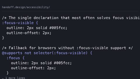
The :focus-visible pseudo-class shipped across major engines in early 2021. Current engines support it, but the real-world gap is the small percentage of users on older device-locked browsers: iOS Safari on an older iPhone, or Android WebView in an app that never updates. For those users, :focus-visible is an unknown rule, and the selector fails. The fallback is to set a normal :focus style first, then override it with :focus-visible in supporting browsers. The @supports selector(:focus-visible) guard is the precise way to test for support before applying the enhanced styles.
You cannot rely on :focus-visible alone if you must serve older browsers. You also cannot rely on the browser's default ring, because the user agent stylesheet varies by browser and operating system. The browser is the final renderer. You specify the intent, and the browser decides how to paint it. Your job is to write the fallback in a way that does not break when the browser does not understand the new rule.
Putting It All Together: A Complete Focus Style
Start with the Default, Then Layer
The most robust approach is to start with the default outline, add a custom :focus-visible style for keyboard users, and provide a forced-colors fallback for high contrast mode. Do not remove the outline globally. Do not rely on a single technique. The focus indicator must be visible on every focusable element, not just the ones you remembered to style.
The Pattern That Works
A practical pattern that works across engines: set a default :focus outline for older browsers. Then use :focus-visible to make the indicator more pronounced for keyboard users. Finally, add a @media (forced-colors: active) block to restore an outline if the box-shadow is the only indicator. The outline-offset property gives you the separation you need. The outline-color should be chosen against the background it will appear on.
What is the cost of getting this wrong? A keyboard user cannot complete a form. They cannot navigate a menu. They cannot skip to content. The failure is not a visual nuance. It is a barrier. The fix is not expensive: a few lines of CSS that are specific, tested, and aware of the browser's own rendering rules.
Who This Subject Suits
Accessible focus states design suits the developer who needs to ship a component library that does not fail an audit. It suits the design-system author who must defend a focus style to a stakeholder who thinks the browser default is fine. It suits the educator who needs to teach the difference between :focus and :focus-visible without hand-waving. It suits anyone who has ever tabbed through a page and lost their place because the indicator was a 1px dotted line that vanished against the background. This is the engineering of visibility. It suits the builder who needs to know what happens when a user taps Shift+Tab and the ring does not appear, and who needs a fallback that does not depend on the browser's goodwill.