A Guide to Fluid Typography Using clamp(), Viewport Units, and Accessible Fallbacks
Implement fluid typography with CSS clamp() that respects WCAG zoom requirements, includes rem fallbacks, and states the loading cost of every typeface.
Your text size collapses on a phone. It jumps too late on a tablet. Browser zoom breaks the layout. The fix is a single CSS function: font-size: clamp(1rem, 2.5vw + 0.5rem, 2rem). The text scales continuously between a lower and an upper bound, using viewport units as the middle value. That line works in every mainstream engine shipped since 2020. But it works only if you write the fallback line above it and respect what WCAG zoom demands. What follows are three complete code samples, the failure cases that burn real projects, and the honest limits of clamp().
The One-Line Fallback That Saves Older Browsers
The most common mistake with clamp() is using it alone. A browser that does not understand the function drops the entire declaration. It falls back to whatever font-size appeared earlier in the cascade. If nothing appeared earlier, the text renders at the default, ignoring your carefully chosen minimum.
Write The Static Line First
An older iOS Safari on a device that cannot update, an Android WebView inside an app that never gets new system components. These are the real gap hidden by a caniuse percentage of 97% support. The accepted fallback is a static declaration immediately before the clamp() line:
html {
  font-size: 1.25rem; /* fallback for locked browsers */
  font-size: clamp(1rem, 2.5vw + 0.5rem, 2rem);
}
That pattern costs one line. It guarantees that a user on an engine from 2019 still gets readable type. The @supports guard is a second layer you can add, but it is rarely necessary because the two-line pattern works everywhere:
@supports (font-size: clamp(1rem, 1vw, 2rem)) {
  .card-title {
    font-size: clamp(1.25rem, 3vw + 0.5rem, 2.5rem);
  }
}
Inside the guard, write clamp() freely. Outside, the earlier static declaration holds. This is the complete answer to implementing the technique without abandoning the fraction of users stuck on device-locked browsers.
What WCAG 1.4.4 Actually Demands from Zoom
The accessibility requirement that trips most developers is WCAG 1.4.4 Resize text. Users must be able to zoom to 200% without losing content or function. The critical detail: the success criterion applies to zoom, not to changing the default font size alone. When you zoom, the viewport width multiplies. A clamp() expression that uses vw as its middle value scales with that multiplication, so it passes. But only if the minimum and maximum also scale.
Why Pixel Endpoints Fail
Consider font-size: clamp(16px, 4vw, 32px). At a 375px viewport, the computed value is 16px. Zoom to 200%. The viewport effectively becomes 187.5px. The computed value becomes 16px again. The minimum clamps it. At 200% zoom on a small screen, the text does not grow at all. The user sees the same physical size. That fails the spirit of the criterion even though the letter of the test is about reflow.
The Relative-Unit Fix
The fix is to use rem or em for the minimum and maximum. Never px.
body {
  font-size: 1rem; /* zoom-safe base */
  font-size: clamp(1rem, 4vw + 0.5rem, 2rem);
}
At 200% zoom, the 1rem minimum becomes 2rem in the internal units. The text actually doubles. The viewport unit vw is fine in the middle of the expression. It is what makes the type fluid. But the endpoints must be relative units. This is the difference between a clamp() that passes an automated checker and one that survives a real user trying to read on a low-vision setup at 200% zoom with a narrow window.
A Full Fluid Type Scale That Works
With the fallback and the zoom rule in place, here is a complete, runnable fluid type scale. Five steps, from small caption to display heading. Each step uses the same pattern: a rem fallback, then a clamp() with vw, rem, and a rem maximum.
The Five-Step Scale
/* complete fluid type scale with rem fallback */
:root {
  --step--2: 0.75rem; /* fallback */
  --step--2: clamp(0.75rem, 0.5vw + 0.5rem, 0.875rem);
  --step--1: 0.875rem;
  --step--1: clamp(0.875rem, 0.75vw + 0.5rem, 1rem);
  --step-0: 1rem;
  --step-0: clamp(1rem, 1vw + 0.5rem, 1.25rem);
  --step-1: 1.25rem;
  --step-1: clamp(1.25rem, 1.5vw + 0.5rem, 1.5rem);
  --step-2: 1.5rem;
  --step-2: clamp(1.5rem, 2.5vw + 0.5rem, 2rem);
  --step-3: 2rem;
  --step-3: clamp(2rem, 4vw + 0.5rem, 3rem);
}

.caption { font-size: var(--step--2); }
.body-text { font-size: var(--step-0); }
.lead { font-size: var(--step-1); }
.section-title { font-size: var(--step-2); }
.display { font-size: var(--step-3); }
Why This Replaces The Old Lock Technique
This is the modern replacement for the older CSS locks technique. That approach used calc(1rem + 1vw) inside a media query and then a hard jump at a breakpoint. It worked but produced a visible discontinuity. It also required writing the breakpoint twice. clamp() compresses that into a single expression with no breakpoint at all.
The minimum readable size on this scale is 0.75rem. That is the floor most design systems accept for body text on small screens. Anything smaller becomes a legibility failure. The maximum line-length measure for the body-text step should stay between 45 and 75 characters. Control that with a separate max-width on the container, not with the font size.
Fluid Typography Zoom Compliance in Practice
To verify your clamp() scale actually complies, run the zoom-to-320px check manually. Open the page in a desktop browser. Set the viewport width to 1280px. Then use the zoom control to set 400% zoom. The effective viewport is now 320px. At that width, every line of text must still be readable. The layout must not require horizontal scrolling. The font size must have grown proportionally to the zoom level.
A Heading That Survives The Test
h1 {
  font-family: 'Your Variable Font', Georgia, serif;
  font-size: 2.5rem; /* fallback */
  font-size: clamp(2rem, 5vw + 0.5rem, 4rem);
  line-height: 1.1; /* unitless, not 1.1rem */
  letter-spacing: -0.02em; /* fluid tracking */
}
A media query that hard-codes a 2rem size at 320px is a trap. At 200% zoom the effective viewport is 160px. The media query no longer matches. The clamp() line takes over. At 160px it computes to its minimum of 2rem. That is fine. The trap is writing the media query with a vw unit that goes below 1rem, which would break the zoom guarantee. In practice, the clamp() minimum does the job without a media query. Delete that block.
The unitless line-height is non-negotiable. line-height: 1.1 scales with the font size automatically. line-height: 1.1rem does not. It will create overlapping text at large zoom levels. The negative letter-spacing tightens the display heading at large sizes. It does not harm small text because the scale never applies it to the body step.
Container Query Type Scale: Component-Level Control
Viewport-based clamp() works for page-level type. Inside a card or a sidebar, the relevant unit is the container, not the viewport. CSS container queries let you write font-size against the container’s inline size using the cqi unit. One cqi is one percent of the container’s inline size. This is the right tool when a component changes size independently of the viewport.
Write The Container Query Scale
.card {
  container-type: inline-size; /* establishes the container */
  font-family: 'Inter Variable', system-ui, sans-serif;
}

.card-title {
  font-size: 1.5rem; /* fallback for browsers without cqi */
  font-size: clamp(1rem, 4cqi + 0.5rem, 2rem);
}

@container (min-width: 30rem) {
  .card-title {
    font-size: clamp(1.5rem, 3cqi + 1rem, 2.5rem);
  }
}
The Interop Gap You Must Test
The fallback line for cqi is a static rem value. A browser that does not support container units drops the clamp() declaration entirely. The @container rule needs the container-type declaration on the parent. Without it, the query has nothing to measure and the rule is ignored.
The real gap: older Safari versions that shipped container queries had bugs in the cqi unit itself. The static fallback is not just for ancient browsers. It is for a specific, recent Safari that claims support and then miscomputes. Test the cqi path on an iOS device from 2022 or 2023 before you trust it. The minimum readable size rule still applies inside containers. Never let the cqi calculation drop below 0.75rem in the final computed value.
The Fallback Stack That Never Breaks
The fallback appears in every sample here because it is the difference between a page that works for 97% of users and one that works for nearly all of them. The fallback stack is a cascade of three layers: a static rem declaration, a clamp() with vw or cqi, and then, optionally, a variable font that adjusts optical size.
The Complete Three-Layer Pattern
h2 {
  /* layer 1: static rem fallback for any browser without clamp */
  font-size: 1.75rem;
  /* layer 2: fluid clamp with viewport unit, zoom-safe min/max */
  font-size: clamp(1.25rem, 2vw + 0.75rem, 2.5rem);
  /* layer 3: variable font optical size, only if the font supports it */
  font-variation-settings: "opsz" 20;
  font-family: 'Newsreader Variable', Georgia, serif;
  font-display: swap; /* in the @font-face rule, not here */
  line-height: 1.2; /* unitless */
  letter-spacing: -0.01em;
}
Why Each Layer Matters
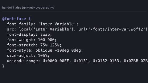
The font-display property belongs in the @font-face rule, not in the h2 selector. It controls how text is shown while the webfont loads. font-display: swap shows fallback text immediately and swaps in the webfont when ready. This prevents invisible text. The fallback stack is the second line of defense. If the webfont fails to load, the Georgia serif renders.
The size-adjust descriptor inside @font-face is a separate tool. It adjusts the font’s metrics to reduce cumulative layout shift when the fallback swaps in. Set it when your webfont has different ascent and descent metrics than your system fallback. Without size-adjust, the swap can shift the layout by a few pixels. That contributes to a nonzero CLS score.
The static rem fallback, the clamp() line, the unitless line-height, and the @font-face size-adjust together form a stack. It survives every failure mode. A blocked font CDN. An ancient browser. All of them.
Common Mistakes That Break Fluid Typography
Three mistakes account for nearly every broken clamp() implementation on the web.
Mistake One: Pixel Endpoints
The first is using px for the minimum or maximum. font-size: clamp(16px, 4vw, 32px) fails WCAG 1.4.4. The endpoints do not scale with user zoom or font-size settings. It also breaks user preferences that set a larger default font size in the OS.
Mistake Two: Inverted Arguments
The second mistake is inverting the arguments. If the minimum is larger than the maximum, the entire clamp() function is invalid. The browser drops the declaration. It falls back to whatever came before. font-size: clamp(2rem, 1vw, 1rem) is a syntax error at runtime, not a graceful degradation.
Mistake Three: Missing The Fallback Line
The third mistake is using vw alone without any rem or em base in the middle value. A value like clamp(1rem, 4vw, 2rem) is safe because the min and max are relative. clamp(16px, 4vw, 32px) with px endpoints is not. The middle value can be a sum of vw and rem, as in 2.5vw + 0.5rem. This ensures the fluid part never collapses to zero on a very narrow screen.
The failure case for the fallback is equally specific. A developer writes only the clamp() line, tests in Chrome, and ships. A user on an older iOS Safari locked to version 12 gets the default font size. Often 16px for everything. Headings collapse to body size. The hierarchy disappears. The fix is the one-line static declaration above the clamp(). It costs nothing and prevents the entire failure.
Another silent failure: using clamp() inside a container query without the container-type declaration on the parent. The query has no container to measure. The @container rule is ignored. The cqi unit inside clamp() resolves against the viewport instead. The sizes are wildly different from what you intended.
When Viewport Units Fail: The Narrow-Window Zoom Reality
Fluid typography zoom compliance sounds like a checkbox. The reality is messier. At 200% zoom on a 320px-wide viewport, the effective width is 160px. Your clamp() expression must still produce a readable size at that width.
The 160px Stress Test
Consider a heading with clamp(1.5rem, 6vw + 1rem, 3rem). At 160px, the middle value calculates to 6 * 1.6 + 1 = 10.6px. It clamps up to 1.5rem. That is readable. The same expression at a 375px viewport and 100% zoom gives 6 * 3.75 + 1 = 23.5px, clamped to 24px. The heading is identical at normal and at 200% zoom. Correct behaviour. The minimum holds the line.
The failure appears when the minimum is too small. clamp(0.75rem, 6vw + 0.5rem, 3rem) at 160px gives 6 * 1.6 + 0.5 = 10.1px, clamped to 12px. That is below the minimum readable size for a heading. It likely fails contrast and readability.
The Practical Floor
The rule: set the minimum of every heading to at least 1.25rem and the body minimum to 1rem. That is not a WCAG requirement by number. It is the floor that makes the zoom test pass in practice. WCAG 1.4.4 does not specify a pixel size. It specifies that text can be resized up to 200% without loss of content or function. The 320px reflow test comes from WCAG 1.4.10 Reflow. Content must fit in a 320px-wide viewport at 400% zoom. Your clamp() must survive both tests simultaneously. The minimum must be small enough to fit ten words per line at 320px but large enough to remain legible at 160px. That tension is why the rem minimum is the only safe choice.
Table: clamp() Syntax, Fallback, and Zoom Behaviour
Use this table as a quick reference when debugging a font size that does not scale as expected.
| Part of expression | Example value | What it does | Zoom behaviour | Failure mode |
|-------------------|---------------|--------------|----------------|--------------|
| Minimum | 1rem | Sets the smallest size, at narrow viewports or high zoom | Scales with zoom because rem is relative | px minimum breaks zoom; if min > max, function invalid |
| Preferred (middle) | 2.5vw + 0.5rem | The fluid component that changes with viewport or container width | Scales with zoom because it includes a relative unit | vw alone without rem can hit 0 at very small widths; cqi has Safari interop bugs |
| Maximum | 2rem | Caps the largest size at wide screens | Scales with zoom because rem is relative | px maximum breaks zoom; if max < min, function invalid |
| Fallback line | font-size: 1.25rem; | Used by browsers that do not support clamp() | Static, does not scale fluidly but respects user font-size | Missing fallback leads to browser default for all text |
| @supports guard | @supports (font-size: clamp(1rem, 1vw, 2rem)) | Optionally scopes clamp() to supporting browsers | Not needed if fallback line present | Over-engineering; guard can hide clamp() from a browser that supports it but not the exact syntax |
The key takeaway: two lines of CSS, a static rem and a clamp() with relative endpoints, are the entire mechanism. Everything else, from @supports to container queries, is a refinement. It adds risk if you do not test it on the specific engines you support.
Line-Height and Letter-Spacing: The Fluid Properties That Matter
Fluid typography is not only about font-size. The line-height and letter-spacing that accompany a clamp() expression must also be fluid. Otherwise the visual rhythm breaks at extreme zoom levels.
The Unitless Line-Height Rule
The rule for line-height is simple. Always use a unitless value. line-height: 1.5 scales proportionally with the font size. At 2rem the line height becomes 3rem. At 0.75rem it becomes 1.125rem. If you write line-height: 1.5rem, the line height stays fixed at 24px regardless of the font size. At a large display heading the lines overlap. At a small caption they are too far apart. Unitless line-height is the only value that preserves readability across a fluid scale.
Fluid Letter-Spacing
Letter-spacing is trickier. It does not scale linearly with font size. A display heading at 4rem can tolerate -0.02em of negative tracking. The same value on 1rem body text makes it cramped. The fluid approach is to use a clamp() for letter-spacing as well, with em units so it scales with the element’s own font size:
h1 {
  font-size: clamp(2rem, 5vw + 1rem, 4rem);
  letter-spacing: clamp(-0.02em, -0.5vw, 0em); /* fluid tracking */
}
The em unit inside the clamp() is relative to the element’s font size. The negative tracking tightens as the font grows and loosens as it shrinks. The vw component adds a slight viewport influence. This is a refinement, not a requirement. WCAG does not test letter-spacing. But it is what makes a fluid scale look professionally tuned.
The same principle applies to the font-size-adjust property. It lets you preserve the x-height of a fallback font when the webfont has a different aspect value. font-size-adjust: 0.5 tells the browser to scale the fallback font so its x-height matches the webfont’s. This prevents a jarring visual shift when the webfont loads late.
The Cumulative Layout Shift Problem and Variable Fonts
Every fluid font size that changes as the viewport resizes can shift the layout. A heading grows by 10px. The elements below it move down by that amount. If that happens after the user has started reading, it contributes to a poor Cumulative Layout Shift score.
Reserve Space For The Maximum Size
The mitigation: reserve space for the maximum size before the font loads. For a clamp() expression, set a min-height on the heading’s container. It must account for the maximum font size at the widest viewport. Or use aspect-ratio on media components. For text alone, set the container’s min-height to the line-height of the maximum font size times the number of lines the heading will occupy.
The Optical Size Axis
Variable fonts add another layer of control. A single variable font file contains a continuous range of weight, width, slant, and optical size axes. Control them via font-variation-settings. The optical size axis (opsz) is the most useful for fluid typography. As the font size grows, the optical size increases. The letterforms become more refined. Thinner strokes, more open counters.
Set font-variation-settings: “opsz” 20 on a display heading. This tells the font to render as if it were designed for 20px type, even if the computed size is 4rem. It avoids the problem of a webfont that looks spindly at large sizes because it was tuned for body text. The catch: variation settings do not cascade with the individual properties. Set them explicitly on each selector. You need a font that actually contains the opsz axis. A font without the axis ignores the setting silently.
What This Guide Does Not Cover
This guide has one job: making clamp() work with a fallback and under zoom. It does not cover grid or flexbox layout. Those are separate subjects about two-dimensional and one-dimensional distribution. It does not cover text-wrap: balance or text-wrap: pretty. Those are native text balancing techniques that avoid widows and ragged edges. They do not change font size. It does not cover CSS nesting, style queries, or CSS Houdini. Those are unrelated to fluid type.
If you are building a layout that also needs to be fluid, the container query type scale in this guide composes with grid and flexbox. The container-type declaration on a grid item does not affect its layout behaviour. What does matter: test the combination on a real device. The cqi unit has interop bugs in older Safari versions that shipped container queries. Those bugs do not show up in desktop Chrome.
The Honest Caveat: clamp() Is Not a Magic Bullet
Every tool has a boundary. clamp() cannot make your type accessible if the rest of the page fails the zoom test. A fixed sidebar that does not reflow at 320px will still fail WCAG 1.4.10. The font size can be perfect and the page still fails. It cannot compensate for a font that has poor legibility at small sizes. The minimum readable size is a property of the glyphs, not the CSS. It cannot animate smoothly between values in every engine. Animating font-size triggers layout and paint on every frame. That performance cost compounds across a page with many headings. The compositor-only path is reserved for transform and opacity. A fluid resize animation should use a transform: scale(), not a font-size transition.
It also cannot replace a considered type scale. A clamp() expression with arbitrary numbers is still arbitrary. The scale in this guide is one starting point, not a universal law. The correct maximum line-length measure for your body text depends on your font’s x-height and your audience’s reading context. The fluid tracking that works for a display serif will fail on a grotesque sans. The honest ending: clamp() removes the need for breakpoints in font size. It does not remove the need for design judgement. The one sentence that sets this apart from every other clamp() tutorial: the cqi unit in container queries has interop bugs in the Safari versions that ship the feature, and the only safe path is to test on a device from the same era as your user base, not on the latest desktop browser.