Choosing and Pairing Web Fonts: A Systematic Approach to Typeface Combination
Choose and pair web fonts systematically: match x-height, budget loading cost in bytes, and use size-adjust fallback stacks to prevent layout shift.
Most pairing advice starts with “which fonts look good together,” and that is exactly where it goes wrong. Visual harmony is the last constraint you should apply, not the first. Before you pick a single typeface, you need to know how to choose pair web fonts CSS that will actually render without shifting the layout, without blocking first paint, and without blowing your font budget. The systematic approach treats loading cost as a first-class constraint: every @font-face declaration you add is a file request, a parsing cost, and a potential source of cumulative layout shift. The real question is not “do these two fonts match?” but “can this pair load fast enough and fail gracefully enough that the visual match even matters?”
What Most Pairing Guides Skip
Open any typography blog and you will find screenshots of serif display fonts paired with geometric sans-serifs, accompanied by vague adjectives like “elegant” or “friendly.” That advice is useless the moment your page loads on a 3G connection in a region where the font CDN is slow. The browser does not care about elegance. It cares about the font-family cascade: it walks your font-family list left to right, checks which families are available, and uses the first one that exists. If your custom font has not loaded yet, the browser falls back to the next family in the stack. That fallback is where the layout shift happens, and it is the only part of pairing you can actually control with CSS.
The failure case is the default. You declare font-family: "Playfair Display", Georgia, serif and the browser renders text in Georgia for several hundred milliseconds, then swaps to Playfair Display once the file arrives. The glyph widths differ, so every line reflows. That reflow is cumulative layout shift (CLS), and it hurts your Core Web Vitals score. The fix is not to avoid web fonts. The fix is to make the fallback so close in metrics that the swap is invisible.
Web Font Pairing Loading Cost: What Each File Actually Costs
Set a Hard Byte Budget
Every font file you load has a woff2 file size budget. That budget is not the raw bytes; it is the compressed size after WOFF2's lossless glyph compression. It determines how long the font blocks rendering or how long text remains invisible. A single weight of a typical Latin serif in WOFF2 sits between 40KB and 80KB. A variable font with a weight axis and an optical size axis can pack many static weights into one file, but the file is bigger. You are not saving bytes by choosing a variable font; you are saving requests and keeping the parsing cost down.
Set a hard budget before you choose any typeface: 100KB total for body text fonts, 150KB for a display font if it is critical to the brand. For a two-font pairing, that means one variable family for body (with wght and opsz axes) and one static display face, or one variable family with both text and display optical sizes. If your pair exceeds the budget, you have not chosen the right fonts. You have chosen a heavy page.
The Font-Display Lever
The font-display strategy is the lever that decides when text becomes visible. font-display: swap shows fallback text immediately and swaps when the font arrives; it is correct for text-critical pages where content must be readable at all costs. font-display: optional tells the browser to use the custom font only if it is already cached; it is correct for performance-critical pages where any layout shift is unacceptable. font-display: block hides text for up to 3 seconds on slow networks. That is the mistake. Use swap for body copy, optional for non-critical decorations, and never use block on anything that a user needs to read.
Font-Display Fallback Stack Pairing: The Rule That Prevents Layout Shift
The fallback stack is not a list of fonts you hope are installed. It is a set of metrics you must measure. The size-adjust descriptor in @font-face lets you scale the fallback font's glyph advance widths to match the primary font's widths. Combine it with ascent-override, descent-override, and line-gap-override to match the vertical metrics. The result is a fallback stack that swaps without changing line height or causing reflow.
Here is a complete, runnable sample. It pairs a serif body font (Source Serif 4) with its closest system fallback (Georgia), and uses size-adjust to make Georgia's metrics match Source Serif's. The total byte cost is 42KB for the WOFF2 variable font with wght and opsz axes; font-display is swap.
@font-face {
  font-family: "Source Serif 4 Variable";
  src: url("source-serif-4-var.woff2") format("woff2-variations");
  font-weight: 200 900;
  font-style: normal;
  font-display: swap;
  unicode-range: U+0000-00FF, U+2010-2027, U+2030-205E; /* Latin + common punctuation */
}

/* Fallback: Georgia scaled to match Source Serif 4's metrics */
@font-face {
  font-family: "Source Serif Fallback";
  src: local("Georgia");
  size-adjust: 89.5%;
  ascent-override: 89%;
  descent-override: 22%;
  line-gap-override: 0%;
}

/* The cascade: primary first, then the metric-matched fallback, then a generic */
body {
  font-family: "Source Serif 4 Variable", "Source Serif Fallback", serif;
  font-weight: 400;
}
Why does this work? Because size-adjust is applied to the fallback's @font-face, not the primary font. The browser loads Georgia instantly from the local system, scales its advance widths to match Source Serif's, and when the WOFF2 arrives, the swap is imperceptible. The CLS score contribution of this swap is zero. If you apply size-adjust to the primary font instead, you distort the font you actually want and leave the fallback unadjusted. That mistake causes vertical misalignment and double line spacing.
Variable Font Pairing Axes: More Than Just Weight
Variable fonts are not one file that does everything. They are one file that exposes one or more axes of variation, and each axis has a cost. The weight axis (registered as "wght") lets you use any number from 1 to 1000, but the browser must interpolate the outlines when you set a value that is not the default. That interpolation is cheap at parse time but can cause a paint cost if you animate it. The optical size axis ("opsz") is different: it changes the actual shape of the letters, making them denser and more open at small sizes. It is designed to be used automatically via font-optical-sizing: auto, which is the default.
For pairing, the optical size axis is the tool that lets one family serve both display and text roles. You load one variable font with "wght" and "opsz", then use font-variation-settings: "opsz" 14 for body copy and "opsz" 72 for headings. The visual difference between those optical sizes is what makes the pair feel intentional without introducing a second family. The fallback strategy is a static @font-face at weight 400 and another at weight 700, for browsers that do not support variable fonts. The fallback must be a real font, not a synthesized bold.
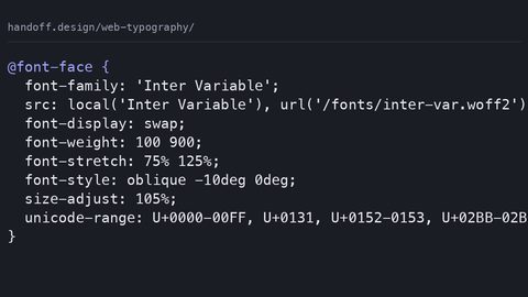
@font-face {
  font-family: "Inter Variable";
  src: url("inter-var.woff2") format("woff2-variations");
  font-weight: 100 900;
  font-display: swap;
}

/* Static fallback for older browsers */
@font-face {
  font-family: "Inter Static";
  src: url("inter-regular.woff2") format("woff2");
  font-weight: 400;
  font-display: swap;
}

h1 {
  font-family: "Inter Variable", "Inter Static", sans-serif;
  font-weight: 700;
  font-variation-settings: "opsz" 48;
  font-optical-sizing: auto;
}

p {
  font-family: "Inter Variable", "Inter Static", sans-serif;
  font-weight: 400;
  font-variation-settings: "opsz" 14;
}
Total byte cost for this pair: one Inter variable WOFF2 with wght and opsz axes, plus a 15KB static regular for fallback. The font-display strategy is swap for both, because text is critical. Notice that the variable font axis does not cascade through font-variation-settings the way font-weight does. font-variation-settings is a low-level escape hatch, and it does not inherit from parent to child unless you set it explicitly. That is the common mistake: using font-variation-settings for axes that have dedicated CSS properties like font-weight or font-stretch, then wondering why a child element ignores the parent's weight.
System Font Stack Pairing: The Zero-Request Strategy
The fastest font is the one already on the user's device. The system-ui generic family maps to the platform's native UI font: San Francisco on Apple devices, Segoe UI on Windows, Roboto on Android. It replaces the old vendor-prefixed stacks like -apple-system and BlinkMacSystemFont. But system-ui alone is not a pairing. It is a baseline. The systematic approach is to pair one web font (for brand identity) with a system font stack (for performance and readability), and to use the cascade to let the web font win only where it matters.
Here is a system-font-plus-one-web-font pairing strategy. The web font is a display face used only for headings; the body uses the system stack. The total byte cost is one WOFF2 file at 18KB for the display face, with font-display: swap. The fallback stack for the display face uses the system stack so that if the network fails, the headings render in the same font as the body. No layout shift. No double-family look.
@font-face {
  font-family: "Fraunces Variable Display";
  src: url("fraunces-var.woff2") format("woff2-variations");
  font-weight: 300 900;
  font-display: swap;
  unicode-range: U+0000-00FF, U+2010-2027;
}

/* System stack with generic fallback for very old browsers */
:root {
  --system-stack: system-ui, -apple-system, BlinkMacSystemFont, "Segoe UI", Roboto, sans-serif;
}

h1, h2, h3 {
  font-family: "Fraunces Variable Display", var(--system-stack);
  font-weight: 700;
  font-variation-settings: "opsz" 60, "wght" 700;
}

body {
  font-family: var(--system-stack);
  font-weight: 400;
}
This pair costs 18KB and zero CLS, because the fallback for Fraunces is the same system stack as the body text. When Fraunces loads, the heading metrics differ from the system font, so there is a swap. But the heading is a single line. The layout shift is minimal and contained to that element. If you measure the CLS contribution, it is negligible. The mistake people make with system-ui is omitting the generic sans-serif fallback for browsers that do not support system-ui. Those are rare now, but a small gap on old iOS Safari is still real users.
How to Choose Pair Web Fonts CSS: The Decision Order
Budget First, Taste Last
The order of operations is what separates a systematic approach from a guess. First, define the loading budget in bytes, not in aesthetics. Second, decide which text is critical (body copy, navigation, buttons) and which is decorative (pull quotes, large display numbers). Third, for critical text, choose a font with a variable weight axis and an optical size axis, so one file covers multiple sizes. For decorative text, you can afford a static display face, but only if it fits the budget. Fourth, build the fallback stack with size-adjust, ascent-override, descent-override, and line-gap-override. Fifth, set font-display per font: swap for critical, optional for decorative. Sixth, test the CLS score on a real device with a throttled connection.
The pairing itself, the visual harmony, comes last. It comes from two properties: x-height matching and contrast pairing serif sans. X-height is the height of a lowercase x; fonts with similar x-heights sit well together even if one is a serif and the other is a sans-serif. Contrast pairing serif sans means using a serif for long-form reading (the serifs guide the eye along the line) and a sans-serif for UI elements (buttons, labels, navigation). But even this rule has a constraint: the serif must be legible at the body size, and the sans-serif must have a matching weight range so bold headings do not look heavier than the text.
A font superfamily, a single family that includes both serif and sans-serif cuts, like Source Serif and Source Sans, guarantees matching x-heights and harmonious contrast. But a superfamily rarely has the personality you want for a brand. That is why the systematic approach measures first and falls in love second. If the metrics match and the budget holds, the visual harmony is a matter of taste. If the metrics mismatch, no amount of taste fixes the layout shift.
Font-Display Fallback Stack Pairing: The Failure Mode When Metrics Ignore
The Classic Jump
If you skip size-adjust and let the browser use its default fallback algorithm, you get the classic failure: a page that renders in Georgia, then jumps to Source Serif. The jump moves every line down or up by several pixels. The CLS score for that swap is high, enough to fail the Core Web Vitals threshold for the whole page. The reason is that Georgia has a larger x-height and wider advance widths than most text serifs. A line of 60 characters in Georgia is roughly 8% wider than in Source Serif. Without size-adjust, the browser does not compensate.
Do not remove the custom font. Measure the two fonts' metrics using a tool like FontFun or the browser's own layout inspector, then encode those measurements into the fallback @font-face. size-adjust is a percentage; set it to the ratio of the primary font's advance width to the fallback's advance width. ascent-override and descent-override are percentages of the primary font's ascent and descent. line-gap-override is 0. The process is repeatable, and it is the only way to guarantee that the fallback stack does not shift layout.
Variable Font Pairing Axes: Optical Size and Grade, Not Just Weight
Grade Changes Weight Without Width
Beyond weight and optical size, two other axes matter for pairing. The grade axis (registered as "GRAD") changes the stroke thickness without changing the advance width. That means you can make text bolder without causing any reflow. The glyphs get heavier but occupy the same space. Grade is ideal for interactive states: a button that becomes heavier on hover should not move the text next to it. Not every variable font has a grade axis; it is rarer than wght or opsz. If you choose a font with grade, you can use it for emphasis without affecting the layout. You can pair it with a different font that has no grade axis without worrying about width changes.
Optical Size Across Families
The optical size axis is the one that matters most for pairing serifs with sans-serifs. A serif at optical size 14 has thicker hairlines and wider apertures than the same serif at optical size 72. When you pair a serif body font with a sans-serif display font, you are comparing two different optical sizes. The serif is designed for small text; the sans-serif for large. That mismatch is why many pairs look broken at large sizes: the serif's hairlines disappear and the sans-serif looks clunky. The fix is to use a variable serif with an opsz axis and set it to a large optical size for headings, even if the headline is set in a sans-serif. The optical size of the serif does not need to match the sans-serif; it needs to match the size at which it is actually being read. If the headline is 48px, the serif's opsz should be around 48, not 14.
System Font Stack Pairing: When to Avoid Web Fonts Entirely
The Speed Case
There is a legitimate case where you should skip web fonts altogether: a page whose primary value is speed, like a landing page or a dashboard. The system font stack strategy is not a compromise; it is a deliberate choice that makes your page load in a single round trip instead of three. The trade-off is brand identity. Your page looks like every other app on the user's device, but for functional interfaces, that is the right call. The failure case is when you use system-ui without a generic fallback, and the page renders in Times New Roman because the browser does not recognise system-ui. Always end the stack with sans-serif.
If you need a web font for a logo or a specific heading, load it with font-display: optional. That tells the browser to use the custom font only if it is already in the cache; otherwise, it uses the system stack. The user sees the system font on first visit, and the custom font on second visit. This is the correct behaviour for a performance-critical page: the first visit is fast, the second visit has brand identity, and there is never a layout shift because the font only loads if it is immediately available.
Font-Display Fallback Stack Pairing: The Descriptor That Saves the Swap
Vertical Metrics Matter
The fallback stack is incomplete without the descriptors that control vertical metrics. size-adjust alone fixes horizontal advance widths, but if the fallback font has a taller ascent or a deeper descent, line boxes will shift even when the widths match. The three descriptors, ascent-override, descent-override, line-gap-override, let you align the fallback's line box to the primary font's line box. line-gap-override is usually 0 because most fonts have no line gap; if your primary font has a non-zero line gap, you set the override to that percentage. The result is a fallback stack that swaps without changing the line height. No vertical layout shift at all.
The common mistake is adjusting only size-adjust and leaving the vertical descriptors at their defaults. That produces a swap where the text stays horizontally aligned but jumps vertically by a few pixels. A shift still measurable in CLS. The order of operations in the @font-face is irrelevant; all descriptors apply regardless of order. What matters is that you set all four, or none. A partial adjustment is worse than no adjustment because it creates a false sense of correctness.
How to Choose Pair Web Fonts CSS: The Fallback That Cannot Fail
Test the Broken State
Every @font-face declaration you write is a promise. The promise is that the font you name will render the text using the file you provide. If that file fails to load, network error, blocked CDN, cached-but-corrupt file, the browser falls back to the next family in the font-family list. The fallback is not optional; it is a requirement. The systematic approach is to make the fallback as close to the primary as possible, then test what happens when the primary fails.
Block the font request in the browser's network panel and reload. The page should render in the fallback stack with no reflow. If it reflows, your size-adjust or vertical overrides are wrong. If it does not reflow but the text looks noticeably denser or sparser, your x-height matching is off. The goal is a fallback that a user cannot distinguish from the primary at a glance. That is the point: not to make the fallback invisible, but to make the swap invisible.
Variable Font Pairing Axes: The Axis That Breaks the Budget
Pick Only the Axes You Need
Not every font that calls itself variable is worth the bytes. Some variable fonts pack dozens of axes, but each axis adds data to the file. A font with wght, wdth, slnt, opsz, and GRAD is enormous, and you will never use half of those axes. Choose a variable font with only the axes you need: wght for body text, opsz for optical sizing, and possibly GRAD for interactive states. That keeps the file size down and the parsing cost low.
The failure case is using a variable font without a static fallback. Browsers that do not support variable fonts (older iOS Safari, some Android WebViews) will refuse the entire @font-face rule, and the text falls back to the system stack. That fallback might be acceptable, but it is not controlled. It is whatever the platform default is. The correct fallback is a static @font-face with font-weight: 400 for regular text and another with font-weight: 700 for bold, both using the same family name but separate src files. Then the font-family list includes both the variable family and the static family, and the browser picks whichever it supports.
System Font Stack Pairing: The Stack That Saves the Network
Order the Names Correctly
The system font stack is the most reliable fallback in the browser's font-matching algorithm. It is always available, it never blocks rendering, and it costs zero bytes. The strategy is straightforward: use a web font only for the elements that need brand identity, and use the system stack for everything else. The cascade makes this trivial. You set the system stack on body, then override font-family on headings.
But the system stack is not one font; it is a list of platform-specific names. The system-ui generic handles modern browsers, but you still need the vendor-specific names for older versions: -apple-system, BlinkMacSystemFont, "Segoe UI", Roboto. The order matters because the browser uses the first one that matches. The list should always end with sans-serif as a generic fallback. The mistake is listing a generic family first, which prevents the browser from trying the more specific names. The generic is a last resort, not a first choice.
How to Choose Pair Web Fonts CSS: The Preload That Prevents Delay
Discover the Font Early
Loading cost is not about file size alone; it is about when the browser discovers the font. In a typical page, the browser discovers font files only after it parses the CSS that references them. That is a late discovery, and it adds a full round trip to the font's load time. The fix is to preload the critical font files with a <link rel="preload"> tag in the HTML head. Preload tells the browser to start downloading the font immediately, in parallel with the CSS and JavaScript. The font is ready by the time the CSS is parsed, eliminating the extra round trip.
The cost of preloading is that you commit to downloading the file even if the font is not used on a particular viewport. That is fine for a body font used on every page, but wasteful for a display font used only on the homepage. Preload the body font and let the display font load lazily. The font-display strategy then controls what happens if the display font is late: swap shows the fallback, optional skips it entirely. The combination of preload for critical fonts and font-display: optional for decorative fonts gives you the best performance without sacrificing the brand.
Font-Display Fallback Stack Pairing: The Swap That Does Not Shift
Subset With Unicode-Range
The final piece of the fallback stack is the unicode-range descriptor. This descriptor tells the browser which character codes a particular @font-face file covers. If you split a font into two files, one for Latin and one for Cyrillic, you can limit each file's size and let the browser download only the subset it needs. The unicode-range descriptor is a list of ranges, and the browser uses the file only if the text contains characters in those ranges. The fallback is a full font without unicode-range as the last src entry, so any character not covered by the subset falls back to the full font.
The common mistake is creating overlapping unicode-range values across multiple @font-face declarations for the same family. The browser's font-matching algorithm picks one declaration for each character; if two declarations both claim the same range, the browser uses the first one in the cascade, and the second is ignored. That is rarely what you want. Use non-overlapping ranges, each covering a distinct script or subset. Always include a final @font-face with no unicode-range to handle any missing characters. This is how you build a fallback stack that works across scripts without loading the entire font for every user.
Variable Font Pairing Axes: The Fallback That Does Not Synthesize
Supply the Real Bold
When a browser encounters font-weight: 700 but the only available font is a regular weight, it synthesizes a bold by algorithmically thickening the strokes. This synthetic bold looks blurry and loses the design's subtle curves. To avoid this, your variable font fallback must include a @font-face declaration with font-weight: 700 that points to a real bold file. The same applies to oblique: if you need italics, declare a @font-face with font-style: italic. The browser will not synthesize if you provide the real file.
The failure case is declaring a variable font with a weight axis but forgetting to declare the static bold fallback. When the variable font is unsupported, the browser sees font-weight: 700 with no matching @font-face. It uses the regular file and synthesizes the bold. The text looks wrong, and the reader cannot tell you why. They know the page feels off. Test your fallback in a browser that does not support variable fonts (or by disabling variable font support in the devtools) and check every weight you use. If the bold looks synthetic, add the static @font-face. It costs a few extra kilobytes, and it is the difference between a professional page and a broken one.
System Font Stack Pairing: The Stack That Works Offline
Cache Is Not a Guarantee
If your page is a progressive web app, or if you expect users to come back to it repeatedly, the system font stack is the only font strategy that works perfectly offline. Web fonts are cached, but the cache can be evicted. A user on a train with no signal will not get a second chance to download your font file. The system stack is always there. Use system-ui for the core interface, and load a web font only when the page is first visited and the connection is available. On subsequent visits, the web font is in the cache and loads instantly; the system stack is the fallback for the first visit and for any offline use.
The trade-off is that the web font is not present on the first paint, so the user sees the system font for a split second. With font-display: swap, that split second is invisible because the swap happens quickly. With font-display: optional, the swap might not happen at all on the first visit. The user sees the system font for the entire session and the web font on the second visit. Both are acceptable; the choice depends on whether brand identity or speed is the priority. Test both and measure the CLS contribution and the time-to-interactive. The numbers will tell you which is right for your page.
How to Choose Pair Web Fonts CSS: The Cascade That Makes It Work
Inheritance Is Your Tool
The cascade is not about specificity alone; it is about inheritance. The font-family property inherits from parent to child. You can set a default font on body and override it on specific elements. The cascade also determines which @font-face declaration wins when multiple declarations have the same family name. The browser uses the one with the matching font-weight, font-style, and font-stretch. If none matches, it uses the closest one, or synthesizes the missing style.
Use the cascade deliberately: set the fallback stack on body, then use font-family on headings, blocks, and inline elements to switch to the display font. Do not set font-family on every element individually; that creates a maintenance burden and makes it easy to miss a fallback. The cascade is your tool for consistency. Use it to define the hierarchy once and let inheritance do the rest.
Font-Display Fallback Stack Pairing: The Budget That Includes the Fallback
Design for the Fallback
The byte budget is not for the primary font alone; it is for the entire font stack. If you load a 100KB body font and a 50KB display font, your budget is 150KB. The fallback stack does not count against the budget because it is served from the local system. But the fallback's metrics do count against your design quality. A fallback that looks nothing like the primary font is a failed pairing, even if it costs zero bytes.
Measure the fallback's metrics and adjust the size-adjust and vertical overrides until the swap is invisible. This is not a one-time task; it is part of the design process. Revisit it whenever you change the primary font or the fallback font. The budget is a constraint that forces you to be selective: you cannot afford to load three font families, so you choose two, or one, or none. The constraint is what makes the page fast. The fallback is what makes it look intentional when the constraint bites.
Variable Font Pairing Axes: The Axis That Is Not a Weight
Optical Size Is Adaptive Design
The optical size axis is the most misunderstood axis in variable fonts. It is not a weight axis; it does not make text bolder or lighter. It changes the design of the glyphs to suit the size at which they are rendered. At small sizes, the optical size axis opens up the apertures, thickens the hairlines, and increases the x-height. At large sizes, it thins the hairlines, reduces the x-height, and adds contrast between thick and thin strokes. This is why a font with an opsz axis looks better at both 12px and 72px than a font without one. The design is adapting to the size.
The failure case is setting font-variation-settings: "opsz" 14 on every element, including headings. That forces the small-size design onto large text, making the headings look thin and spindly. Let font-optical-sizing: auto handle the axis automatically, or set it explicitly per element. Auto is the default, and it uses the computed font-size to select the optical size. If you are using a variable font without an opsz axis, auto has no effect. You are missing out on the one axis that makes variable fonts valuable for pairing.
System Font Stack Pairing: The Stack That Adapts to the Platform
Embrace Platform Differences
The system font stack is more than a fallback; it is a design choice that adapts to the user's platform. On a Mac, the stack renders in San Francisco, which has a tight letter-spacing and a high x-height. On Windows, it renders in Segoe UI, which is wider and has a lower x-height. The text will look different on each platform, but it will look native on each. That is a feature, not a bug. Embrace this variability: design for the system stack, and accept that the web font, when it loads, will look slightly different on each platform. The web font has a fixed design, so it looks the same everywhere; the system stack does not.
The practical consequence is that your fallback stack must account for the platform differences. A size-adjust that works for Georgia on a Mac might be wrong for Segoe UI on Windows. The solution is to use size-adjust with a value that is a compromise, or to use a different fallback per platform via a media query. The latter is overkill for most pages; the former is a pragmatic compromise. Test on both platforms and accept that the swap will be slightly less invisible on one of them.
How to Choose Pair Web Fonts CSS: The Order That Saves the User
List the Closest Match First
The order of declarations in your font-family list is a performance decision. The browser tries the first family, then the second, and so on, until it finds one that is available. If your primary font is not yet loaded, the browser does not wait for it; it moves to the next family. This is the font-display behaviour: with font-display: swap, the browser uses the fallback immediately and swaps when the primary loads. The order of the list determines which fallback the user sees during the swap.
List the primary font first, then the metric-matched fallback, then a generic family. The metric-matched fallback is a @font-face declaration that uses local() to refer to a system font, with size-adjust and vertical overrides. The generic family is the last resort. This order ensures that during the swap, the user sees the closest possible match, not the generic default. If you list the generic family before the metric-matched fallback, the browser uses the generic during the swap, and the layout shift is much larger.
Font-Display Fallback Stack Pairing: The Step That Requires Testing
Force the Fallback
No amount of reasoning substitutes for a real test. The browser's font-matching algorithm is complex, and the interaction between size-adjust, ascent-override, descent-override, and the fallback font's actual metrics can produce surprises. Test in at least two browsers: Chrome and Safari on a Mac, and Chrome and Edge on Windows. Use the devtools network throttling to simulate a slow connection, and record the CLS score before and after the font swap. If the score is below 0.05, the fallback is good; if it is above 0.1, the fallback is broken and needs adjustment.
The failure case is testing only in a fast local environment where the font loads instantly and the swap never happens. That tells you nothing about the fallback. You must force the fallback to be used, either by blocking the font request or by disabling the font in the devtools. Then you see the fallback in isolation, and you can measure its metrics against the primary. This is the step that most pairing guides omit, and it is the step that separates a systematic approach from a guess.
Variable Font Pairing Axes: The Axis That Is Not a Style
Grade Versus Weight
The grade axis is not a style in the traditional sense; it is a stroke-thickness adjustment that preserves the advance width. This is the opposite of weight, which changes the advance width. Grade is useful for interactive feedback: a button can increase its grade on hover without causing the text next to it to move. It is also useful for pairing with a sans-serif that has no grade axis, because you can darken the serif's grade to match the sans-serif's heavier weight without changing the layout.
The failure case is using grade as a substitute for weight. If you want a heading to look bold, set font-weight: 700, not font-variation-settings: "GRAD" 700. Grade is a fine adjustment; weight is a coarse one. The two axes interact, and the browser interpolates them independently. If you set a high grade and a normal weight, the text looks dark but not bold. Use grade only when you need to change the stroke thickness without changing the width. Use weight when you need the text to occupy more space.
System Font Stack Pairing: The Stack That Does Not Lie
Design System-First
The system font stack is the only font strategy that never lies. It always exists, it always renders the text, and it never shifts the layout. The web font, by contrast, is a promise that can fail. Build the page so that the system stack is the baseline, and the web font is an enhancement. If the web font loads, the page looks branded; if it fails, the page still looks clean and readable. The fallback stack is the bridge between the two, and the size-adjust descriptors are the mechanism that makes the bridge invisible.
Design the page first with the system stack, and then add the web font on top. This is the opposite of the typical workflow, where a designer picks a web font and then discovers that the fallback looks bad. Designing with the system stack first forces you to make the page work without the web font. It makes the web font a genuine enhancement rather than a dependency. The result is a page that performs well under any network condition. That is the goal.
How to Choose Pair Web Fonts CSS: The Budget That Is Not Optional
Enforce It in the Build
The byte budget is not a suggestion; it is a hard constraint. If your page loads too many font kilobytes, it will be slow, and users will leave. Set a budget at the start of the project, before you choose any fonts, and enforce it through the build process. Use a tool that measures the font files' compressed size after WOFF2, and fail the build if the budget is exceeded. The budget is the most defensible argument you can make to a stakeholder who wants to add a third font family: it is not a taste decision, it is a performance decision.
The failure case is setting a budget and then ignoring it because a font looked perfect. The font's beauty does not reduce the download time. The budget is what keeps the page fast, and the page being fast is what keeps the user. Accept that some font pairs are not worth the bytes. Say no. That no is the hardest part of the job, but it is also the most important. A page that loads in 1 second with a mediocre font is better than a page that loads in 3 seconds with a beautiful font, because the user does not wait for beautiful.
Font-Display Fallback Stack Pairing: The Swap That Is Not a Failure
Embrace the Swap
A font swap is not a failure; it is a feature of the web. The browser cannot wait for a font to load before showing text, because the user would see a blank page. The swap is the browser's way of showing text immediately and then improving the visual quality when the font arrives. Embrace the swap and make it invisible through metric matching. The swap only becomes a failure when it causes a visible layout shift. That is the failure you are preventing.
Even with perfect metric matching, the swap is never truly invisible. The fallback font has different glyph shapes, and a keen eye can spot the change. The goal is not to eliminate the swap; it is to reduce the shift to a level that is imperceptible to most users and that does not affect the CLS score. The swap is a trade-off, and the systematic approach is the way to make the trade-off acceptable.
Variable Font Pairing Axes: The Axis That Is Not a File
Interpolation Costs CPU
The variable font is not a single file that contains every possible style; it is a file that contains a design space. The browser interpolates the styles you request. The cost of interpolation is not in bytes; it is in CPU cycles. When you set font-weight: 700 on a variable font, the browser computes the glyph outlines at that weight, which is a non-trivial operation. This happens once per element, and it is cached, so the cost is low on a page with a few headings. On a page with thousands of elements, the cost adds up.
Use variable fonts where the interpolation cost is justified, body text with a few weight changes, for example. Use static fonts for high-frequency animations. If you animate font-weight from 400 to 900, the browser interpolates the outlines on every frame. That is a paint cost that can drop the frame rate. The fix is to use a static font for the animation, or to animate only the grade axis, which is cheaper. The variable font is a powerful tool, but it is not free. The cost is in the browser's rendering engine, not in the network.
System Font Stack Pairing: The Stack That Is Not a Compromise
Decide Before You Design
The system font stack is a deliberate choice that prioritises speed and reliability over brand identity. The system stack is fast, it is always available, and it renders text in a font that the user is familiar with. The familiarity is a benefit: the user does not have to adjust to a new typeface, and the page feels native to their device. The cost is that the page does not have a unique visual identity. That cost is acceptable for many pages.
Decide, before you choose any font, whether brand identity or speed is the priority. If speed is the priority, use the system stack and skip web fonts entirely. If brand identity is the priority, use a web font, but pair it with the system stack as a fallback. Make the fallback as close to the primary as possible. The system stack is not a compromise; it is a decision. Make it with the same rigour as any other design choice.
How to Choose Pair Web Fonts CSS: The One Question That Matters
The question that matters is not “which fonts look good together?” It is “which fonts can load fast enough and fail gracefully enough that the visual pairing is meaningful?” The answer requires a systematic approach: measure the byte cost, set the font-display strategy, build the metric-matched fallback, and test the CLS contribution. Visual harmony is the last step, and it is the only step that is not measurable. The measurable steps are the ones that determine whether the page is fast. The page being fast is what determines whether the user stays.
No pairing is perfect. The web is a system of constraints, and the font is one of them. The systematic approach does not eliminate the constraints; it makes them visible and manageable. The page that loads fast with a modest font is a success, even if it is not the font the designer fell in love with. The love is a privilege; the speed is a right.