A Guide to CSS transform Functions: scale, rotate, skew and translate
CSS transform functions scale, rotate and skew animate on the compositor thread without triggering layout or paint. Learn each function with complete, runnable code samples.
The compositor guarantee is the single most important fact on this page: transform and opacity are the only properties the browser can animate entirely on the compositor thread, without ever touching layout or paint. The CSS Triggers specification documents this categorically. Every other animatable property, from top to width to background-color, forces the main thread to recalculate geometry, repaint pixels, or both. That cost compounds with every element affected. The CSS transform scale rotate skew family exists because it lets you move, resize, and distort visual output while the compositor handles the heavy lifting. When you understand which functions do what and when they stay compositor-safe, you stop guessing and start building interfaces that stay at 60 frames per second even on low-end devices.
The Compositor-Safe Promise: Why transform and opacity Are Different
The compositor is a separate thread that takes the already-painted layers and composites them onto the screen. When you animate transform, the browser moves a layer around. It does not re-run layout or repaint the content. Animating opacity does the same for transparency. The CSS Triggers specification lists exactly which properties trigger layout, which trigger paint, and which trigger composite only. transform and opacity are the only two in the composite-only column. That is why the phrase CSS transform scale rotate skew is shorthand for “visual changes with zero reflow.”
How Layer Promotion Works
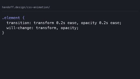
This guarantee holds as long as you transform an element that already has its own layer. The browser creates layers automatically in many cases, but you can force the issue with will-change. Declaring will-change: transform promotes an element to its own layer before the animation starts, which removes a potential first-frame jank. Use it sparingly. Applying will-change to dozens of elements at once means dozens of layers, and each layer costs memory and compositing time. Add will-change right before the animation begins and remove it after it ends. Or use it only on elements that are persistently animating, like a spinner. Do not sprinkle it across a page globally; the layer promotion itself becomes the bottleneck.
The Stacking Context Trap
Any element with a transform creates a stacking context, which changes how z-index and painting order behave. A transformed element with z-index: 0 will paint above an untransformed sibling with z-index: 5 if the transformed element appears later in the DOM. This is not a bug. It is the spec’s defined behavior. A transform also creates a containing block for fixed and absolute descendants. An element with position: fixed inside a transformed parent will no longer be fixed relative to the viewport; it becomes fixed relative to that parent. If you have a modal or a dropdown that uses fixed positioning and it suddenly anchors to the wrong spot, check whether any ancestor has a transform, even a zero-value one like transform: rotate(0deg).
CSS Transform Functions Guide: The Complete Function List
This CSS transform functions guide covers the practical set: scale, rotate, skew, and translate, plus their axis-specific variants and the 3D versions. The formal syntax for the transform declaration is a space-separated list of functions, applied left to right. Each function takes its own arguments. The full grammar includes matrix(), translate(), translateX(), translateY(), scale(), scaleX(), scaleY(), rotate(), skew(), skewX(), skewY(), matrix3d(), translate3d(), translateZ(), scale3d(), scaleZ(), rotate3d(), rotateX(), rotateY(), rotateZ(), and perspective(). You will rarely need matrix() by hand; it exists as the serialized form of any composited transform. The 3D functions add depth but also add perspective requirements and can trigger different compositing paths, so treat them as a separate category.
Function Order Matters
The order of functions matters. transform: scale(2) rotate(45deg) is not the same as transform: rotate(45deg) scale(2). The first scales the element first, then rotates the scaled version. The second rotates first, then scales the rotated version. In practice, the difference is whether the rotation axis is stretched. For most UI work, translate first, then rotate, then scale keeps the geometry predictable. When you need a specific order, write it explicitly rather than relying on memory.
Avoid Overwriting Transform Declarations
A common mistake is writing multiple transform declarations separately. transform: scale(1.5); transform: rotate(45deg); does not combine them; the second declaration overwrites the first, and the element only rotates. The transform declaration is not additive across rules. To combine, put both functions in one declaration: transform: scale(1.5) rotate(45deg).
CSS Scale Individual Property: Scaling Without Reflowing Siblings
The individual transform properties, introduced in CSS Transforms Level 2, let you set scale, rotate, and translate separately. The scale property is especially useful because it lets you change one axis or both without touching the transform shorthand. When you apply scale to an element, the element visually grows or shrinks, but its layout box stays the same size. That is the entire point: siblings do not move, and the document flow is untouched.
Basic Scale on Hover
Here is a card that enlarges on hover. The layout cost is zero; the compositor scales the existing layer up.
.card {
  width: 200px;
  height: 100px;
  background: lightgray;
  transition: scale 0.2s ease;
}

@media (prefers-reduced-motion: no-preference) {
  .card:hover {
    scale: 1.1;
  }
}
The transition applies to the scale property itself, not to the transform shorthand. This keeps the animation compositor-safe. If you wrote transform: scale(1.1) in the hover rule and transition: transform, it would still work, but the individual property is clearer and avoids accidentally overwriting a rotate or translate that might live in the same transform declaration elsewhere.
Progressive Enhancement with @supports
Browser support for individual properties is broad but not universal. Older Safari versions and some Android WebViews do not recognize scale, rotate, or translate as standalone properties. Check caniuse for the current support landscape before shipping. The accepted fallback is to use the transform shorthand inside an @supports block. Test for support with @supports (scale: 1), then apply the individual property, and provide the shorthand alternative for browsers that lack it.
.card {
  width: 200px;
  height: 100px;
  background: lightgray;
  transition: transform 0.2s ease, scale 0.2s ease;
}

@supports (scale: 1) {
  .card:hover {
    scale: 1.1;
  }
}

@supports not (scale: 1) {
  .card:hover {
    transform: scale(1.1);
  }
}
Note that the transition declaration above lists both transform and scale; if the browser supports scale, it transitions that; otherwise it transitions transform. The @supports rule decides which declaration wins. This is a reliable pattern for progressive enhancement.
CSS Rotate vs Transform Rotate: Which One to Use When
The distinction between CSS rotate vs transform rotate is subtle but practical. The individual rotate property applies a rotation independently of the transform shorthand. If you use both, the individual property applies before the transform list, and the transform list applies on top. This ordering is defined in the specification. For most simple rotation needs, either works. The individual property is cleaner when you only rotate and do not need to chain other functions.
Spinning an Icon
Here is an icon that spins when clicked. The rotation is a full turn, and because rotate is compositor-safe, the animation stays smooth.
.icon {
  display: inline-block;
  width: 24px;
  height: 24px;
  background: rebeccapurple;
  border-radius: 50%;
}

@keyframes spin {
  from { rotate: 0deg; }
  to { rotate: 360deg; }
}

@media (prefers-reduced-motion: no-preference) {
  .icon:active {
    animation: spin 0.5s linear;
  }
}
The rotate() function does the same thing inside the shorthand: transform: rotate(360deg). The difference becomes relevant when you also scale or translate. Writing transform: rotate(45deg) scale(1.2) is fine, but if you only rotate, the individual property is more readable and less error-prone. Both the individual rotate property and the rotate() function accept an angle, which can be in degrees, gradians, radians, or turns.
The 3D Limitation
One caution: the individual rotate property does not accept a vector for 3D rotation; that is rotate3d() inside the transform list. If you need to rotate around a custom axis such as rotate3d(1, 1, 0, 45deg), you must use the transform shorthand. The individual property only handles a 2D rotation around the z-axis.
CSS Transform Functions Guide: Skew for Decorative Distortion
Skew is the function that tilts an element’s edges along an axis. skewX(angle) tilts the top and bottom edges horizontally, moving the left edge down and the right edge up, or vice versa. skewY(angle) tilts the left and right edges vertically. skew(angleX, angleY) applies both at once. Skew is rarely needed for functional UI, but it is excellent for decorative elements like badges, ribbons, or background shapes that need a dynamic, angled look.
Building a Slanted Ribbon
Here is a ribbon that skews by 20 degrees to create a slanted tag effect. The element’s layout box remains rectangular, so surrounding text does not shift.
.ribbon {
  display: inline-block;
  padding: 0.5em 1em;
  background: gold;
  transform: skewX(-20deg);
}

.ribbon span {
  display: inline-block;
  transform: skewX(20deg); /* counter-skew the text to keep it upright */
}
The counter-skew on the inner span is a common technique: you skew the outer container, then skew the inner content in the opposite direction to keep the text readable. This works because transforms stack in the same coordinate system. The outer skew applies to the whole element, and the inner skew applies relative to that, canceling it out.
Skew Performance and transform-origin
Skew is a transform, so it is compositor-safe. But be careful with the layout cost of the content inside. The skew itself does not trigger layout, but if the skewed element contains text that wraps to new lines, the browser may still have to re-layout that text when the skew changes during an animation. For a static skew, there is no issue; the layout happens once, then the compositor renders the skewed layer.
The transform-origin property controls the point around which skew, rotate, and scale operate. The default is 50% 50%, the center of the element. Changing it to transform-origin: top left makes the element pivot around its top-left corner. This is essential for creating effects that hinge on a specific point, like a door swinging from its left edge. The origin itself does not affect the compositor guarantee; it is a parameter in the transform calculation.
Compositor-Safe CSS Transforms: The Performance Contract
Compositor-safe CSS transforms are about predictable performance under load. When the compositor handles a transform animation, the main thread is free to handle JavaScript, network events, and layout for other parts of the page. If you animate a property like left or top, the browser must re-run layout on every frame, which can cascade to the entire document. The difference is stark: animating left on a fixed-position element at 60 frames per second will cause jank on mid-range devices, while animating transform: translateX() will stay smooth.
What the Spec Says
This is why the CSS Triggers specification is so useful. It lists each property and its triggering behavior. For transform, it says “composite only.” That means no layout, no paint, only the final compositing step. opacity is the same. Every other property, including filter, box-shadow, and background-color, triggers paint at minimum. Paint is expensive because it rasterizes pixels, and on high-DPI screens that cost multiplies.
will-change Does Not Fix Everything
A common misconception is that will-change: transform automatically makes an animation fast. It does not. will-change only promotes the element to its own layer, which the compositor can then move. If you then animate a property that triggers layout, like width, the layer promotion does not help; the main thread still does the layout work, and the compositor only sees the final result. The layer promotion also has a memory cost, so use it only on elements that actually animate. The best practice is to add will-change in a class that also triggers the animation, and remove it when the animation finishes.
Watch for Text Reflow
Another pitfall is animating transform on an element that contains text that reflows. For example, a card that scales on hover, and inside that card there is a paragraph that wraps. The scale is compositor-safe, but if the text wraps differently at the scaled size, the browser may need to re-layout the text. In practice, the text layout is computed at the original size, and scaling happens after, so it rarely reflows. But if the card’s width is a percentage and the scale changes the effective width, the containing block may change. Keep scaled elements at fixed dimensions to avoid this edge case.
The Fallback: @supports and the transform Shorthand
Not every browser supports the individual transform properties. The real-world gap is small but meaningful: older iOS Safari versions on devices that cannot update, and some Android WebViews in apps that never get new releases, lack support for scale, rotate, and translate as standalone properties. Check caniuse for the latest numbers. The accepted fallback is to use the transform shorthand inside an @supports block. Test for the property you need, then apply the individual property; otherwise, apply the shorthand.
@supports (translate: 0) and (scale: 1) and (rotate: 0deg) {
  .element {
    translate: 10px 20px;
    scale: 1.5;
    rotate: 15deg;
  }
}

@supports not ((translate: 0) and (scale: 1) and (rotate: 0deg)) {
  .element {
    transform: translate(10px, 20px) scale(1.5) rotate(15deg);
  }
}
This pattern ensures that the visual result is identical in modern and legacy browsers. The transform shorthand is well-supported everywhere, including the prefixed -webkit- versions that shipped in Safari 9. The only truly ancient failure is Internet Explorer’s matrix filter, which you should never need to write; it is a historical artifact.
Mixing Individual Properties and the Shorthand
When you mix individual properties and the transform shorthand, the order is fixed: the individual properties apply first, then the transform list. If you write scale: 2 and transform: rotate(45deg), the element is scaled first, then rotated. This is different from writing transform: scale(2) rotate(45deg), where the scale happens first anyway. The individual properties cannot be interleaved with the shorthand functions; they are always applied before the entire transform list. If you need a different order, use only the shorthand.
Transform-Origin and Perspective: Where the Pivot Points
The transform-origin property determines the pivot point for all transform functions. The default is 50% 50%, the geometric center of the element’s border box. You can set it to keywords like top, bottom, left, right, or to length and percentage values. For scale, the origin determines the point that stays fixed while the element grows or shrinks. For rotate, it determines the axis around which the element swings. For skew, it shifts the direction of the distortion.
Scaling From a Corner
Here is a button that scales from its bottom-right corner on hover, as if it is being pulled from that point.
button {
  transform-origin: bottom right;
  transition: transform 0.15s ease;
}

@media (prefers-reduced-motion: no-preference) {
  button:hover {
    transform: scale(1.05);
  }
}
The transform-origin itself does not affect compositor safety. It is a mathematical parameter in the transform computation, and the compositor handles it. However, changing the origin during an animation can cause a jump because the element is re-projected around a new point. If you need to move the origin, do it before the animation starts, not as part of the animated keyframes.
Adding Depth with Perspective
Perspective is a separate concern. The perspective() function inside a transform list applies a one-point perspective to the element, making 3D transforms like rotateX and rotateY appear to have depth. The perspective property on a parent establishes a shared perspective for all transformed children. Without perspective, rotateX on an element looks like a vertical squash. With perspective, it looks like a card flipping in space. Perspective is also compositor-safe, but it requires the browser to compute a 3D projection, which is more expensive than a 2D transform. Use it sparingly, and only on elements that genuinely need depth.
will-change and Layer Promotion: When to Use and When to Avoid
The will-change declaration is a hint to the browser that an element is likely to change. When you write will-change: transform, the browser promotes the element to its own compositor layer, which the compositor can then move without re-rasterizing. This is useful for elements that animate frequently, like a draggable panel or a rotating spinner. The cost is memory: each layer is a separate texture, and on a page with many layers, the GPU memory usage climbs.
The Global will-change Mistake
Do not apply will-change globally. A common mistake is to add will-change: transform to every element that might animate, thinking it makes everything faster. The opposite happens: the browser creates hundreds of layers, and the compositor has to blend them all every frame, which is slower than a single layer. Add will-change to the specific element that is about to animate, and remove it when the animation ends. There is also a subtlety: will-change: transform creates a stacking context and a containing block for fixed and absolute descendants, exactly as an actual transform would. Adding will-change to an ancestor can break fixed-position modals.
When You Can Skip It
When you do need to animate a transform, you often do not need will-change at all. The browser automatically promotes layers for elements that have a transform animation running, as long as the animation is long enough to be detected. The will-change hint mainly helps to avoid the first-frame delay while the layer is created. For a hover effect that triggers immediately, will-change can prevent a one-frame flash of un-promoted content. For a long-running animation, the browser promotes on its own.
A practical rule: use will-change: transform only on elements that are persistently animated or that need a layer for other reasons, and always test the performance with and without it. If there is no measurable difference, leave it off.
prefers-reduced-motion: Respecting the User’s Setting
Every transform animation you write should respect the prefers-reduced-motion media query. This is not optional accessibility polish; it is a user preference that signals vestibular disorders. The query has two values: no-preference and reduce. When the user has set reduce, suppress non-essential motion. The common pattern is to wrap transform animations in a media query that checks for no-preference, and leave the default state static.
@media (prefers-reduced-motion: reduce) {
  * {
    animation: none;
    transition: none;
  }
}
This global reset is heavy-handed but effective for a site that wants to guarantee no motion. A more surgical approach is to write the animation inside a no-preference block, as shown in several examples above. The transform itself does not cause harm if it is applied statically; it is the animation that matters. A static scale, rotate, or skew is fine under reduced motion because it does not move. Only the transition or keyframe animation should be suppressed.
Static Transforms Are Safe
The transform declaration itself is not a motion trigger. If you apply rotate: 45deg to an icon and never animate it, the icon is tilted. That is acceptable under reduced motion. The issue arises when you add a transition that smoothly changes the angle on hover. The hover state can still apply, but the transition between states should be immediate instead of animated. Achieve this by leaving the transition declaration outside the no-preference block, or by setting transition: none in the reduce block.
Debugging Transform Failures: What Actually Goes Wrong
Overwriting Declarations
The most common transform failure is overwriting. If you try to apply scale in one rule and rotate in another, only the last one wins because both write to the same transform declaration. The fix is to combine them into a single declaration or use individual properties.
Inline Elements Won't Transform
The second most common failure is applying a transform to an inline element. The transform declaration only applies to transformable elements: block-level boxes, inline-block boxes, and replaced elements like images. A plain inline span will not transform unless you change its display to inline-block or block.
z-index and Stacking Contexts
A third failure is z-index not working as expected. This happens because a transform on an ancestor creates a stacking context, and the z-index of a descendant is then relative to that context, not the root. If you have a dropdown that appears under a sibling despite a high z-index, check whether any ancestor has a transform, opacity less than 1, or filter. Any of these creates a stacking context. Move the dropdown outside that ancestor or remove the transform from the ancestor.
Fixed Positioning Breaks
A fourth failure is fixed positioning breaking. If you have a modal with position: fixed, and it suddenly scrolls with the page, look for a transform on an ancestor. The transform creates a containing block for fixed descendants, so the modal becomes fixed relative to that ancestor instead of the viewport. This is a common gotcha when you animate a container with transform for a parallax effect. Move the modal outside the transformed container.
Transitions That Won't Fire
A fifth failure is the transition not firing. This happens when the property value does not change in a way that allows interpolation. Transitioning from display: none to display: block does not work; display is not interpolable. Transitioning from auto to a length does not work for width or height. For transforms, the transition fires as long as the start and end values are both valid transform lists with the same function type. If you transition from transform: scale(1) to transform: rotate(45deg), the browser cannot interpolate because the function types differ. Keep the same set of functions with different arguments.
FAQ: CSS Transform Scale Rotate Skew Questions
Does transform: scale(1.5) affect the element’s layout size?
No. The transform changes the visual rendering only. The element’s layout box remains the same, so siblings and the document flow are unaffected. This is what makes scale useful for hover effects without reflow.
Can I animate transform with CSS transitions without triggering layout?
Yes, as long as the transition is on transform or the individual transform properties, and the browser supports compositor-only animation. The CSS Triggers specification confirms that transform triggers no layout and no paint, only composite.
What is the difference between rotate and transform: rotate()?
The individual rotate property and the rotate() function both rotate an element. The difference is that the individual property applies before the transform list and cannot be combined with other functions in the same declaration. Use the individual property for simple rotations and the transform list for chaining multiple functions.
Why does my transformed element create a stacking context?
Any transform, including a zero-value one like transform: rotate(0deg), creates a stacking context. This affects z-index ordering and can cause fixed descendants to anchor to the transformed element instead of the viewport.
How do I support browsers that do not understand the individual transform properties?
Use the @supports rule to test for support, then apply the individual properties. In the fallback block, use the transform shorthand with the equivalent functions. This is the accepted progressive enhancement pattern.
What does will-change: transform actually do?
It promotes the element to its own compositor layer, which allows the compositor to move it without re-rasterizing. It does not make an animation faster if the property being animated triggers layout or paint. Use it sparingly and only on elements that animate.
Is skew safe to animate?
Yes, skew is a transform function, so it is compositor-safe. However, if the skewed element contains text that needs to reflow as the skew changes, the browser may have to do layout work. Keep skewed elements’ dimensions fixed for the safest animation.
The One Thing to Do Next
Open your project’s CSS and find the first animation that animates left, top, width, height, or margin. Replace it with a transform-based equivalent. If the element moves horizontally, use translateX. If it resizes, use scale. If it turns, use rotate. Wrap the animation in a prefers-reduced-motion: no-preference block. This one change will remove the layout and paint cost from that animation and move it to the compositor. Before you refactor anything else, measure the difference in DevTools performance panel. The frame rate will tell you whether the compositor guarantee is working for you.