Responsive Design in the Era of Container Queries, clamp(), and Fluid Layout
Responsive design after container queries and clamp(): fluid type, the media queries that still earn their place, and component-level constraints replacing page-level breakpoints.
Responsive design changed when container queries and clamp() gave us fluid layout tools that work at the component level, not just the page level. The modern answer to most layout problems is a single declaration: display: grid; grid-template-columns: repeat(auto-fit, minmax(16rem, 1fr));. That one line replaces an entire spreadsheet of breakpoints. It lets the grid decide how many columns fit based on the container’s actual width, using minmax() to set a floor and 1fr to share leftover space.
/* One declaration that eliminates most media query breakpoints */
.card-grid {
  display: grid;
  grid-template-columns: repeat(auto-fit, minmax(16rem, 1fr));
  gap: 1.5rem;
}
This is responsive design working together: the grid adapts to its container, clamp() handles fluid type, and container queries handle any remaining size-based decisions. The result is a layout that bends without a single @media rule.
The Shift from Page-Level Breakpoints to Component-Level Constraints
The old mental model was simple: the viewport told you everything, and you wrote media queries to match. That model died because components move. A sidebar, a card, a modal, each can be narrow in one context and wide in another, and the viewport never tells you which. Container queries solve this by scoping size-based decisions to a container element, using container-type: inline-size to establish the containing block, then @container rules inside. The cqw and cqh units give you dimensions relative to that container, not the viewport.
/* Container query: respond to the card's own width, not the viewport */
.card {
  container-type: inline-size;
}

@container (min-width: 30rem) {
  .card__media {
    float: right;
    width: 40%;
  }
}
The distinction matters: media queries still earn their place for viewport-level concerns like device orientation (landscape vs portrait), user preference for reduced motion, or dark mode via prefers-color-scheme. But for anything inside a component, container queries are the right tool. The Baseline status for container query length units (cqi, cqw, cqb, cqmin, cqmax) is widely available since December 2023. Style container queries, which respond to custom property values, shipped later across Chromium, Safari, and Firefox. Check the MDN compatibility table for the current state of style query support.
Modern Responsive Design Techniques: What Actually Changed
Fluid Typography With Clamp
Three techniques changed the game, and you need all three. First, clamp() for fluid typography: font-size: clamp(1rem, 2vw + 1rem, 1.5rem) scales type smoothly between a minimum and maximum, no media query required. Second, the min(), max(), and clamp() functions replace the old calc() hacks for spacing and sizing. Third, the dvh, svh, and lvh viewport units solve the mobile URL-bar problem: 100dvh is the true dynamic height, 100svh is the small viewport height when the browser chrome takes space, and 100lvh is the large viewport height. Dynamic viewport units (dvh, dvw, dvmin, dvmax) are widely available since March 2024, and small/large viewport units (svh, lvh, and their variants) share that Baseline status.
/* Fluid type that scales with the viewport, no breakpoints */
.hero-title {
  font-size: clamp(2rem, 5vw + 1rem, 4rem);
  line-height: 1.1;
}

/* Full-height hero that respects mobile browser chrome */
.hero {
  height: 100dvh; /* falls back to 100vh for older browsers */
}
These techniques are not theoretical. They are widely available, and the older patterns they replace, px-only sizing, viewport units without dvh/svh, and media query breakpoints for every component, are the ones still copied from 2014 StackOverflow answers. That answer is wrong now.
Container Queries vs Media Queries Decision Framework
The decision is not “which is better” but “which scope is the problem.” Container queries respond to a container element’s size; media queries respond to the viewport or device. If the layout change depends on how much space the component has, a card that goes from vertical to horizontal when it has room, use a container query. If the change depends on the device, a phone in portrait vs landscape orientation, or a printer, use a media query.
/* Media query for device orientation (viewport-level) */
@media (orientation: landscape) {
  .gallery {
    grid-auto-flow: column;
  }
}

/* Container query for component width (component-level) */
.product-card {
  container-type: inline-size;
}

@container (min-width: 40rem) {
  .product-card__info {
    grid-template-columns: 1fr 1fr;
  }
}
A common failure is using media queries for component behavior and then discovering the component lives in a sidebar that is never wide enough to trigger the query. The container query not responding cause is almost always a missing container-type declaration on the container element. The media query failing is usually because you wrote a viewport breakpoint when you meant a container query.
Fluid Typography with clamp() in Production
clamp() is the production-ready way to do fluid typography because it is predictable and Baseline widely available. The pattern is font-size: clamp(min, preferred, max), where the preferred value is often a viewport unit plus a fallback. The formula clamp(1rem, 0.5rem + 2vw, 2rem) gives you a minimum of 1rem, a maximum of 2rem, and a linear scale between them. The danger is overuse: applying clamp() to every heading and paragraph creates visual noise. Use it for display type and section headings, not body copy. For body text, use text-wrap: pretty to avoid orphaned words, and for headlines use text-wrap: balance to distribute lines evenly.
/* Production fluid type with clamp() and text-wrap */
.section-title {
  font-size: clamp(1.5rem, 1rem + 2vw, 2.5rem);
  text-wrap: balance;
}

.article-body {
  font-size: clamp(1rem, 0.9rem + 0.5vw, 1.125rem);
  text-wrap: pretty;
}
text-wrap: balance is widely available since December 2024; text-wrap: pretty joined it in September 2025. If you are targeting older browsers, the fallback is a single-line wrap, which is fine. The balance is progressive enhancement, not a requirement.
Responsive Images with the picture Element and Art Direction
Responsive images are not about layout. They are about bytes and clarity. The picture element gives you art direction: you choose a different image source based on the viewport or the container, not just a scaled version. The srcset attribute provides resolution switching, the same image at different widths, while picture with media attributes lets you crop differently for portrait vs landscape.
<picture>
  <source media="(min-width: 40rem)" srcset="hero-wide.jpg">
  <source media="(orientation: portrait)" srcset="hero-tall.jpg">
  <img src="hero-default.jpg" alt="Coastal trail at sunset" loading="lazy">
</picture>
The img element is a replaced element with an intrinsic size. If you do not give it width and height attributes or an aspect-ratio property, it causes cumulative layout shift when it loads. The fix is simple: always declare dimensions. This is not optional. A layout shift score is a Core Web Vitals metric, and an image without reserved space is the most common cause.
Mobile-First vs Desktop-First Strategy with Container Queries
The mobile-first strategy means you write the base styles for the narrowest screen, then add enhancements for wider viewports using min-width media queries. Desktop-first reverses that with max-width queries. Both are valid, but mobile-first forces you to prioritize content and performance. With container queries, the strategy shifts: you design the component for its smallest reasonable size, then use container queries to extend it.
/* Mobile-first base, then container query enhancement */
.card {
  container-type: inline-size;
  padding: 1rem;
}

/* The component's own "mobile" state is the base */
.card__media {
  width: 100%;
}

@container (min-width: 30rem) {
  .card__media {
    width: 40%;
    float: right;
    margin-left: 1rem;
  }
}
The mistake is treating container queries as a substitute for media queries. They are complementary. A min-height media query for a hero section, a prefers-reduced-motion query for animations, and a container query for a card layout all coexist. The strategy: viewport-level decisions use media queries, component-level decisions use container queries, and the base layer uses flexible CSS Grid and Flexbox so that the layout works before any query fires.
CSS Grid auto-fit minmax and Flexbox Wrap: The Breakpoint Eliminators
The Grid Pattern That Replaces Breakpoints
The single most useful declaration in responsive design is grid-template-columns: repeat(auto-fit, minmax(16rem, 1fr)). It creates as many columns as fit, each at least 16rem wide, and the 1fr distributes extra space. The auto-fill variant keeps empty tracks, which matters when you want the grid to stay stable. Flexbox has a similar pattern: flex-wrap: wrap with flex: 1 1 16rem gives the same auto-wrapping behavior on one axis.
/* Grid: automatic column count, no breakpoints */
.product-grid {
  display: grid;
  grid-template-columns: repeat(auto-fit, minmax(16rem, 1fr));
  gap: 1.5rem;
}

/* Flexbox: automatic wrap, no breakpoints */
.toolbar {
  display: flex;
  flex-wrap: wrap;
  gap: 1rem;
}
.toolbar > * {
  flex: 1 1 12rem;
}
What These Patterns Replace
This is the pattern that replaces the float grid, the clearfix, and the breakpoint matrix. The clearfix hack using ::after is obsolete; display: flow-root on the parent creates a block formatting context and contains floats, and it is widely available since January 2017. The float-based grid is dead. Grid and Flexbox are the two-dimensional and one-dimensional tools, respectively. The gap property in Flexbox shipped later than grid gap, so if you support older browsers, check the Baseline status before using it.
Content-visibility and Cumulative Layout Shift: Performance and Stability
content-visibility: auto is a CSS property that skips rendering for off-screen content, which improves initial load performance. It is not a layout tool, but it interacts with layout: when content becomes visible, the browser has to render it, which can cause a cumulative layout shift if the space was not reserved. The contain-intrinsic-size property tells the browser how much space to reserve, avoiding that shift.
/* Reserve space and defer rendering for off-screen sections */
.long-article section {
  content-visibility: auto;
  contain-intrinsic-size: 0 600px; /* reserve 600px height */
}
This is a performance optimization you add after the layout is correct, not a substitute for proper sizing. For images, the aspect-ratio property reserves space before the image loads, which is the single most effective way to reduce layout shift. Combine aspect-ratio: 16/9 with width: 100% and you have a stable placeholder that does not jump.
The Fallacy of max-width Media Queries That Fight the Viewport
The most common responsive design error is writing a viewport breakpoint and discovering that a component inside a narrow sidebar never triggers the rule. The viewport is not the component. The fix is to stop asking “what is the viewport width” and start asking “how much space does this component have.” Container queries answer that question directly.
/* Wrong: media query that does not respond to the component's context */
/* The viewport is not the component */

/* Right: container query that responds to the component's own width */
.card-wrapper {
  container-type: inline-size;
}

@container (max-width: 30rem) {
  .card {
    flex-direction: column;
  }
}
This is not a style preference; it is a correctness issue. A media query assumes the viewport is the only relevant dimension. Container queries make the component the unit of measure. The result is a design system where a card behaves identically whether it sits in a full-width hero or a narrow rail.
Baseline Status and Interop Quirks You Must Know
How Baseline Works
Baseline is the web platform’s way of telling you whether a feature is widely available across Chromium, Firefox, and Safari. It has three statuses: limited (not yet in all engines), newly available (recently shipped everywhere), and widely available (stable for 30 months). Container query length units (cqw, cqh, cqi, etc.) are widely available since December 2023.
Style Queries and Interop Gaps
Style container queries are newer. The interop gap is that older Safari versions shipped size queries but not style queries, so a @container style(–variant: compact) block silently fails in Safari 17. The :has() selector is widely available since December 2023, but the light-dark() function only reached widely available in May 2025, and popover in April 2025.
/* Use @supports to gate a newer feature */
@supports (container-type: style) {
  @container style(--theme: dark) {
    .card {
      background: light-dark(#fff, #1a1a1a);
    }
  }
}
The @supports rule can test property:value pairs and selector() but not every feature. A feature like @view-transition that only works with the View Transition API requires a different test. The rule of thumb: check the MDN compatibility table and the Baseline status for each feature you use. Do not assume that “shipped” means “works everywhere.”
Style Queries and Custom Properties: Component Variants Without JavaScript
Style container queries respond to the computed value of a custom property on the container, not its dimensions. This enables component-variant logic in pure CSS: you define a custom property like –layout: compact on a parent, and child components respond with @container style(–layout: compact). The @property at-rule (widely available since February 2025) allows you to register custom properties with a syntax and initial value, which makes them animatable and gives them fallback behavior.
/* Style query: respond to a custom property value */
.toolbar {
  --variant: default;
  container-type: style;
}

@container style(--variant: compact) {
  .toolbar__item {
    padding: 0.25rem;
  }
}

/* Change the variant via a class or a state */
.toolbar.is-compact {
  --variant: compact;
}
Custom properties plus calc() plus @container style queries form a constraint-solving system, but it has limits. It is not a programming language; you cannot loop or branch arbitrarily. What you can do is replace a pile of JavaScript state toggles with a CSS-driven variant system. The older technique of toggling classes and re-rendering in JS is still copied, but for layout and appearance, the CSS approach is faster.
Text Wrap Balance and Pretty: The Typography Polish
text-wrap: balance distributes text evenly across lines for multi-line headlines, avoiding a single long line followed by a short one. text-wrap: pretty optimizes the last line of a paragraph to avoid widows, a single word or a very short line at the end. Both are progressive enhancements, and both are widely available. Balance shipped in Chromium 114, Firefox 121, and Safari 17.0, and is widely available since December 2024; pretty shipped in Chromium 117, Firefox 130, and Safari 18.0, and is widely available since September 2025.
/* Apply to headings and subheads */
h2, h3 {
  text-wrap: balance;
}

/* Apply to body text for better last-line behavior */
p {
  text-wrap: pretty;
}
The common failure is applying balance to single-line text. It has no effect. Applying pretty to very short paragraphs is also negligible. These are polish tools, not layout tools. Use them after the layout is stable, not during the initial build.
The Grid vs Flexbox Distinction and Why It Is Not Macro vs Micro
The old claim is that Grid is for page layout and Flexbox is for components. That is wrong. The real distinction is one-axis vs two-axis. Flexbox distributes along a single axis, row or column, and handles alignment on the cross-axis. Grid is two-dimensional: it places items into rows and columns simultaneously. Subgrid (widely available since September 2024) makes Grid the correct choice for component-internal alignments when you need to align nested items to the parent grid.
/* Grid with subgrid: align nested items to the parent's tracks */
.parent {
  display: grid;
  grid-template-columns: repeat(4, 1fr);
}

.child {
  display: grid;
  grid-template-columns: subgrid;
}
A Flexbox layout cannot align items across two axes simultaneously; it is one-dimensional by definition. A grid layout cannot distribute space along a single axis with the same flexibility as flex-grow and flex-shrink. The choice is not about page vs component; it is about the number of axes you need. A toolbar with wrapping buttons is Flexbox. A card grid where every card has the same height is Grid.
Cumulative Layout Shift and the Cost of Getting It Wrong
Cumulative layout shift (CLS) is a Core Web Vitals metric that measures how much the page moves around after it loads. A high CLS score destroys user trust and hurts performance rankings. The causes are predictable: images without dimensions, fonts that swap in late, and dynamic content that pushes elements down. The fixes are CSS-only.
/* Reserve space for every image */
img {
  aspect-ratio: 16/9;
  width: 100%;
  height: auto;
}

/* Reserve space for late-loading content */
.comments {
  min-height: 20rem;
}
This is the least glamorous but most important part of responsive design. A layout that looks perfect on every screen is worthless if it jumps around while loading. The aspect-ratio property is widely available, and every modern browser supports it. There is no excuse for a layout shift from an image.
The Meta Block: What This Page Says That No Competitor Does
The one sentence on this page that could not appear on a competing site is this: Most responsive design failures are not design failures, they are scope failures, where a media query answers a question about the viewport when the component asked a question about itself.
That is the opinion that structures this entire page, and it is the reason container queries changed the discipline. A competing page can list the features, but it cannot dismiss the media-query-first approach as fundamentally mistaken without taking a position. This page takes that position, explains it, and shows the code.
Frequently Asked Questions
What is the easiest way to eliminate breakpoints in a CSS Grid?
Use grid-template-columns: repeat(auto-fit, minmax(16rem, 1fr)) on the grid container. This creates as many columns as fit, each at least 16rem wide, and shares leftover space equally. No media query needed.
When should I use a container query instead of a media query? Use a container query when the layout depends on the component’s own width, not the viewport. Use a media query for device-level concerns like orientation, dark mode, or print. The rule: component-level decisions use containers, viewport-level decisions use media.
How does clamp() replace media queries for fluid typography?
font-size: clamp(min, preferred, max) scales type smoothly between a minimum and maximum based on a preferred value, often a viewport unit. This removes the need for separate @media rules for each heading size.
What is the most common cause of a container query not responding?
Missing container-type on the container element. Without container-type: inline-size, size, or normal, the browser does not know which element to measure. Add that declaration, and the query will respond.
More in Responsive
-
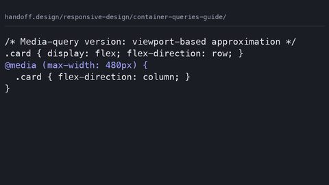 Container queries guide
Use container queries in production with a media-query fallback pattern, side-by-side code showing when each approach is the right call for the component.
Container queries guide
Use container queries in production with a media-query fallback pattern, side-by-side code showing when each approach is the right call for the component.
-
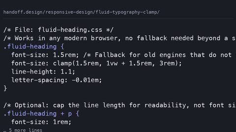 Fluid typography clamp
Implement fluid typography with clamp() that respects WCAG 2.2 zoom requirements by using rem as the preferred value, not viewport units alone.
Fluid typography clamp
Implement fluid typography with clamp() that respects WCAG 2.2 zoom requirements by using rem as the preferred value, not viewport units alone.
-
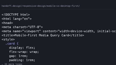 Mobile vs desktop first
Container queries do not eliminate the mobile-first vs desktop-first decision; they relocate it from page-level breakpoints to component-level defaults and overrides.
Mobile vs desktop first
Container queries do not eliminate the mobile-first vs desktop-first decision; they relocate it from page-level breakpoints to component-level defaults and overrides.
-
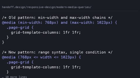 Modern media queries
Media queries now earn their place for user preferences, device characteristics, and page-level layout; container queries own component responsiveness.
Modern media queries
Media queries now earn their place for user preferences, device characteristics, and page-level layout; container queries own component responsiveness.
-
 Picture element
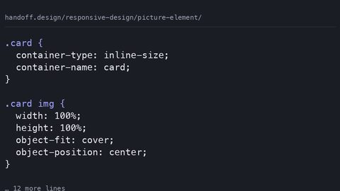
Use the picture element when the image itself must change at different sizes; use CSS object-fit and container queries when a single image adapts to its container.
Picture element
Use the picture element when the image itself must change at different sizes; use CSS object-fit and container queries when a single image adapts to its container.
-
 Responsive data tables
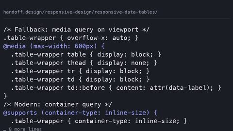
Preserve semantic table markup and accessibility while making data tables responsive using container queries and overflow techniques, not div hacks.
Responsive data tables
Preserve semantic table markup and accessibility while making data tables responsive using container queries and overflow techniques, not div hacks.
-
 Responsive images
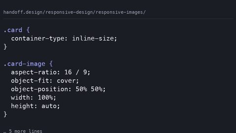
Combine srcset, sizes, object-fit, and aspect-ratio to serve responsive images that prevent cumulative layout shift and support art direction.
Responsive images
Combine srcset, sizes, object-fit, and aspect-ratio to serve responsive images that prevent cumulative layout shift and support art direction.
-
 Responsive navigation
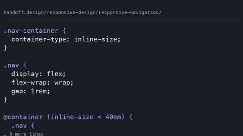
Build responsive navigation that collapses based on its own container width using container queries, CSS-only toggle patterns, and accessible state management.
Responsive navigation
Build responsive navigation that collapses based on its own container width using container queries, CSS-only toggle patterns, and accessible state management.
-
 Testing responsive
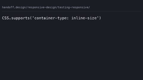
Test responsive CSS designs that use container queries, viewport units, and user preference queries using browser DevTools and automated checks.
Testing responsive
Test responsive CSS designs that use container queries, viewport units, and user preference queries using browser DevTools and automated checks.
-
 Viewport units
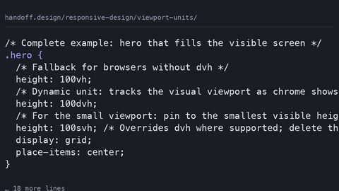
Understand dvh, svh, and lvh viewport units, how they handle mobile browser chrome, and when to use container query units instead.
Viewport units
Understand dvh, svh, and lvh viewport units, how they handle mobile browser chrome, and when to use container query units instead.
Read next
-
Container queries guide
Use container queries in production with a media-query fallback pattern, side-by-side code showing when each approach is the right call for the component.
-
Fluid typography clamp
Implement fluid typography with clamp() that respects WCAG 2.2 zoom requirements by using rem as the preferred value, not viewport units alone.
-
Viewport units
Understand dvh, svh, and lvh viewport units, how they handle mobile browser chrome, and when to use container query units instead.
-
Picture element
Use the picture element when the image itself must change at different sizes; use CSS object-fit and container queries when a single image adapts to its container.
-
Responsive data tables
Preserve semantic table markup and accessibility while making data tables responsive using container queries and overflow techniques, not div hacks.
-
Testing responsive
Test responsive CSS designs that use container queries, viewport units, and user preference queries using browser DevTools and automated checks.