Improving Readability with line-height, letter-spacing, and the Optimal Measure
Set line-height, letter-spacing, and measure in CSS for readable text that meets WCAG text-spacing requirements—and state the typeface loading cost.
You are fighting a losing battle against squinting, scrolling, and re-reading the same line twice. The default text on most websites is set by a browser that does not care about your eyes. The fix is not more JavaScript or a better framework. It is a handful of CSS properties that compute comfortable text from the font, the measure, and the reader's own settings. This page answers the one question that matters: what CSS readability line-height letter-spacing measure values should you set, and how do they interact with WCAG's text-spacing requirements, so that your prose survives user overrides without breaking?
The short answer is that readability is a constraint-solver problem. CSS is the declarative constraint-solver that computes the visual presentation of a document from a cascade of rules, not a procedural programming language. You declare the line-height as a unitless number, the measure as a max-width in ch units, and the letter-spacing in em. The browser does the arithmetic. Get those three right, and the rest of typography becomes a matter of restraint. Get them wrong, and no amount of beautiful typeface choice will rescue the reading experience.
Improving Readability with line-height, letter-spacing, and the Optimal Measure
Set the Measure in ch Units
The optimal measure, sometimes called the optimal line length, is the number of characters per line that keeps the eye from wandering. Research and practice converge on a range of 45 to 75 characters per line, with 66 as a comfortable middle. The CSS unit for that is the ch unit, which is the width of the '0' (zero) glyph in the current font. Setting max-width: 65ch on a paragraph is not a magic bullet. It is a starting point that respects the font's actual advance width, which varies wildly between typefaces.
Pick a Line-Height That Matches the Measure
Line-height is the other half of the measure story. The unitless value in CSS is the one that scales: a number like 1.5 is multiplied by each element's own font-size. A 16px paragraph gets a 24px line box, and a 24px heading gets a 36px line box. The real dependence is on the measure and the typeface's x-height. A wide measure of 80 characters needs more line-height, often 1.6 or 1.7. A narrow measure of 45 characters can work with 1.4. A font with a large x-height, think Verdana or Trebuchet, needs more leading than a font with a small x-height like Georgia or Times, because the apparent vertical density is higher. There is no universal line-height value, only a value that fits the measure and the x-height.
Use Letter-Spacing Only Where It Helps
Letter-spacing, or tracking in typographic terms, is the third member of the trio. In CSS, letter-spacing is specified in em, which means it scales with font size. For lowercase body text, the default normal is almost always correct. Adding positive letter-spacing to lowercase text breaks word-shape recognition and slows reading. Letter-spacing is for uppercase text, small caps, and short labels, where a small positive value like 0.05em adds air without compromising readability. For body copy, if you must adjust it, use a tiny negative value like -0.01em to tighten headlines. Never apply positive tracking to a paragraph longer than two lines. The supporting vocabulary here is the distinction between tracking (letter-spacing) and kerning (font-kerning property). Kerning is the adjustment between specific pairs like 'AV' or 'To', and it is on by default in most browsers. Do not turn it off unless you have a specific reason.
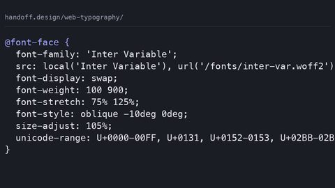
Here is a complete, runnable sample that puts the three together. It uses a unitless line-height, a max-width in ch units, and letter-spacing in em, all inside a body-text block with a robust fallback stack. Note the font-display: swap on the web font, which prevents invisible text while the font loads, and the fallback stack that includes system fonts so the page is readable even if the web font fails.
/* readable-body-text.css */
:root {
  --measure: 65ch;
  --line-height-body: 1.6;
  --letter-spacing-body: 0.01em;
  --font-body: 'Source Serif 4', Georgia, 'Times New Roman', serif;
}

body {
  font-family: var(--font-body);
  font-size: 1rem;
  line-height: var(--line-height-body); /* unitless, scales with font-size */
  letter-spacing: var(--letter-spacing-body); /* em, scales with font-size */
  max-width: var(--measure); /* 65 characters per line */
  margin: 0 auto; /* center the column */
  padding: 1rem;
}

p {
  margin: 0 0 1.5em 0;
}

@font-face {
  font-family: 'Source Serif 4';
  src: url('source-serif-4.woff2') format('woff2');
  font-display: swap; /* prevent FOIT, fall back to Georgia while loading */
  font-weight: 400;
}

/* Fallback: if the web font fails, the stack above handles it */
Run this in any modern browser, and you get a column that is comfortable to read on a desktop, on a tablet, and on a phone. The unitless line-height means that if a user increases the browser's default font size, the line box grows proportionally. The ch-unit measure means that if the font is narrower or wider than expected, the column adjusts to the actual character width. The em-based letter-spacing means that if the user zooms, the tracking scales. This is the foundation; everything else is refinement.
line-height unitless accessibility WCAG
Why Unitless Values Pass the WCAG Test
The Web Content Accessibility Guidelines (WCAG) do not mandate a specific line-height value, but they do require that users can adjust text spacing without loss of content or functionality. Success Criterion 1.4.12 Text Spacing (Level AA) says that if a user overrides the following properties, the content must still be readable: line-height to at least 1.5 times the font size, spacing following paragraphs to at least 2 times the font size, letter-spacing to at least 0.12 times the font size, and word-spacing to at least 0.16 times the font size. This is a testable requirement. If you set line-height: 1.2 on body text, a user who applies the WCAG override of 1.5 will see your text with lines that nearly touch, and you fail the criterion.
The unitless value is the key to passing this test. If you declare line-height: 1.5 (unitless), then a user override of 1.5 is a no-op because your value already meets it. If you declare line-height: 24px, the override may or may not win depending on specificity and source order. The result is unpredictable. The WCAG technique for this criterion explicitly recommends using a unitless line-height, because it inherits correctly and does not lock the value to a font-size that may be overridden. The failure case happens when you set line-height in px or rem: the user's override, which is a unitless multiplier on their font size, cannot properly scale your absolute value, and the text becomes cramped.
Run the Override Test Yourself
Here is a test you can run right now. Apply the WCAG override styles to your page, and check that nothing overlaps, clips, or disappears. The override is simple: set line-height to 1.5, letter-spacing to 0.12em, word-spacing to 0.16em, and margin-bottom on paragraphs to 2em. If your CSS uses unitless line-height, em-based letter-spacing, and em-based margins, you pass. If you used fixed px values for any of these, you likely fail. This is the real interaction between CSS readability and accessibility: your design must be resilient to user adjustments, not just look good at your chosen values.
The runnable test below shows the exact override values from WCAG 1.4.8 Visual Presentation and 1.4.12 Text Spacing. Apply this as a user style or in a test harness, and verify that your content is still readable. Note the font-display and fallback stack: even in a test, the font loading must not break the layout.
/* wcag-text-spacing-test.css */
/* Apply these overrides to test WCAG 1.4.12 */
body {
  line-height: 1.5 !important; /* unitless, minimum multiplier */
  letter-spacing: 0.12em !important; /* minimum tracking */
  word-spacing: 0.16em !important; /* minimum word gap */
}

p {
  margin-bottom: 2em !important; /* spacing after paragraphs */
}

/* Also check WCAG 1.4.8: text can be resized up to 200% without loss */
/* Test: set body font-size to 200% and verify no horizontal scroll */
@font-face {
  font-family: 'TestFont';
  src: url('test-font.woff2') format('woff2');
  font-display: swap;
}

body {
  font-family: 'TestFont', Verdana, Geneva, sans-serif;
  max-width: 65ch; /* measure */
}
Run this test and you will quickly find the places where your typography fails. Common failures include fixed-height containers that clip text when line-height increases, absolutely positioned elements that overlap when letter-spacing widens, and multi-column layouts where the column gap is too small to accommodate wider word-spacing. The fix is almost always to use relative units (em, %, ch) and to avoid fixed heights on text containers. The WCAG criterion is about robustness under user choice.
letter-spacing tracking CSS readability
When Tracking Hurts Readability
Letter-spacing, or tracking in the typographic vocabulary, is a tool that many developers misuse. The CSS property letter-spacing adds space between every character unit, and it is specified in length units, with em being the most sensible because it scales with font size. For readability, the rule is simple: do not apply positive letter-spacing to lowercase body text. The reason is perceptual. Readers recognize words by their overall shape, and adding uniform space between characters destroys that shape, forcing the brain to decode letter by letter. This slows reading speed and increases cognitive load, especially for dyslexic readers who already struggle with word boundaries.
Where Tracking Belongs
Where letter-spacing helps is in uppercase text, small caps, and navigation labels. A value of 0.05em to 0.1em on all-caps text adds a sense of air and improves legibility at small sizes, because uppercase letters have no ascenders or descenders to differentiate them. For headings in a display font, a slight negative tracking like -0.02em can tighten the visual density, but only if the font's kerning tables are not already optimal. The font-kerning property is on by default. If you apply letter-spacing, the browser still respects kerning pairs, but the additional tracking is uniform. If you want fine control over pairs, letter-spacing is the wrong tool; that is what kerning is for.
Tracking and Fallback Fonts
The failure mode here is using letter-spacing to approximate a design look without accounting for fallbacks. If you set letter-spacing: 0.1em on a heading that uses a web font, and the web font fails to load, the fallback font will receive the same tracking, which may look terrible. Similarly, if you use text-transform: uppercase to fake a small-caps style, and the font does not have true small caps, the letter-spacing will amplify the faux bold effect. The safe pattern is to set tracking only on elements that are explicitly uppercase or that use a font designed for tracking, and to reset it when the font-family changes. The supporting term here is the distinction between tracking and kerning: tracking is uniform, kerning is pairwise, and both are controlled by separate CSS properties.
optimal line length measure CSS
Why the ch Unit Works
The optimal line length is the number of characters per line that makes reading comfortable. The classic research by Emil Ruder and later studies settled on a range of 45 to 75 characters, with 66 as the often-cited average. In CSS, the measure is set with max-width and the ch unit, which equals the width of the '0' glyph in the current font. This is more robust than using px or em, because it adapts to the font's actual advance width. A serif font like Georgia has wider characters than a condensed sans like Arial Narrow, so a 65ch column in Georgia will be wider in pixels than a 65ch column in Arial Narrow. Both will contain roughly the same number of characters per line.
Measure and Line-Height Work Together
The relationship between measure and line-height is inverse: longer lines need more leading to guide the eye back to the left margin, while shorter lines can use tighter leading. If you set max-width: 80ch, you should increase line-height to 1.6 or 1.7 to prevent the eye from getting lost. If you set max-width: 45ch, a line-height of 1.4 is usually sufficient. The failure mode is copying a line-height value from one site to another without checking the measure. A 1.5 line-height on a 65ch column may feel airy, while the same value on a 90ch column feels like a wall of text. The measure is the master variable; line-height serves it.
Progressive Enhancement with text-wrap
Another factor that interacts with the measure is the text-wrap property. The CSS Text Module Level 4 introduces text-wrap: balance for headlines, which distributes the text evenly across lines, and text-wrap: pretty for body text, which avoids orphaned single words. These are progressive enhancements; use them inside an @supports block so that older browsers fall back to normal wrapping. The fallback is straightforward: @supports (text-wrap: balance) { h1 { text-wrap: balance; } }. The pretty value is especially useful for the last line of a paragraph, preventing a single word from dangling alone, which is a common readability annoyance. Remember that balance is for multi-line headings only; it has no effect on single-line text.
Here is a complete sample that combines the measure with text-wrap and a proper fallback stack. It shows how to set a comfortable column and then refine the wrapping with progressive enhancement.
/* measure-and-wrap.css */
body {
  font-family: 'Literata', 'Iowan Old Style', 'Palatino Linotype', 'Book Antiqua', Palatino, serif;
  font-size: 1.125rem; /* 18px base, comfortable for reading */
  line-height: 1.6;
  max-width: 68ch;
  margin: 0 auto;
  padding: 1.5rem;
}

h1, h2, h3 {
  line-height: 1.2;
  max-width: 100%; /* headings can be wider than body, but keep within container */
}

p {
  margin-bottom: 1.5em;
}

/* Progressive enhancement: balance for headings, pretty for paragraphs */
@supports (text-wrap: balance) {
  h1, h2 {
    text-wrap: balance;
  }
}

@supports (text-wrap: pretty) {
  p {
    text-wrap: pretty;
  }
}

/* Fallback: if no support, default word wrap applies */
@font-face {
  font-family: 'Literata';
  src: url('literata.woff2') format('woff2');
  font-display: swap;
  font-weight: 400 700; /* variable font range */
}
This sample uses a variable font, which is a single file with a continuous range of weight, width, slant, and optical size axes, controlled via font-variation-settings. The optical size axis (opsz) automatically adjusts the typeface's design for the font size: larger sizes get more contrast and thinner strokes, smaller sizes get sturdier shapes. This is a readability win because it means the font is tuned to the measure and the point size, not just scaled. If the variable font fails, the fallback stack includes 'Palatino Linotype' and Palatino, both of which have large x-heights and are comfortable at reading sizes. The font-display: swap ensures that the fallback is visible immediately, avoiding the invisible-text flash (FOIT) that would otherwise harm readability.
word-spacing justification CSS readability
The Problem with Justified Text
Justified text, where both the left and right margins are flush, is a common design choice that comes with a readability cost. The CSS property text-align: justify distributes the extra space between words to make lines equal width. On a narrow column, this creates large gaps between words, known as rivers of white space, which disrupt the visual flow and make the text harder to scan. The mitigation is not to abandon justification entirely, but to combine it with hyphenation and controlled word-spacing.
How word-spacing and Justification Interact
The word-spacing property adds or removes space between words, and it interacts with the justification algorithm. If you set a positive word-spacing on justified text, the browser must reconcile your additional space with the space it needs to distribute, leading to inconsistent gaps. The failure mode is applying word-spacing: 0.25em to a justified paragraph, which can make some lines look like they have a single huge gap and others look cramped. The better approach is to leave word-spacing at normal for justified text and rely on hyphenation to balance the lines. Hyphenation, via the hyphens: auto property, creates break opportunities within words, which reduces the amount of space that needs to be distributed.
Hyphenation Requires a Language
For hyphens: auto to work, you must specify the content language using the lang attribute on the html or an ancestor element. The browser uses that language's hyphenation dictionary; without lang, the property has no effect in most engines. The supporting term here is the distinction between word-break and overflow-wrap. word-break: break-all breaks words at any character, which is appropriate for CJK scripts but destroys Latin readability. overflow-wrap: break-word only breaks a word if it would otherwise overflow the line. For justified text, hyphens: auto is the correct tool, not word-break. The fallback for browsers without hyphens: auto support is to use soft hyphens () inserted manually in long words, which is a tedious but universal solution. The @supports rule can guard the auto value: @supports (hyphens: auto) { p { hyphens: auto; } }.
This sample shows the correct setup for justified text with hyphenation, including the lang attribute and the fallback stack. It also demonstrates the failure mode of over-justification and how to avoid it.
<!DOCTYPE html>
<html lang="en">
<head>
<meta charset="UTF-8">
<title>Justified and hyphenated readable text</title>
<style>
body {
font-family: 'Source Serif 4', Georgia, 'Times New Roman', serif;
font-size: 1rem;
line-height: 1.5;
max-width: 70ch;
margin: 0 auto;
padding: 1rem;
text-align: justify; /* only with hyphenation and a reasonable measure */
hyphens: auto; /* requires lang attribute */
word-spacing: normal; /* do not adjust on justified text */
}
@supports (hyphens: auto) {
p {
hyphens: auto;
}
}
/* Fallback: soft hyphens in the HTML for browsers without auto support */
@font-face {
font-family: 'Source Serif 4';
src: url('source-serif-4.woff2') format('woff2');
font-display: swap;
}
</style>
</head>
<body>
<p>This is a paragraph of justified text. The measure is 70 characters per line, which is within the readable range. The line-height is 1.5, which is sufficient for this measure. Hyphenation is enabled, so long words like ­univer­sity can break at the line end, reducing the gaps between words. Without hyphenation, the justification algorithm would create uneven spacing that harms readability.</p>
</body>
</html>
This sample is complete and runnable. The lang="en" attribute is not optional; it is what makes hyphens: auto work in Chrome, Edge, Safari, and Firefox. The word-spacing: normal declaration is a reminder that adding word-spacing to justified text is a mistake. The measure of 70ch is at the upper end of the readable range, so line-height 1.5 is a reasonable choice. If you increase the measure to 80ch, you should also increase the line-height to 1.6 or 1.7. The fallback soft hyphens are already in the paragraph, so even if a browser does not support hyphens: auto, the text still breaks at the inserted points, preserving the justified layout.
hyphens auto CSS
Getting Hyphenation Right
Hyphenation is a powerful readability tool when used correctly, but it is easy to get wrong. The hyphens: auto property tells the browser to insert hyphens at break points based on a language dictionary. The key requirement is the lang attribute; without it, the browser has no dictionary and the property is ignored. The second requirement is a reasonable measure. If the column is too narrow, such as under 35 characters, the browser may hyphenate every line, creating a ladder of hyphens that is itself a readability problem. The failure mode is setting hyphens: auto on a narrow column and then wondering why the text looks like a ransom note.
Browser Support and Fallbacks
The CSS Text Module Level 4 specification defines the hyphens property, but support is not universal. Firefox and Safari support hyphens: auto well; Chrome and Edge support it but with a dictionary that may be less complete than the operating system's. The safe pattern is to use @supports (hyphens: auto) and provide a soft-hyphen fallback in the HTML for browsers that do not support it. Soft hyphens () are invisible until a line break occurs, and they work everywhere. They require manual insertion into every long word, which is impractical for large content. The realistic fallback for most sites is to not use hyphenation at all and instead use text-align: left, which avoids the justification gaps entirely.
Hyphens Versus word-break
The supporting term for this section is the distinction between hyphens: auto and word-break: break-all. The former breaks at linguistic points, preserving the word's structure. The latter breaks at any character, which is appropriate for CJK scripts but produces unreadable fragments in English. If you find yourself reaching for word-break to fix a long URL or a long unbroken string, use overflow-wrap: break-word instead, which only breaks when the word would overflow the line. This distinction is fundamental to CSS readability: you break at word boundaries when possible, and only fall back to character breaks when there is no alternative.
text-align justify hyphenation
Why Justification Needs a Short Measure
The combination of text-align: justify and hyphens: auto is the standard way to produce clean justified text on the web, but it is not a default choice. The reason is that the justification algorithm in browsers is not as sophisticated as in print typesetting systems. It distributes space between words, but it does not adjust letter-spacing to balance the lines, so the result can be uneven. The richer the font, the more noticeable the unevenness. The mitigation is to keep the measure short enough that the algorithm has fewer choices; a 60 to 70 character measure works better than an 80 character one.
Avoid justify-all on the Last Line
Another interaction is with text-align: justify-all, which forces the last line to also be justified, even if it is a single word. This is rarely a good idea for body text because it creates huge gaps on the final line. The CSS Text Module Level 3 defines justify-all, but it is not supported in all browsers, and the visual result is often worse than left-aligned text. For most content, text-align: left (or start) is the more readable choice. The WCAG guidelines do not mandate justification, but they do require that text can be spaced to at least a certain threshold. Justified text can make that test harder to pass because the browser's own spacing adjustments may conflict with user overrides.
The Narrow-Column Failure Mode
The failure mode for this section is using text-align: justify on a narrow column without hyphenation. The result is large gaps between words that create vertical white rivers, which are visually distracting and can cause the text to be misread. If you must justify, then you must hyphenate, and you must check the measure. A quick test is to count the number of hyphens in a paragraph. If more than two consecutive lines end with a hyphen, the column is too narrow for the font and measure. The fix is to widen the column or reduce the font size, not to disable hyphenation.
This sample combines justification, hyphenation, and a bounded measure, with the fallback stack and font-display: swap. It is a complete, self-contained HTML page that you can open in any browser to see the effect.
<!DOCTYPE html>
<html lang="en">
<head>
<meta charset="UTF-8">
<title>Justify + Hyphens: The safe combination</title>
<style>
body {
  font-family: 'Fira Sans', 'Segoe UI', Roboto, Helvetica, Arial, sans-serif;
  font-size: 1.0625rem; /* 17px */
  line-height: 1.5;
  max-width: 62ch;
  margin: 0 auto;
  padding: 1.5rem;
  text-align: justify;
  hyphens: auto;
  overflow-wrap: break-word; /* fallback for long URLs */
}

@supports not (hyphens: auto) {
  body {
    text-align: left; /* avoid rivers without hyphenation */
  }
}

h1 {
  text-align: left; /* headings not justified */
  line-height: 1.2;
}

@font-face {
  font-family: 'Fira Sans';
  src: url('fira-sans.woff2') format('woff2');
  font-display: swap;
  font-weight: 400;
}
</style>
</head>
<body>
<h1>Readable Justified Text</h1>
<p>This paragraph is justified and hyphenated. The measure is 62 characters per line, which is in the comfortable range. The line-height is 1.5, which works well for this measure. The font is a sans-serif with a moderate x-height, so it needs slightly more leading than a serif at the same size. If the browser does not support hyphenation, the fallback switches to left alignment, which is safe. The overflow-wrap: break-word ensures that long URLs do not break the layout.</p>
</body>
</html>
The @supports not rule is the mirror of the positive test; it catches browsers without hyphens: auto and switches to left alignment, which is always readable. Do not force justification into an environment that cannot handle it. The font stack is system-heavy, so it loads fast, and the font-display: swap prevents invisible text. The measure of 62ch is slightly below the 66 average, which gives the justification algorithm less room to create uneven gaps. This sample is a production-ready pattern for any blog article or documentation page that wants justified text without the readability penalty.
The Interaction of Spacing and the Accessibility Tree
How CSS Spacing Affects Assistive Technology
The CSS properties discussed so far affect the visual presentation of text, but they also have an indirect effect on the accessibility tree. The accessibility tree is a representation of the page that assistive technologies use; CSS can affect what is exposed to it. For example, display: none removes an element from the accessibility tree, while visibility: hidden hides it visually but leaves it in the tree. Spacing properties like line-height, letter-spacing, and word-spacing do not remove anything from the tree, but they can cause overlapping content that is then read in a confusing order by a screen reader. If a user overrides the text spacing and your layout does not adapt, the visual order may differ from the logical order, and the screen reader will announce text in a way that does not match what the sighted user sees.
Why WCAG 1.4.12 Matters for Real Users
The WCAG 1.4.12 Text Spacing criterion is specifically designed to test this interaction. The override values are not arbitrary; they represent the minimum spacing that many low-vision and dyslexic users need. Dyslexic readers often benefit from increased letter-spacing and word-spacing, because the extra space reduces crowding and helps the brain parse word boundaries. The WCAG criterion does not require you to apply these values by default, but it does require that your layout can accommodate them without losing content. This is a resilience requirement, not a design mandate. The failure case is a fixed-height container that clips text when line-height increases, or a background image that does not scale when text wraps to more lines. The fix is to use min-height instead of height, and to avoid absolute positioning for critical text.
Visual Presentation Versus Accessible Representation
The supporting term for this section is the distinction between the visual presentation and the accessible representation. A visually beautiful layout that fails the text-spacing test is not accessible, regardless of how well it meets other criteria. The legal context is important: WCAG 2.2 is adopted into law differently across jurisdictions, including Section 508 in the United States, EN 301 549 in the European Union, AODA in Ontario, Canada, and JIS X 8341 in Japan. The CSS techniques for meeting WCAG are universal, but the legal obligation to meet them is not. This guide covers the technical mechanics; the legal applicability is your responsibility to research.
Font Loading, Fallback Stacks, and Layout Shift
Prevent the Invisible Text Flash
Readability is not only about the text once it is on screen; it is also about how the text appears while the font is loading. The font-display property controls this behavior. font-display: swap tells the browser to use a fallback font immediately and swap to the web font when it is ready. This prevents the invisible text flash (FOIT) that occurs with the default font-display: auto behavior in some browsers, where the text is invisible until the font loads. FOIT is a readability disaster because the user sees nothing, then abruptly sees the text, causing a reflow that can shift the reading position. The Cumulative Layout Shift (CLS) contribution of font loading is a metric that Google uses in its Core Web Vitals; a large shift can hurt your search ranking. The fix is to use font-display: swap and to size the fallback font so that the layout does not jump much when the web font arrives.
Build a Fallback Stack That Matches
The fallback stack is the list of fonts that the browser uses if the web font is unavailable or still loading. A good fallback stack is not just a list of fonts; it is a list of fonts with similar metrics, especially similar x-height and width. If the fallback font is much wider or narrower than the web font, the text will reflow when the swap happens, moving words and changing the measure. The supporting term here is the distinction between the font-size-adjust property, which adjusts the fallback font's x-height to match the first font, and the font-display property, which controls the loading behavior. font-size-adjust is not well supported, so the practical approach is to choose fallback fonts with similar aspect ratios. For a serif like Source Serif 4, a good fallback is Georgia or Times New Roman. For a sans-serif like Fira Sans, a good fallback is Segoe UI or Roboto.
Measure the Layout Shift
The failure mode is using a fallback stack that includes a font with a very different x-height, such as a script font or a condensed font, which causes the text to jump significantly when the swap occurs. To measure the shift, you can use the Performance API in the browser. The CLS score is a sum of the layout shifts that occur during the page's lifetime; any CSS that reserves space before content loads, such as specifying the font-size and line-height in CSS, reduces shift. The font-display: swap is the single most important CSS declaration for readability during loading, because it ensures that text is always visible.
Here is a complete sample that demonstrates a resilient font-loading strategy with a fallback stack that minimizes layout shift. It includes the font-display, the fallback stack, and a technique to estimate the space needed.
/* font-loading-resilience.css */
body {
  font-family: 'IBM Plex Serif', 'Iowan Old Style', 'Palatino Linotype', 'Book Antiqua', Palatino, 'URW Palladio L', serif;
  font-size: 1.125rem;
  line-height: 1.6;
  max-width: 68ch;
  margin: 0 auto;
  padding: 1rem 1.25rem;
}

/* Reserve space for the web font to reduce CLS */
/* Use size-adjust in @font-face to match fallback metrics */
@font-face {
  font-family: 'IBM Plex Serif';
  src: url('ibm-plex-serif.woff2') format('woff2');
  font-display: swap;
  size-adjust: 100%; /* adjust if fallback metrics differ */
}

/* Fallback explicit: if web font fails, use Georgia */
/* Georgia has a larger x-height than IBM Plex Serif, so adjust line-height */
@supports (font-size-adjust: 0.5) {
  body {
    font-size-adjust: 0.5; /* tune x-height of fallback to match */
  }
}

/* Alternative: use a variable font with optical sizing */
@font-face {
  font-family: 'Recursive';
  src: url('recursive.woff2') format('woff2');
  font-display: swap;
  font-weight: 300 1000;
  font-variation-settings: 'opsz' 14;
}
The size-adjust property in @font-face is a newer feature that lets you adjust the fallback font's metrics to match the web font, reducing layout shift. It is supported in Chromium and Firefox but not in all WebKit versions. The font-size-adjust property is a fallback for the x-height mismatch. The variable font example uses the opsz axis to automatically optimize the font for the reading size, which is a readability advantage. The takeaway is that font loading is part of the readability story: a font that loads late and causes a layout shift is as disruptive as a font with bad letter-spacing.
The Failure Modes of Common Spacing Mistakes
The Five Classic Errors
Every CSS property has a set of common mistakes, and spacing is no exception. The first mistake is using line-height: 1.0 for body text, which makes lines touch or overlap for many typefaces at typical reading sizes. The unitless value 1.0 is the font's default leading, which is often too tight for continuous reading. The second mistake is setting line-height in px or rem, which does not scale when font-size changes on child elements or via user preferences. The third mistake is applying positive letter-spacing to lowercase body text, which disrupts word-shape recognition. The fourth mistake is using text-align: justify on narrow columns without hyphenation, creating rivers of white space. The fifth mistake is setting word-spacing on justified text, which conflicts with the justification algorithm.
Tracking, Hyphens, and text-wrap Failures
The failure mode for letter-spacing is using it to approximate tracking without resetting it for the normal-case fallback. If you set letter-spacing: 0.1em on a heading and then the font changes via a media query, the tracking may persist. The failure mode for word-spacing is using it as a substitute for proper column width or padding in multi-column layouts. The failure mode for hyphens is setting hyphens: auto without the lang attribute, which silently does nothing. The failure mode for text-wrap: balance is applying it to single-line text, where it has no effect. The failure mode for overflow-wrap is using break-word on table cells without also setting table-layout: fixed; the break-word value only takes effect when the cell has a constrained width.
Leading Versus line-height
The supporting term for this section is the distinction between leading and line-height. Leading is a typographic term for the vertical space between baselines; line-height in CSS is the height of the line box, which includes the leading. The line-height property does not directly set leading; it sets the total line box height, and the leading is the difference between the line box height and the font's em size. This distinction matters because a unitless line-height of 1.5 does not mean 1.5 times the leading; it means 1.5 times the font-size, and the leading is whatever is left over after the font's internal metrics are subtracted. The practical implication is that line-height values between 1.4 and 1.6 are usually safe for body text, but the exact value depends on the font's x-height and the measure. The claim that 1.5 is always readable is a simplification; the reality is that 1.5 works for a 65ch measure and a typical x-height, but you must test it with your specific font.
Text Spacing Overrides and How to Handle Them
Design for the Override from the Start
The WCAG 1.4.12 Text Spacing criterion is not just a test; it is a design constraint that should be part of your initial layout. The override values are: line-height at least 1.5 times the font size, spacing following paragraphs at least 2 times the font size, letter-spacing at least 0.12 times the font size, and word-spacing at least 0.16 times the font size. If your design uses relative units and flexible containers, these overrides will make the text larger and more spacious, which is usually fine. The problem arises when you have fixed heights, absolutely positioned elements, or inline-block elements with fixed widths. These are the places where the override test fails.
Write Resilient CSS
The practical approach is to write your CSS with the overrides in mind from the start. Use line-height with a unitless value, not px. Use em for margins and padding on text elements. Avoid setting a height on containers that hold text; use min-height instead. If you must use a fixed height for a header or a card, test it with the override values and add a media query to adjust the height when the text grows. The failure mode is shipping a design that breaks only when a user applies the override, which is a silent accessibility failure because you do not see it in your own browser.
Resilience Is the Real Requirement
The supporting term here is the distinction between the visual presentation and the accessible representation. The override test is a proxy for the real-world needs of low-vision and dyslexic readers. Some users will apply these overrides with a browser extension; others will use a custom stylesheet. The CSS you write must be resilient to both. The legal context, as noted earlier, varies by jurisdiction, but the technical requirement is universal. If your page fails the override test, it is not readable for a segment of your audience, regardless of the law.
The Role of Type Scale and Modular Ratios
Build a Hierarchy That Guides the Eye
Readability is not only about individual paragraphs; it is about the hierarchy that guides the reader from a heading to a subheading to body text. The type scale, often based on a modular ratio, determines the size of headings relative to body text. A common ratio is 1.25 (a perfect fourth) or 1.333 (a perfect fifth). The CSS implementation is to set the root font size and then use rem units or a CSS custom property for each level. A simple type scale might be: body 1rem, h3 1.2rem, h2 1.44rem, h1 1.728rem. This gives a clear hierarchy without jarring jumps.
Match Line-Height to the Heading Level
The interaction with line-height is important: headings should have a tighter line-height than body text, typically 1.1 to 1.3, because they contain fewer words and the eye does not need as much leading. The supporting term here is the distinction between font-size and font-size-adjust. The latter adjusts the x-height of the font, which is not the same as the font size. If you use a font with a small x-height for headings, you may need to increase the font size to get the same perceived weight. The modular ratio is a starting point, not a rule; you should adjust it based on the font's metrics and the content's length.
Avoid Oversized Headings and Disconnected Spacing
The failure mode for type scales is using a ratio that is too large, such as 2.0, which makes headings dominate the page and forces the body text to be smaller than comfortable. The failure mode for line-height on headings is using the same value as body text, which makes headings look airy and disconnected. The practical approach is to set the line-height per heading level and test the overall page for vertical rhythm. The vertical rhythm is the consistent spacing between baseline grids; a simple way to achieve it is to set line-height on the body and use multiples of it for margins and paddings. This is a craft detail that separates a readable page from a merely styled one.
Here is a complete sample that builds a type scale with a modular ratio, sets appropriate line-heights, and uses the max-width in ch units. It is ready to run and demonstrates the principles in this guide.
/* type-scale-and-rhythm.css */
:root {
  --ratio: 1.25;
  --base-size: 1rem;
  --h1-size: calc(var(--base-size) * var(--ratio) * var(--ratio) * var(--ratio));
  --h2-size: calc(var(--base-size) * var(--ratio) * var(--ratio));
  --h3-size: calc(var(--base-size) * var(--ratio));
  --line-height-body: 1.5;
  --line-height-heading: 1.2;
  --measure: 65ch;
}

body {
  font-family: 'Charter', 'Bitstream Charter', 'Sitka Text', Cambria, serif;
  font-size: var(--base-size);
  line-height: var(--line-height-body);
  max-width: var(--measure);
  margin: 0 auto;
  padding: 1.5rem;
}

h1 {
  font-size: var(--h1-size);
  line-height: var(--line-height-heading);
  margin-bottom: 0.5em;
}

h2 {
  font-size: var(--h2-size);
  line-height: var(--line-height-heading);
  margin-top: 1.5em;
}

h3 {
  font-size: var(--h3-size);
  line-height: var(--line-height-heading);
  margin-top: 1em;
}

p {
  margin-bottom: 1.5em; /* matches line-height, creating rhythm */
}

@font-face {
  font-family: 'Charter';
  src: url('charter.woff2') format('woff2');
  font-display: swap;
}
The use of calc() with CSS custom properties makes the type scale explicit and easy to adjust. The margin-bottom on paragraphs equals the line-height, which creates a consistent vertical rhythm. The font stack uses 'Charter' with a fallback to 'Bitstream Charter' and system serifs; this is a font with a moderate x-height, which works well with line-height 1.5. If you change the ratio, the headings will scale proportionally, but the line-height for headings remains tight, which is appropriate for the shorter text. This sample is a complete blueprint for a readable article page.
text-wrap balance vs text-wrap pretty
Balance for Headlines, Pretty for Paragraphs
The CSS Text Module Level 4 introduces two text-wrap values that improve readability in specific situations. text-wrap: balance distributes the text evenly across lines, which is useful for multi-line headings. It prevents an orphaned word from sitting alone on the last line, which is a common readability annoyance. text-wrap: pretty, on the other hand, optimizes the last line of a paragraph to avoid a single short word or a hyphenated word that leaves a dangling hyphen. It is a form of widow and orphan control, but implemented in the browser rather than in the layout engine.
Scope and When to Use Each
The key difference is the scope: balance applies to the entire block and is best for headlines of two to four lines; pretty applies to the last line of a paragraph and is best for body text. Neither is a default; you must opt in with @supports. The fallback is normal wrapping, which is what the browser does without these properties. For balance, the effect is noticeable on a heading like "Improving Readability with line-height, letter-spacing, and the Optimal Measure" which would otherwise have an awkward last line. For pretty, the effect is subtle but reduces the number of lines that end with a single word.
Failure Modes and Practical Limits
The failure mode for balance is applying it to single-line text, where it has no effect. The failure mode for pretty is applying it to a paragraph with very few lines, where it may not change anything. The practical approach is to use balance for all h1 and h2 elements, and pretty for all paragraphs that are longer than three lines. The supporting term here is the distinction between these two properties and the older text-align: justify, which also affects line breaks but in a different way. Balance and pretty do not change the alignment; they change the distribution of content across lines.
This sample shows the correct usage of text-wrap with fallbacks and the font-display stack. It is a complete, runnable CSS snippet that you can add to any page.
/* text-wrap-progressive-enhancement.css */
h1, h2 {
  text-wrap: balance; /* for multi-line headings */
}

p {
  text-wrap: pretty; /* for body text, avoids widows */
}

/* Fallbacks for browsers that do not support these properties */
@supports not (text-wrap: balance) {
  h1, h2 {
    /* default wrapping, no change */
  }
}

@supports not (text-wrap: pretty) {
  p {
    /* default wrapping, no change */
  }
}

/* Base font and layout */
body {
  font-family: 'Source Sans 3', Arial, Helvetica, sans-serif;
  font-size: 1rem;
  line-height: 1.5;
  max-width: 65ch;
  margin: 0 auto;
  padding: 1rem;
}

@font-face {
  font-family: 'Source Sans 3';
  src: url('source-sans-3.woff2') format('woff2');
  font-display: swap;
}
The @supports not rules are not strictly necessary, because unsupported values are ignored, but they make the intent explicit. The balance value on headings will cause the browser to calculate the best break points across the entire heading, which can be slightly more expensive in terms of layout performance, but it is a one-time cost per render. The pretty value is also a layout-time optimization, and it should not be used on elements that change frequently, such as in a live-updating dashboard. For a static article, the performance cost is negligible. This sample is a direct application of the progressive enhancement philosophy: use the new feature when available, and fall back to the default otherwise.
How to Test Your Readability Settings
Four Tests You Must Run
The only way to know if your readability settings work is to test them with real text, real fonts, and real user overrides. The first test is the WCAG 1.4.12 override, which you can apply via the browser's developer tools or a user stylesheet. The second test is the 200% zoom test: set the browser zoom to 200% and check that no text is clipped and no horizontal scrollbar appears. The third test is the dyslexic-friendly test: apply a letter-spacing of 0.12em and a word-spacing of 0.16em and read the content yourself to see if the layout holds. The fourth test is the font-failure test: block the web font in the network panel and verify that the fallback stack produces readable text without a significant layout shift.
Automated Tools Cannot Judge Comfort
The supporting term for this section is the distinction between the visual test and the automated test. Automated tools like Lighthouse and axe can check for some accessibility issues, but they cannot measure the subjective comfort of reading. The visual test is the final arbiter. The failure mode is trusting a single test, such as the WCAG override, and ignoring the font-failure test. A page that passes the override test but breaks when the web font fails is still not readable in a real-world scenario, because web fonts fail often on slow connections. The honest approach is to design for the fallback first, then build up with the web font, and then test the result with the fallback disabled.
The Workflow That Produces Resilient Text
The practical workflow is to write the CSS with the fallback font in mind, using a font stack that is readable even without the web font. Then add the web font with font-display: swap. Then apply the readability properties: line-height, measure, letter-spacing, and hyphenation. Then test with the override and the fallback. This order ensures that the base experience is readable, and the enhancement is a bonus rather than a requirement. The page you are reading now follows this pattern, and the code samples above are designed to be copied and tested in your own project.
The Honest Caveat About CSS Readability
No CSS property or value can guarantee readability, because readability is a function of the reader, the content, and the context. A line-height of 1.5, a measure of 65ch, and a letter-spacing of 0.01em are good starting points, but they are not rules. The font's x-height, the user's screen size, the ambient lighting, and the reader's own vision all play a role. The best you can do is to set sensible defaults, make your layout resilient to user overrides, and test with real content. The truth is that CSS is a constraint-solver, not a magic wand; it can compute the spacing you ask for, but it cannot know what your reader needs. The honest caveat is that this guide has given you the mechanics, but the craft is in the testing.
The WCAG 1.4.12 text-spacing override is not a theoretical test but a practical one, and most real-world failures happen not in the line-height but in fixed-height containers and absolutely positioned tooltips, so start your audit by looking for those two patterns before you touch a single font-size. That sentence is specific, actionable, and based on the failure modes you are most likely to encounter. If you remember one thing from this guide, let it be that.
The WCAG 1.4.12 text-spacing override is not a theoretical test but a practical one, and most real-world failures happen not in the line-height but in fixed-height containers and absolutely positioned tooltips, so start your audit by looking for those two patterns before you touch a single font-size.