CSS Animation: Transitions, Keyframe Animations, and Render Performance
CSS animation spans transitions, keyframes, and scroll-driven timelines—but only transform and opacity animate without triggering layout or paint.
Open this page and you already know what CSS animation is. You have written a hover effect, watched a spinner spin, or cursed a change that would not fire. What this catalogue owns is the map of that terrain: every technique, every trap, every declaration that costs you frames, and the two newest arrivals that change what you can build. It routes you to the child article that answers the exact question you are asking, whether that is how changes interpolate, how keyframes sequence, or why your scroll work janks on a phone. The working front-end developer, the design-system author, the performance-conscious dev, the technical writer, each finds their lane here and their exit.
Who This Guide Is For
For the reader learning from zero, this is not your starting point; go to web.dev/learn/css or the MDN CSS first-steps guide, then return here for the mechanics. For the designer who wants to know why a layout works, go to Every Layout or Refactoring UI, then come back for the machinery. For someone debugging a React state bug or comparing CSS-in-JS libraries, those questions live elsewhere. What you will not find here is hand-holding on selectors or specificity. This assumes you write CSS daily and need to know what shipped, what is safe to use, and what the fallback is, without reading five blog posts to find out.
CSS Transitions Tutorial: The Single Declaration That Fixes Most Animation Problems
If you only take one thing from this page, take this: the most common animation problem in CSS, a property that changes abruptly, a hover that snaps instead of gliding, a menu that appears instead of fading, is solved by a single declaration. Put a change on the element you want to affect, list the properties you care about, and give it a duration and an easing. The single declaration that most often solves an animation problem is this:
.element {
  transition: transform 0.2s ease, opacity 0.2s ease;
  will-change: transform, opacity;
}
Why does this work? Because transform and opacity are the two compositor-safe properties. They can be animated entirely on the compositor thread, the separate process the browser uses for painting and compositing, without touching the main thread that runs your JavaScript and recalculates styles. When you fade opacity from 0 to 1, the browser takes the element, draws it once, and then just changes the alpha value on that pre-drawn texture. When you shift the transform, the browser moves the whole texture without re-drawing it. No layout cost, no paint cost. A composite, the cheapest possible frame.
The will-change Hint and Its Limits
The will-change hint tells the browser to prepare for this animation in advance, promoting the element to its own compositor layer. Use it sparingly. will-change overuse consumes memory and can degrade performance by creating too many layers. The rule of thumb: apply will-change before the animation starts, and remove it after the animation ends. The safest two values are will-change: transform and will-change: opacity. You rarely need any others.
The Declaration That Causes Jank
The flip side is the declaration that most often causes performance problems. Animating box-shadow or height triggers paint or layout on every frame. Box-shadow is a paint-cost nightmare: the browser has to re-draw the shadow, which involves blurring and spreading, on every single frame of the animation. Height is worse: changing height triggers layout, which means the browser re-calculates the position and size of every element that depends on that element’s height, potentially the whole document. The declaration that causes the most jank looks like this:
.element {
  transition: height 0.3s ease; /* forces layout on every frame */
  transition: box-shadow 0.3s ease; /* forces paint on every frame */
}
Avoid these. If you need to animate height, use calc-size(), which is Baseline Newly Available, or use the FLIP technique (First, Last, Invert, Play), where you measure the starting and ending positions, apply a transform to invert the change, then transition the transform. The compositor-safe rule is explicit: only transform and opacity can be animated entirely on the compositor thread. Everything else, color, background, width, margin, filter, runs on the main thread and costs layout or paint, or both. That is not a performance tip; it is the fundamental law of CSS animation performance. The Interop project continues to push browsers toward consistent compositor behaviour, but the law has not changed.
There is nuance: modern browsers can sometimes composite a filter animation if it is on its own layer, but that is not the rule, and you should not bet on it. If you must animate something other than transform or opacity, keep the animated element isolated, use contain: strict or contain: content to limit the layout and paint scope, and keep the animation short. And if you are tempted to use the all value, do not. Changing all means the browser has to check every animatable property on every frame, which defeats the optimisation you just learned.
CSS Keyframes Animation: Sequencing Motion With @keyframes
When a single change is not enough, when you need three steps, a pause, a bounce, or a loop, you reach for keyframes. The @keyframes at-rule defines a set of keyframe blocks, each with a percentage or the from/to shorthand, and each listing the properties that change at that point. The animation property then applies the keyframes to an element, with a duration, an easing, an iteration count, and a direction. The syntax is:
@keyframes slide-in {
  from { transform: translateX(-100%); opacity: 0; }
  to { transform: translateX(0); opacity: 1; }
}

.element {
  animation: slide-in 0.5s ease-out forwards;
}
The from and to keywords are shorthand for 0% and 100%; that older technique remains perfectly valid. You can define intermediate steps with 25%, 50%, 75%, and so on. Each keyframe block can contain any animatable property, but the compositor-safe rule still applies: the animation runs on the main thread if you animate non-compositor-safe properties. Keep keyframes to transform and opacity for smooth, off-main-thread motion.
Older Techniques That Still Matter
There are older techniques in keyframes that still matter. The animation shorthand omitting the duration defaults to 0s, which means the animation does not play; always set a duration. Omitting the name means the animation does not apply at all. The !important declaration inside keyframes is ignored per spec, so do not rely on it. animation-iteration-count: 0 means the animation does not play, though events may still fire, a common gotcha. The animation-composition property, now Widely Available, controls how a keyframe value combines with the underlying value; the default is replace, but you can use add or accumulate for layering effects. And the linear() easing function, Baseline Newly Available, lets you define a piecewise-linear curve for precise control over velocity, useful for mimicking physics without JavaScript.
One older technique that has not been replaced is the steps() easing function for frame-by-frame animation, such as a sprite sheet. steps(10) jumps through ten discrete frames, giving the illusion of film. No newer feature replaces it, so keep it in your toolkit.
If you need to coordinate multiple animations on the same element, the animation shorthand accepts a comma-separated list: animation: slide 1s ease, fade 2s linear;. Each animation runs independently, and they can share the same keyframes or use different ones. The Web Animations API, via Element.animate(), gives you the same capabilities from JavaScript, returning an Animation object you can pause, reverse, or cancel, useful when you need programmatic control beyond what CSS offers.
Compositor-Safe CSS Properties: The Only Two You Should Animate
The term compositor-safe gets thrown around, but it has a precise meaning. A property is compositor-safe if the browser can animate it without running layout or paint on the main thread. The canonical compositor-safe properties are transform and opacity. The compositor thread, the process that composites the pre-drawn layers of your page into the final image, can handle these two directly. It takes the layer, applies a matrix (for transform) or an alpha multiplier (for opacity), and sends it to the screen. No style recalc, no layout, no paint.
Every other animatable property, color, background-color, width, height, margin, padding, border, box-shadow, filter, clip-path, triggers layout or paint when animated. Layout is the most expensive: changing width or height forces the browser to re-calculate the geometry of the element and everything around it, which can cascade through the whole document. Paint is cheaper than layout but still expensive: changing color or background means re-drawing the pixels of that element. Composite is the cheapest: moving or fading an already-drawn texture.
The Practical Rule
The practical rule: if you are animating anything other than transform or opacity, you are paying for layout or paint on every frame. That does not mean you can never do it; it means you should do it rarely, keep the animated element small and isolated, and use contain: strict to limit the blast radius. The contain property is an older technique that is still valid: it tells the browser that the element’s layout and paint do not depend on anything outside its subtree, which lets the browser skip work. For animation performance, contain: strict or contain: content is your friend.
Individual Transform Properties and will-change
The individual transform properties, translate, rotate, scale, are Widely Available and are just as compositor-safe as the transform shorthand. The rotate property takes an angle (rotate: 45deg) or an axis and angle (rotate: x 90deg), and it composes with transform in the order you specify. If you need to animate a 3D rotation, rotate is cleaner than hand-writing a matrix. The will-change property, as mentioned, hints to the browser to optimise for an expected change; will-change: transform and will-change: opacity are the two safest values. Overusing will-change, on every element, or on a property that never animates, causes excessive memory consumption, because each will-change element becomes its own layer. The older technique of applying will-change on hover is still valid, but you must remove it after the animation ends to free that memory.
One clarification that defuses a common myth: CSS animations are not automatically hardware-accelerated. The browser decides whether to use the compositor based on what you animate. The claim that “CSS animations are hardware-accelerated” is only true for transform and opacity. Animating height on a mobile device will jank just as much as animating it in JavaScript, because the main thread is doing the layout work. The performance-conscious developer’s mental model should be: transform and opacity are cheap, everything else is expensive, and the compositor thread is the place you want your animation to live.
CSS Animation Performance: What a Declaration Actually Costs
Performance is not a feeling; it is a measurable cost per frame. Every CSS animation runs on either the main thread or the compositor thread. The main thread is where your JavaScript runs, where the browser parses CSS and HTML, where style is recalculated, layout happens, and paint is generated. If your animation runs on the main thread, it competes with everything else that thread does: a scroll handler, a React render, a network callback. If the main thread takes longer than 16.7 milliseconds (at 60 frames per second) to finish its work, you drop a frame, and the animation stutters. The compositor thread, by contrast, is dedicated to turning layers into the final image; it does not run your JavaScript, and it is far more likely to hit every frame.
So the question for any animation is: which thread runs it? The answer is determined by the property you animate. transform and opacity are compositor-only. Everything else is main-thread. There is a third category, partial, for properties like filter that can sometimes be composited if the element is on its own layer, but that is not guaranteed and varies by browser and situation. For the working developer, treat it as binary: transform and opacity are compositor-only; everything else is main-thread.
The Cascade Cost
The cost of a main-thread animation is not just the property itself; it is the cascade. Animating width triggers layout, which means the browser re-calculates the containing block for every element that depends on that width, and if those elements have their own layout dependencies, the cascade propagates. A width animation on a top-level container can re-layout the entire page. Animating box-shadow triggers paint on the element and possibly on the area behind it, which means the browser re-draws the shadow’s blur, a heavy filter operation. Cumulative Layout Shift (CLS) is a related concern: if your animation changes the layout in a way that moves elements after the user has started interacting, that contributes to CLS, which hurts your Core Web Vitals score. The fix is to reserve space before the animation starts, use explicit dimensions or aspect-ratio, so that the animation does not shift the layout.
Layout cost and paint cost are qualitative, not numeric: none, low, medium, high. Any property that triggers a containing block or reflows siblings has a cost that compounds. The most expensive layout properties are width, height, margin, padding, border-width, and position. The most expensive paint properties are box-shadow, text-shadow, filter, and background-image changes. The composite-only properties, transform and opacity, have no layout cost and no paint cost; they only composite.
Measure, Then Optimise
The practical takeaway: measure before you optimise. The browser DevTools Performance panel shows you exactly which thread is busy and whether you are dropping frames. The older technique of using will-change on hover is a band-aid, not a cure; it tells the browser to prepare a layer, but if the property you animate is not compositor-safe, the layer does not help. The older technique of contain: strict isolates the layout and paint scope, which genuinely helps. And the older technique of jQuery’s .animate() is obsolete; replace it with CSS or the Web Animations API.
There is a hard limit on what CSS animation can do. CSS cannot animate to auto; a change from height: 0 to height: auto does not interpolate, because auto is not a numeric value. The calc-size() function, newly available, changes this for height, but it is not yet widely supported. CSS cannot sequence complex timelines without the Web Animations API; for a multi-stage animation with pauses and branches, you need JavaScript. CSS cannot respond to JavaScript state without flipping custom properties; you set a custom property in JS, and a CSS change picks it up. That works, but it is a bridge, not a native channel. These are the real gaps, and knowing them saves you hours of debugging.
Scroll-Driven Animation CSS: Motion That Follows the Scroll
The newest entrant to the CSS animation landscape is scroll-driven animation. Instead of running on a clock, these animations progress based on scroll position. The animation-timeline property accepts a scroll() or view() function, and the animation-range property sets which part of the scroll the animation covers. The syntax is:
@keyframes fade-in {
  from { opacity: 0; }
  to { opacity: 1; }
}

.element {
  animation: fade-in linear both;
  animation-timeline: view();
  animation-range: entry 0% entry 100%;
}
The scroll() function uses the scroll container as the timeline; the view() function uses the element’s visibility in the viewport as the timeline. The scroll() function syntax takes an axis (block, inline, x, y) and a scroller (nearest, root). The view() function takes an axis and an inset (auto or a length) to adjust when the animation starts and ends. The animation-range property can use normal, a length-percentage, or a timeline-range-name like entry, exit, cover, contain. The view-timeline shorthand names a timeline and sets its axis.
Scroll-driven animations run off-main-thread when you animate compositor-safe properties. That is their superpower: a parallax effect, a progress bar, a fade-in-on-scroll, all declarative, all compositor-safe, no JavaScript scroll listener. The JavaScript equivalent, a scroll observer that updates style properties on every scroll event, runs on the main thread and can jank, especially on low-end mobile devices. The CSS version is the better choice for any scroll-linked animation that you can express with transform or opacity.
Spec Status and Fallback Strategy
The spec status is a W3C Working Draft from 19 October 2023, and the Baseline status is Limited Availability. Chrome and Edge have shipped it. Firefox and Safari have not shipped it. That means the fallback is a JavaScript scroll observer; you cannot rely on scroll-driven animations in a production site without progressive enhancement. If you use @supports to check for animation-timeline, you can serve a static fallback for browsers without support.
Scroll-driven animations are not the same as the View Transitions API, though both are new. Scroll-driven animations tie motion to scroll position; View Transitions tie motion to DOM state changes. They complement each other: a scroll-driven animation can be part of a view transition’s keyframes, but they serve different purposes. The Interop project has not yet made scroll-driven animations uniformly compatible, so test in Chromium first, and treat Firefox and Safari as the fallback target.
View Transitions API: Declarative Morphing Between DOM States
The View Transitions API is the other newest entrant, reaching Baseline Newly Available. It is a declarative way to animate between two DOM states. You capture a before state, change the DOM, capture an after state, and the browser morphs between them. The CSS part is the animation definition; the triggering requires JavaScript. You call document.startViewTransition(), passing a function that updates the DOM, and the browser takes a snapshot of the old state, runs your DOM update, takes a snapshot of the new state, and then animates between the two snapshots using the ::view-transition pseudo-elements.
The view-transition-name property assigns a name to an element so the browser can pair the old and new states of that element; the default is none, which means the element participates in the transition only as part of the page-level crossfade. The ::view-transition pseudo-element is the root of the overlay tree; ::view-transition-old is the snapshot of the outgoing page state, and ::view-transition-new is the live representation of the incoming state. You can style these pseudo-elements with CSS animations, including compositor-safe transforms, to create custom morphing effects.
A common pattern: a list item moves to a new position when filtered, or a modal fades in and scales from the button that opened it. The View Transitions API handles both without you writing JavaScript to measure positions or manage animation state. The spec status is a W3C Candidate Recommendation from 20 May 2025, and it is Newly Available, meaning it has shipped in Chrome, Edge, and Safari, but not in all engines. Firefox has not shipped it, so test in Chromium and Safari, and provide a no-JS fallback that swaps the DOM without animation.
What View Transitions Are Not
A frequent confusion is that View Transitions are a CSS feature. They are not; they are a platform feature with a JavaScript trigger and a CSS animation layer. The claim that view transitions are declarative is true for the animation definition, but the transition cannot start without document.startViewTransition(). The CSS part is only the animation definition, not the trigger. Another confusion is with CSS animations: View Transitions capture before and after states and morph between them automatically; CSS Animations define explicit keyframes that run on a timeline. Use View Transitions for state changes like page navigations or list reordering; use CSS Animations for continuous effects like spinners or hover states.
Baseline is a grouping that tells you whether a feature is newly available or widely available across engines. View Transitions is Newly Available, which means at least one major browser has shipped it, but not all. When a feature becomes Widely Available, you can use it without a fallback. For now, use @supports to check for the view-transition-name property and provide a graceful fallback that updates the DOM.
Transition on Display and @starting-style: Animating Discrete Properties
For years, one of the most requested CSS animations was a fade-in on an element that appears and disappears: a dropdown, a tooltip, a dialog. The problem: the display property is discrete, not animatable. You cannot change from display: none to display: block; the value flips at the end, so the element appears suddenly, and the opacity fade cannot start until the element is displayed. The workaround was a JavaScript timer or a clever use of animation-fill-mode. Both were ugly.
The modern solution is transition-behavior: allow-discrete, which enables changes on discrete properties like display and content-visibility, paired with @starting-style, which defines the styles the element should change from when it is first rendered. The syntax puts the starting style inside the @starting-style at-rule:
.dropdown {
  transition: opacity 0.3s ease, display 0.3s ease allow-discrete;
}

@starting-style {
  .dropdown {
    opacity: 0;
  }
}

.dropdown.open {
  display: block;
  opacity: 1;
}
When the .open class is added, the browser uses the @starting-style as the initial value, and the change runs. Without @starting-style, the display property flips first, and there is no visible fade. The transition-behavior property is Baseline Newly Available, and @starting-style is also Newly Available. This is a genuinely new capability, animating from display: none, and it removes the need for the older technique of “opacity with a visibility delay” that always felt hacky.
The same applies to the older technique of changing height: auto. height: 0 to height: auto does not animate because auto is not a numeric value. The calc-size() function, Newly Available, allows height: calc-size(auto, size) to animate, but it is not yet widely supported. The older technique of using max-height as a stand-in, changing from max-height: 0 to max-height: 500px, works but has the unfortunate side effect of animating through the wrong distance (the easing applies to the max-height, not the actual height, so the animation speed is wrong). Prefer transition-behavior with display for show/hide, and use calc-size() when you must animate intrinsic height.
The CSS Animation Guide FAQ: Five Answers to Common Questions
What is the difference between transition and animation?
A transition interpolates from one computed value to another when a property changes, with a duration and easing. An animation uses @keyframes to define multiple steps, can loop, can run in reverse, and can be paused. Transitions are for simple state changes (hover, focus, class toggle); animations are for sequenced or repeated motion.
Why does my transition not fire?
The most common cause is that the property value does not change in a way that produces computed-value interpolation. For example, background-color changes between named colors, but height: 0 to height: auto is not interpolatable; auto to 0 does not fire either. Also, the initial value must be set before the target value; if you set the target in the same style block as the change, there is nothing to change from. And display does not animate unless you use transition-behavior: allow-discrete.
Is CSS animation always better than JavaScript animation?
No. CSS animations are declarative and can run on the compositor thread for transform and opacity, which is a real performance advantage. But CSS cannot easily sequence complex timelines, cannot respond to asynchronous events, and cannot animate to auto without calc-size(). For anything more complex than a hover or a simple keyframe sequence, the Web Animations API gives you more control. Use CSS for what it is good at, and use WAAPI for the rest.
What does will-change really do?
will-change is a hint to the browser that a property is expected to change, so the browser can prepare optimisations in advance, such as promoting the element to its own compositor layer. It is not a magic performance booster; it reduces the cost of the first frame of an animation. Overuse causes excessive memory consumption. Use will-change: transform or will-change: opacity on the element you are about to animate, and remove it after the animation ends.
Can I animate everything with transform and opacity?
No. transform and opacity are the compositor-safe properties, but they cannot express every visual change. You cannot change color, background, size, or position (in the layout sense) with transform alone. transform moves the visual layer but does not change the element’s layout position; that is useful for avoiding layout cost, but it means other elements do not reflow. If you need to change layout, you have to animate a layout property, which costs you performance. The rule is: prefer transform and opacity for motion, and use explicit layout changes sparingly, with contain to limit the cost.
Interop, Baseline Status, and the Honest Caveat
The landscape of CSS animation is not static. The Interop project is a cross-browser effort to make features behave identically; each year’s project is a different undertaking. Baseline status moves on a rolling 30-month window: a feature goes from limited to newly available to widely available as more engines ship it. The dates in this page will be superseded; the W3C publishes the spec status, and the Web Platform Baseline dashboard publishes the current availability. Check those before you rely on a feature in production.
Browser version numbers change every four to six weeks for Chrome and Edge, every four weeks for Firefox, and with each Safari point release. Do not memorise them; use @supports to test for the property you need. Tooling support, which features Lightning CSS, PostCSS, or Sass can parse, changes with each release as well. And performance benchmarks shift as engines optimise; a property that is slow today may be faster next year, but the compositor-safe rule is structural and unlikely to change.
Older Techniques Worth Keeping
The older techniques worth keeping: CSS Motion Path (offset-path) is Widely Available and useful for animating along a curve; the individual transform properties are Widely Available and cleaner than the shorthand; @property for animatable custom properties is Widely Available, letting you animate typed custom properties with @property syntax and initial-value descriptors; the Web Animations API via Element.animate() is still the best tool for programmatic control; and the FLIP technique remains the correct approach for layout transitions not covered by View Transitions.
Older Techniques Worth Dropping
The older techniques worth dropping: -webkit-transform and -webkit-keyframes prefixes are no longer required; the all value is a performance anti-pattern; will-change on hover without removal causes memory leaks; and jQuery’s .animate() should be replaced with CSS or WAAPI. The CSS Houdini Paint Worklet for animation is stalled, the spec is not moving, and the Paint API remains Chromium-only; do not build on it.
The Honest Caveat
The honest caveat: every technique on this page has a cost, and the cost is not always what the tutorial says. The compositor-safe rule is a guide, not a guarantee; the actual performance of a transform animation depends on the size of the layer, the device’s GPU, and the surrounding CSS. The View Transitions API is new, and its animation semantics may change as the spec matures. Scroll-driven animations are limited in Firefox and Safari, so you cannot use them without a fallback. And the accessibility implications of CSS animation, motion can trigger vestibular disorders, so respect prefers-reduced-motion, and remember that content: generates text that may not be exposed to assistive technology, are not optional.
Where to start? If you have one animation to write today, start with a change on transform and opacity. If you have a scroll effect, try a scroll-driven animation in a Chromium browser, and fall back to a scroll listener elsewhere. If you are moving an element between two DOM states, look at the View Transitions API. The map is in front of you; the exits are clear. Choose the cheapest property, verify the Baseline status, and write the fallback.
More in Animation
-
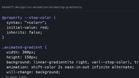 Animating gradients
CSS gradients cannot be transitioned directly—the browser snaps between values. Learn how @property enables smooth gradient animation by typing custom properties for interpolation.
Animating gradients
CSS gradients cannot be transitioned directly—the browser snaps between values. Learn how @property enables smooth gradient animation by typing custom properties for interpolation.
-
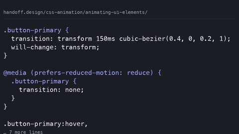 Animating UI elements
Animate UI elements at 60fps by restricting motion to transform and opacity. Learn compositor-safe techniques for buttons, toggles and form controls with reduced-motion fallbacks.
Animating UI elements
Animate UI elements at 60fps by restricting motion to transform and opacity. Learn compositor-safe techniques for buttons, toggles and form controls with reduced-motion fallbacks.
-
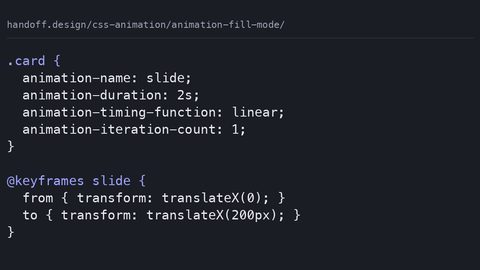 Animation fill mode
animation-fill-mode controls whether an element retains styles from the keyframes before the animation starts and after it ends. Learn forwards, backwards and both with runnable samples.
Animation fill mode
animation-fill-mode controls whether an element retains styles from the keyframes before the animation starts and after it ends. Learn forwards, backwards and both with runnable samples.
-
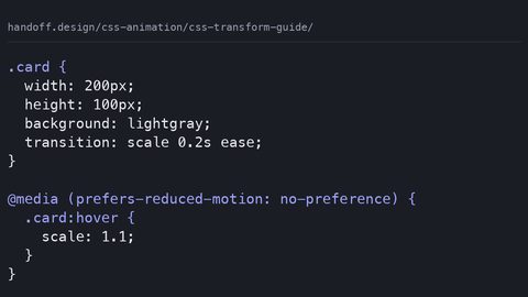 CSS transform guide
CSS transform functions scale, rotate and skew animate on the compositor thread without triggering layout or paint. Learn each function with complete, runnable code samples.
CSS transform guide
CSS transform functions scale, rotate and skew animate on the compositor thread without triggering layout or paint. Learn each function with complete, runnable code samples.
-
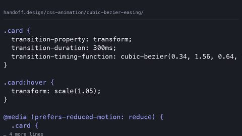 Cubic bezier easing
cubic-bezier defines custom easing curves with four control points for CSS transitions and animations. Learn to design curves that feel natural using complete code samples.
Cubic bezier easing
cubic-bezier defines custom easing curves with four control points for CSS transitions and animations. Learn to design curves that feel natural using complete code samples.
-
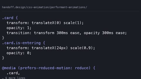 Performant animations
Only transform and opacity animate on the compositor thread. Learn which CSS properties trigger layout or paint, how to measure the cost, and how to write animations that stay at 60fps.
Performant animations
Only transform and opacity animate on the compositor thread. Learn which CSS properties trigger layout or paint, how to measure the cost, and how to write animations that stay at 60fps.
-
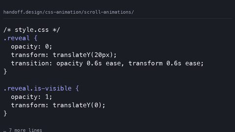 Scroll animations
Build on-scroll animations with IntersectionObserver or the declarative scroll() and view() timeline functions. Learn which approach runs off the main thread with runnable samples.
Scroll animations
Build on-scroll animations with IntersectionObserver or the declarative scroll() and view() timeline functions. Learn which approach runs off the main thread with runnable samples.
-
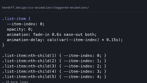 Staggered animations
CSS has no stagger() function. Create staggered animations with animation-delay, custom properties and nth-child to cascade start times across a list of elements.
Staggered animations
CSS has no stagger() function. Create staggered animations with animation-delay, custom properties and nth-child to cascade start times across a list of elements.
-
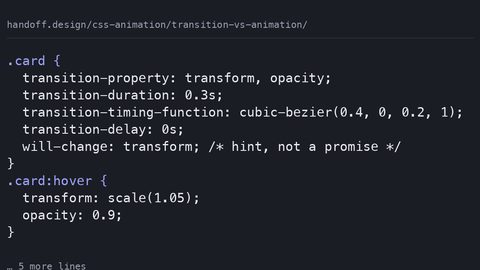 Transition vs animation
CSS transitions respond to property state changes; CSS animations run independently. Learn the performance cost of each and when to choose one over the other.
Transition vs animation
CSS transitions respond to property state changes; CSS animations run independently. Learn the performance cost of each and when to choose one over the other.
-
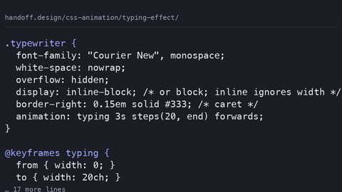 Typing effect
Build a CSS-only typewriter effect with animation-timing-function: steps(). Understand the layout cost, the monospace requirement, and the reduced-motion fallback.
Typing effect
Build a CSS-only typewriter effect with animation-timing-function: steps(). Understand the layout cost, the monospace requirement, and the reduced-motion fallback.
Read next
-
CSS transform guide
CSS transform functions scale, rotate and skew animate on the compositor thread without triggering layout or paint. Learn each function with complete, runnable code samples.
-
Animating gradients
CSS gradients cannot be transitioned directly—the browser snaps between values. Learn how @property enables smooth gradient animation by typing custom properties for interpolation.
-
Typing effect
Build a CSS-only typewriter effect with animation-timing-function: steps(). Understand the layout cost, the monospace requirement, and the reduced-motion fallback.
-
Transition vs animation
CSS transitions respond to property state changes; CSS animations run independently. Learn the performance cost of each and when to choose one over the other.
-
Cubic bezier easing
cubic-bezier defines custom easing curves with four control points for CSS transitions and animations. Learn to design curves that feel natural using complete code samples.
-
Performant animations
Only transform and opacity animate on the compositor thread. Learn which CSS properties trigger layout or paint, how to measure the cost, and how to write animations that stay at 60fps.